About me
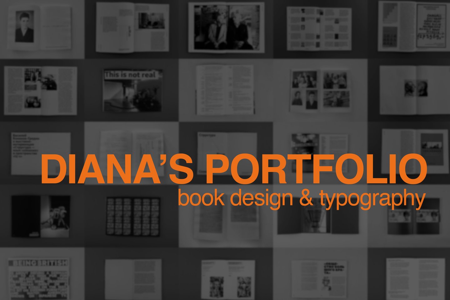
I’m a communication designer specializing in book design. I’m interested in how ideas can shape the way a book looks, feels and is read. My approach begins with the content. I look for visual metaphors, typographic systems and structural solutions that reflect the meaning of a text rather than simply illustrate it. For me, book design is a way to build a relationship between an idea and the reader.
Typography is more than a visual element
Type influences how we read, understand and experience information. Its form, scale, rhythm and placement all contribute to the meaning of a design. I believe every typographic decision should be intentional — not just decorative, but connected to the idea behind the project.
Arha
Poster series and calendar · Typography
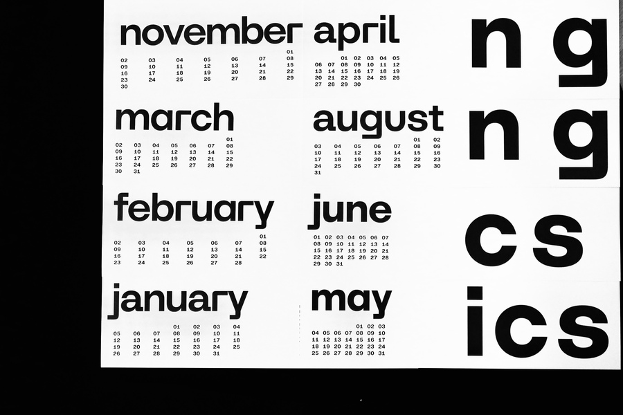
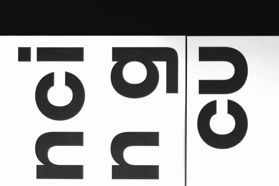
A typeface by Bolditalic studio, Arha draws on the visual legacy of early grotesque typefaces and Constructivist architecture. For this project, I explored its character through the theme of sport, reinterpreting the era’s visual language and its idea of the «new human». The posters become an abstract composition in which typography takes the leading role. Meaning gives way to form, revealing the typeface’s movement, rhythm and expressive potential.
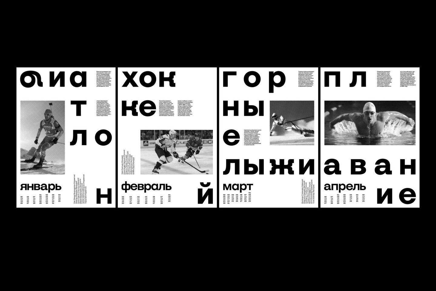
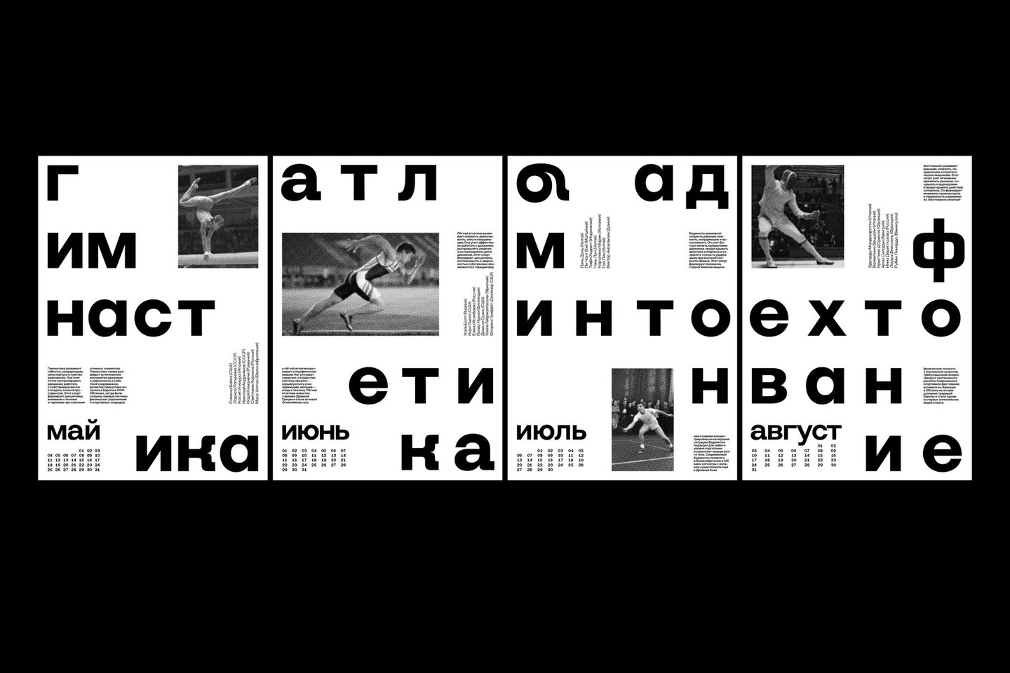
Fixed horizontals, flexible width
The composition is built around a system of fixed horizontal levels. All elements align along the same lines, while the width of the grid changes according to the length of each word and the shape of its letters. This contrast creates a balance between order and movement. The calendar grid follows the same principle, adapting to the typography rather than imposing a rigid format.
From type to the book
Typography can create rhythm, organize information and shape the way we experience content. In book design, I explore these possibilities through the structure of the page, the sequence of reading and the relationship between text and image.
Arcadia by Tom Stoppard
Book design · Unusual shape
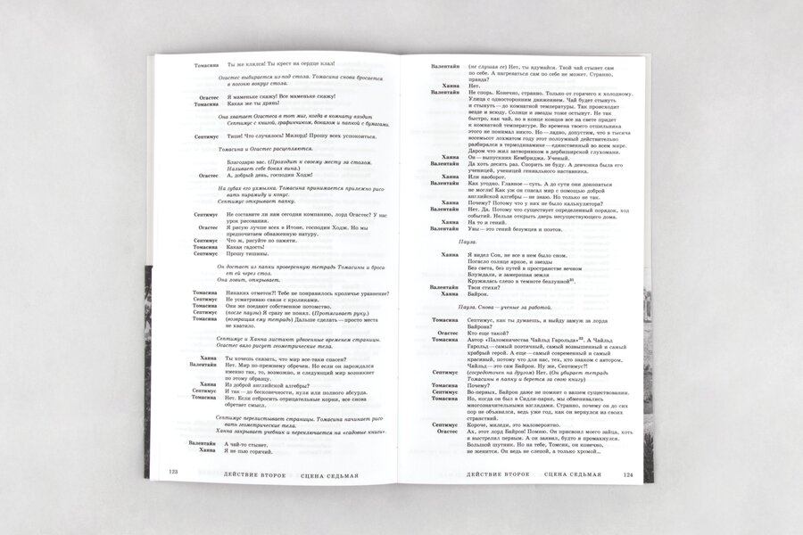
Two eras, one page.
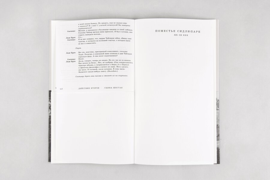
Tom Stoppard’s Arcadia moves between two time periods, connecting their characters, ideas and discoveries. I wanted the book’s structure to reflect this parallel narrative. I divided the page through the middle, creating a visual separation between the two timelines while allowing them to exist within the same publication.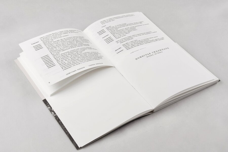
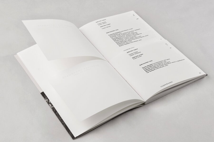
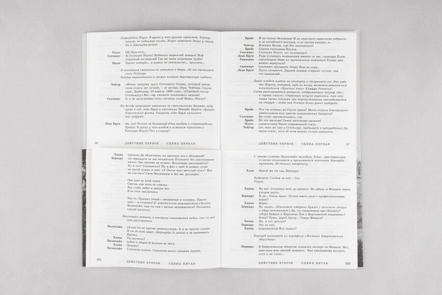
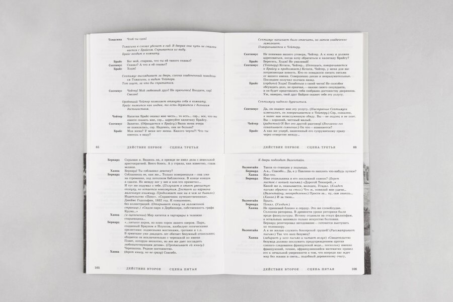
At the end, all the characters appear on stage together. The page division disappears, and the book becomes a unified whole, reflecting the convergence of the two timelines.
Small encyclopedia
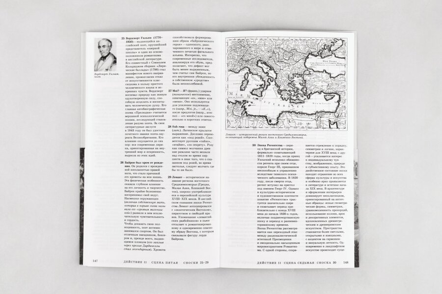
Instead of conventional footnotes, I created a separate encyclopedia in the book. It brings together short biographical and theoretical references to the people, concepts and ideas mentioned in the play — from historical figures to scientific and philosophical discussions. This additional layer helps readers navigate the intellectual context of the text without interrupting the main narrative.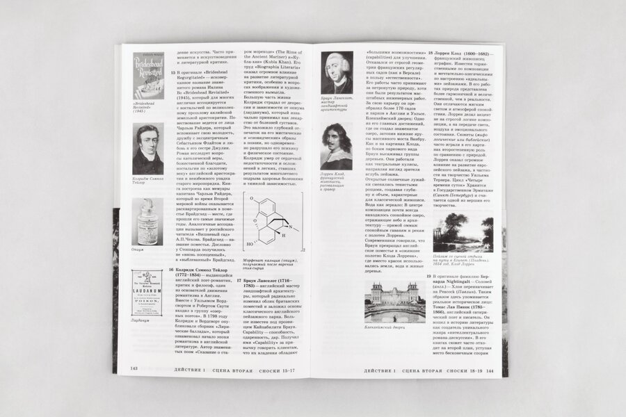
Debates 1972
Editorial design · Wim Crouwel and Jan van Toorn
Two perspectives in one conversation.
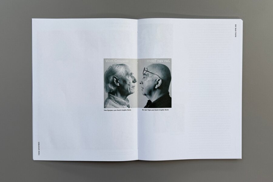
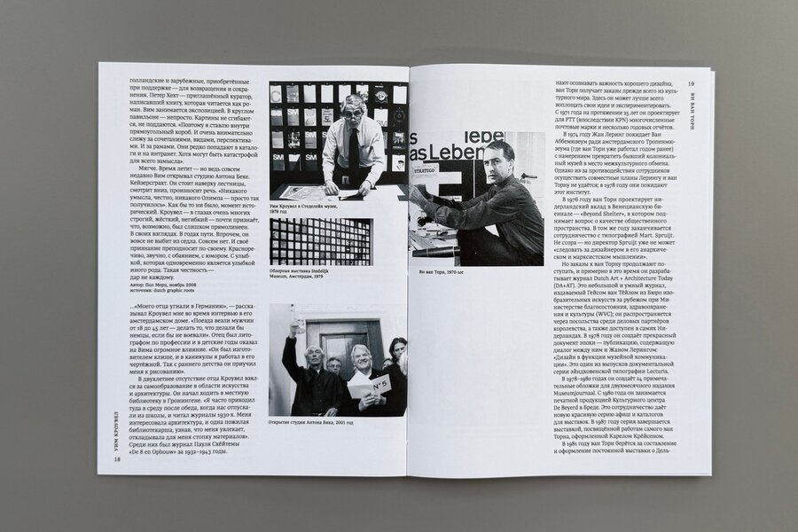
The book explores the 1972 debate between Wim Crouwel and Jan van Toorn, bringing together the discussion itself, their work, biographies and the historical context of their opposing design approaches. Each designer has their own side of the spread, creating a consistent visual distinction between the two perspectives. The publication combines the debate with contextual material to help readers understand the ideas behind it.