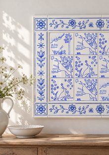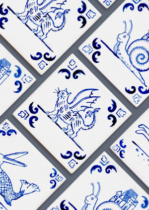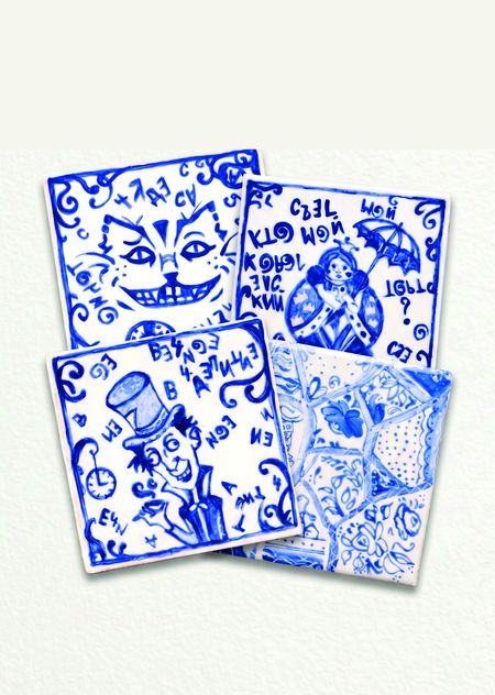
The collection of ceramic tiles unites three narrative portraits of key fairytale characters and one abstract mosaic tile, which served as the starting point for the entire visual exploration.
Concept and Visual Language
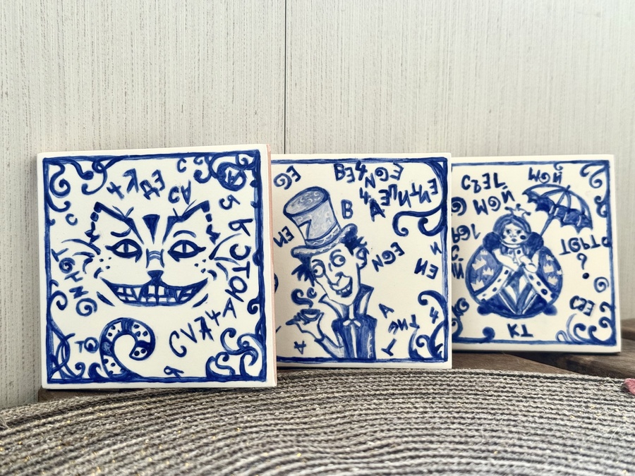
Instead of canonical, formal figures, the characters are depicted with expressive flair and a touch of self-irony. The tiled space is filled with mirrored text, inverted phrases, and scattered symbols, all referencing the logic of dreams and the laws of the looking glass.
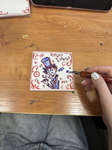
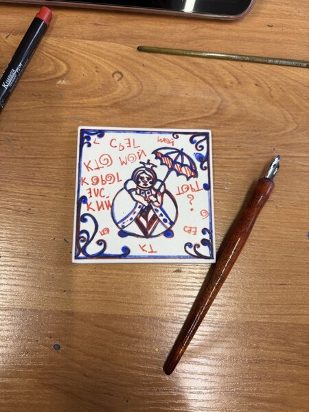
Tile Creation Process
Contrast of Form and Content
The module’s strict square form and canonical blue pigment contrast with the careless dynamism of hand-sketching.
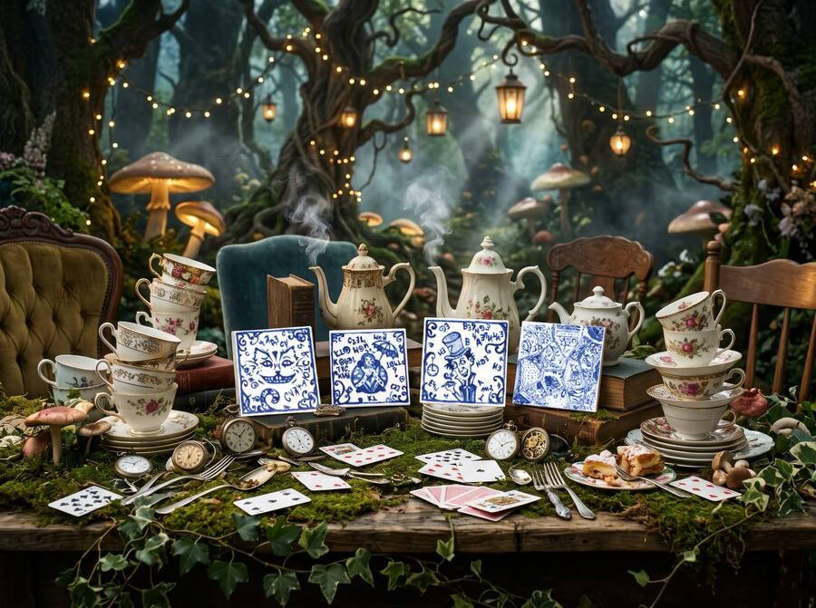
The objects can be displayed as a single 2×2 modular unit, arranged in a horizontal triptych with a distinct accent, or exist as independent interior art pieces.
A significant part of the project involved the tactile and visual contrast of surfaces, emphasizing the development of the author’s search.
Thematic Triptych («Cheshire Cat, ” „Mad Hatter, ” „Queen of Hearts“)
Base: matte ceramic (10 × 10 cm)
The velvety, non-reflective surface of the matte tile enhances the graphic quality of the cobalt lines, drawing the ceramic closer to book illustration.
2. «First Draft» (Fragment No. 0 / Abstract Collage)
Base: glossy ceramic (10 × 10 cm)
The first, experimental piece in the cycle, where brush plasticity, pigment density, and glaze behavior were tested. The tile is designed using a patchwork principle: mosaic sectors connect botanical patterns, graphic polka dots, and naive silhouettes of houses. The glossy, vitreous surface creates depth and the effect of a shattered mirror, unifying imaginary fragments.
Practical Application
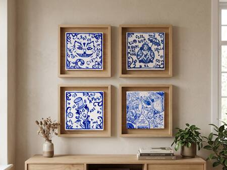
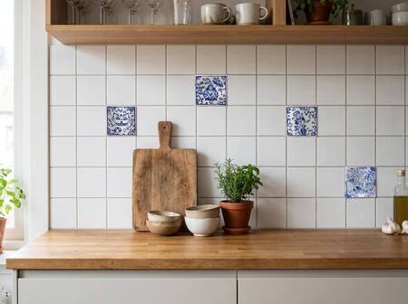
The collection is designed as a versatile decorative element: an accent interior tile inset, a base for a wall panel, a tabletop art object, or a functional design stand.