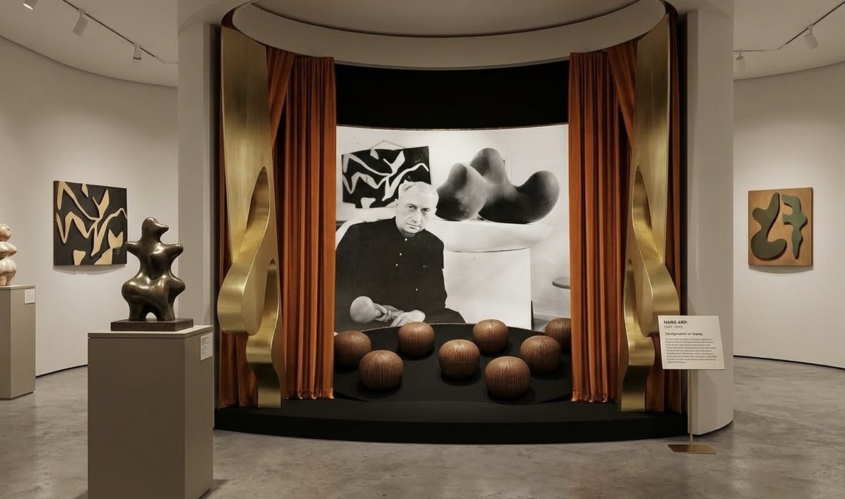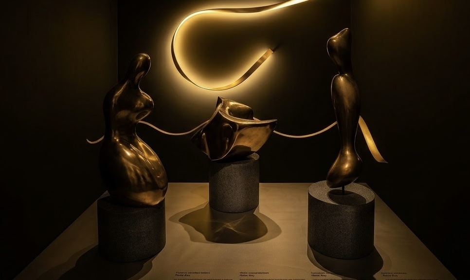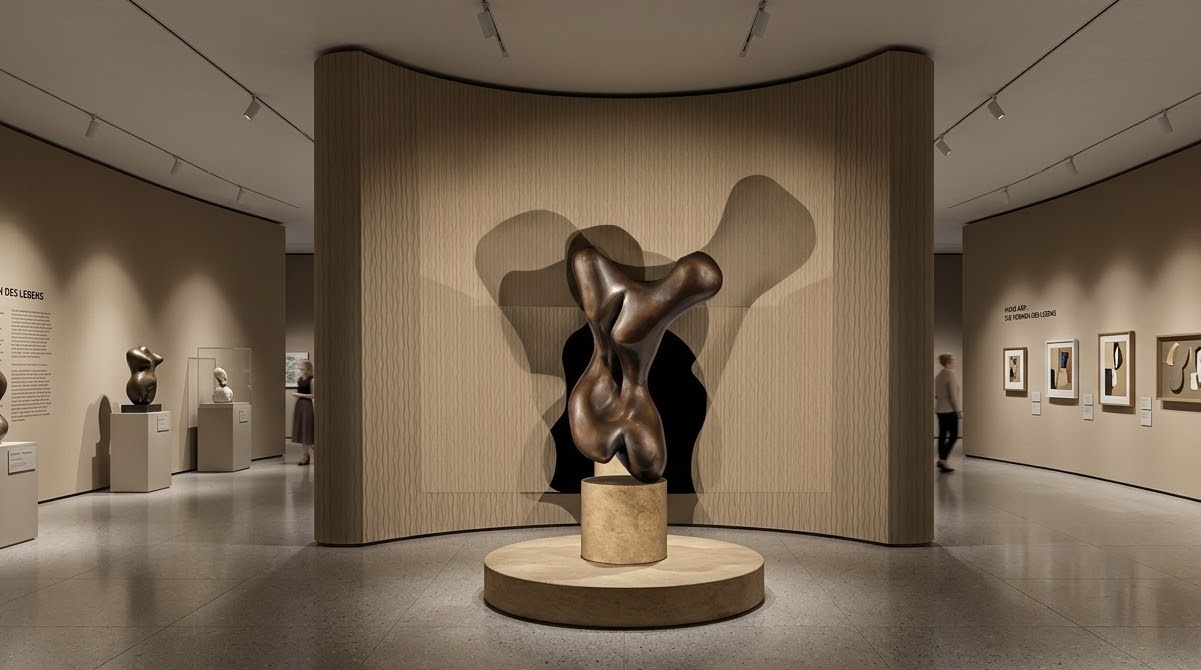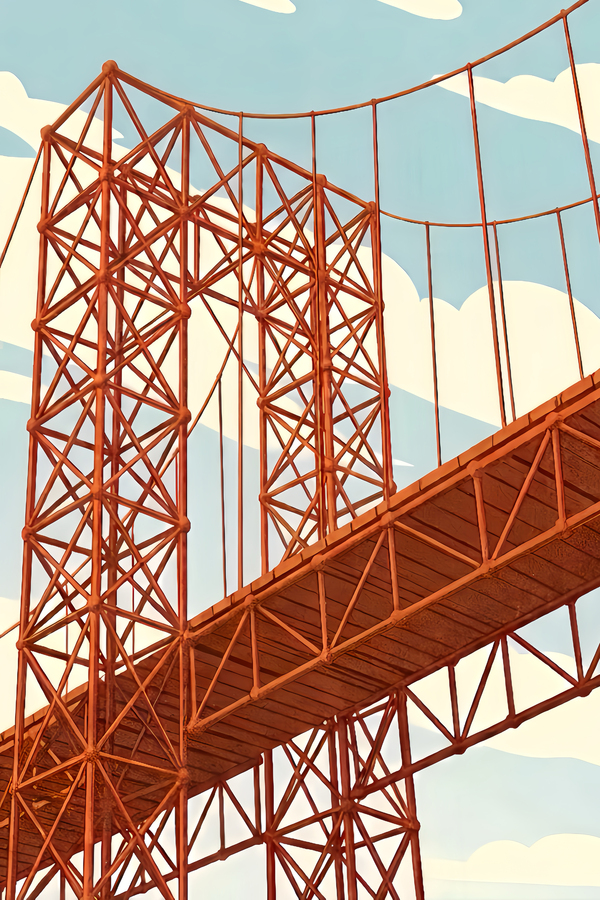
My old project was called «Forms of Time.» Over the course of a year, we worked on an exhibition space dedicated to the work of Hans Arp—the most abstract of the Surrealists and the most surreal of the Abstractionists.
Arp—aesthetic and mesmerizing. Its metamorphoses and continuous processes of birth in nature cannot leave one indifferent, and its «fluid» plasticity will remain in your memory forever.
Identity
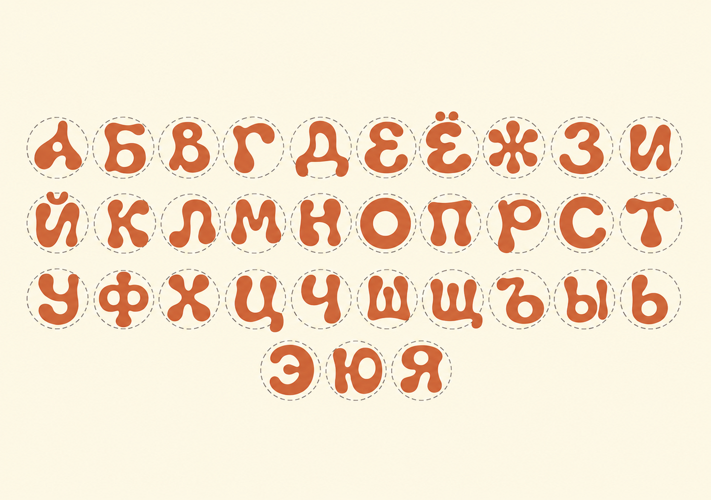
First, I focused on the project’s brand identity. Using Gemini, I designed my own typeface in the style of Hans Arp. I chose the artist’s work as a reference and asked the AI to render an amorphous typeface for the Cyrillic alphabet in the colors of my previous project.
Prompt:

Similar fonts found using the WhatTheFont service
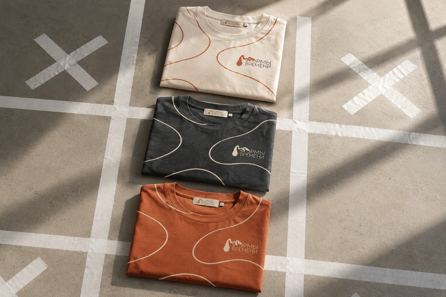
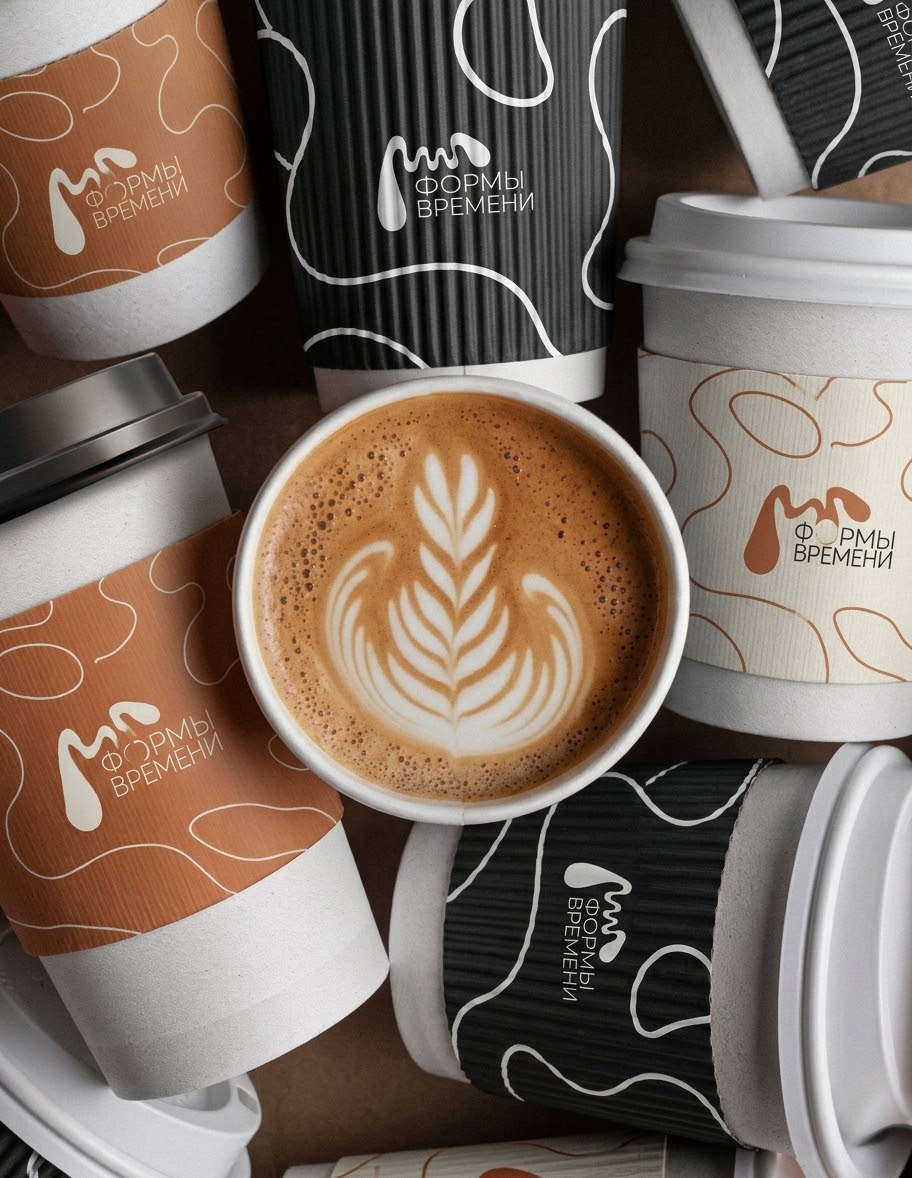
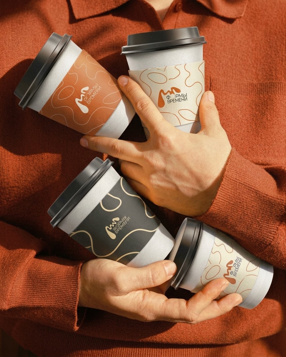
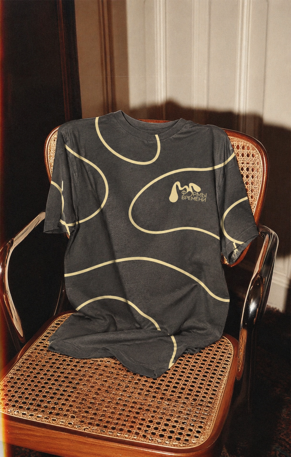
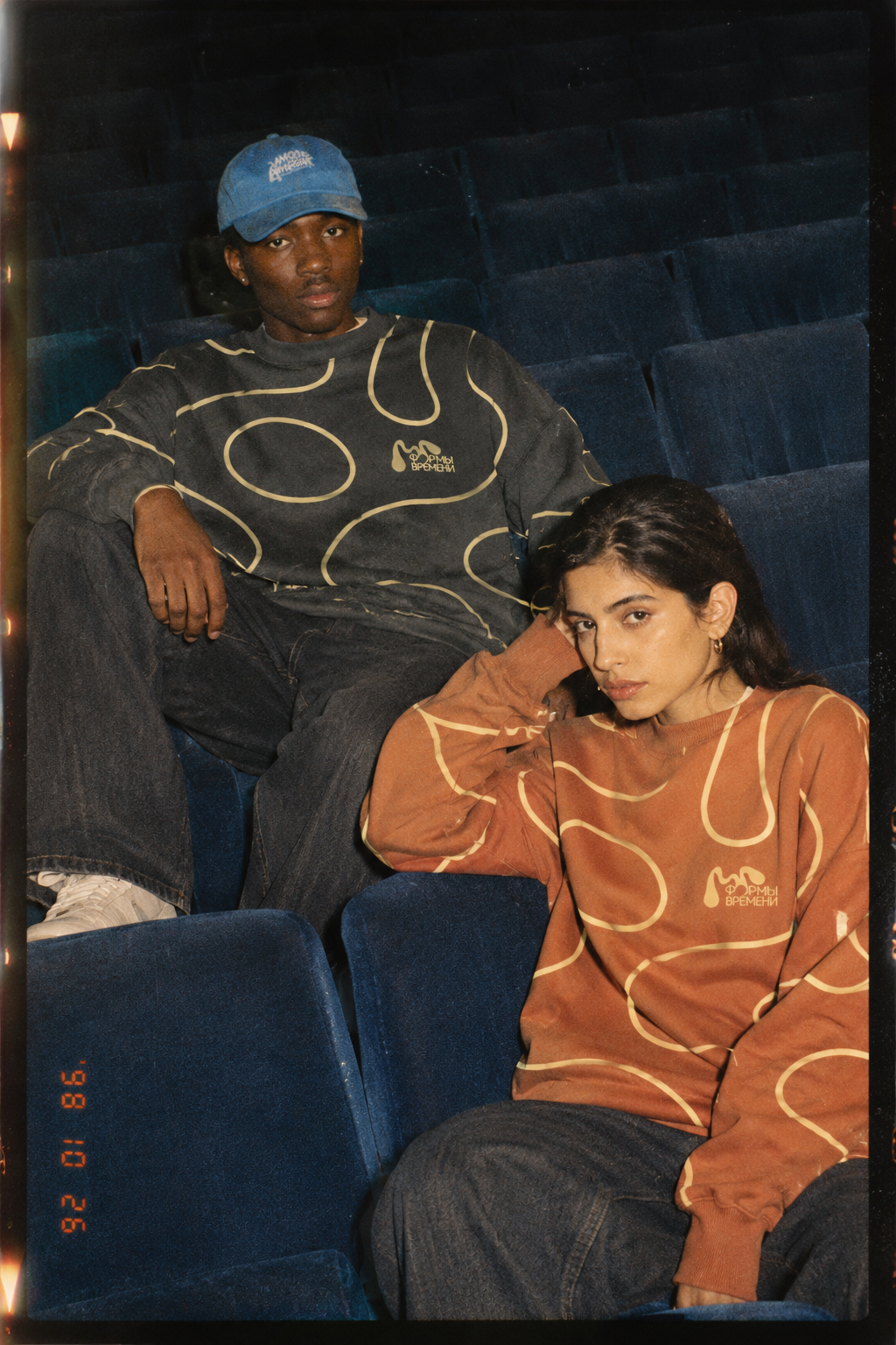
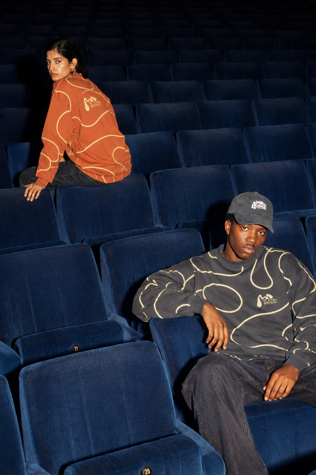
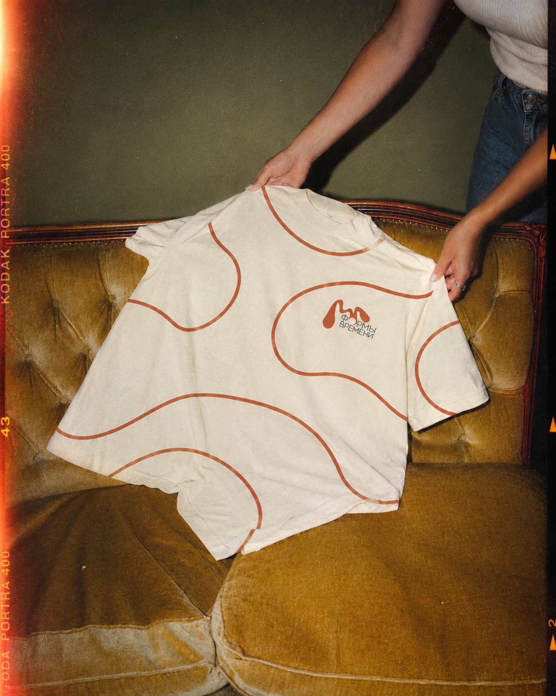
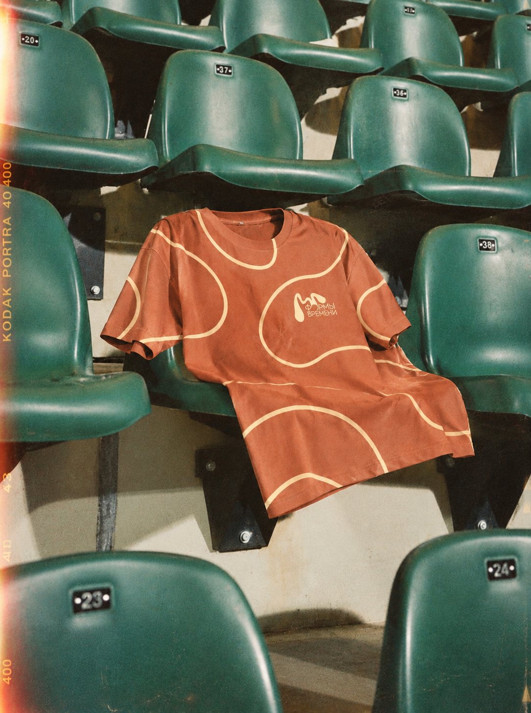
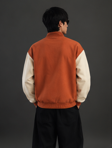
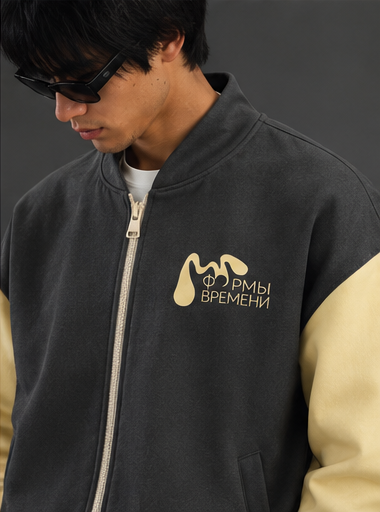
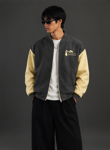
Merchandise

Exhibition Space