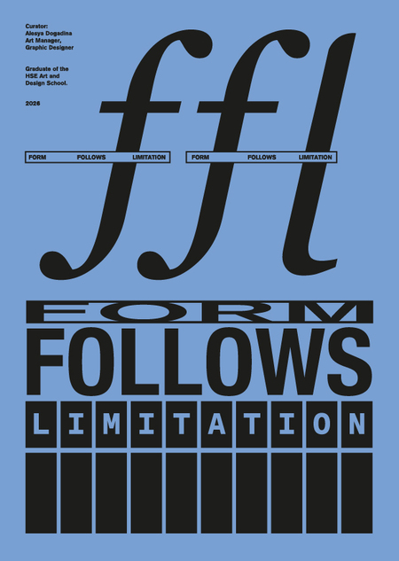
We are accustomed to thinking that the most important aspects of typography are legibility and readability. Any distortion in typography seems like an error. But what if the strange behavior isn’t a glitch, but a scenario?
The exhibition «Form Follows Limitation» examines typeface as an object whose shape is dictated by rules and constraints: modular, monospaced, technical. The exposition presents two states: strict adherence to the norm and transformation under the pressure of conditions.
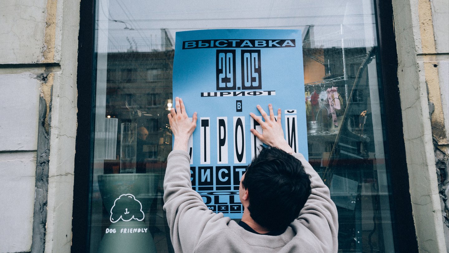
Exhibition Installation
The installation process for the exhibition «Form Follows Limitation» at Tipa Coffee became a pivotal phase in the project’s realization, demanding the comprehensive application of art direction competencies. The primary goal was translating the exhibition’s conceptual framework into a physical space: it required ensuring the sequential unfolding of the theme—moving from monospaced typefaces through modular systems to elongated typography achieved via spatial dramaturgy. I developed the space’s zoning plan, defined visitor circulation paths, and thoughtfully structured the rhythm of alternating interactive installations and areas for contemplation. Every exhibit was assigned a location justified not by aesthetic preference, but by narrative logic.
Exhibition Opening
The exhibition was structured around a central thesis: the form of a typeface is always dictated by limitations—those willingly adopted or those imposed by the environment. The exhibition space was divided into two conceptual zones.
The first zone featured monospaced fonts, where I explored the aesthetics of a rigid system. Each character exists within a uniform width, and this constraint becomes the generator of plastic expressiveness.
The second zone showcased elongated, condensed typefaces. This area demonstrated how external pressures (such as the narrow format of packaging, labels, or signage) deform the letterform, thereby generating a new, unintended shape. Every object in these zones—from large-scale installations to tactile modular constructors—was intended to translate an abstract typographic property into a physical function.
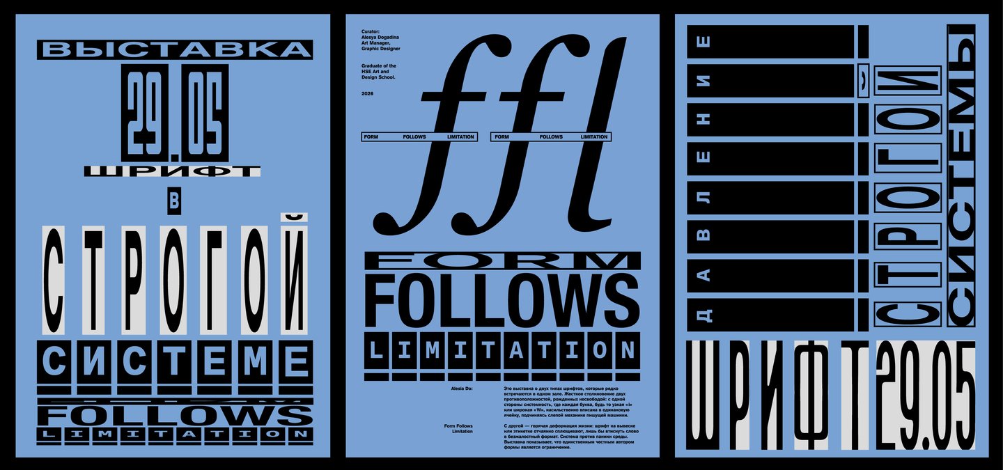
Exhibition Opening Poster
Exhibition Navigation Map
Curatorial Text
Card Game: Answers to Exhibition Questions
Explication
Specimen for each font presented at the FFL exhibition
Theoretical Aspect of Monospaced Typeface
Module Fonts