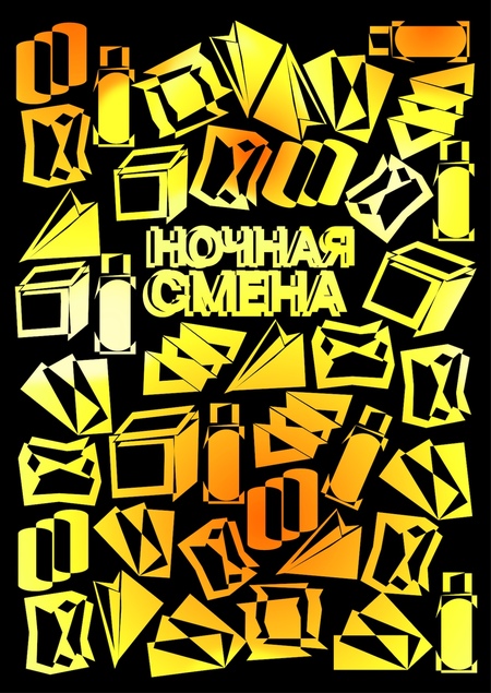
«Night Shift» is the brand concept for 24-hour vending machines offering ready-to-eat meals, healthy snacks, and beverages. The project is designed for city residents who value their time and seek high-quality nutrition around the clock. The visual identity is built upon expressive typography, dynamic graphics, and vibrant color palettes that convey the rhythm of the nocturnal city.
Concept 1: Night Beacon
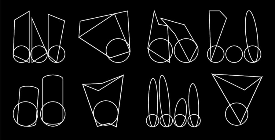
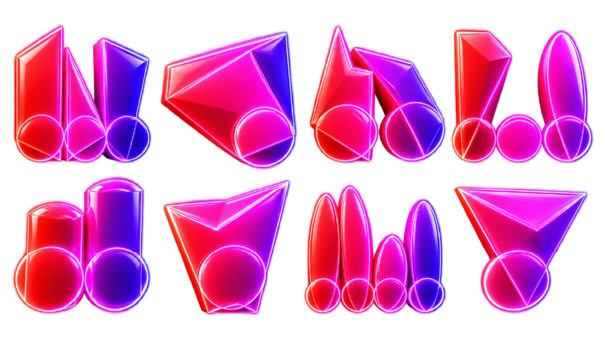
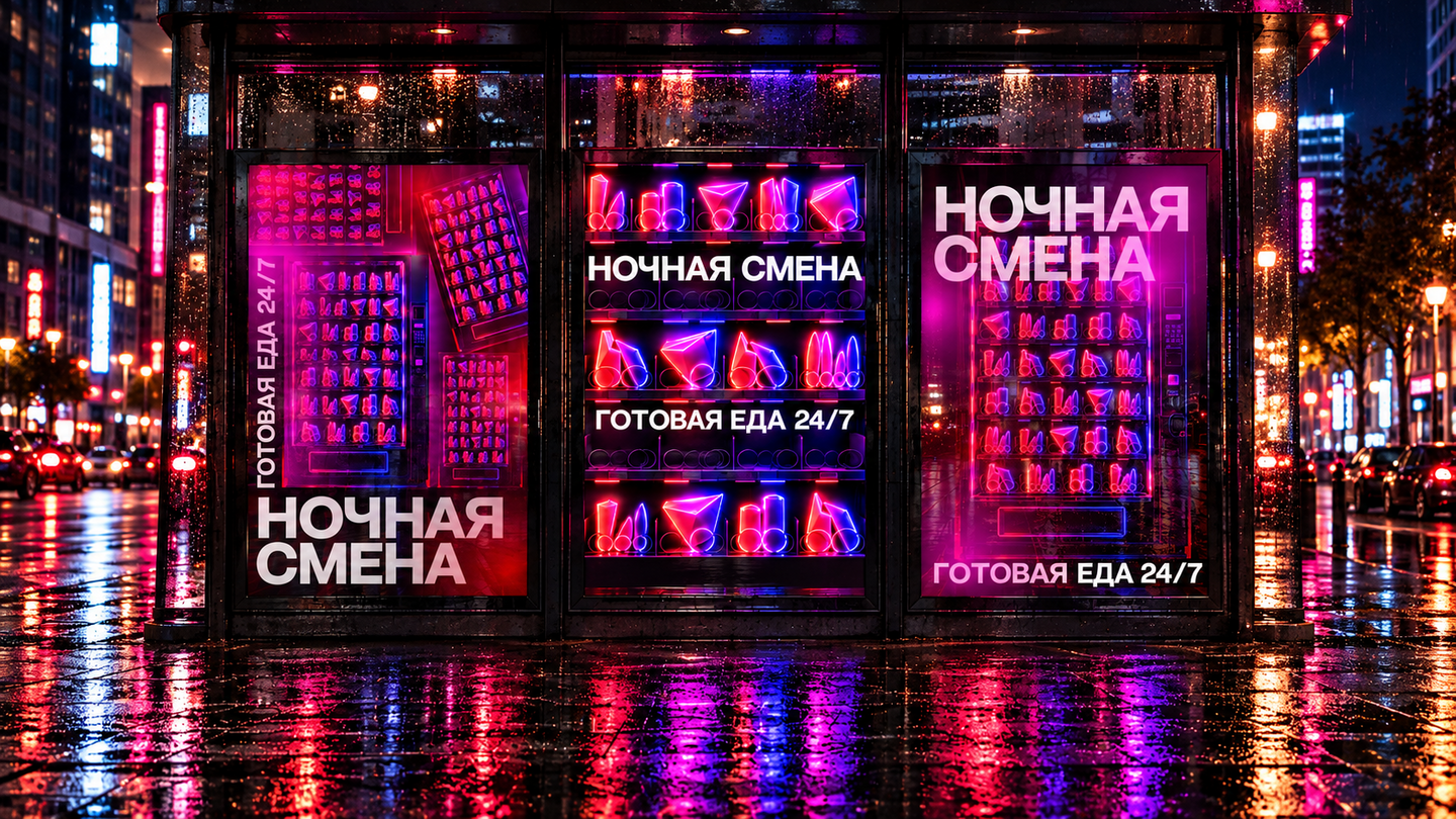
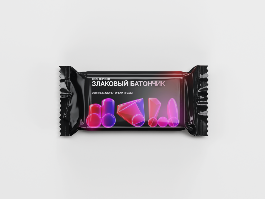
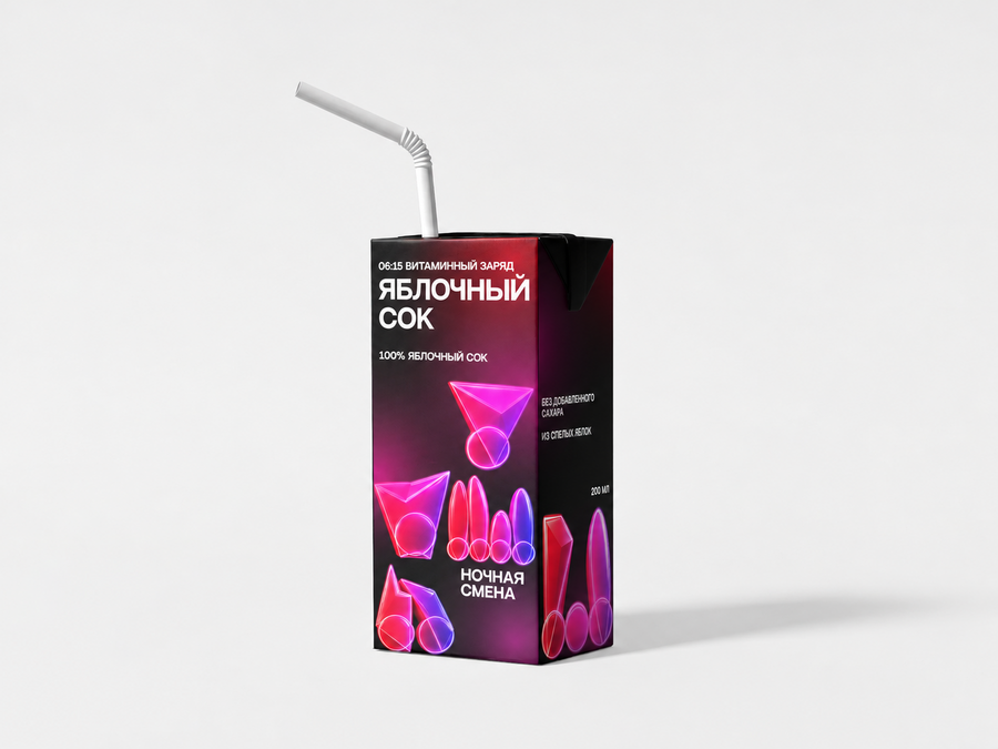
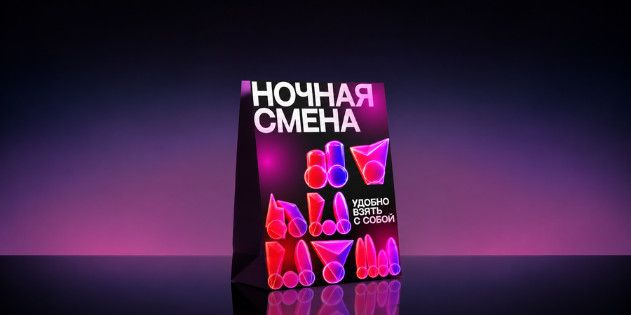
At night, the city becomes dark and empty, yet the functioning vending machine remains a bright point of light. Humans orient themselves toward light when almost everything else is shrouded.
The conceptual symbol system is inspired by the forms of products and packaging found in vending machines. Neon gradients and volumetric shapes convey the atmosphere of a nocturnal city, making the identity recognizable.
Posters
Packaging and Brand Collateral

Concept 2: Structure
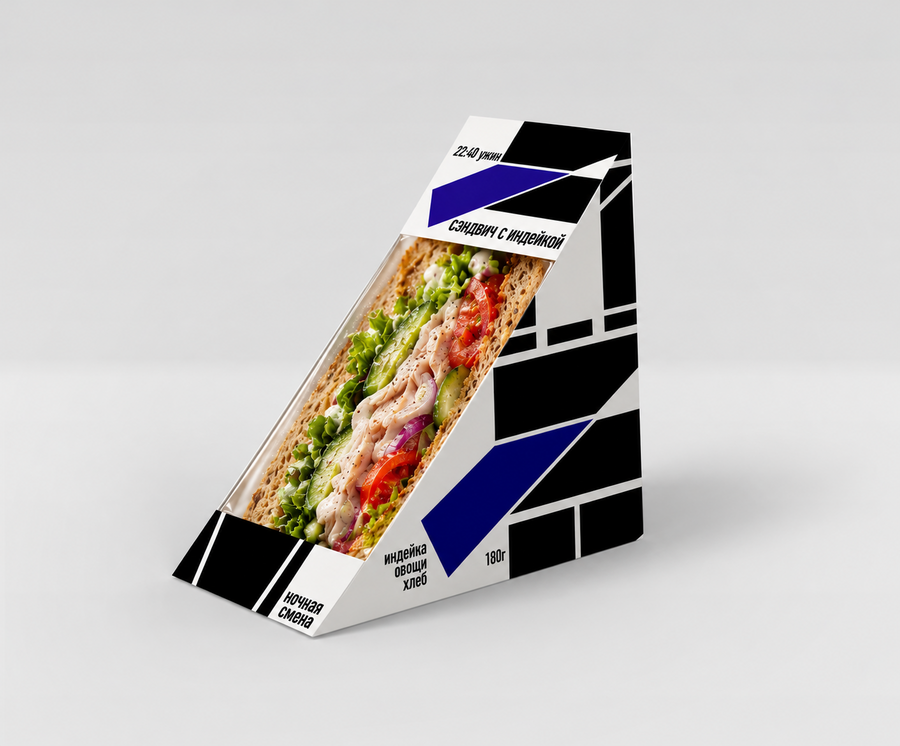
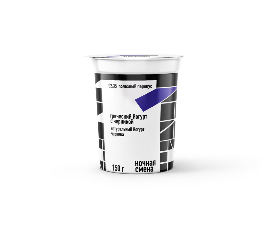
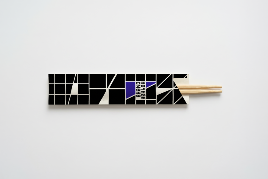
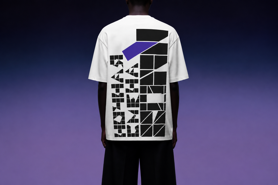
Before a purchase, all products inside the vending machine are organized: packages stand in rows, repeat, and form a grid. However, when one item is purchased, the order is disrupted and the grid changes.
The system of conceptual symbols is inspired by the structure of packaging inside vending machines. Geometric modules, offsets, and breaks in form create a dynamic visual rhythm that reflects the process of selecting and receiving a product.
Logo
Business Documentation
Packaging and Branding Materials
Concept 3: The Delivery Moment
The main action of the vending machine is changing the item’s position. It is inside the system, then it shifts and falls out.
The system of symbols reflects the moment the product is dispensed from the machine. The displacement, overlap, and deformation of geometric forms convey movement and the dynamism of the process.
Posters
Vending Machine
Packaging and Brand Collateral