Factory: SNOW WHITE™
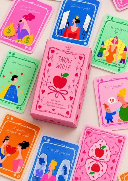
SNOW WHITE™ — an original deck of cards that reimagines the fairy tale «Snow White and the Seven Dwarfs» within the context of modern media culture. The familiar plot transforms into a story about power, competition, attention management, and control over public image. In the world of the deck, beauty becomes capital, popularity becomes a resource, and the recognition of others becomes a tool of influence. The Evil Queen strives to maintain her position, the Mirror functions as a mechanism for assessing and distributing attention, and Snow White becomes the subject of a struggle for visibility and recognition. The seven dwarfs are reinterpreted as participants in a single system, integrated into the processes of information production, exchange, and dissemination. Through the visual imagery of fairy tale characters, symbols of the digital environment, and the aesthetics of commercial media, the project explores how traditional narratives of envy, power, and beauty are reflected in the contemporary culture of personal branding and the attention economy.
Concept
SNOW WHITE™ is an original interpretation of the fairy tale, in which the magical world operates as a closed media system. The characters become participants in a struggle for attention, influence, and control over information. The mirror transforms into an evaluation algorithm, the Queen into a figure managing visibility and status, and Snow White into the central object of the system, whose value is determined by external recognition.
The deck explores the contradiction between the self and one’s public image, showing how beauty, reputation, and popularity become tools of power. Its visual language merges fairy-tale imagery with the aesthetics of digital interfaces, commercial branding, and glossy media culture.
Principle of Series Organization
The SNOW WHITE™ deck is built upon a system of four suits, which reflect the core mechanisms of the media environment: Mirrors—image and self-presentation; Apples—temptation and manipulation; Algorithms—metrics and attention distribution; and Contracts—money and power. Fable characters are recontextualized as participants in a system where beauty becomes capital, and popularity becomes a tool of influence. The series is unified by a consistent color palette, typography, composition, and graphic elements that merge fairytale aesthetics with the visual language of contemporary media culture.
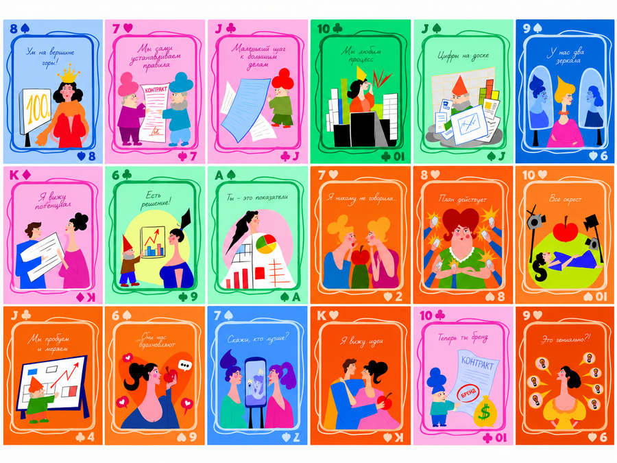
Visualization
Technical Specifications
Key Parameters
Number of cards — 36 pcs.
Card size — 63 × 88 mm.
Material — specialized playing card cardboard with a density of approximately 300 g/m².
Printing — full-color, double-sided, 4+4.
Coating — protective varnish or special playing card coating.
Corners — rounded.
Jokers — unified, original design, approved to align with the front-side visual system.
Preparing files for print
Bleed allowance—3 mm on each side.Color model—CMYK.Raster image resolution—300 dpi at actual size.Text and important elements—must be kept at least 3 mm away from the cut line.Fonts—must be converted to curves.Final file format—Print PDF; editable source files are saved separately.
Packaging
For the deck, a custom-made, foldable cardboard box with flaps is being developed. Its design continues the visual language of the cards, incorporating the project’s graphic elements, typography, and brand color palette. The packaging layout is prepared separately, taking into account the die-cut outline, fold lines, and gluing flaps.
Materials and production cost calculation
- Concept and Design DevelopmentThe concept for the SNOW WHITE™ deck was developed, reimagining the fairy tale «Snow White and the Seven Dwarfs» through the themes of personal branding, attention economics, media, and social relationships. A system of 36 cards, divided into four suits, was developed, and a visual concept was created for each card.2. Illustration CreationOriginal illustrations for the card fronts were developed. For each card, a theme, color scheme, and composition were chosen. A unified graphic system was established, including suit and rank designations, decorative borders, and handwritten typography.3. Print Layout PreparationThe layouts for the card fronts and the unified back design were finalized. A review was conducted regarding the placement of graphic elements, bleed margins, and cut-out areas. The files were prepared for printing according to the printer’s technical specifications.4. Packaging DesignA design for the custom cardboard box was created, harmonizing with the deck’s visual style. The packaging die-cut pattern was developed, taking into account the stack size of the cards, flaps, and fold lines. A layout was prepared for printing and subsequent assembly.5. Card and Packaging PrintingFull-color, double-sided printing of the deck on thick playing card stock is planned. The packaging, featuring custom artwork, is printed separately. Before producing a run, color reproduction, illustration sharpness, and layout accuracy against the original are verified.6. Post-Press FinishingAfter printing, the sheets are cut to the specified format, and the card corners are rounded. If necessary, a protective coating is applied to increase the surface’s resistance to wear.7. Assembly and Quality ControlThe finished cards are assembled into a 36-card deck and placed in individual packaging. The completeness, print quality, cutting accuracy, corner condition, and overall correspondence of the final product to the designed aesthetic are verified.