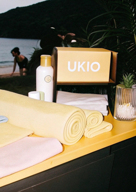
The UKIO brand produces Vietnamese bonus aromamas and other therapeutic products. The curses can decorate the house both individually and in association with each other — to gather and understand like a designer. This helps the owner to create a unique form and enjoy the unique object of the decor.
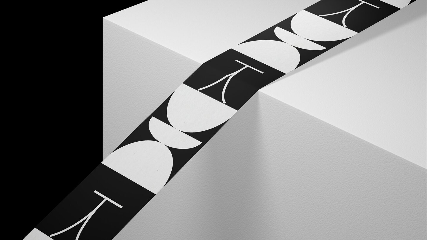
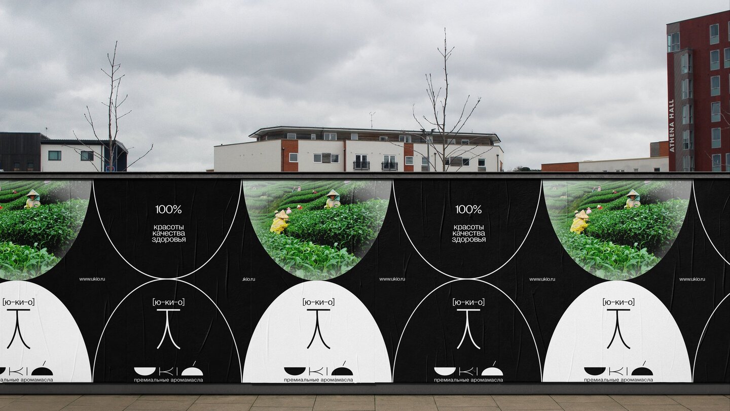
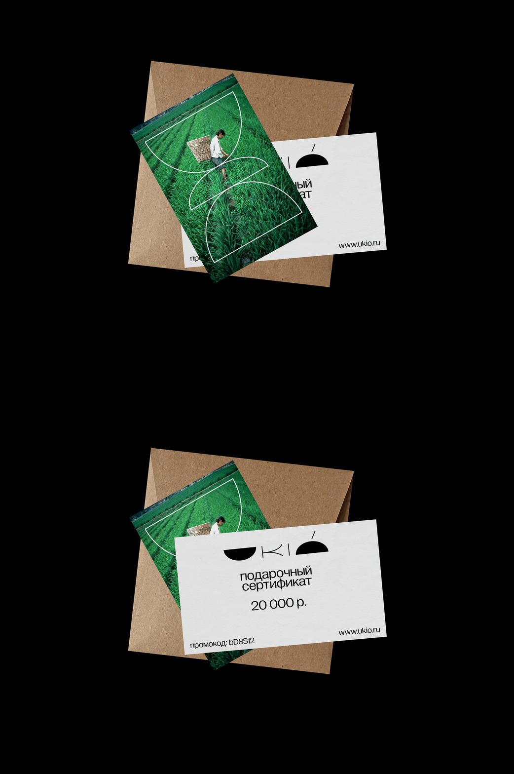
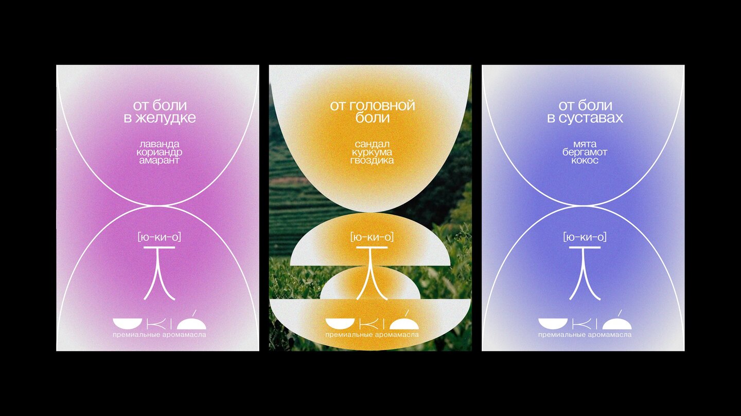
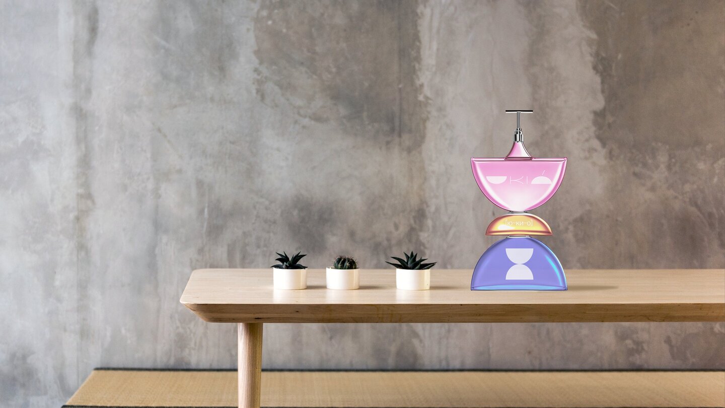
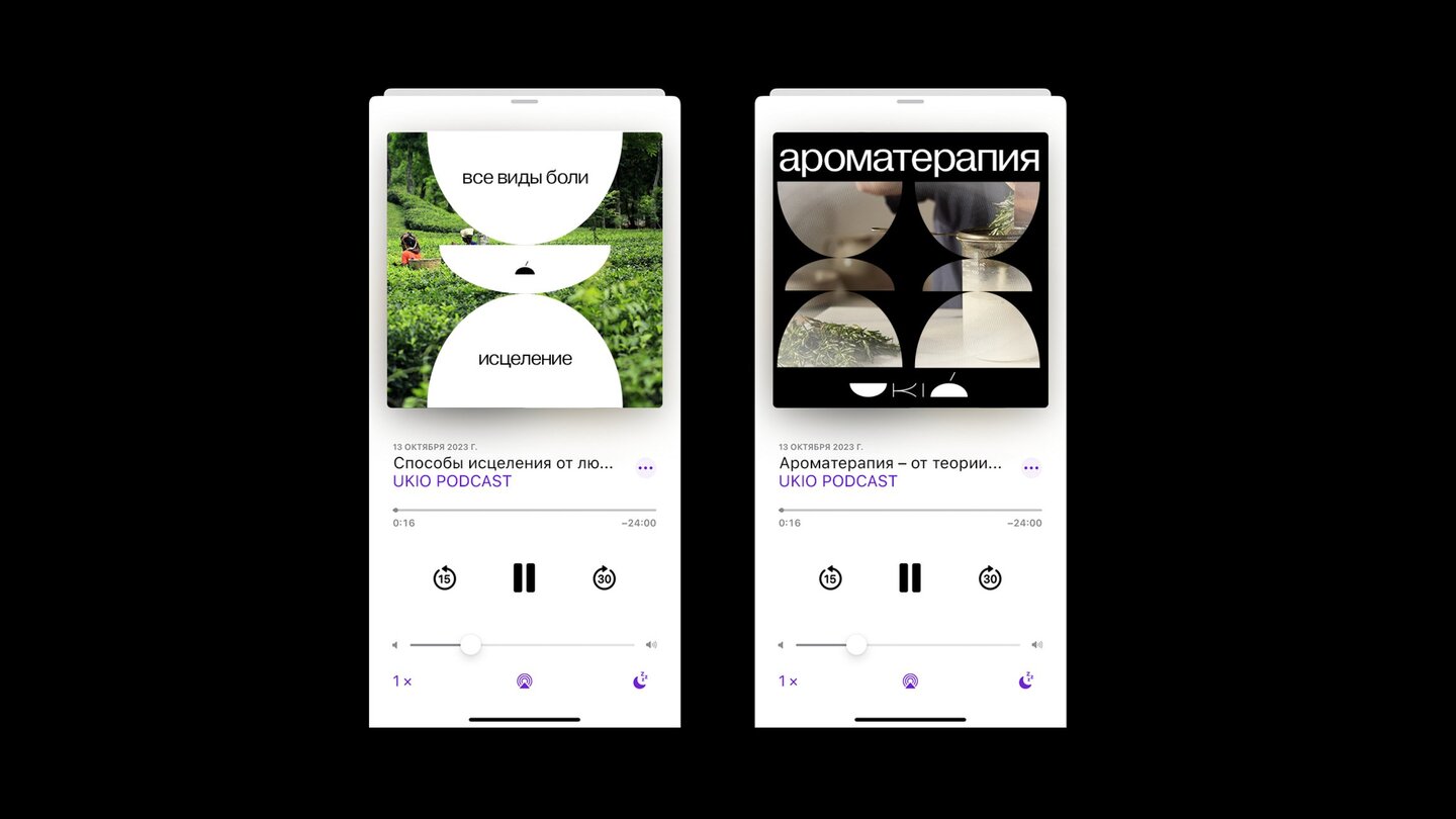
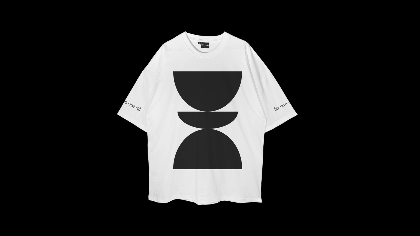
I asked you to neuralize Qwen to analyze the old UKIO brand style based on these images. It helped me create the most accurate rebranding proms. Here are the excerpts from the analysis: 1. Target Audience: People who value quality, natural products, healthy lifestyles, aesthetics and the ability to express themselves through design. 2. All right, all right, okay, okay, okay, okay, okay, okay, okay, okay, okay, okay, okay, okay, okay, okay, okay, okay, okay, okay, okay, okay, okay, okay, okay, okay, okay, okay, okay, okay, okay, okay, okay, okay, okay, okay, okay, okay, okay, okay, okay, okay, okay, okay, okay. Colour palette: Soft, harmonious colors (e.g. purple, yellow, blue) are used on the first three images, as well as black and white tones on the following. This creates a calm and peaceful atmosphere. 3. Impressive and emotional connection: Calm and harmony. Color palette, minimalistic design, and natural motives create a sense of calm and harmony that contributes to a positive emotional connection with the brand. Brand successfully communicates the idea of caring for his health and well-being through the use of natural products. 4. All right, all right, okay, okay, okay, okay, okay, okay, okay, okay, okay, okay, okay, okay, okay, okay, okay, okay, okay, okay, okay, okay, okay, okay, okay, okay, okay, okay, okay, okay, okay, okay, okay, okay, okay, okay, okay, okay, okay, okay, okay, okay, okay, okay. Packaging and presentation: A special feature of packing is the ability to assemble cans into different compositions, which makes the use of the product more interesting and meets aesthetic needs. Minimalism, simplicity and purity of design.
Logo
prompt: Create a modern, minimalist logo for a premium Vietnamese brand of natural aromatherapy oils called 'UKIO.' The logo should reflect harmony, nature, and creativity. Use soft, harmonious colors such as purple, yellow, blue, and neutral tones. Incorporate abstract geometric elements like circles, semicircles, or flowing lines to symbolize unity, time, and the connection between health and self-expression. The design should evoke calmness and balance while maintaining an elegant and contemporary aesthetic. Consider including a subtle reference to natural elements (e.g., sandalwood, trees, or essential oil droplets) without being overly literal. The final result should work well in both color and black-and-white formats and be versatile for use on packaging, digital platforms, and merchandise.
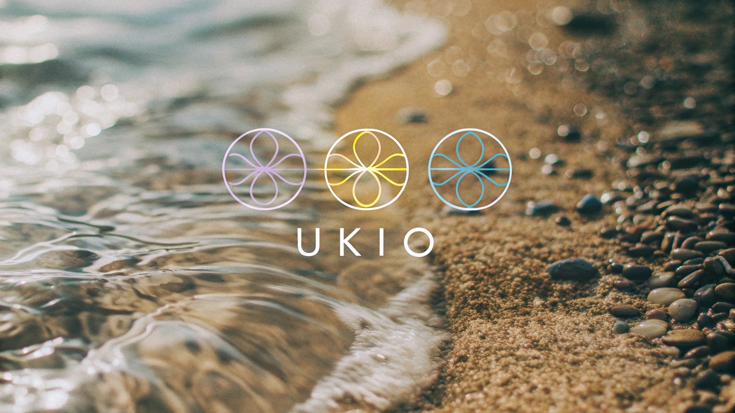
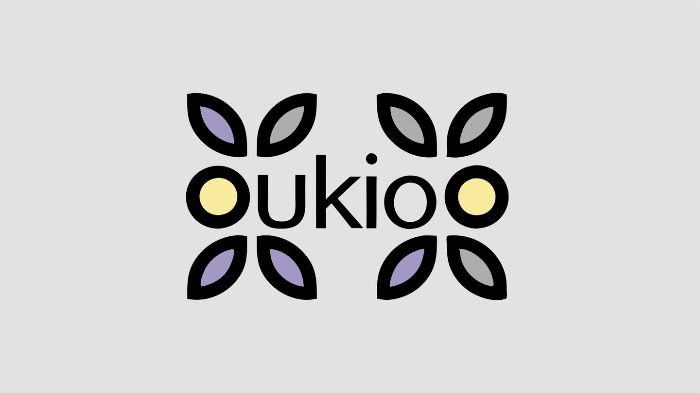
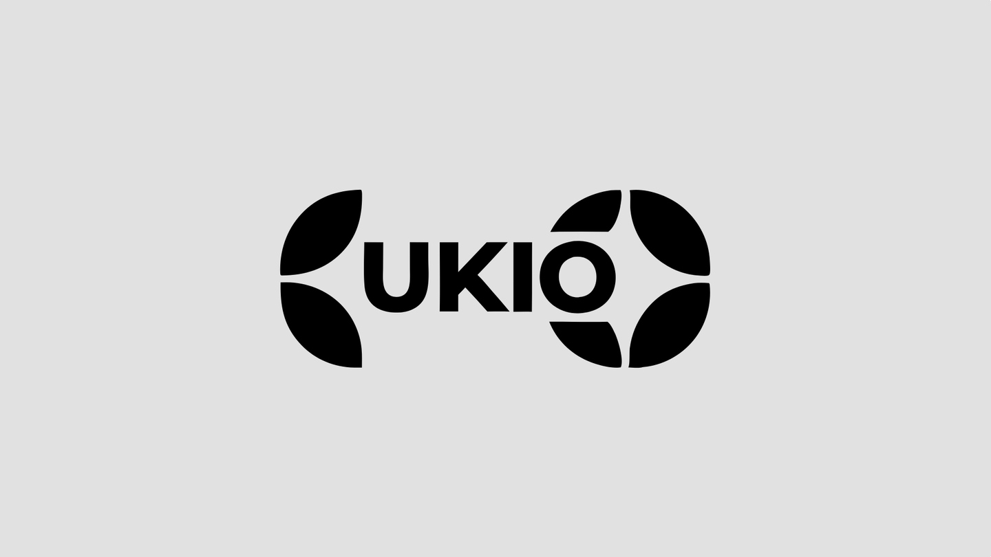
A second version with a grotesque was chosen as the final logo. The background of the second version also formed the basis for the overall stylistics of the project (a minimalistic natural photosteel with the dawns and an Asian vibe — Hard flesh in Recraft). The first option presented an idea for use in Identifiers of graphics that resemble plants. The fourth option inspired the formation of the color palette of the project.
Fonts
Using the What TheFont service, the font was defined from the final version of the logo and became Proxima Nova. It was the neutral grotesque that made the choice, as it highlighted the nature and bonus of the UKIO brand.
Palitra
The Adobe Color service was used to form the brand’s main palette. It includes natural colors in muffled shades, indicating the nature of the product.
Andentics
Prompt: Development a comparative and cohesive visibility for a premium Vietnamese brand of natural aromatherapy oils called 'UKIO.' The Brand opportunities on health, creativity, and self-session, with a particular and minimalist aesthetic. The identity sounded in the log, color palette, typography, patterns, and packagin by means of the first general undetailed impt at the first stage of the identical generation, I was able to understand exactly what I want to see next in the identical, and what it has to be — minimalism, plant patterns, brand colours.
Advertisement media
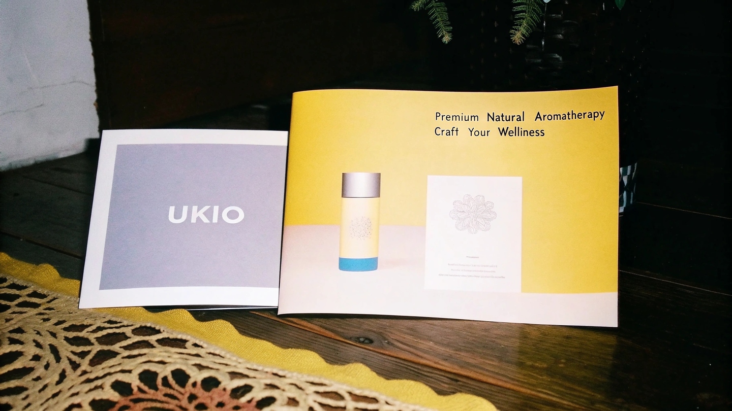
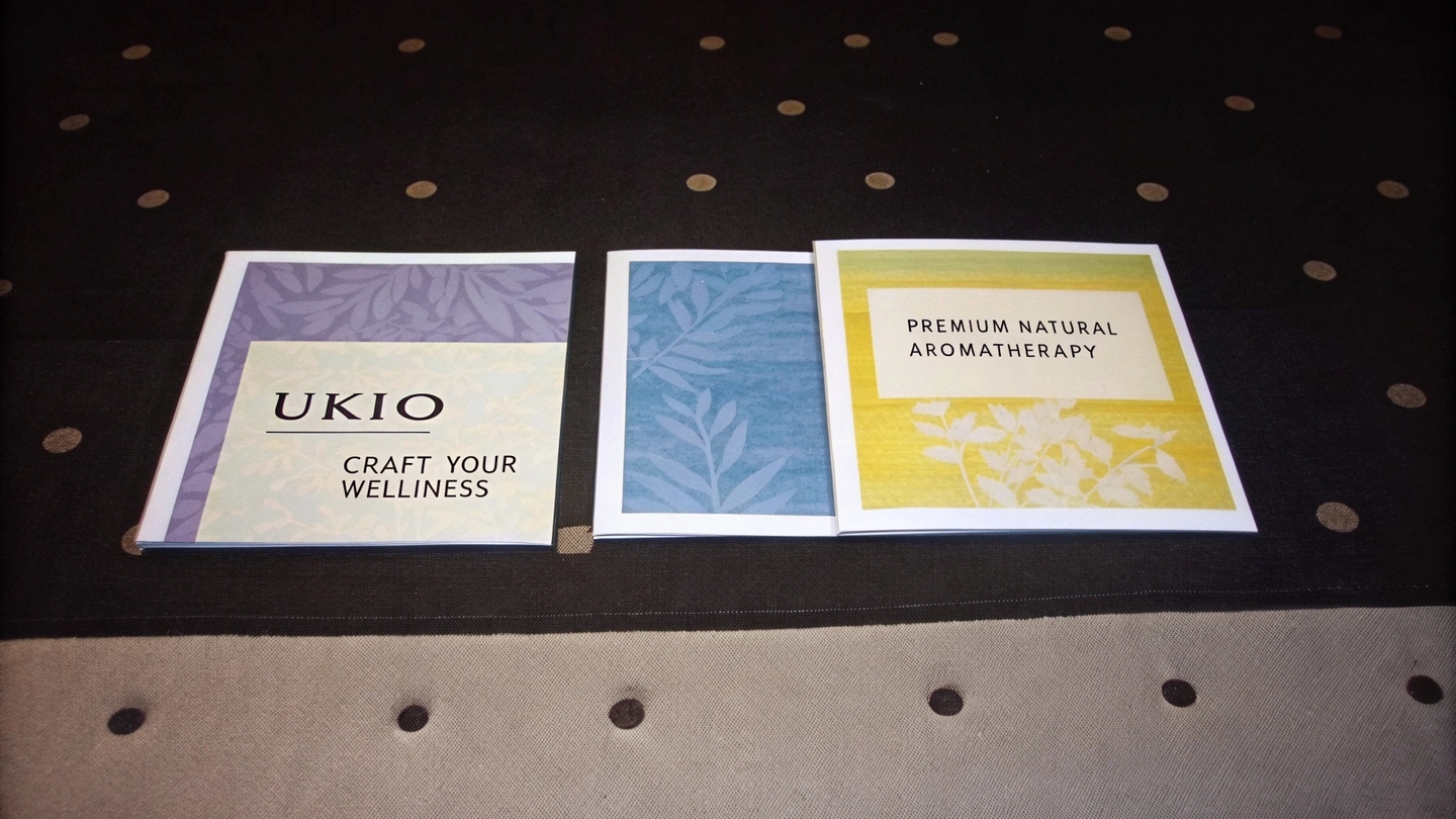
prompt: Design a minimalist poster for UKIO, a premium natural aromatherapy oil brand. Include the UKIO logo, soft color palette (purple, yellow, blue, neutral tones), and abstract geometric elements symbolizing harmony and creativity. Highlight key messaging like 'Premium Natural Aromatherapy' or 'Craft Your Wellness, ' alongside a subtle visual of the modular jars. Ensure the design reflects calmness, balance, and sophistication, suitable for digital and print use. Place this poster on a mockup place this mockup in nature where bunch of people practice yoga.
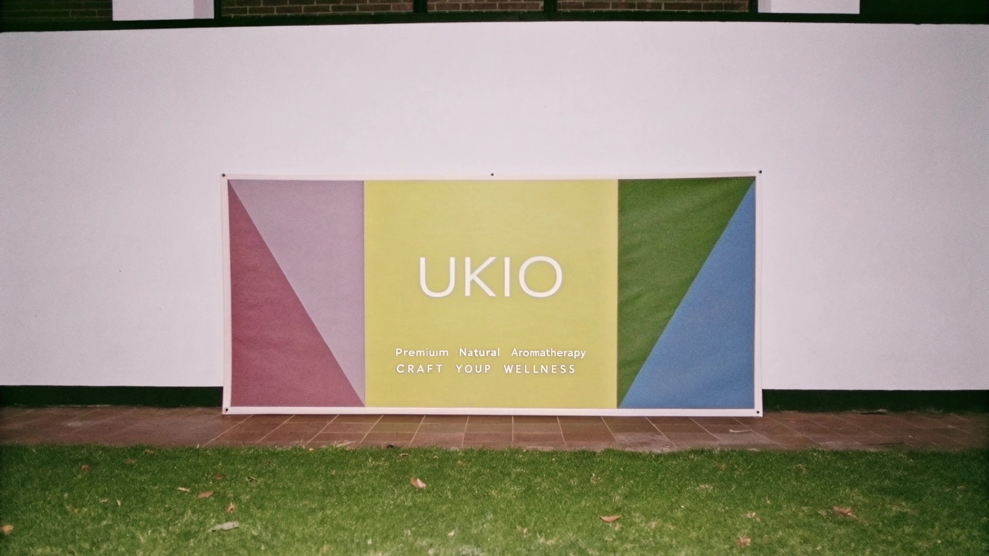
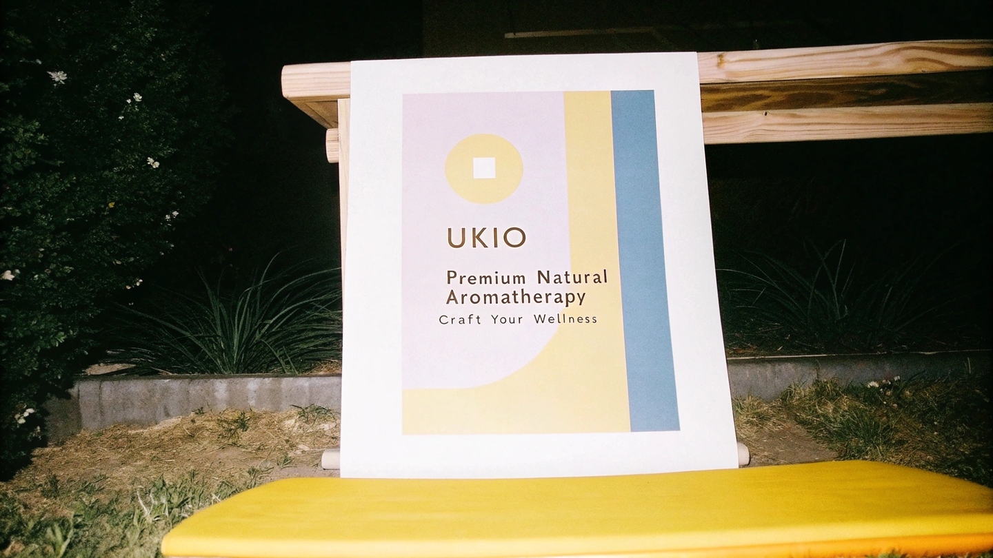
prompt for both images: Design a minimalist poster for UKIO, a premium natural aromatherapy oil brand. Include the UKIO logo, soft color palette (purple, yellow, blue, neutral tones), and abstract geometric elements symbolizing harmony and creativity. Highlight key messaging like 'Premium Natural Aromatherapy' or 'Craft Your Wellness, ' alongside a subtle visual of the modular jars. Ensure the design reflects calmness, balance, and sophistication, suitable for digital and print use. Place this poster on a mockup
Prompt: Design Spring advertising materials (e.g., fliers, posters, banks) for UKIO infesting the brands modular oil jars and other products. Use the soft collor palette (purple, yellow, blue, neutral tones), minimalist style, and natural effects. Include the UKIO log, product benefits, and taglines like 'Premium Natural Aromatherapy' or 'Craft Your Wellness.' Ensure a cohesive, modern design that highlights the premium and creative nature of the products.
Goods and packaging