Navigation
- Navigation
- Concept
- Early Futurism: The Cover as a Challenge to Tradition
- The Book as a Construct: Visual Rhythm and Reading
- Illustrations and Posters of the ROSTA Windows
- Reissues and the Contemporary View
- Conclusion
- Bibliography
Concept
Vladimir Mayakovsky’s image is widely recognized not only through his poetry but also through visual representations—book covers, illustrations, posters, and portraits. In the early period of his work, Mayakovsky was associated with Russian Futurism—an artistic movement that sought to revitalize the language of art and opposed tradition. This ambition manifested not only in literary texts but also in the design of books: through the use of unconventional typography, sharp contrasts, geometric forms, and expressive composition. Therefore, these visual materials allow us to explore how the image of the rebel poet was created and transformed.This topic remains relevant because Mayakovsky’s image has been reinterpreted repeatedly over time. In early Futurist editions, he might appear as a provocative author challenging literary norms. In posters and later publications, the focus could shift toward the poet’s social role, his connection to the era, and the mass audience. Contemporary covers and illustrations, in turn, offer new ways of reading his works. Comparing these materials allows us to observe not only shifts in artistic style but also which aspects of Mayakovsky different eras deemed most significant.
Material Selection Principle.
The study includes covers and illustrations from Mayakovsky’s works, as well as posters related to his creative output, provided their authorship and origin can be established through reliable sources. Material is selected based on three criteria: connection to Mayakovsky’s work; the ability to date the image or edition; and the availability of data concerning the artist, designer, publisher, or archive source. The body of work may include early Futurist editions, the book «For the Voice, ” materials from „ROSTA Windows, ” as well as selected later and contemporary editions of the poet’s works.
Research Structuring Principle.
The material is structured chronologically and thematically. The first section examines early Futurist editions and the characteristics of their visual language. The second section addresses the design of books and posters where the poet is presented as an author addressing a broad audience and participating in public life. The third analyzes later and contemporary covers and illustrations, demonstrating how the interpretation of Mayakovsky’s works changes. The work concludes with a comparative section, highlighting the persistent and evolving elements of the image of the rebellious poet.
Within each section, the images are analyzed using a unified set of parameters: composition, color, typography, figure scale and placement, the relationship between image and text, and the nature of visual rhythm. It is specifically noted what is depicted and what associations the chosen form creates. This principle allows for the comparison of different objects on a common basis, moving beyond subjective impressions.
Principle of Selecting and Analyzing Textual Sources.
Textual sources are necessary for verifying historical context and clarifying the meaning of visual materials. These include publications of Mayakovsky’s works, information on book design, library and museum catalogs, archival descriptions of posters, scholarly publications on Russian Futurism, and studies of book graphics. Priority is given to sources that specify the authorship, date, place of storage, and bibliographical data of the object. Information from online catalogs and secondary publications is cross-referenced with other available descriptions whenever possible.
The analysis is built upon comparing the image with the work and the context of its creation. It is important not to attribute intentions to the artist that cannot be confirmed by sources, nor to derive characteristics of an era from a single example. Factual data—such as the publication date or the name of the designer—is separated from the researcher’s interpretation, which is the explanation of how the composition or typography affects perception.
Hypothesis
How has the visual image of the rebellious poet evolved in the covers and illustrations of Mayakovsky’s works—from the Futurist publications of the early 20th century to contemporary reissues?
The research hypothesis suggests that in early Futurist materials, Mayakovsky’s image is constructed through a visual challenge to tradition: experimental typography, sharp contrasts, and dynamic composition. In posters and subsequent interpretations, this image may shift from that of the individual rebel to that of a public poet connected to his audience and the era. Contemporary covers do not merely replicate the former visual image; rather, they select and recontextualize its individual characteristics. By comparing these materials, we can test this hypothesis and determine which visual features are preserved and which are transformed.
Early Futurism: The Cover as a Challenge to Tradition
[Literary Debut of V.V. Mayakovsky] A Slap to Common Taste. [In Defense of Free Art. Poems. Prose. Essays] / D. Burlyuk, N. Burlyuk, A. Kruchenykh, V. Kandinsky, B. Livshits, V. Mayakovsky
One of the most significant visual examples of early Russian Futurism is the collection «Slap in the Face of Public Taste,» published in Moscow in 1912. This was a collective literary and artistic manifesto involving David Burliuk, Nikolai Burliuk, Alexander Kruchenykh, Vladimir Mayakovsky, Viktor Khlebnikov, and other representatives of the Futurist movement. Even the title of the collection demonstrates the authors' fundamental stance: to oppose traditional culture and conventional ideas about art.The absence of decorative elements, illustrations, and complex composition emphasizes the aggression of the verbal gesture itself. The title becomes the primary visual object and is perceived as a direct address to the reader. It does not merely convey the book’s content; it provokes and enters into conflict with public opinion.Typography plays a particularly vital role. The letters are stretched vertically, are closely set, and resemble a poster inscription. The large font makes the title visually heavy and conspicuous, and its placement, nearly filling the entire height of the cover, creates a sense of pressure and force. Here, the text functions not only as a carrier of meaning but also as an image. Thus, the Futurist book rejects the traditional notion of the cover as neutral decoration and transforms it into an independent artistic statement.
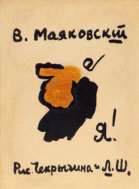
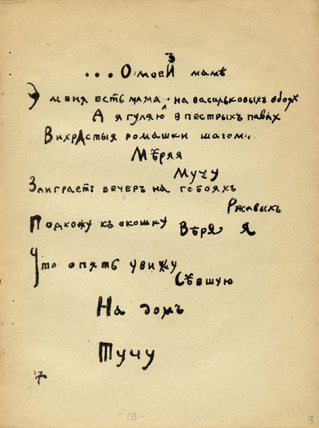
Cover of the poetry collection «I» by V.V. Mayakovsky, 1913. Illustration by Chekrygina and L. Sh. Page from the collection «I» by V.V. Mayakovsky, 1913. Illustration by Chekrygina and L. Sh.
If the primary visual impact in «Slap…» was created by a large title and reserved typography, the design here becomes more personal and less aggressive, owing to uneven and softer typography. The typeface does not seem «sharp» or perfect; the emphasis is on the text being handwritten. The ends of the letters curve.
The poems inside are also set in irregular lines, rather than standard rows. The handwritten letters vary in size and placement, and the spacing between them is inconsistent. The text is perceived simultaneously as a poem and as a graphic drawing. This design draws the reader’s attention to the sound and rhythm of the word, while also disrupting the conventional order of a book page. The visual form becomes part of a futuristic experiment—offering the reader not just to read the text, but to view it as an image.
Image: Illustration from the poetry collection «I.» 1913

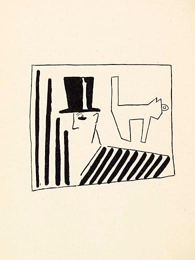
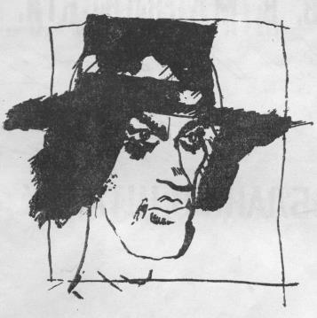
Cover: «Vladimir Mayakovsky» V.V. Mayakovsky, Moscow: Publication of the 1st Journal of Russian Futurists, 1914. V. D. Burlyuk. Portrait of V.V. Mayakovsky. Illustration in the book V.V. Mayakovsky: «Tragedy…»
The journal is executed in black-and-white styling, and the images are rendered graphically. The cover remains predominantly textual: information regarding the genre, production, artist, and publisher is organized in a strict vertical sequence. Visual expressiveness emerges from the contrast between font sizes and the unconventional design of the title «Futurists, ” where individual letters feature decorative elements. While the book signals its affiliation with a Futurist publication, it simultaneously places Mayakovsky’s name as the central focus.D. V. Burluk’s illustration offers a different way to present the author. It is not a realistic portrait, but a schematic, almost mask-like image. The face is constructed from several lines, the figure is enclosed in a frame, and a symbolic animal figure is placed nearby. Black vertical stripes and diagonal hatching create a sharp graphic rhythm. The image does not strive to detail physical appearance; instead, it translates the portrait into a conventional sign.The cover and the illustration showcase two distinct levels of representation of Mayakovsky. The cover informs the reader of the author’s name and the status of his work, while the portrait transforms him into a character within the Futurist artistic world. In this context, it is particularly significant that the play is titled after the poet himself, as the author’s identity becomes integrated into the theatrical work and its visual presentation.
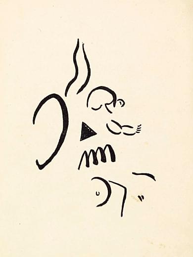
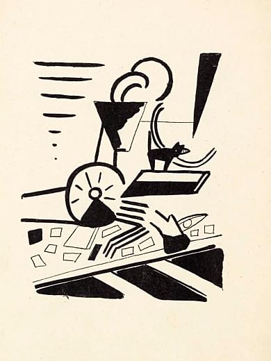
Illustrations for V.V. Mayakovsky’s book «Vladimir Mayakovsky. Tragedy,» Moscow: Publication of the First Journal of Russian Futurists, 1914.
In the left illustration, the face is presented as a collection of discrete elements. The lines vary in thickness and direction, and some details appear deliberately unfinished. A dense black triangle is placed in the center of the face, which is perceived as an independent graphic symbol that disrupts the natural structure of the image. Extending above the head are elongated, wavy lines reminiscent of moving air, flames, or sound.
This fragmentation may relate to the theatrical nature of the work. Before the reader, there is not a specific, everyday scene, but rather an abstract depiction of a character existing within the space of dramatic action. The face may convey a state of being, the motion of thought, and internal tension. The visual form does not illustrate a specific detail from the text literally; rather, it conveys the general atmosphere of tragedy.
The composition on the right exhibits greater dynamism. It integrates the human figure with geometric planes, a circle, diagonal lines, and small rectangular elements. The black and white forms are sharply contrasted, making the image resemble a structure composed of individual moving parts. The diagonals create a sense of acceleration and directed movement, while the lines surrounding the figure enhance the impression of tension.
The image is not built around a central point. The viewer’s gaze moves from the figure to the circle, then to the diagonal planes and fine geometric details. Because of this, the composition is perceived as a process, rather than a frozen scene. Such an organization of the image aligns with a futuristic interest in movement, energy, and the deconstruction of stable forms.
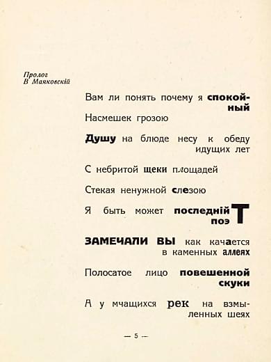
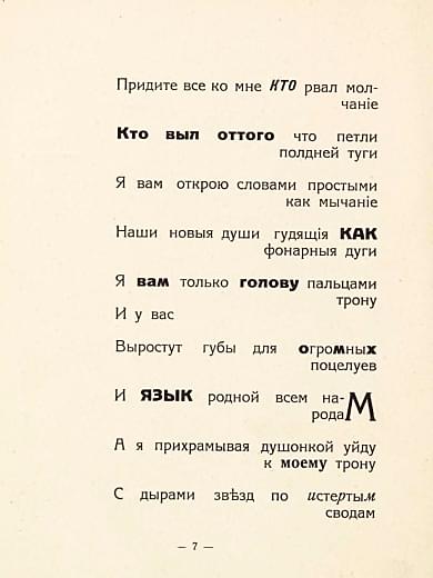
Pages from V. V. Mayakovsky’s book, «Vladimir Mayakovsky: Tragedy,» Moscow: Publication of the First Journal of Russian Futurists, 1914.
The visual design of the pages supports this semantic structure. The text is not aligned in a single, even column: individual lines shift to the right, large spaces appear between words, and phrases are broken into short semantic groupings. Because of this, the poem is perceived not as ordinary printed text, but as a sequence of distinct rhetorical gestures. The reader must not only follow the content but also observe how the phrases move across the page.The words «calm, ” „soul, ” „last poet, ” „have you noticed, ” „head, ” „how, ” „huge, ” and „tongue“ are highlighted in semi-bold font. This emphasis establishes semantic accents and recalls the intonation of a stage performance. This arrangement can be compared to the oral nature of Futurist poetry. The text is designed to be spoken—to vary in volume and pace—to have a public impact.There is also a distinct graphic emphasis on the word „poet.“ The final letter „t“ is enlarged and is the largest in the entire text on the page; it also visually resembles a cross or a vertical mark. The compositional function of the letter is evident, so the word is emphasized not only by typeface but also by form, making the image of the „last poet“ the visual center of the fragment.On the right page, some words are pushed to the right margin: „silence, ” „tight neck, ” „muttering, ” „lantern arch, ” „throne, ” and „kisses.“ This placement creates the effect of internal speech movement. The line seems not to end at the conventional margin but to continue into the space of the page. As a result, the book spread begins to resemble a stage where words appear with varying intensity and in different directions.
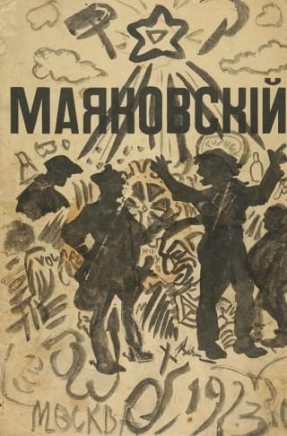
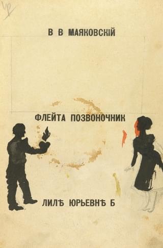
The poem «Flute Spine» was written in 1915 and is dedicated to Lily Yuryevna Brik. This is indicated on the title page with the pre-reform inscription: «Lil Yuryevn B.». Therefore, the visual material of this book should be viewed as the design for a lyrical work focused on themes of love, inner conflict, and personal expression.The cover composition is built upon the collision of two modes of representation. On one side, the author’s large name is set in a strict, dense typeface, immediately organizing the page space. On the other, the illustration appears deliberately uneven, almost handwritten: lines freely intersect, figures are outlined generically, and the background is filled with signs, inscriptions, and decorative elements. Thanks to this, the book merges print discipline with the visual expressiveness characteristic of Futurist culture.In the design of «Flute Spine, ” the human figures form a more dramatic situation: tension, movement, and interaction can be felt between them.The visual contrast between the large word „Mayakovsky“ and the multitude of small drawings can be compared to the internal organization of the poem itself. The lyrical hero of „Flute Spine“ speaks in the first person, but their experience constantly extends beyond a private love story. The text combines confession, suffering, challenge, and the aspiration for a grand emotional gesture. Consequently, the author’s name on the cover becomes more than mere bibliographic information—it establishes the image of a poet who transforms personal feeling into public address.
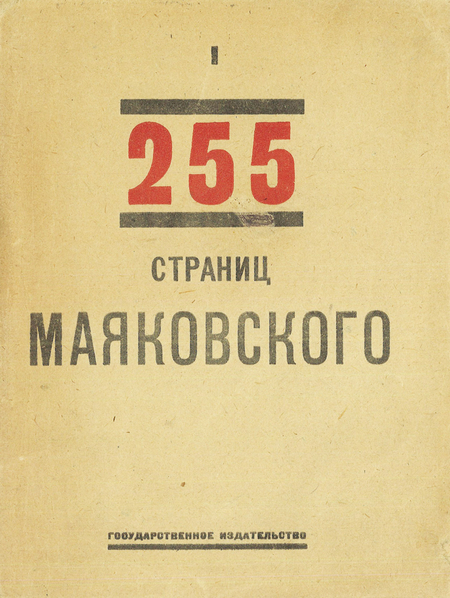
The cover features a distinct artistic style—Constructivist typography, which developed within Russian art culture in the 1920s. Its characteristics manifest through the use of geometric lines, the contrast between red and black, large-scale type, asymmetrical arrangement of text blocks, and a rejection of decorative illustration.The visual language of this book is tied to the changing cultural context. In Mayakovsky’s early Futurist publications, the book was often perceived as a manifest or an artistic provocation. By 1923, the collection was intended for broader distribution and the mass reader. Consequently, the design becomes more concise, organized, and easily legible from a distance. The cover resembles a poster—its main elements must be quickly captured by the eye.The red color of the number «255» serves an accent function. It highlights the volume of the book, setting it against the black of the other elements.Image: Cover of the book «255 Pages by Mayakovsky» V.V. Mayakovsky, 1923, Gosizdat
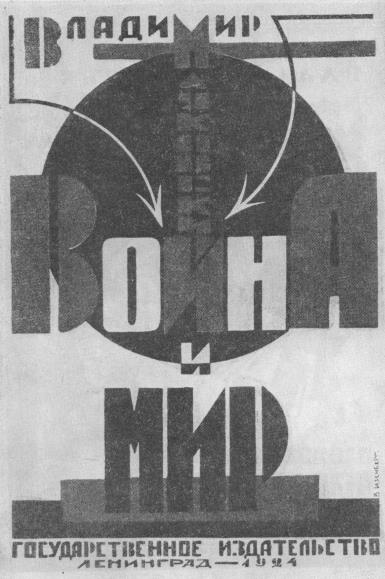
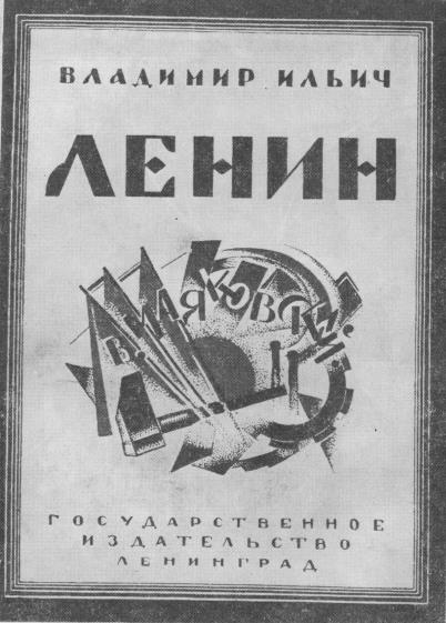
Left: Cover of the book «War and Peace.» 1924 Artist V. K. Isenberg Right: Cover of the book «Vladimir Ilyich Lenin.» 1925 Artist E. Schulte
V. K. Eisenberg’s cover for «War and Peace» (1924) exemplifies an early Constructivist approach to the classics. During this period, artists sought to «cleanse» the perception of older texts from bourgeois decorativeism, proposing instead a stark, structural aesthetic. The composition is built on the contrast of masses: a dark disk, symbolizing some global, fateful force, serves as the background for the text blocks. The use of arrows pointing both inward and outward creates vector tension, transforming the title into a dynamic diagram of elemental clash.E. Schulthe’s cover for «Vladimir Ilyich Lenin» (1925) translates this language into the realm of political myth-making. Where Eisenberg presents a struggle of masses, Schulthe depicts the dynamics of state-building. The composition here is far more complex, reminiscent of the photomontage principle. The layering of geometric planes, diagonal lines, and intersecting segments creates a sense of multidimensionality, mimicking the operation of a complex mechanism or the architectural blueprint of a new society. The name «LENIN, ” rendered in monumental grotesque at the top, functions not merely as a signature but as an unshakeable foundation upon which the simmering energy of transformation unfolds. It is a visualization of the idea of revolutionary „organized chaos, ” which takes form under the leadership of a guide.
Cover spread of the book «Elephants in Komsomol.» 1929 Artist N. V. Ilyin
Cover design for Vladimir Mayakovsky’s collection «Elephants in Komsomol» (1929)—it marks the culmination of typographical avant-garde and the transition to the more radical, «shouting» design of the late 1920s. This is where the letter finally triumphs over the image. A massive, distorted letter «С» that literally «cuts through» the cover space becomes the main visual focus. It doesn’t just denote the first word; it establishes the scale of the entire work. All the text—the title, the author’s name, and the content—is organized according to the principle of dynamic montage. Slanted lines, varying point sizes, and the use of negative space create a visual rhythm that directly correlates with Mayakovsky’s poetic rhythm—his «laddering,» his sharp, clipped phrases, and his expression.
Book as Construction: Visual Rhythm and Reading
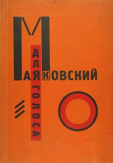
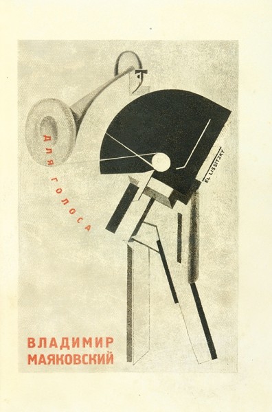
Mayakovsky, V. For the Voice / Book Constructor by El Lissitzky. Berlin: State Publishing House, 1923.
The images presented are classic examples of 1920s Soviet Constructivism, a period when the book was no longer seen merely as a text carrier but transformed into a complex visual object, structured according to the principles of architecture and engineering. During this era, artists and designers, such as Alexander Rodchenko, El Lissitzky, and others, sought to break away from traditional «ornamentation» and forged a new visual language based on geometry, dynamism, and functionality. Instead of simply illustrating the content, they began designing a visual environment that dictates a specific rhythm of perception and sets the emotional tone even before the first word is read.The book cover employs a radical approach to typography, where letters become independent architectural elements. There is no conventional separation between text and decoration here. The spelling of the poet’s surname itself becomes the graphic framework of the composition. The use of massive, heavy typefaces and their intentional shifting relative to axes creates a sense of instability and powerful motion. Black vertical and horizontal lines cut through the orange space, forming a potent visual contrast that mirrors the energy of the poet himself—his clipped verse, his «ladder» rhythm, and his aggressive, expressive manner of presentation. This is a visual manifesto, where the scale of the letters corresponds to the stature of Mayakovsky’s personality. The illustration demonstrates an even deeper integration of engineering thought into graphics. The image of the gramophone is not an attempt to render the object naturalistically; rather, it functions as a graphic schematic of sound. The artist uses pure geometric forms—circles, triangles, lines—to construct the image of the instrument. The inscription «FOR THE VOICE, ” inscribed into the curve of the horn, transforms the text into part of the physical process of sound emission. This turns reading into an act of co-creation with form: the viewer’s eye is forced to move along trajectories defined by the graphic elements, mimicking waves or the movement of mechanical parts.