From Sacred Talisman to National Symbol
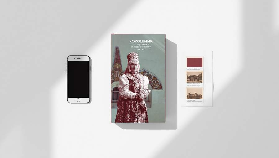
«Kokoshnik» is more than just a book detailing costume history; it is a compilation of visual research, an archival catalog, and a geographically rooted historical document.
The book incorporates several different narrative forms: conventional text, visually organized by its priority and importance to the reader, and a visual component presented in various formats, thus providing a comprehensive overview of the structure of folk costumes in general, and of the kokoshnik as one of its components.
Burgundy
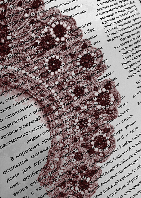
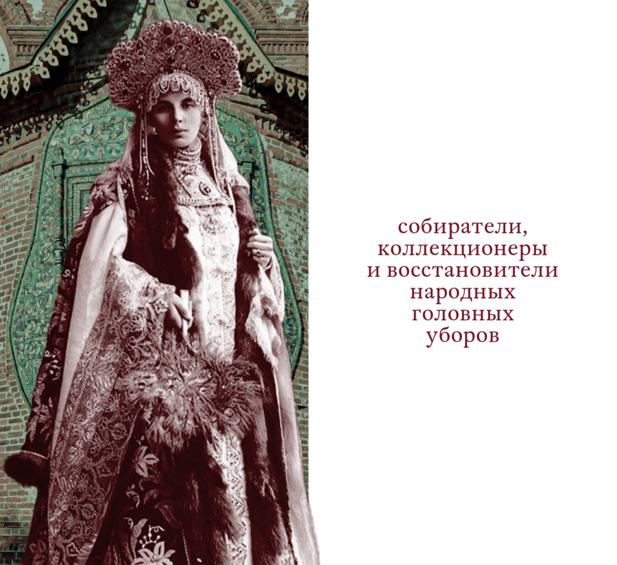
The entire book is printed in a single Pantone color—meaning one shade of ink is used for both the text and the imagery.
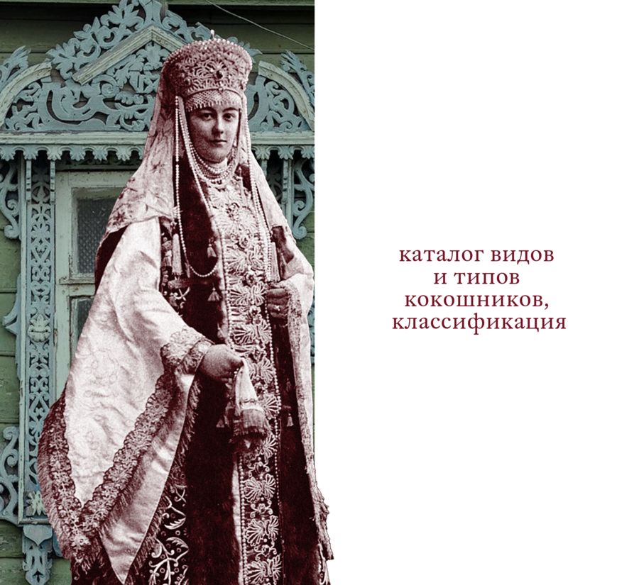
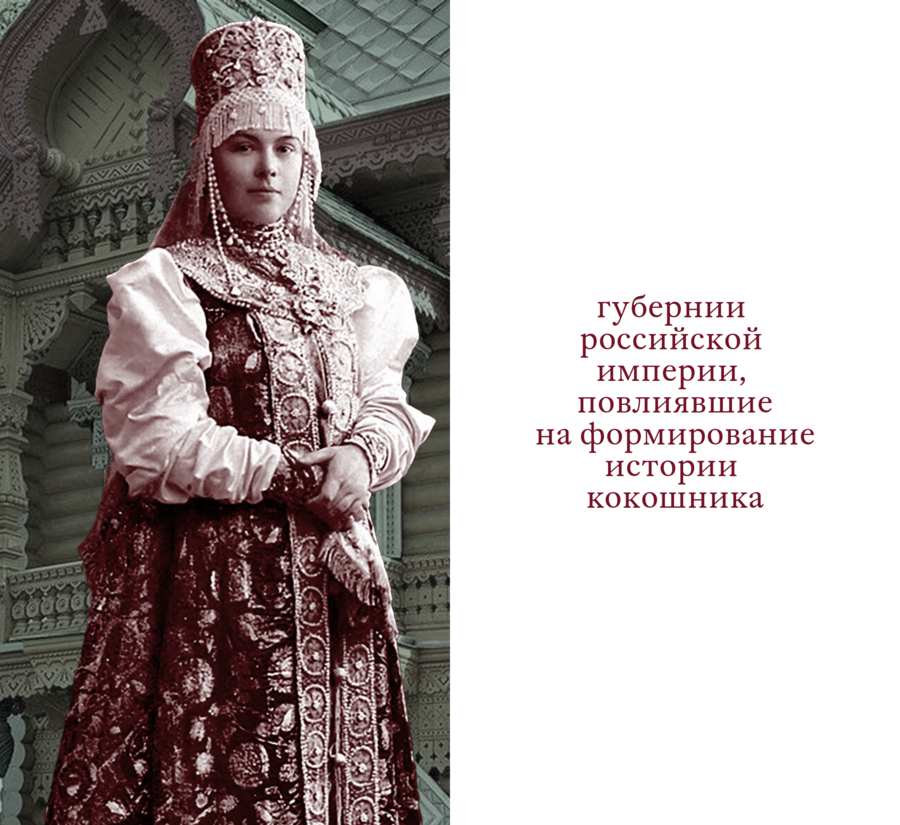
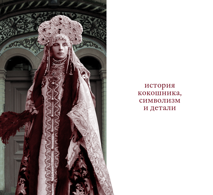
Printing the book in a single Pantone color significantly reduces per-unit cost due to ink savings and the elimination of the need for color proofs. Burgundy was chosen as the primary color to tie together the text and the illustrations. The hue was selected after reviewing preserved photographs that share a similar color. Consequently, the text’s legibility is maintained, the monochrome images remain recognizable, and they are sure to surprise the attentive reader.
Muted emerald
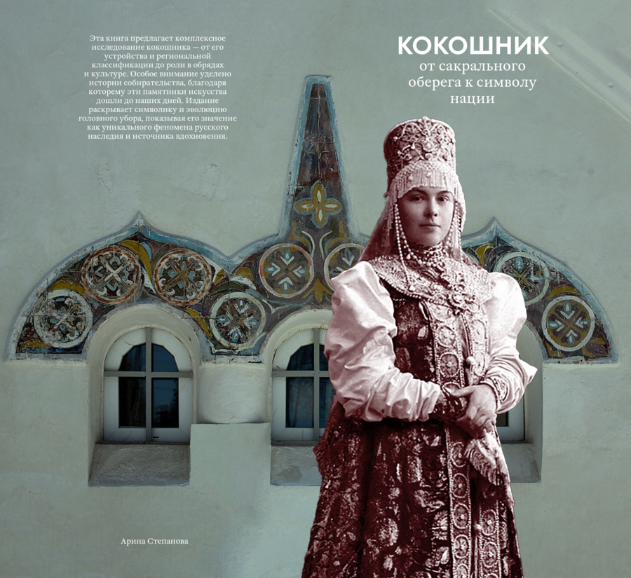
However, despite the complete authenticity of the monochrome book, the decision was made to delicately introduce one additional shade—it appears only on the dust jacket and the cover.
The title and cover are built on a single principle: a girl in traditional attire against a backdrop of architectural elements. It is these fragments of buildings that have a greenish tint, as this color was frequently used in the decoration of ornate facades.
Text
The text component of the book is composed of museum annotations to the headdresses themselves, historical articles, and descriptions from literary works.
The book presents three types of text blocks: the main text makes up the fundamental body, while there is also supplementary text—which contains definitions of historical terms, quotes from historians, and other information that enriches the narrative. The smallest amount of text is found in the captions accompanying the photographs, explaining the time and place of their creation, as well as the museum collections to which they belong.
Detail
At the beginning of each section, the first letter of the main text is emphasized through size and placement relative to the entire text block.
As a tribute to traditional Russian religious or children’s books, each new section begins with an initial letter. It is larger and draws attention not only through its size but also through its placement—it sits almost in the center of the page height, seemingly leaving space for canonical illustrations above it, and relative to the text block, the initial letter is offset from the beginning of the line, allowing the reader to prepare for the new section.
Scope
The book features varying sizes for both images and typography, all designed to capture the reader’s attention.
Large images of headwear or portraits allow for the examination of details, while distant shots provide a complete overview of the costume. The catalog section of the book features two headpieces on a two-page spread—similar in form or other characteristics—allowing for direct comparison, and in conjunction with the accompanying text, they convey the mood of the exhibition label that explains the details.
Center
Composition in the book is central: this applies to all elements, but it is most noticeable when examining the text blocks. Symmetry relative to the center is one of the key distinguishing features of Russian headwear, and this is literally reflected in every element of the book.
All text blocks are centered, yet they possess several visual distinctions that allow one type of information to be differentiated from another. The main body text is justified, but to emphasize the central composition, the final line is noticeably shorter and remains centered. Additional information is formatted in a smaller font size and has a narrower line width, making it denser than the main text. Key theses and quotes, conversely, are enlarged compared to the standard text and are also centered, but feature ragged edges, which lends dynamism to both the page and the spread.