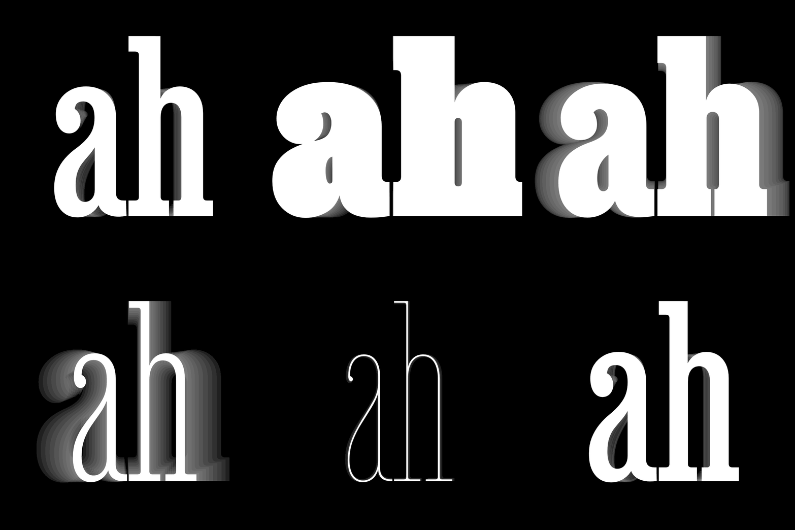
David Jonathan Ross / Job Clarendon / 2021
Concept
The typeface is a font that combines grotesque and antique features. This typeface is often rectangular (or trapezyed) in shape, but the thickness of the vertical and horizontal strokes is approximately equal, adding to the weight font. Brussian antique usually has equal proportions of capital signs, the vertical axis of the ovals, symmetry and a large point of the lowercase. Brook fonts are also called Slab Serif, Square Serif, or Egyptian, which in Russian means. Several factors influenced this name. After Napoleon’s expedition in 1798, all Egyptian was fashionable and all new was considered Egyptian. This rule has also been extended to fonts. It is also associated with the capture by the English of the French frigate Egyptienne, which was brought to London in 1802.
The development of press technology as a result of the industrial revolution of the late 18th century has led to changes in the economy and the aesthetic preferences of society, which have also affected the development of fonts. Mechanization has also influenced the attitude of designers towards the printing trade. There was a free mix of different styles, which also influenced the font drawing. New styles began to be created. In the early 19th century, the Brusque Antique appeared in England. After the greasy fonts, the linguists wanted to continue this trend in the new garrisons as well. The main idea of the paper typefaces was to transfer the weight to the skeleton of the letter when the verticals in the font decided to add the same thickness as the horizontal. As a result, the scripts were simplified and there was almost no contrast between the strokes.
For an untying viewer’s eye, the decision to add massive readings to the font made it too dark and, of course, allocated it to the excise class. You could see a brusque antique on the signs, ads on the streets of London, and it would pick up the eyes of passers-by. Because of its monumentality, activity and expression, it was considered too bright and used for advertising purposes. However, the situation has changed over time. The hypothesis of the study is that the typeface originally used only for attribution became the most utilitarian, undesired and readable text type. The work will review the history of the development of the paper typefaces and the key garrisons. Through the evolution of the scripts in different time periods — from their appearance to modern times — it will be shown how the font has been modified throughout its path.
Early fonts. 19th century
The first string typeface will not be available until 1815, but the undocumented letters started to be used much earlier. They appeared on flyers, promotional signs, architectural inscriptions. For example, there is a lottery ticket using the Slab-Serif of 1810. Moreover, there is evidence that Egyptian-type inscriptions were in existence as early as 1754. Alan Bartram recorded them in a building in Berwick-apon-Tuid. Attach the card at this time a special style in the design of letters and printed publications is beginning to emerge. On one page of the ad, there is a free combination of different fonts in different sizes and drawings.
Unknowed author / Unknowed slab-serif / 1835
Vincent Figgins is considered to be the first wordliter to create a string typeface. In 1815, he created the Antique garrison, meaning «the ancients». It consisted only of capital letters, poured out of metal. Geometricity in the early garrisons only appeared in round signs. Their contours were approaching the shape of the perfect circle.
Vincent Figgins / Antique / 1815
In 1820, Robert Thorne’s fonts appeared in Thorowgood. His versions have already been named «Egyptian». Because of the fatty of the font itself and the concept of monolinarity, massive squares look very heavy and look like rails.
Robert Torn / Egyptian / 1820
Robert Torn / Egyptian / 1820
The printing community treated innovation differently. Some people were attracted to the weight of the paper typefaces, and some of these experiments seemed to be some kind of disrespect. During the printing of low-quality paper, all the thin antiquities were lost, so many printers quickly preferred paper typefaces. However, Thomas Curson Hansard, for example, severely criticized Egyptian fonts:
In 1821, the lowercases began to develop. The question arose as to the shape of the end of the carry-out elements: to make them straight, rounded or to add drops. Around the same time, the lithium factories produced paper typefaces with capital and lower case letters in text sizes. However, given their fattyness, it can be concluded that they were not used for the set texts. Except for short phrases with small pegs on ads and book cover sheets. In Antique No. 2 Figgins added more contrast, and the light between the labs became almost indistinguishable, giving the font a more complex view. The two-part lowercases 'a' and ''g'' also give the impression.
V. & J. Figgins / Antique No. 2 / 1825
Specimen of Modern Printing Types by Edmund Fry / 1828
Until 1825, italics were only for mausculine signs. Caslon introduced the pencil in the negative letters.
Caslon / Antique-No-6 / 1825
Hugh Hughes / Italic Antique / 1830
In the 1830's, narrow strings of antiquities began to appear. The first such type is the Throwgood 1832 model. The outer contour of the letters is rounded corners and the inner clearance in the letters is narrow. There are options where both the outer and internal contours are flat in round signs. Thanks to its long, compact forms, narrow Egyptian fonts quickly became popular among printers because of the ability to post more words in the row. In the future, they were subjected to a large number of modifications.
Robert Besley and Co. [late Wm Throwgood and Co.] ♪ Condensed Egypt ♪ 1851
In the 1840s, a more bright outline began to appear. In the 1840 Antique version of Figgins, there are long edges in the font that give the font expression, while maintaining its hardness and humerus. There are drops in the lined, folded tail at ''t', the sign’s aperture is closed.
V. and J. Figgins / Antique / 1840
Clarendon is an antique block with contrasts and a slight round-up. It was released in 1845 by Robert Besley. This typeface is easy and friendly, as opposed to the geometrical bars of antiques. After Clarendona’s release, similar fonts even have the name «clamenton» or «ion» fonts.
Robert Besley / Clarendon / 1845
The first typefaces were very figured, live, and often decorative. There were drops, round-ups, and smooth horizontal touches to the stams. They were used in commercials, flyers, dialing each line in new print, creating a sandy, diverse design.
Antique (from Caslon & Livermore) / 1830
Geometric string fonts. The first half of the twentieth century