Hello!
My name is Natasha Reshetnikova, and I graduated with honors from the HSE Art and Design School with a Bachelor’s degree in Communication Design.
I have been freelancing for about four years, taught design technologies at the HSE Art and Design School, interned at the T-Bank Central University, and am actively involved in extracurricular activities. I am currently interning with the School of Design’s PR department!
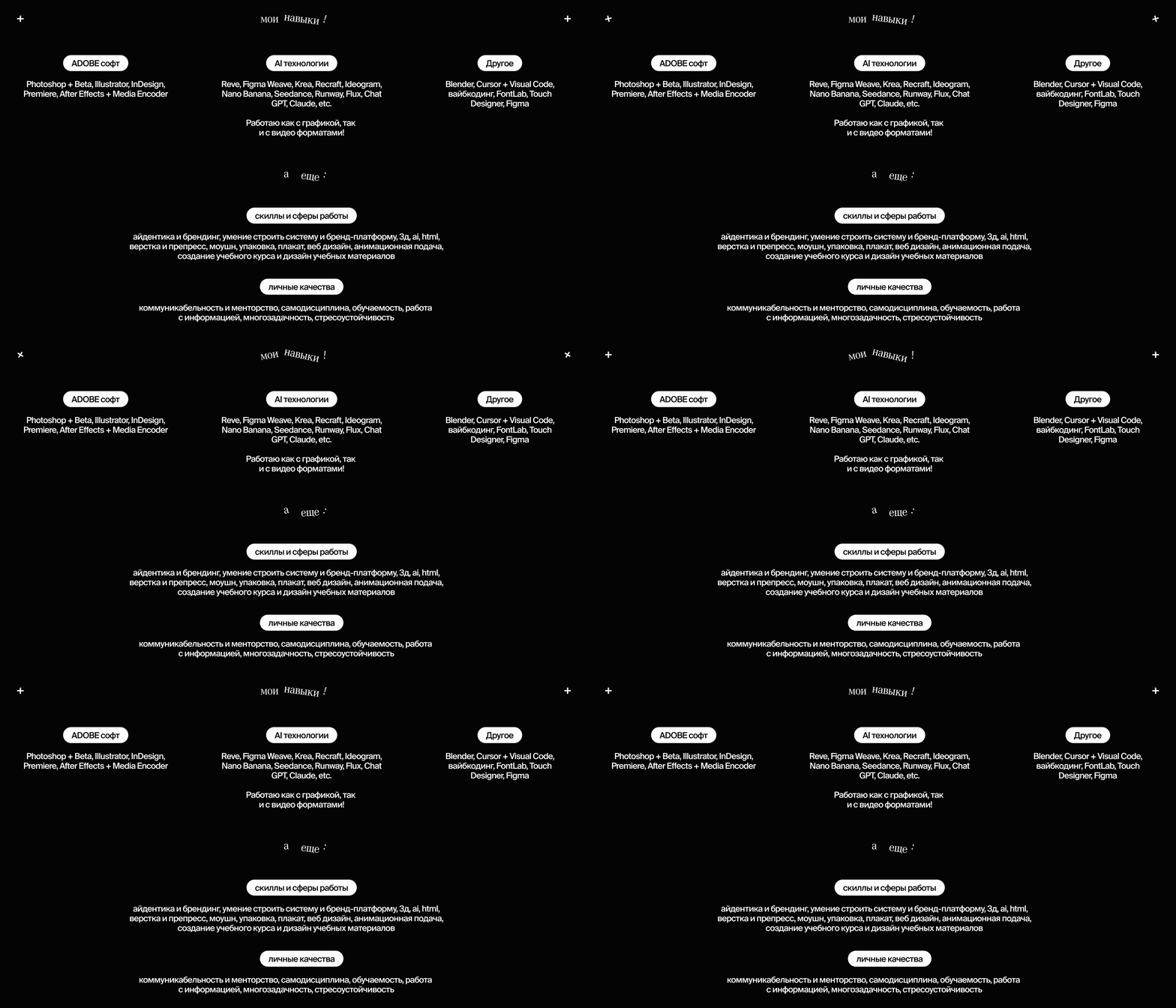
During my studies, I successfully developed a portfolio across various design disciplines. Within my specialization, I focused primarily on identity and branding. Additionally, I studied motion design, packaging, web layout, poster design, and other areas. Moving forward, I plan to continue teaching at the School and grow into a role as a student project curator. For my Master’s specialization, I chose the «Motion Design» track. This will allow me to expand my competencies and master new tools in this field!
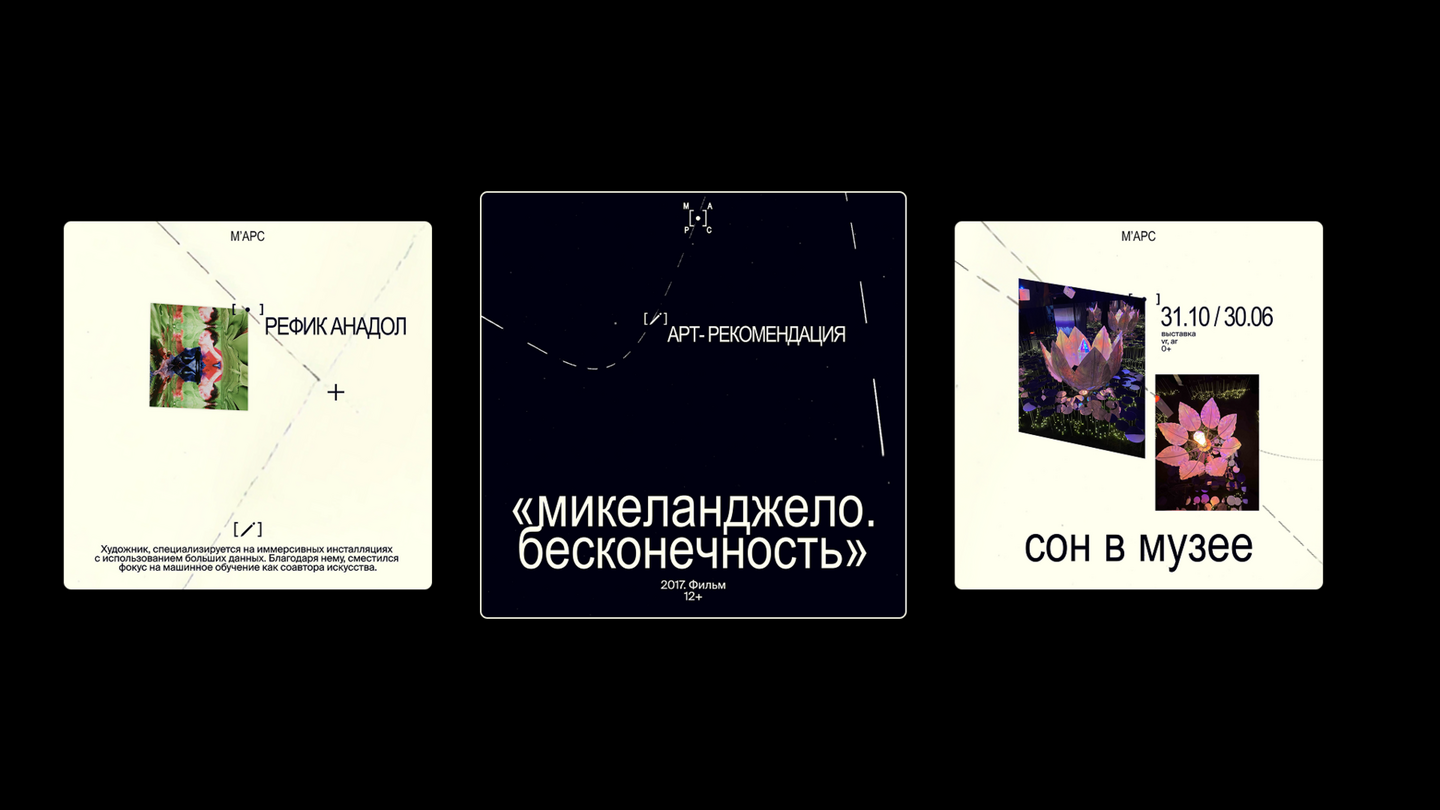
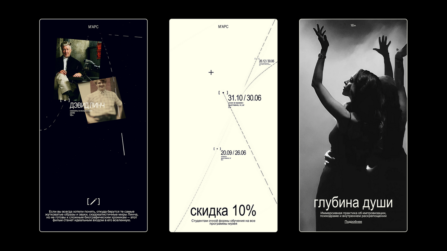
The MARS Center for Digital Art is an exhibition space specializing in multimedia projects and digital art. It hosts exhibitions, festivals, and master classes.
The center’s existing identity does not fully reflect its positioning as a pioneer in multimedia and digital art. It was necessary to visually convey that MARS is not a classic museum, but a vibrant, ever-evolving digital environment.
«The Museum as a Digital Space»
This metaphor reflects the brand’s core values: immersiveness, engagement, and immersion. The identity lives and evolves with every new event while maintaining a unified visual code.
The style is built around a custom interactive generator that allows users to build their own layouts, create events, and dive into the generated digital space in real time.
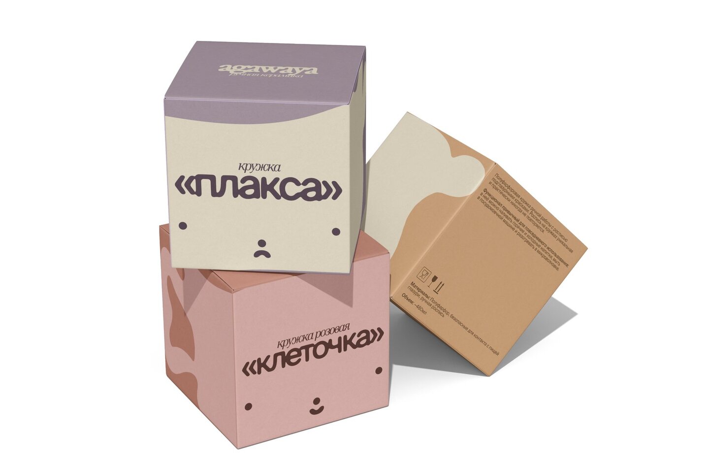
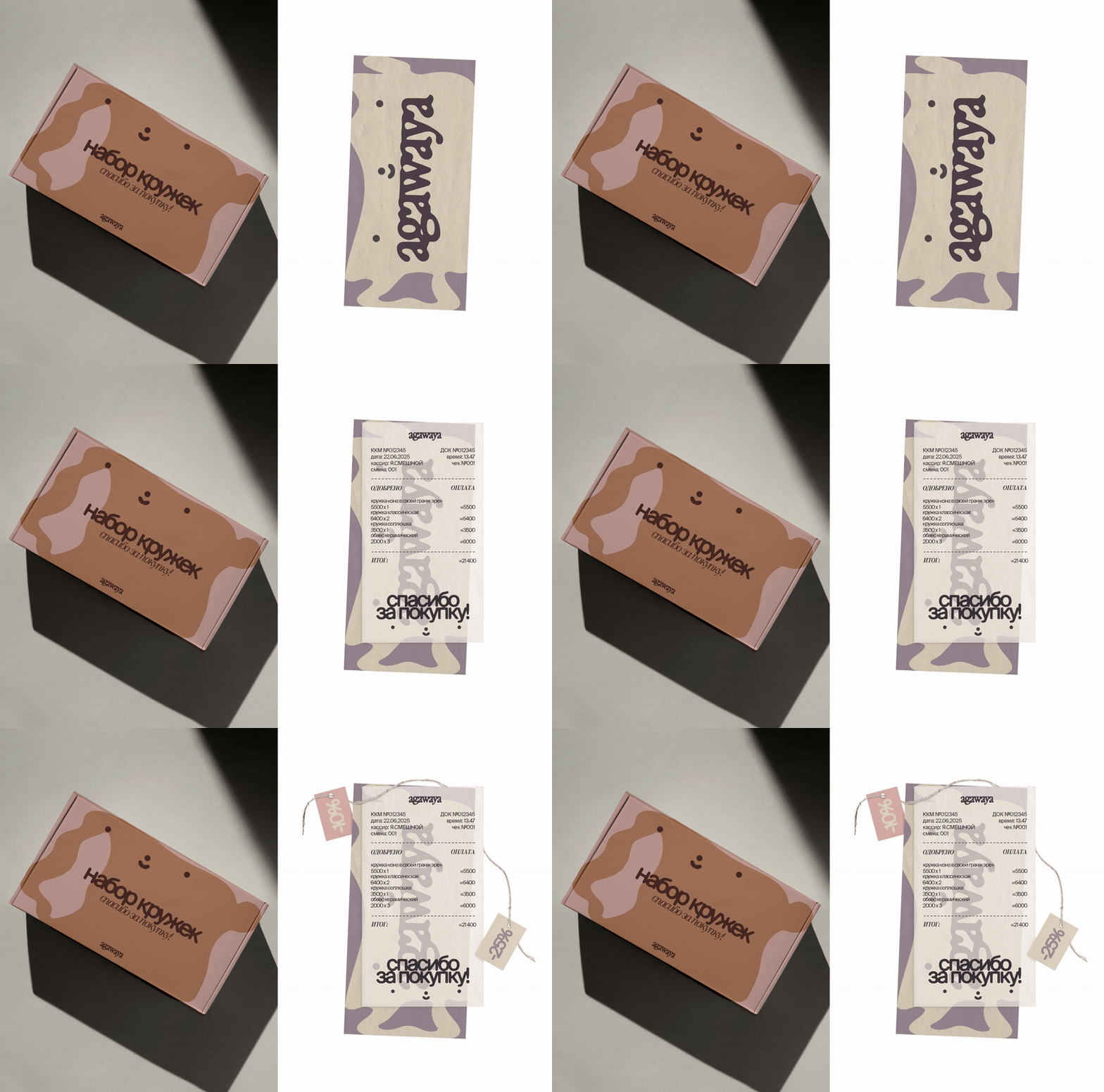
Agawaya is a local Moscow brand specializing in handmade ceramic dinnerware and home accessories by Alyona Agaeva.
The rebranding utilizes fluid shapes that directly reference the clay used to create the pieces. The presence of faces as a core element of the brand’s product line is translated into the aesthetic, underscoring its uniqueness.
Team project as part of the student Creadathon hosted by the Art and Design School and YARKO (an animation studio from Gazprom-Media Holding).
The creative brief was to develop merchandise for two distinct audience segments. The merchandise needed to convey the brand’s values and evoke a strong emotional response. Additionally, the items had to be functional, suitable for long-term use, and straightforward to develop.
Over two days, we collaborated with the client, conducted brand research, and developed a merchandise line across various categories, aligning with the studio’s values and brand book.
Following the Creadathon results, I was selected for a month-long internship at the studio!
Cubes become a metaphor for the creative process at the «YARKO» studio: from individual elements, entire animated worlds are built step by step. By coming together, they symbolize teamwork, flexibility, and limitless possibilities.