The Saratov Region as a Brand
This work is a visualization of the comprehensive territorial brand of the Saratov region. Instead of a conventional flat image, I propose a volumetric, hyperrealistic composition that transforms the region’s historical and cultural codes into a contemporary, premium, and recognizable visual product. My goal was to bring together everything our region possesses and present it in a way that creates an irresistible desire in the viewer to connect with this richness.
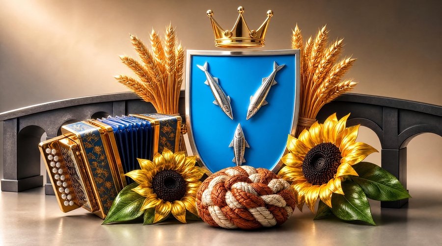
I placed the coat of arms of the Saratov region (the shield with three herons and a crown) at the center of the composition. Thanks to the textured 3D rendering (silver and gold), it looks like a precious artifact, emphasizing the region’s status and historical heritage.
Around the central element, I arranged key attributes that reveal the multifaceted nature of the Saratov land:
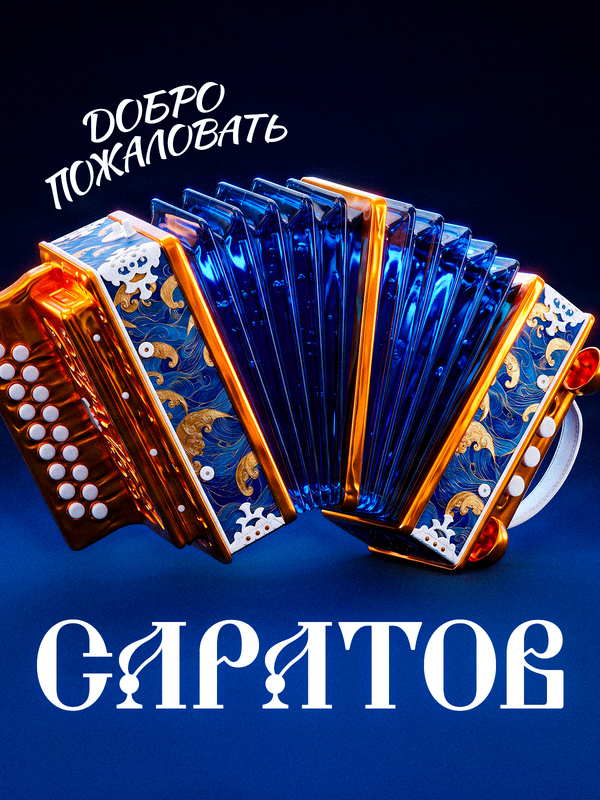
The Saratov accordion (on the left)—a symbol of rich musical culture and folk art. Its blue body with golden floral ornamentation echoes the colors of the coat of arms.
The Saratov Bridge (in the background)—a symbol of connecting shores, progress, industrial power, and the link between times.
The Saratov kalach bread (in the center foreground)—a symbol of hospitality, generosity, and the traditions of baking.
Wheat and sunflowers—symbols of agricultural wealth, fertility, the sun, and the region’s prosperity.
The color palette is dominated by a noble blue-gold scheme, softened by the warm tones of golden wheat, leaf green, and the copper accents of the kalach. This creates a feeling of wealth, warmth, and comfort.
Due to the hyperrealistic 3D presentation and the warm, «golden» light, this composition looks like a premium souvenir or the cover of a travel album. But its main strength is that it is adaptable and can serve as the foundation for an entire line of unique merchandise—from postcards and magnets to local product packaging.