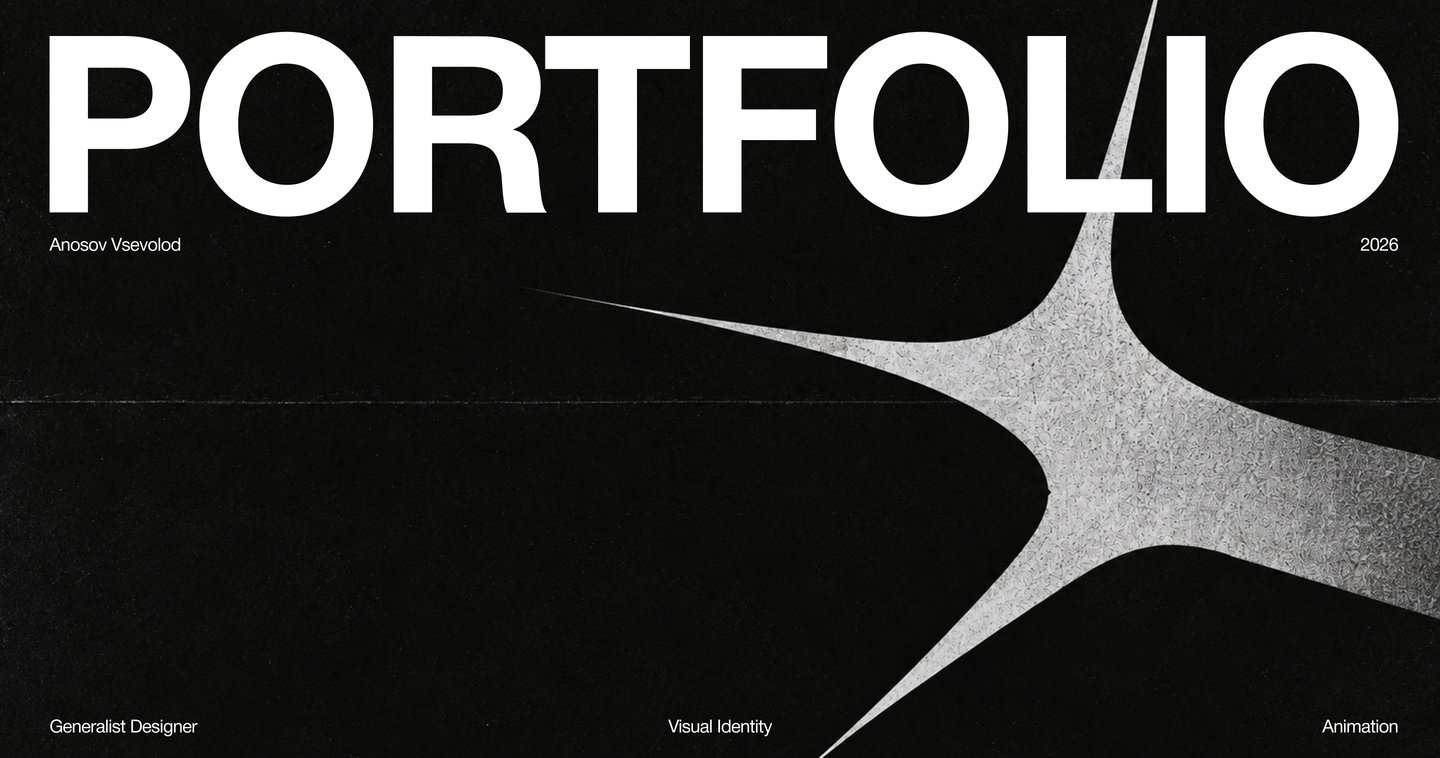
Turning complex ideas into distinctive visual experiences.
Design is more than how things look.
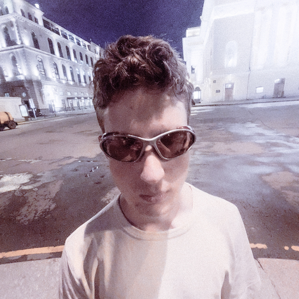
I’m Vsevolod Anosov, a multidisciplinary designer working across visual identity, motion, digital, and editorial design.For technology-driven businesses, design is a way to make complex ideas easier to understand and harder to forget.I connect strategy, visual identity, and motion to create distinctive visual languages that work across different touchpoints — from a brand’s first impression to the details people interact with every day.One approach. Different challenges.
From shaping a studio’s identity to exploring individual logo forms and designing a printed publication, each project approaches visual communication from a different perspective.
A brand without a clear foundation.

Skale.Solutions lacked a cohesive brand platform, and its existing logo felt disconnected from a clear visual direction.The challenge was to establish a consistent identity that could express the studio’s character without overshadowing the work it creates for its clients.
An analysis of competing studios revealed an important opportunity: Skale.Solutions did not need to compete with its clients’ brands for visual attention.
Instead, its identity could provide a restrained, consistent foundation that allows the work produced for clients to take centre stage.
The identity needed to balance two qualities: the clarity and restraint required of a studio brand, and the ambition and creative drive of its young team.
Swiss typography provided the structural foundation. A subtle punk influence introduced a more rebellious, energetic character without compromising the overall clarity of the system.
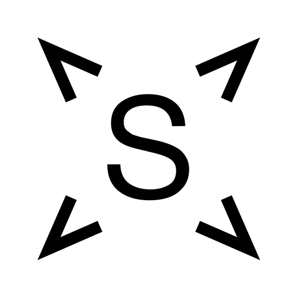
The identity needed to balance two qualities: the clarity and restraint required of a studio brand, and the ambition and creative drive of its young team.Swiss typography provided the structural foundation. A subtle punk influence introduced a more rebellious, energetic character without compromising the overall clarity of the system.The concept brings together a clear typographic structure and carefully controlled visual disruption.Inspired by the energy of a supernova, the identity reflects the team’s drive to experiment and push ideas forward, while maintaining a visual language that supports rather than competes with the work itself.
The rebrand establishes a clearer visual foundation for Skale.Solutions, balancing a restrained presence with a distinct creative character.
The resulting system is designed to make the studio recognizable while leaving room for the work it produces to remain the focus.
A brand lab for physical objects.
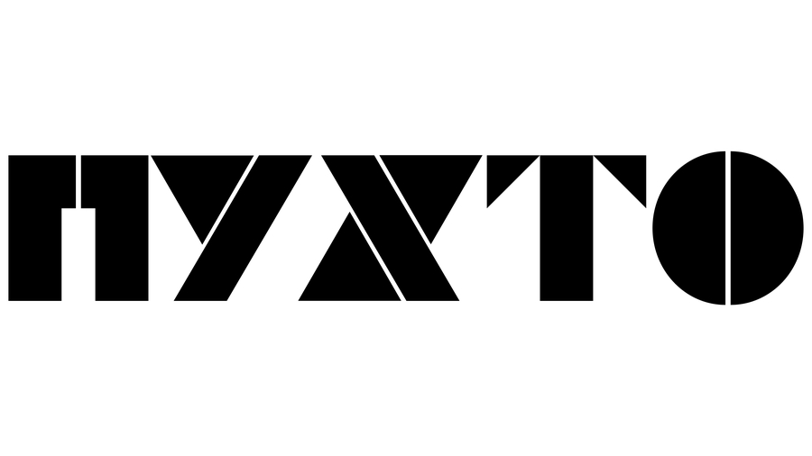
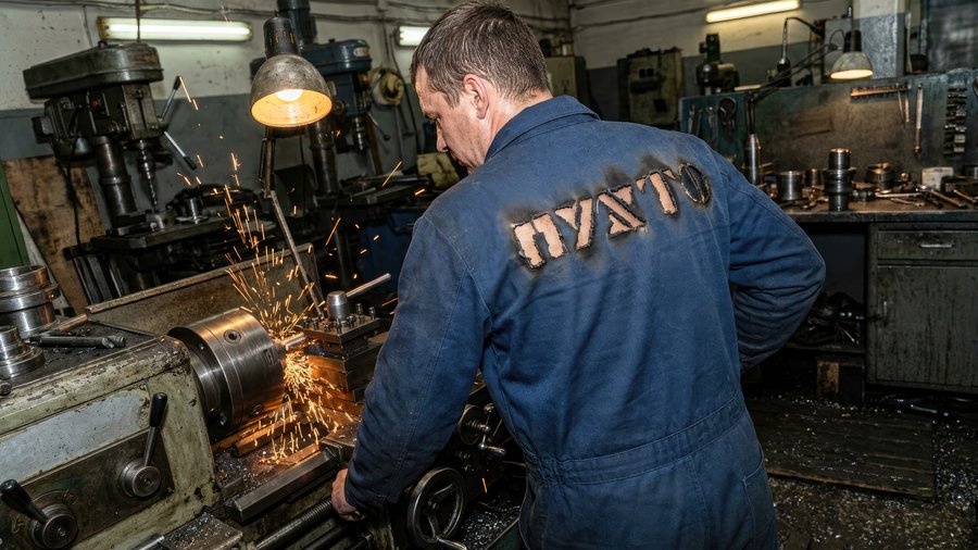
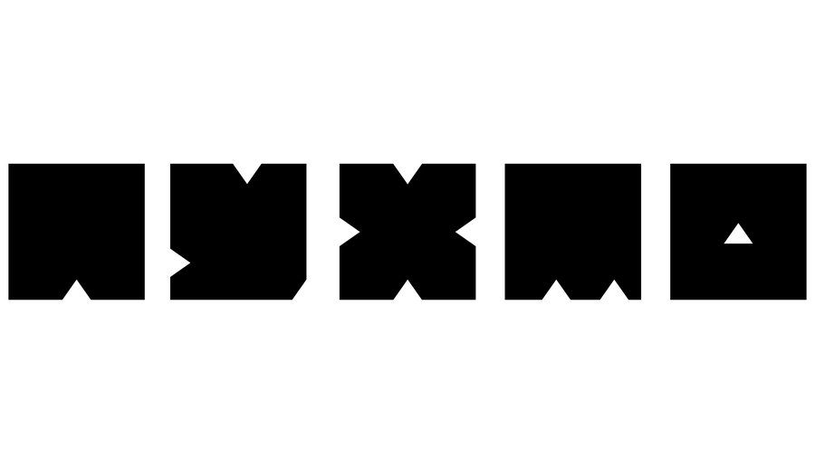
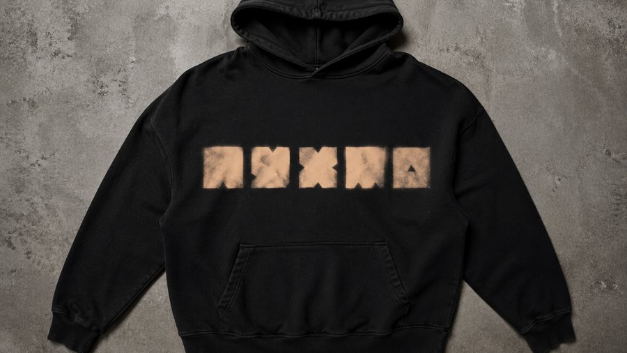
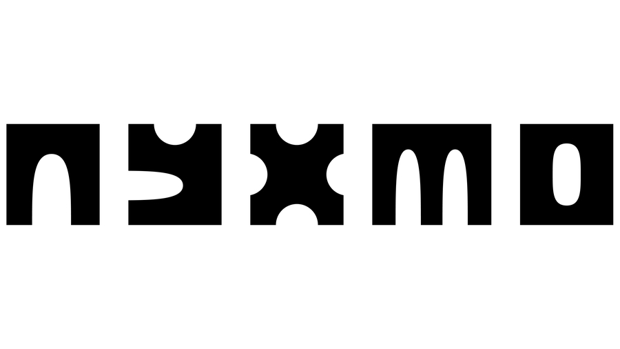
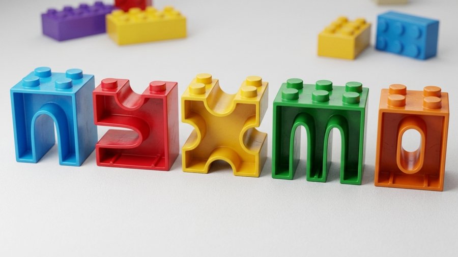
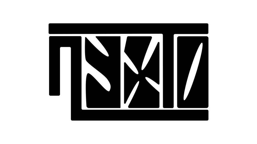
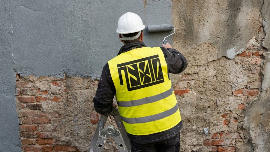
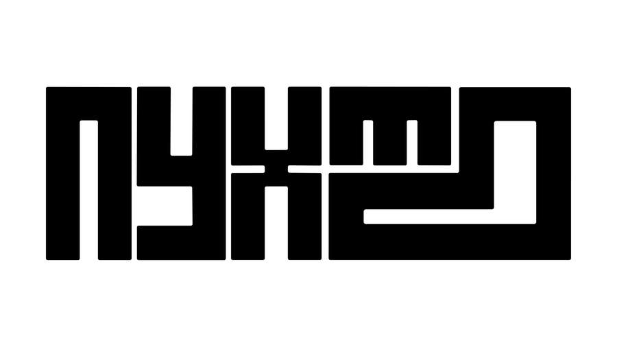
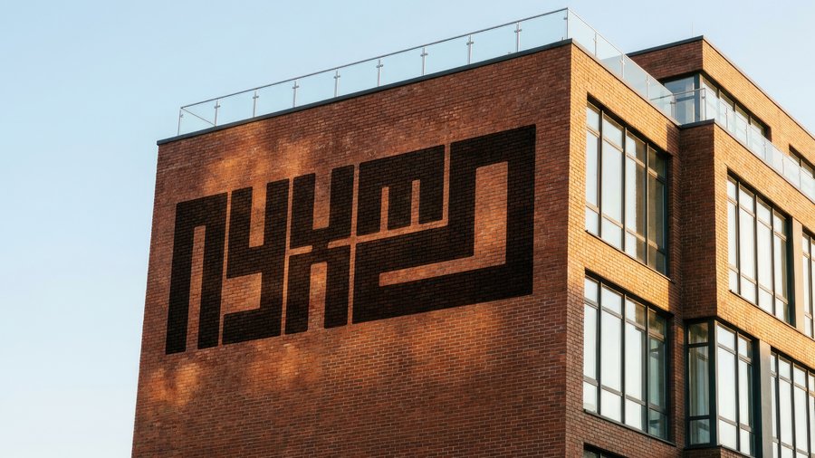
I developed ten logo concepts to explore different ways of reimagining ПУХТО’s existing visual identity.
One name. Ten interpretations.
Each concept explores a distinct approach to form, typography, and visual character, revealing different possibilities for the brand’s future logo.