Data choice
Income data for the Moscow region budget were selected for the analysis. These data include information on revenue from taxes, transfers and other sources.
Information taken from <a href="https://data.mos.ru/opendata/64051?pageSize=10&pageIndex=8&isRecommunicationData=false>(this page) / text cliché
Reasons for the analysis
These data provide important information for the analysis of the region ' s financial processes. The study of budget revenues provides an insight into the financial situation of the Moscow region, an assessment of the effectiveness of tax policy and the allocation of funds to various projects and programmes.
I was interested in analysing these data, as they directly affect the development of the region and the quality of life of its inhabitants.
Main type of data visualization
Type of visualization
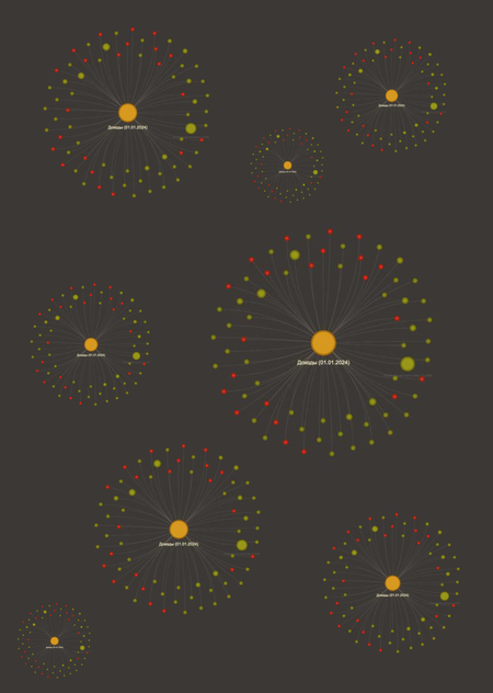
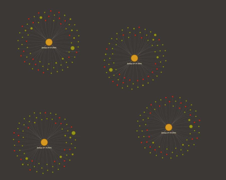
A row in the form of wood (or hierarchical structure) was selected to analyse the budget income data. This type of graph is suitable for showing the contribution to the total income of each individual source.
In addition, the following types of visualization were selected as additional types: column, circular and dissipation. As a result, the data can be presented in a more familiar way.
1. Loading and production of data
This block imports the necessary libraries: -numpy: to deal with arrays and mathematical operations. — pandas: for data reading and processing in tables (DataFrame). — matplotlib.pyplot: to construct graphs and diagrams. — pyvis.network: to create interactive graphs using the PyVis Library.
2. All right, all right, okay, okay, okay, okay, okay, okay, okay, okay, okay, okay, okay, okay, okay, okay, okay, okay, okay, okay, okay, okay, okay, okay, okay, okay, okay, okay, okay, okay, okay, okay, okay, okay, okay, okay, okay, okay, okay, okay, okay, okay, okay, okay, okay. Fragile diagram
— The function reads data from the CSV file. — Transforms the Revenue VolumeActual column into a numerical format and replaces all errors with zeros.
— A graph is created using the PyVis Library. — Graphic parameters include background colour, dimensions and orientation (non-directed graph). — For each administrator (except for the line «Proceeds, Everything») a node is added to the graph. — The size of the node depends on the actual income. — The color of the node depends on the value of income (green for positive values, red for zero).
— Adds a node for total income to all administrators for each date. — This node will connect all other nodes related to this date. — For each administrator whose date coincides with the total, a rib is created between him and the income, total node.
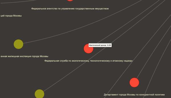
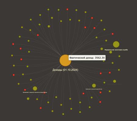
What does the node diagram look like?
3. Horizontal column diagram
— The function downloads data and purifies the Revenue VolumeActual column by converting it into a numerical format. — Only lines where income is greater than or equal to 1.0 are left. — The lines «Proceeds, everything» are deleted.
— There is a horizontal column diagram showing administrators on the Y axis and their actual income on the X axis. — Graphic layout: background colour, X axis scale (logarithmic), signatures and headings.
Image of horizontal column chart
4. All right, all right, okay, okay, okay, okay, okay, okay, okay, okay, okay, okay, okay, okay, okay, okay, okay, okay, okay, okay, okay, okay, okay, okay, okay, okay, okay, okay, okay, okay, okay, okay, okay, okay, okay, okay, okay, okay, okay, okay, okay, okay, okay, okay. Round diagram
— This function filters the data, leaving only those lines where the income exceeds the given threshold threshold. — Similar to the previous function, the redundant words are removed and the long names of the administrators are cut off. — The lines below the threshold are grouped into one category «Other». — A new DataFrame is being created for the schedule, including data for «Others.»