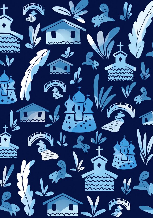
Gzhel is included in the list of the most recognizable symbols of Russia.
When studying the currently existing tourist cluster «City of Gzhel», I wanted to make some changes so that the territory would sparkle with new colors. I would like to do this for an audience that will perceive Gzhel not just as paintings in blue and white, existing at the moment, but also as a unique territorial object with high tourist, social and cultural attractiveness. My task was to create a simple and convenient navigation, as well as to increase the attractiveness of the village for local residents and attract tourists.

Corporate identity
To create a logo, I started looking for what Gzhel had already used for all this time. While searching, I came across the coat of arms of the village of Gzhel and immediately thought that the coat of arms or flag is always associated with a place and territory. Also, in addition to the coat of arms, when searching, I often came across a firebird on the paintings of Gzhel. Since this bird is an important symbol for Gzhel, I took it as the basis of my logo and came up with a lettering that could be combined with a bird.
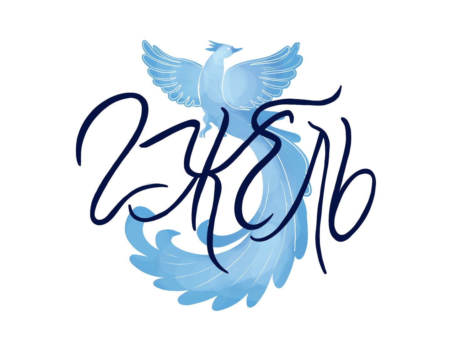
Logo
Logo in primary colors
The main elements of the identity of the territorial brand «Gzhel» is a pattern system based on the symbols I created for the tourist route, and a simplified version of the logo is also used.
Character-based pattern
Font pattern
A pattern based on a simplified logo
Urban space
Navigation system
I collected 25 points in a tourist route and built the optimal order. In the developed application, people can choose any route category where certain places of interest will be offered, but since everything is individual, if you want to visit something additionally, you can edit the route for yourself.
Poster map
Tickets
Brochure
Souvenir products
Bag, hats, jackets and umbrellas
Shoppers and T-shirts
badge
Puzzles
Boxes
Packages
App