I was 11. At 6:00 a.m., in my mom’s cold car, we waited for the salon to warm up a little bit. Grey winter behind the window, quiet inside. All of a sudden, it was a song. Mom said it was her favorite. Freddie Mercury’s voice broke into that fucking silence, and something shuddered inside. The song was over, the radio sounded on its own day-to-day, and I was still there in those sounds that somehow woke my soul up. We went to school silently without waiting for the heat. Since then, Somebody to Love has been my favorite.
About the project.
Queen is a legendary British rock band that gained worldwide prominence in the mid-1970s. Established in 1970, it is considered one of the most successful and influential groups in the history of rock music. The unique style of Queen combines elements of rock opera, progressive rock and hard rock, allowing them to stand out on the music stage. Thanks to Freddie Mercury’s outstanding vocals and the virtual guitar game on Brian May, Queen was able to win the hearts of millions of fans around the world.
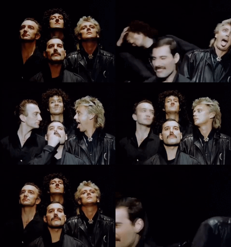
Queen, 1985
Queen is not just a group, but a universe in which heroes, tragedies, and triumphs mired in musical paintings live. Their songs are a challenge to a time when opera drama is next to rock and roll insolence, and paphos is changing with sincerity. How can you remain indifferent when the Bohemian Rhapsody of the opera turns into chaos and then gives way to an almost prayerful ending? Or when the first chords of We Will Rock You run a rhythm in the heart that you can’t disobey?
My project is an attempt to look at this magic through a data lens. Can the analysis of the pace, duration of compositions, tonics and other parameters shed light on why Queen music remains so multilayered and all-pervasive? It’s probably in these numbers that the answer to the question is why millions of people around the world continue to sing the Don\t Stop Me Now, feeling every note of the tide of freedom and joy, and why, at 11:00, sitting in my mom’s cold car, I couldn’t take my thoughts away from Somebody to Love.
How ai sees Queen*
In graphics, I used the cover of A Night at the Opera as the main coloristic reference point. Its complex but harmonious palette — a combination of deep blue, warm cream, and obsessive beard-gold shades — gave the project a visual rhythm. The final palette included
Project ' s palitaire
To analyse Queen’s songs, I looked at the following four indicators: 1. The song length is to explore how the average track length of albums and years changed. 2. The tone of the songs is to determine the most popular tone and change it over time. 3. The frequency of words in the texts is to identify the key words most commonly used in Queen’s songs and their distribution to albums.
Step-by-step work plan.
** Data preparation** Started with dataset search: / Used the Kaggle platform. == sync, corrected by elderman == @elder_man Then downloaded the data from Google Colab: / downloaded the CSV files from Google Colab. / / Checked the data structure with df.head () and df.info (). // Cleaned data if necessary (e.g., deleted blanks or extra symbols). Then started filtering data: / Filed data for the Queen group. // Cleared the songs from the stop-words and puncture signs.
** When the programme was fully aligned, it began to analyse the following indicators and draw up charts. Song duration: Researched how the average track length of albums and years changed. / Visualized the results using a linear diagram. Song popularity: Compared popularity metrics (e.g. number of strims, auditions, or chart appearances). / Visualized the results using a linear diagram. Analysis of audio profile: Researched parameters such as Energy, Danceability, Valence, and their change over time. / Visualized the results by means of a thermal diagram and a column chart. The number of words in Queen: Identifyd the key words most commonly used in Queen’s songs. Visualize the results with: / Cloud of words. / / Cycle diagram with exploding segment. / / / / Precision diagram with stars. / / / / / / Column diagram.
1. The duration of the songs.
The diagrams illustrate how the average length of Queen’s songs changed over time. In the early 1970s, the group followed ** the shorter format typical of the classical rock of that period.** By mid-decade, however, there has been a marked increase in the average length of tracks, peaking in 1975. This may be related to the ** experimental Queen** approach, which has become their brand. After this peak, the duration of the songs gradually decreases, but remains above the initial values, demonstrating the evolution of the group style.
The combination of the popularity and the duration of the songs seemed surprising. It seems that Queen was well balanced between simple, reminiscent tracks, such as We Will Rock You, and complex compositions like The Prophets Song. This allowed them to remain popular, not only among rock lovers, but also in the mainstream culture. It is particularly noteworthy that the band’s longest songs often became its most significant works, forming a unique Queen style.
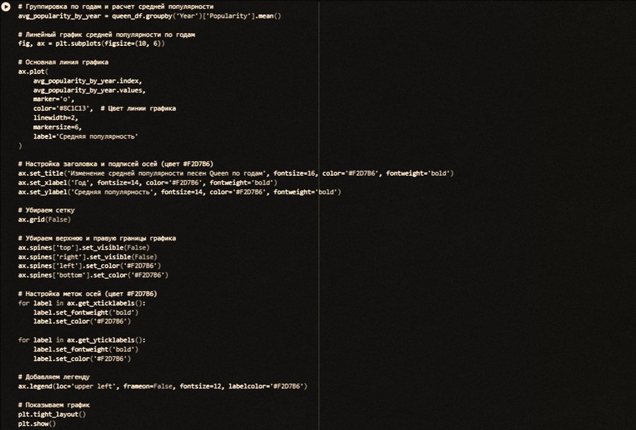
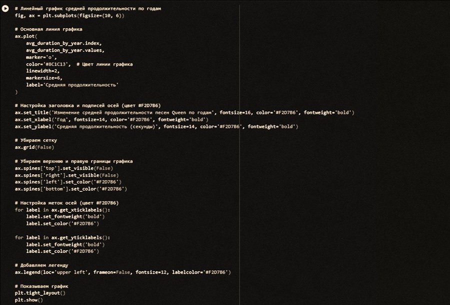
1. Linear Graphics of Change in Song Duration / 2. Linear schedule for changing the popularity of songs
2. All right, all right, okay, okay, okay, okay, okay, okay, okay, okay, okay, okay, okay, okay, okay, okay, okay, okay, okay, okay, okay, okay, okay, okay, okay, okay, okay, okay, okay, okay, okay, okay, okay, okay, okay, okay, okay, okay, okay, okay, okay, okay, okay, okay, okay. Audio characteristic analysis. (Energy, Danceability, Valence and their change over time)
The warm map and the column chart illustrate the evolution of key audio characterizations of Queen songs throughout their creative journey. ** The target scale highlights the most significant trends in parameters such as Energy (energy), Danceability (dance) and Valence (imposition).** Each year is presented as a row and the characteristics as columns. The colour intensity reflects the value: cold shades (blue) indicate low values and warm (red) values reflect high values.
The Queen’s analysis shows the evolution of their music through audio characterization. ** At the beginning of the career, the band created strong rock compositions** («We Are the Champions»), but by the 1980s, it had shifted to melodic ballads («Love of My Life»), reducing Energy. Danceability ** was high** even in rock songs such as «Donxt Stop Me Now» and «Another One Bites the Dust», highlighting the universality of their music. The mood (Valence) ** was changed from positive ** in the early tracks («Don\t Stop Me Now») ** to melancholic later** («Bohemian Rhappody», «The Show Must Go On»). The impact of the context is also visible: in the 1980s, Queen ** experimented with disco and electronics**, increasing Danceability, and after the diagnosis of Freddie Mercury, HIV developed deep-seated, low-Valence melodramatic compositions. Queen combined rock power with pop music elements, remaining innovators and creating a multifaceted style that is relevant decades later.
The diagrams illustrate how Queen has evolved as a musical collective. The combination of high energy in early works, experiments with dance and deep emotional themes in later compositions provides a unique picture of their creativity. Queens did more than follow trends; they asked them, leaving an indelible mark in the history of music. This analysis confirms that their music remains relevant because of its universality and multidimensionality.
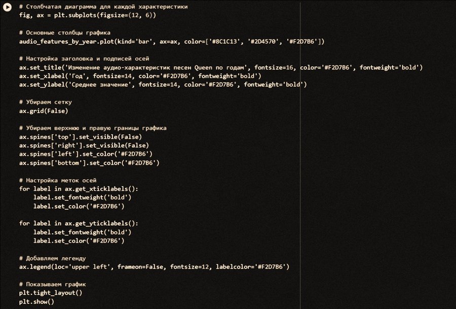
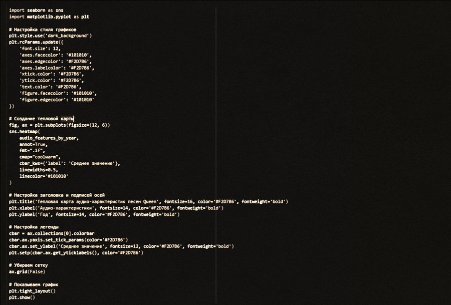
1. Code for thermal diagram / 2. Code for columnized diagram
3. The frequency of words in Queen’s texts.
It’s probably the most interesting diagram I’ve ever had. The chart shows the most common words in Queen’s songs. ** The apparent prevalence of words related to emotions, appeals and communication: Love, yeh, im, dot, ooh. ** The most commonly used word is love (415 times), highlighting the ** central role of the theme of love in the creation of the group**. This word is a symbol of their lyrical style, where feelings and emotions occupy a key place.
The Cloud of Words
Of particular interest is the abundance of inter-homes and sounds, such as yeh (385 times), ooh (239 times) and oh (221 times). These words add the language of expression and help to create typical vocal parties that have become a special feature of Queen. They also make the texts more dynamic and suitable for implementation, increasing the emotional effect. The use of pronouns and forms related to personal treatment is notably frequent: Im (304 times), youre (174 times), baby (138 times). This shows that Queen sought to create an intimate, almost interactive atmosphere in his songs, as if talking directly to the listener. Such an approach makes their music more personal and close.