About the Project
Plague Town is an asymmetrical board game about the conflict between physicians and fanatics. The physicians attempt to save the city, while the fanatics spread the plague and obstruct the creation of a cure.
The startup concept involves independently publishing the game, selling physical boxes and themed merchandise, and hosting demonstration play sessions.
The redesign objective is to update the academic project’s packaging and develop a unified visual style for the product, marketing, and overall presence.
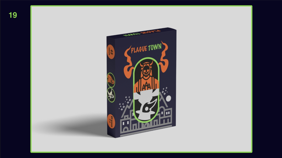
The original project included the development of the rules, the game board, cards, and the iconography for the two factions. The contrast between orange and green formed the foundation of the new design.
Brand
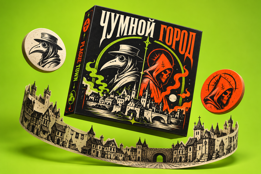
The Plague City combines a tabletop game with merchandise featuring the symbols of opposing factions. A player can choose a side not only at the game table but also through a T-shirt, bag, or pin.
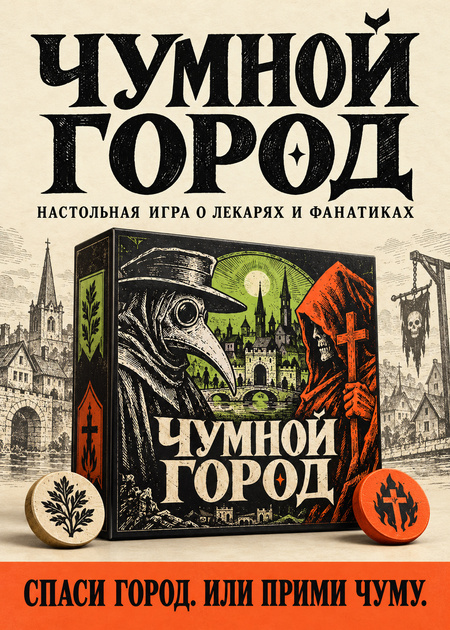
The visual style is based on medieval engraving. The plague doctor mask, the fanatic’s hood, and the city arch are repeated across the packaging, game components, and promotional materials.
Product. Game Packaging
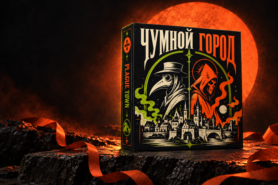
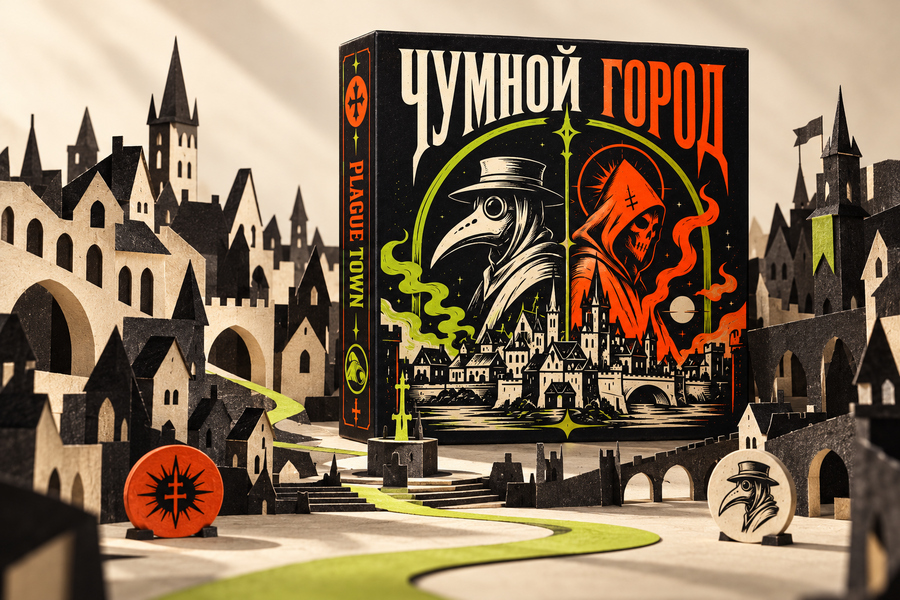
The startup’s main physical product is a board game box. In the new design, the original characters and color contrast have been maintained. The texture of the matte cardstock, the volume, and the studio lighting illustrate how the packaging might look on a retail shelf.