Original size 2480x3500

Branding and packaging design for the energy drink Glim

Longread translated automatically

The project goal is to develop a distinct energy drink brand for young adults aged 18–25—a brand that won’t be embarrassing to bring to a party.

big
Original size 2480x1750

Idea Generation

At the core of the design concept is a secret oracle. The bottle answers the questions posed to it, but the answer is revealed only in the darkness through the use of luminescent paint. The identity and packaging design are built around a variable typeface from which the logo, predictions on the bottle, and the pattern on the packaging are assembled. The main graphic element—an acidic distortion—conveys the atmosphere and mood of a party.

big
Original size 2480x1750

Idea Generation

big
Original size 2480x1750

Idea Search

Original size 2480x1750

Idea Generation

Original size 2480x1750

Idea Generation

Original size 2480x1750

Idea Search

Original size 2480x1750

Idea Generation

Original size 2480x1750

Idea Generation

Final Concept

Original size 2480x1750

Fundamental Design Elements

Original size 2480x1750

Variable Font

Original size 2480x1750

Glim square font

Original size 2480x1750

Glim round font

Original size 2480x1750

Grim Triangular Font

Original size 2480x1750

Variable Font

Original size 2480x1750

Variable Font

Original size 2480x1750

Variable Font

The identity and packaging design are built on a variable typeface from which the logo, predictions on the can, and the packaging pattern are assembled.

Original size 2480x1750

The main graphic motif—acidic distortion—conveys the atmosphere and mood of the party.

Original size 2480x1750

Brand Slogan

Original size 2480x1750
Branding and packaging design for the energy drink Glim
Дарья Данилычева создала брендинг и дизайн упаковки для энергетика Glim, ориентированный на молодую аудиторию 18-25 лет. Проект включает в себя уникальную концепцию с люминесцентной краской и вариативным шрифтом, формирующим логотип и паттерн.
Project description created with AI
Project created at 08.02.2022
More projects in packaging design
Софья Арчугова создала текст с пояснением понятия "текст" в лингвистике. Проект включает в себя определение текста как организованной и законченной речи.
Георгий Сапожков создал идентичность для сети киосков, продающих сухие семена с приправами. Проект использует метафору баланса как символ восточной гармонии для изменения восприятия продукта в России.
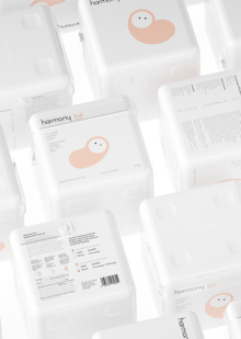
Евгений Каширин разработал концепцию детского питания, адаптированную под возраст ребёнка и его рост. Проект Harmony представляет собой текст, в котором описываются особенности состава грудного молока и идеи по изменению формулы в зависимости от месяца жизни ребёнка.
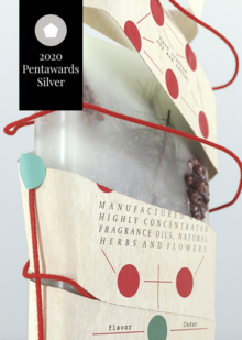
Евгений Каширин представил историческую интерпретацию флорентийского саше в формате книги. Проект включает описание традиционного рецепта саше, созданных в аптеке «Pharmaceutical di Santa Maria Novella» с 1612 года.
lpudesign
LPU — Lovely Professional University, India’s Best Private University in Punjab. A university with the infrastructure of global standards, internationally benchmarked curricula, rich diversity of students, innovative pedagogy for participative and experiential learning with focus on research, innovation and entrepreneurship
design
object design
art
fashion
environment
game design
illustration
animation
cgi
sound