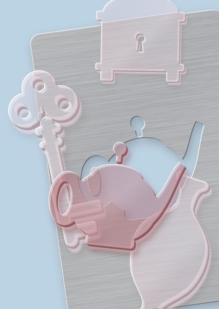
Rebranding
I have chosen a new metaphor for the project’s rebranding.
A New Metaphor—The Unique Form
In a world full of millions of antique objects, almost all of them are beautiful, but none are right for you. Every person has a vacant space of a precise shape—in their home, in their memory, in their life—and nothing accidental can fill it. Then, one object appears, and it fits that space without a gap, as if it were made just for you. This isn’t a purchase; it’s a perfect match.
Then I asked ChatGPT to generate a logo, select brand colors, and choose a typeface pairing consisting of an antique and a grotesque style.
Logo
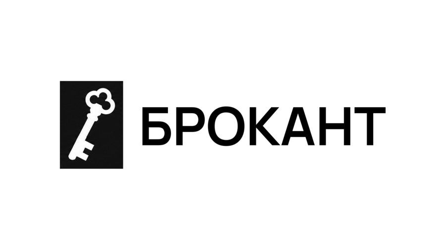
[prompt]Create a minimalist black-and-white vector logo for an antique shop named «BROKANT».
Layout: The logo should feature a brand symbol on the left and the word «BROKANT» on the right, arranged horizontally.
Brand symbol: A rigid, upright rectangular stencil plate with perfectly straight sides and sharp, square corners. The plate itself must remain completely vertical and level, with no rotation, tilt, rounded corners, or irregular edges. Inside the plate, carve out a clean silhouette in the negative space in the shape of a simple, recognizable antique key. Only the key silhouette is tilted diagonally to the right; the surrounding rectangular stencil plate must remain perfectly straight and upright. The key should have a simple, restrained silhouette with a straight shaft, a basic circular or rounded bow, and a small number of clearly defined teeth. Avoid intricate details, ornamental flourishes, excessive curves, or overly elaborate vintage styling.
The key must be formed by empty white space cut out of the solid black plate, not by a separately drawn key. Its overall height must precisely match the cap height of the wordmark. The rectangular stencil plate should be noticeably wider than the wordmark’s letter height, establishing a strong geometric symbol.
Typography: The exact Cyrillic word «БРОКАНТ», set in uppercase using Manrope SemiBold. Preserve the typeface’s original letterforms, clean geometry, and balanced spacing. Do not substitute Latin characters for Cyrillic letters.
Visual style: Restrained, sophisticated, contemporary, and timeless. It should convey the identity of a premium antique boutique that communicates the discovery of historical objects through a simple geometric metaphor. Avoid clichés, decorative ornaments, or excessive vintage styling.
Color and execution: Strictly monochrome black and white. A solid black rectangular plate featuring a white key-shaped cut-out, paired with black typography set against a pure white background. The artwork must be flat vector, with crisp contours, precise geometry, sharp edges, and high contrast.
Strictly avoid: A tilted or rotated plate, rounded plate corners, an overly elaborate key, a separately illustrated key, gradients, shadows, textures, 3D effects, mockups, additional symbols, and any colors other than black and white.
Present one finished, clean vector logo centered on a plain white canvas.
Color Palette
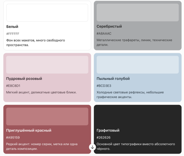
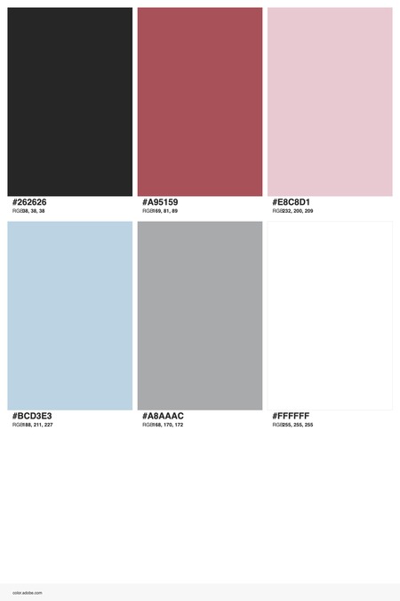
ChatGPT generation // Adobe Color
Typeface Pair
Using the website WhatsThatFont, I identified them as Manrope in the Bold weight and PT Serif in the Regular weight.
Mockups
I generated all images using the Magnific platform, based on the Google Nano Banana 2.1 model.
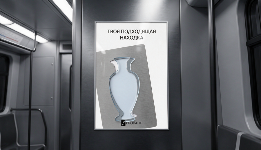
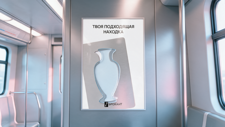
Final mockup // unfinished version
[Poster prompt]Minimalist vertical poster, A-series proportions (1:1.41), pure white background (#FFFFFF), clean premium editorial design.TOP: a headline in two centred lines, «YOUR MATCH» on the first line and «FINDING» on the second, set in a bold geometric sans-serif (Manrope Bold style), all caps, graphite colour #262626, medium-large size, generous white space above and below. Maintain exact Cyrillic spelling.CENTRE: a large thin plate of brushed stainless steel, silver-grey (#A8AAAC), with slightly rounded corners. Satin finish with fine horizontal directional brushing lines, matte, subtle tonal variation, no mirror reflections. The plate is slightly rotated counter-clockwise (about 8°), positioned right of centre, its left edge and bottom-left corner bleeding off the edge of the poster. The plate takes up most of the lower two-thirds of the poster.In the plate is a clean through-cut opening in the silhouette of a classic antique baluster vase: a flared lip, a narrow neck, broad rounded shoulders, a body tapering down to a slim stem and a wide flared foot. One solid closed contour, no inner details. The white background shows through the opening.Lying on top of the opening is a flat piece of thick, crystal-clear glass, about 8 mm, cut in exactly the same vase silhouette, the same size and shape. It sits slightly offset up and to the right of the opening, so a thin crescent of the white cut-out shows on the left side of the neck and body, and the glass slightly overlaps the metal on the right. The glass is highly transparent with a faint, cool, icy dusty-blue tint (#BCD3E3); its polished bevelled edges glow with bright cyan-blue highlights and a subtle shimmer. Soft, cool, translucent shadows from the glass edges fall onto the metal.BOTTOM CENTRE: the attached logo, small, centred, placed over the lower part of the metal plate — a graphite (#262626) vertical rectangle with a white antique key cut out, and the word «BROCADE» to the right of it in a graphite sans-serif. Reproduce the logo exactly as in the reference image.No other text or elements. Lighting is soft, even, diffuse studio light. Photorealistic materials, high detail, quiet, precise, light and premium mood.
[mockup prompt]Photorealistic mockup of the attached poster hanging inside a modern metro train carriage. The carriage interior is dark silver with a matte brushed-metal finish: smooth matte grey panels, subtle reflections, soft even fluorescent lighting, a slight perspective view from inside the carriage, part of a handrail and a seat edge visible at the frame edges, slightly out of focus. The poster is vertical, A-series proportions (1:1.41), mounted on the carriage wall in a very thin, minimal silver aluminum frame, with natural soft reflections on its protective surface. Sharp focus on the poster.
I wasn’t entirely satisfied with the first mockup, so I gave the AI the task of improving it:Edit this image. Keep the poster on the wall exactly as it is — same design, text, logo, position, and size; do not redraw or change it. Maintain the same composition and camera angle.Change only the atmosphere of the metro carriage: make it lighter, softer, and airier. Replace the dark, cold, high-contrast look with soft, even, natural-feeling light, as if daylight is coming through the windows. Lift the shadows, reduce contrast, and change the metal panels to a lighter matte silver-grey instead of dark grey. Add a subtle color grade using the brand palette: soft white, light silver-grey, a hint of dusty blue BCD3E3 in the cool tones, and a touch of powder pink E8C8D1 in the highlights. The resulting photo should look natural and realistic—clean and calm, not dark or moody, but also not overexposed or pastel.
[post prompt]
Square 1:1 social post, flat dusty-blue background. Top center: headline «ANTIQUES FOR EVERY TASTE» in two lines, Manrope Bold, all caps, white. Below, a loose 3×2 grid of small objects with ample negative space: flat powder-pink glass pieces E8C8D1 shaped as an antique key, a teapot, a hand mirror, a ring, and a gramophone, plus one small brushed-steel stencil plate #A8AAAC (top right) featuring a hand-mirror cut-out. The glass has soft bevelled edges and gentle shadows; the plate is slightly tilted. Bottom center: the attached logo in white. Clean, quiet, premium.
[mockup prompt]Reference images attached: (1) the Instagram post image — place it on the phone screen exactly as it is, without redrawing or changing anything; (2) the brand logo — use it as the account avatar.Photorealistic over-the-shoulder shot, horizontal 16:9. We look from behind a young woman’s shoulder: only her hand and part of her wrist are visible in the frame — no face, no head. Her hand holds a modern smartphone slightly tilted towards the camera, in the right half of the frame. Natural, relaxed grip, neat short nails with a soft nude manicure, a thin silver ring, the cuff of a light knit sweater in pale dusty blue.On the phone screen the Instagram app is open, showing a single post from the account «broconte»: a small round avatar with the attached logo, the username «broconte» at the top, and below it the attached post image as the post itself, reproduced exactly. Standard Instagram interface: like, comment, and share icons under the post, a few lines of caption in small grey text. The screen is bright and sharp, with a subtle natural reflection on the glass.Setting: a calm, light café by a large window, slightly blurred in the background (shallow depth of field) — a white marble table with a ceramic cup of coffee, a linen napkin, soft daylight from the window, and maybe a small vintage silver spoon on the table. Color grading in a soft, airy palette: white, silver-gray, powder pink, dusty blue; gentle contrast, natural skin tones, slightly cool light. Shot on a 35 mm lens, f/2, focus on the phone screen, realistic lifestyle photography, clean and premium mood.
[banner prompt]Horizontal 16:9 banner, pure white background. Left column: the attached logo in graphite 262626 at the top left; headline «YOUR PERFECT FIND» in three lines, Manrope Bold, all caps, graphite; below it in a classic serif (PT Serif Regular): «antique treasures await you in the shop»; bottom left, small: «Antikvarnaya St., 17». Right half: flat translucent powder-pink glass pieces E8C8D1 shaped as a medallion, a jewelry box with a keyhole, a hand mirror, a vase, and a table lamp, scattered with air between them, and one brushed stainless-steel stencil plate #A8AAAC with a table-lamp cut-out. Soft pink shadows, polished glass edges.
[mockup prompt]Reference image attached: the banner — place it inside the bus stop advertising lightbox exactly as it is, without redrawing, describing, or changing anything.Photorealistic street photo, horizontal 16:9. A modern minimalist bus stop on a quiet city street in spring: thin matte silver-gray metal frame, clear glass panels, a slim bench. On the side of the shelter is a large horizontal backlit advertising lightbox in a thin silver frame, displaying the attached banner image. The banner is evenly lit, sharp, and readable, with a soft natural reflection on the protective glass.Next to the bus stop grows a sakura tree in full bloom: delicate pale-pink blossoms, a few fresh green leaves, branches partly framing the shelter. Soft pink petals drift in the air and lie scattered on the pavement and the bench. Clean asphalt, pale blue sky with thin clouds, soft diffused morning daylight, calm fresh atmosphere, no people or only a blurred passerby far in the background.Color grading: soft and airy — white, silver-gray, powder pink E8C8D1 in the blossoms, dusty blue BCD3E3 in the sky; gentle contrast, slightly cool, fresh light. Shot on a 35 mm lens at eye level, slight three-quarter angle to the shelter, focus on the banner, realistic outdoor advertising mockup, clean and premium.
[Banner prompt]Wide web banner 970×250, flat muted red background A95159. Left: the attached logo in white at the top; below it, the headline «SALE AT THE ANTIQUE SHOP» in three lines, Manrope Bold, all caps, white; followed by a small white serif line (PT Serif Regular): «30% off every second item.» Right edge: a brushed stainless-steel plate A8AAAC, slightly rotated and cropped by the top and bottom edges, featuring a through-cut silhouette of a ring with a round stone; a clear, slightly icy translucent glass ring of the same shape lies over the cut, offset, with glowing bevelled edges.
[mockup prompt]Reference image attached: the web banner — place it on the screen exactly as it is, without redrawing, describing, or changing anything.Photorealistic interior photo, horizontal 16:9. A modern desktop computer with a thin-bezel monitor rests on a light wooden desk, viewed from a slight angle in the front and to the side. The screen displays a web browser showing a minimalist search engine homepage: an all-white background, a clean, rounded search bar at the top of the page, a few small gray links, and directly below the search bar, a horizontal advertising banner showing the attached banner image. No real search-engine logos or brand names. The screen is bright and sharp, with a soft natural reflection.The workspace around the computer is cozy and tidy: a white wireless mouse on a light gray felt mouse pad, a keyboard, pale silver-gray over-ear headphones resting on the desk, a ceramic mug, a small plant in a white pot, a notebook with a pen, and a couple of small vintage trinkets—a tiny brass key, an old pocket watch, a small glass vase. Soft daylight streams in from a side window; the background wall is light and slightly out of focus.Color grading: soft and airy—white, warm light wood, silver-gray, powder pink E8C8D1, and dusty blue BCD3E3 accents in the objects, slightly cool natural light, gentle contrast. Shot on a 35 mm lens, focus on the screen, realistic lifestyle mockup, clean and premium.
[banner prompt]Horizontal 16:9 banner, flat dusty-blue background BCD3E3. Top left: the attached logo in white. Left side: headline «SALE AT THE ANTIQUE SHOP» in three lines, Manrope Bold, all caps, white; below it a small white serif line (PT Serif Regular): «30% off every second item.» Right side: a large brushed stainless-steel plate A8AAAC, slightly rotated, bleeding off the bottom, with a through-cut antique key silhouette (trefoil bow with three holes); the blue shows through the cut. A translucent glossy pink glass key #E8C8D1 of the same shape lies on top, offset up and to the right, with polished edges and a soft shadow.