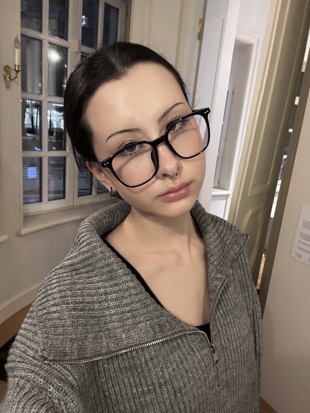
Hello, my name is Ekaterina. I’m a brand designer and illustrator.I specialize in: ✧ identity systems built to survive user-generated content ✧ packaging and label design ✧ 3D product visualisation and campaign imageryI can also: ✧ design the e-commerce flow around the product, not after it ✧ carry a brand across merch, outdoor and a configurator without the system coming apartOpen to commissions and collaborations.
How a project runs:
brief → research → the rule gets written down (palette, line weight, what the brand controls and what the user controls) → every carrier on one board → roughs → revisions → 3D → files
MORY
Tableware printed with children’s own drawings. A brand built from scratch: product range, online configurator, packaging, campaign and merch.
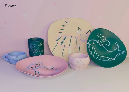
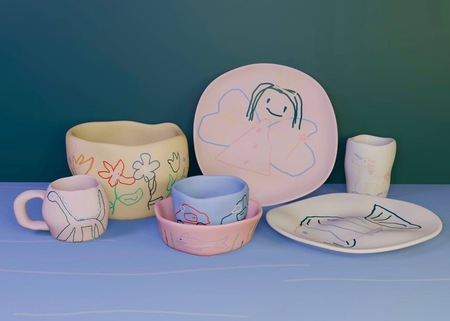
The brand never sees the artwork before it ships. Every piece carries a drawing a customer uploads an hour before production. No art direction stage, no approval, no way to say no. A system that depends on the drawing being good is not a system.So the split is fixed: the brand owns the body colour, the child owns the line. Four ceramic colours, one line weight, no fills, no shading. A unicorn, a fish and a dinosaur drawn by three children at three different ages still read as one set on a shelf — what they share is not subject or skill, it is a single outline on a flat colour.
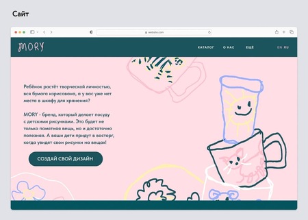
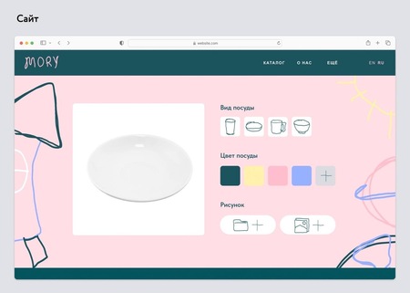
The customer is a parent with a drawer full of paper. The homepage asks their own question back to them in their own words, and gives one button.The wordmark is the only hand-drawn thing in the identity that does not depict anything. Everything else drawn by hand here belongs to a child — if the logo joined in, nothing would separate the brand’s voice from the customer’s.
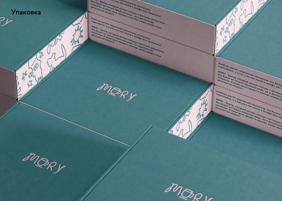
The box is the one surface the customer does not design. So it carries the brand at full strength: deep teal outside, the whole pitch printed along the inner wall, the drawn pattern kept to a narrow band. Opening it is the only moment the brand speaks in its own voice, before the object inside goes back to speaking in the child’s.
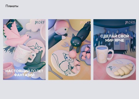
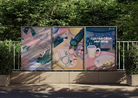
A flat illustrated poster for this brand would read as one more drawing — when the whole promise is that a drawing becomes a thing you can hold. Rendered in soft clay, the mug has weight and a shadow, and the drawing on it stays flat. That contrast is the product in a single image, and it survives being seen from a passing car.
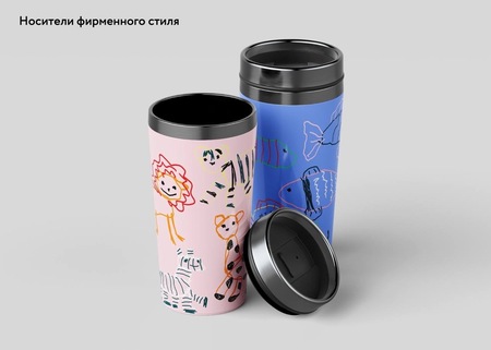
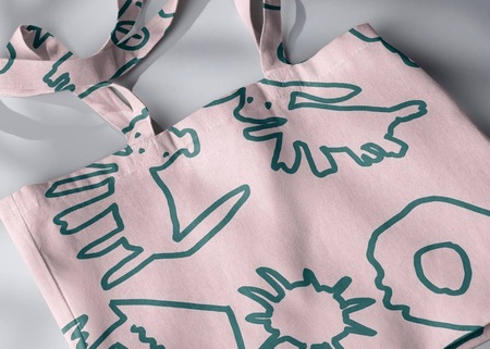
Here the drawings are the surface — packed edge to edge, in full colour — and the object underneath stays plain. The ceramics are one child’s drawing on the brand’s colour; the merch is the brand’s colour buried under a hundred of them. Same two elements, opposite proportions, and that is what keeps the range reading as a range rather than a catalogue.
PABST BLUE RIBBON
Illustration series and limited-edition packaging concept for the American lager. Cans, glassware, apparel and bar collateral.
The PBR medallion is fine engraved line, ribbon and serif type — a hundred and thirty years of detail inside a small circle. Any illustration carrying detail of its own turns the can into noise and the medallion into a sticker.So the illustration gets three flat colours and nothing else: PBR blue, red and white, with one grey. No gradients, no outlines, no texture. The medallion is then the only place on the whole can where the eye finds fine detail, and it wins without being made any bigger.
Every composition is built around a hole in the middle. The medallion is not placed on top of the artwork; the artwork is drawn to open around it. On a shelf, at a metre, you read the ribbon first and the scene second — the correct order for a beer that is bought by its label.
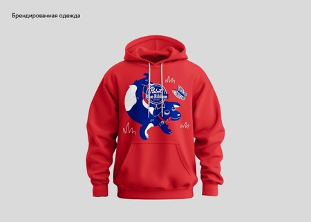
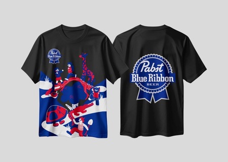
Carriers get different crops, not smaller versions of the same one. A can is held at thirty centimetres and turns in the hand, so it takes the full wrap. A garment is read across a room, so it takes one figure at scale and the medallion alone on the back. Shrinking the can artwork onto a chest print is the usual mistake, and it produces a smudge.
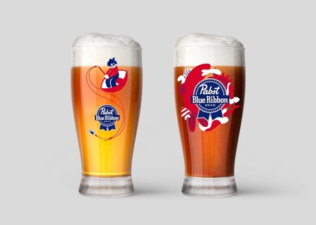
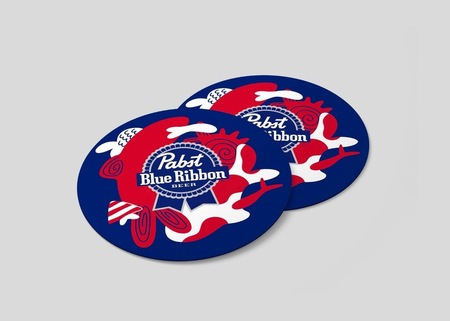
Glass is the hardest carrier: the artwork is curved, backlit and half-covered by beer. Only the largest shapes and the medallion survive, and nothing under about a centimetre of line is used at all. The coasters do the opposite job — flat, dry and sitting still on a table — so they take the densest version of the pattern.
Thanks for watching!
I am still learning, and I would be glad if anyone wants to make something together — an identity, a label, a series, or one stubborn piece of packaging.Write to me: ekurmanalinova@edu.hse.ru