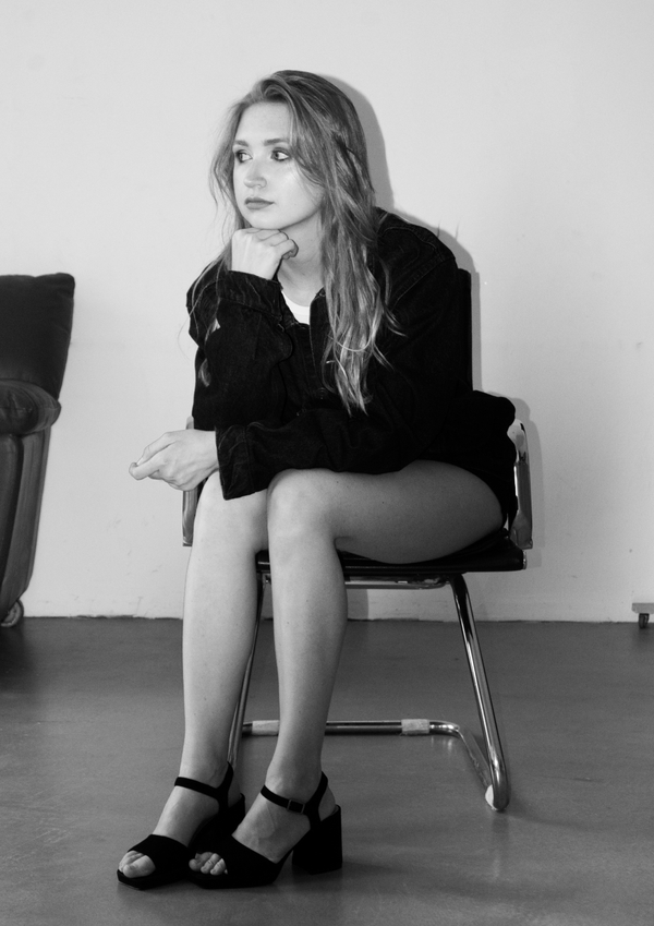
1. Bogdanova Dasha. Communication designerI’m passionate about creating creative advertising campaigns and meaningful brands that communicate ideas, evoke emotions, and promote kindness and empathy.I am interested in collaborating with advertising agencies and creative teams to develop thoughtful campaigns, build distinctive visual identities, and transform ideas into compelling visual communication.
Create with heart. Design with meaning
1. Meaning
Before creating a visual identity or an advertising campaign, I want to understand the idea behind it, the values it represents, and the people it speaks to.2. Strategy
I transform the core idea into a creative concept that connects a brand’s purpose with its audience.3. Visual
Through design and visual storytelling, I translate concepts into experiences that people can see, feel, and remember.
1. 2Spring
Brand
Second Spring is a knitwear restoration studio based in the Novaya Zemlya archipelago. The brand believes that beloved garments hold personal value and deserve a second life. Rather than replacing old things, it encourages people to care for them, preserve their stories, and rediscover the beauty of what they already own.Concept
The visual concept translates the brand’s philosophy into a tactile, natural aesthetic. Warm kraft textures reference the softness of knitted fibres, while muted earthy tones and restrained typography create a sense of calm and timelessness. Minimalist packaging, textured surfaces, and delicate product compositions emphasise the relationship between material, scent, and care.
Main Concept:
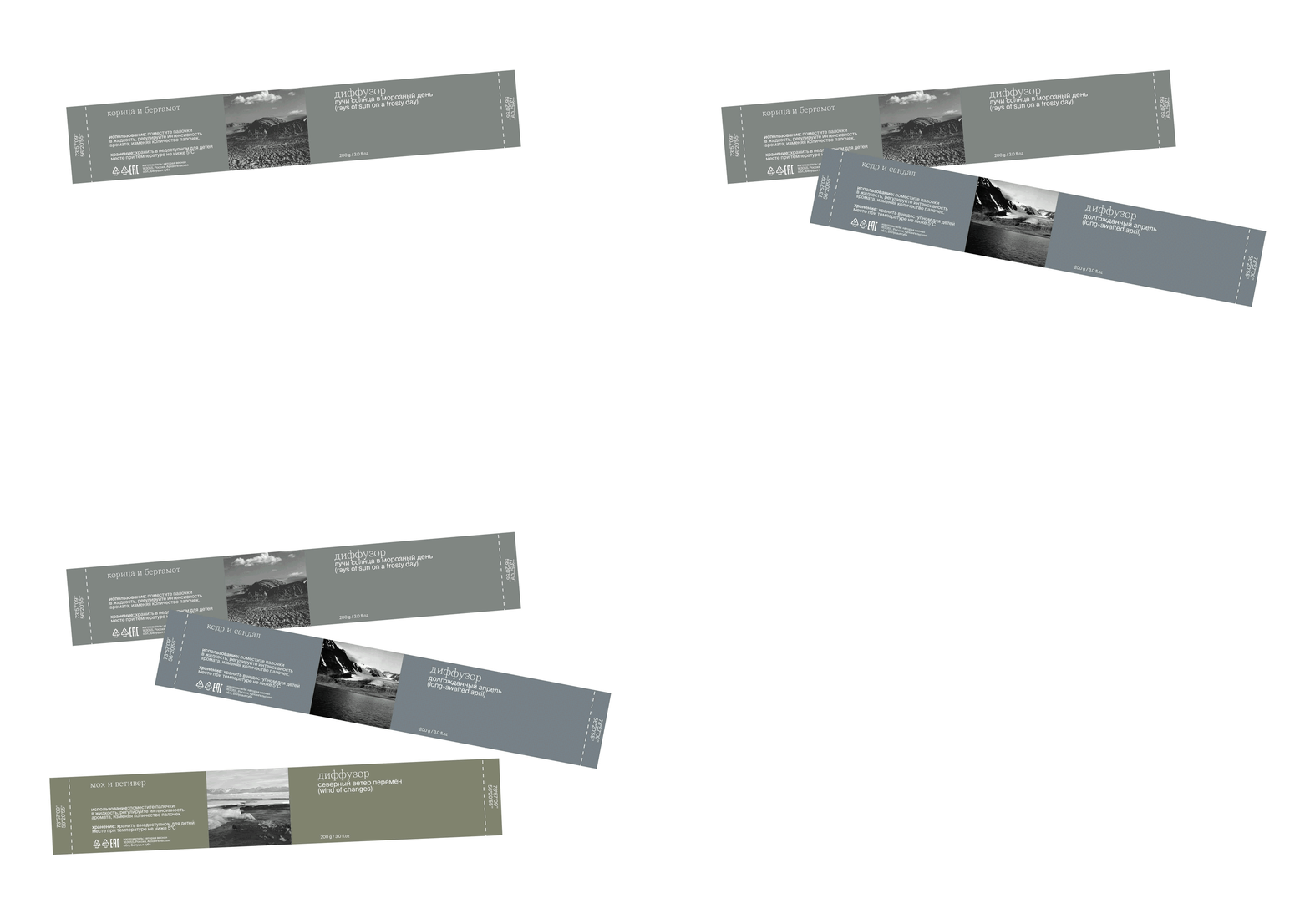
The resulting visual identity presents knitwear care as an intimate ritual — a way to preserve not only garments, but also the memories and emotions attached to them.
2. The Maxim Gorky Literary Festival
Brand
The Maxim Gorky Literary Festival is a cultural event in Nizhny Novgorod dedicated to the legacy of the renowned Russian writer Maxim Gorky and the enduring power of literature. Bringing together writers, readers, and literature enthusiasts, the festival creates a space for meaningful conversations, book discussions, and the exchange of ideas, celebrating literature as a way to connect people and generations.Concept
I worked on the creative brief, exploring how the festival’s literary character could be translated into a simple and expressive visual system. The approach focused on clarity, restraint, and consistency, ensuring that the identity could communicate the festival’s purpose across various materials while keeping literature at the centre of the experience.
Main Concept: Every writer has a personal handwriting, and an authentic way of seeing the world
The result is a clean, minimalist visual identity that balances clarity and character. Its restrained design highlights the literary nature of the festival, creating a cohesive and timeless visual language that communicates its cultural value without unnecessary complexity.
3. App «Bulka»
Brand
Bulka is an app that helps people find cafes and restaurants tailored to their tastes, bringing personalised recommendations and curated collections together in one place.Concept
The main goal was to turn restaurant discovery into an intuitive and enjoyable experience. I developed the concept around three key principles: simplicity, personalisation, and convenience. I designed the user interface with a focus on clarity, intuitive navigation, and accessible information. The app brings recommendations and curated collections into a single space, allowing users to explore options and find places that suit their mood and preferences.