Concept
BEFORE IT’S A THING — media on early signals in design and contemporary visual culture.
The project’s goal is to notice visual and cultural phenomena at an early stage—new techniques, aesthetics, niche scenes, and unexpected connections between design, music, fashion, and internet culture.
Half-Year Plan
Month 1 — Early Signals
How to recognize nascent visual phenomena. Recurring motifs, unexpected coincidences, the first signs of a new aesthetic.
Month 2 — Type in the Wild
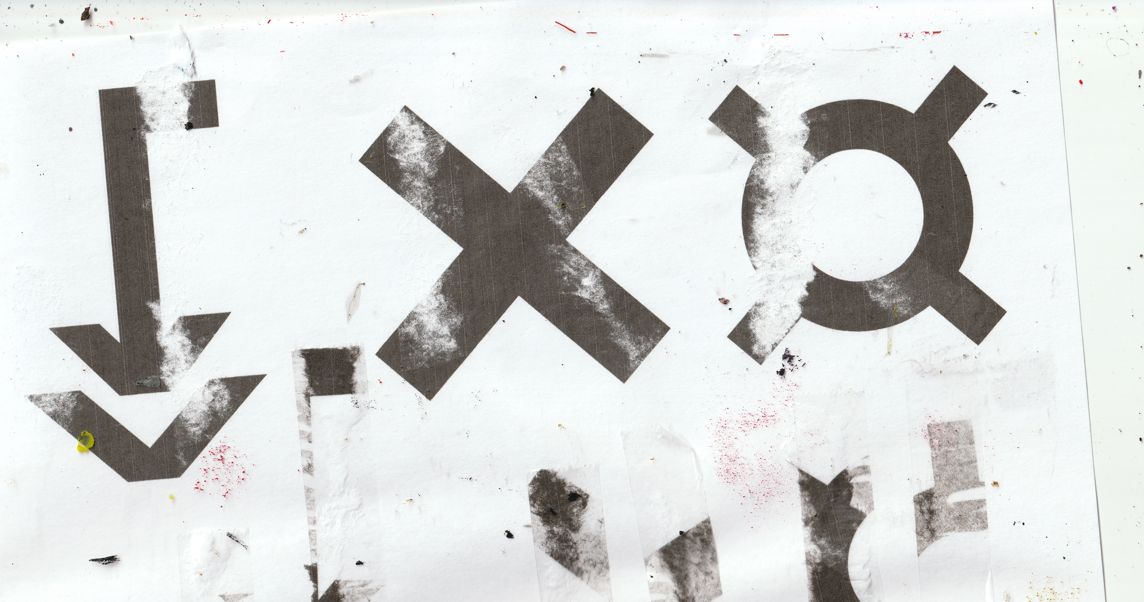
Experimental typography, deformed typefaces, and new methods for working with text.
Month 3 — Underground Scenes
Small design studios, local communities, independent artists, and internet scenes.
Month 4 — Design Meets Music
Album covers, music scenes, artists' visual identity, club graphics.
Month 5 — Digital Mutations
Internet aesthetics, generative graphics, digital artifacts, and the influence of technology on visual language.
Month 6 — Trend or Coincidence?
Hypothesis Testing: Determining which signals developed into noticeable phenomena and which proved to be isolated coincidences.
Content Types
01

SIGNAL 001 / VISUAL CULTUREThe internet is becoming chaotic again.Perfect gradients. Clean grids. Flawless 3D. Everything seems to exist in the same universe.Then, something breaks.Letters stretch beyond recognition. Images shatter into pixels. Textures look as if they were scanned, copied, printed, and scanned again. The compositions resemble the result of an all-night session, not a polished interface.The issue isn’t that sloppy design exists. It always has.The question is: why does deliberately imperfect, DIY graphics attract attention once more?#BEFOREITSATHING
02
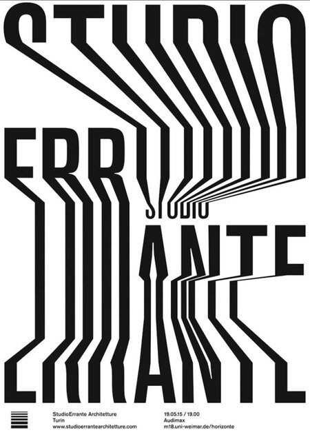
ONE DETAIL, THREE WORLDS / 001One visual device. Three different contexts.GRAPHIC DESIGNThe letters become narrow, elongated, and almost architectural.MUSICThe same distortion makes the poster literally sound before you even play the track.FASHIONTypography transforms into part of the image, rather than just a caption placed on top of it.These examples are not necessarily related. They may belong to different artists, scenes, and cultural contexts.But comparing them raises an interesting question: at what point does a visual device stop belonging to one niche and begin crossing over into different spheres?We are looking for more examples.Where else have you encountered this visual language? Send us your references.#BEFOREITSATHING
03
Survey — What will look dated first?
What will look dated first?
Imagine you are looking at design today. What will most quickly be perceived as a visual artifact of its era?
— Glossy 3D everywhere
— Perfect minimalism
— Y2K aesthetic nostalgia
— AI-generated image aesthetics
— None of the above
04
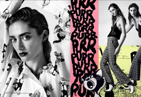
RADAR / ISSUE 001
Three directions we are currently tracking.
01 — TYPOGRAPHY AS OBJECT Letters cease to be merely a means of conveying information. They behave as forms, surfaces, and physical structures.
02 — DIGITAL DIY Scanned textures, intentionally uneven compositions, and visible imperfections challenge the notion that digital design must look flawless.
03 — POST-DARKNESS DESIGN Club flyers, independent music releases, and the visual languages of underground scenes are self-sufficient design environments, not just event embellishments.
These are starting points for investigation—not confirmed predictions.
Over the coming weeks, we will be gathering examples, seeking connections, and testing which directions truly warrant attention.
Radar is on. Nothing is confirmed yet.
#BEFOREITSATHING
05
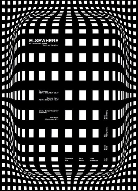
SIGNAL OR NOISE? / 001
How many examples are needed to call something a trend?
Three designers use a similar technique. An interesting coincidence.
Seven independent projects appear on different platforms. It looks like a pattern worth investigating.
Twenty examples are found on a single popular Pinterest board. Perhaps these are no longer twenty independent signals.
The quantity itself proves nothing. We need to ask different questions:
— Are the creators truly independent of one another? — Do the examples belong to different scenes and contexts? — Is the visual similarity specific or merely superficial? — Can original sources be found?
In BEFORE IT’S A THING, repetition is a reason to begin an investigation, not proof of a trend’s existence.
More examples do not always mean more evidence.
#BEFOREITSATHING
06
Audio Message Transcript:Usually, we only learn about trends once they have been packaged and presented to us in a finished form.Pinterest boards. Trend reports. A list of aesthetics we should follow this year.But visual culture doesn’t begin with a name.It begins with people creating something. With small scenes. With independent projects. With techniques moving from one context to another.Our job is to find these connections before they become obvious.Not every coincidence will become a trend. And not every trend can be predicted.But the moment when a new visual language doesn’t even have a name—that is what interests us.This is BEFORE IT’S A THING. Keep noticing what is new.
07
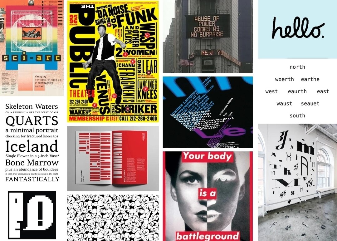
OPEN SUBMISSION / SEND US YOUR SIGNAL
Have you noticed the same peculiar visual detail in three completely different contexts?
Have you come across a designer whose work feels like it belongs to a scene that doesn’t even have a title yet?
Have you seen aesthetics move seamlessly between music, fashion, and graphic design?
Tell us about it.
What to send:
01 — Link to the original work. 02 — Screenshot or image, if available. 03 — Where you found it. 04 — One sentence explaining what caught your attention.
You don’t need to prove it’s a trend. That’s our job.
We don’t promise that every finding will be published. But the most compelling ones may be featured in future SIGNAL research.
Perhaps you’ll be the one to find the next signal for our radar.
#BEFOREITSATHING
08
SIGNAL 002 / VISUAL CULTUREWhy does design start looking like an error?Over-blurred imagery. Text that is impossible to read at first glance. Broken grid systems. Elements that seem to have landed in the wrong places by accident.Not long ago, these things were considered signs of poor design. Today, they can be part of a completely deliberate visual choice.There is a contradiction in this: a designer spends time creating the impression that they didn’t try.Perhaps it’s fatigue from visual perfection. When too many images look uniformly clean, neat, and predictable, imperfection begins to stand out.But a deliberate mistake is also a technique. Once it becomes recognizable, it can be turned into a template and then repeated as easily as any other style.Therefore, what interests us is not the aesthetic of the error itself, but the moment when the error becomes a language.We will look for examples in graphic design, independent music releases, and digital culture.For now, this is an observation, not the announcement of a new trend.#BEFOREITSATHING
09
Do you think unclear design can be good?
Answer options:
— Yes, if it evokes emotion or makes one think.
— Yes, if it is art, but not if it is functional design.
— No, design must primarily solve a problem.
— It depends on the context—there is no universal rule.
— I like it when the design doesn’t explain everything right away.
#BEFOREITSATHING
10