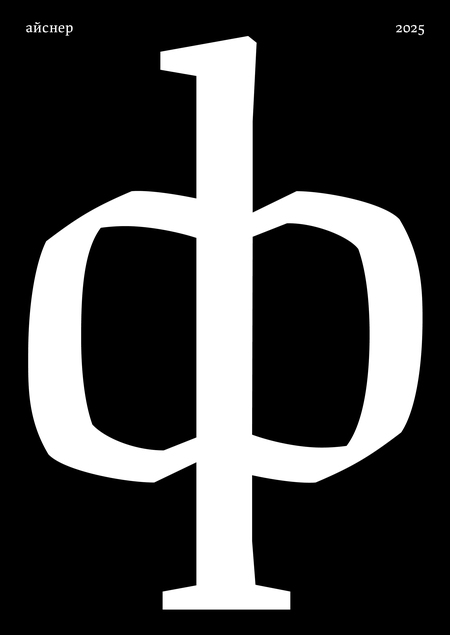
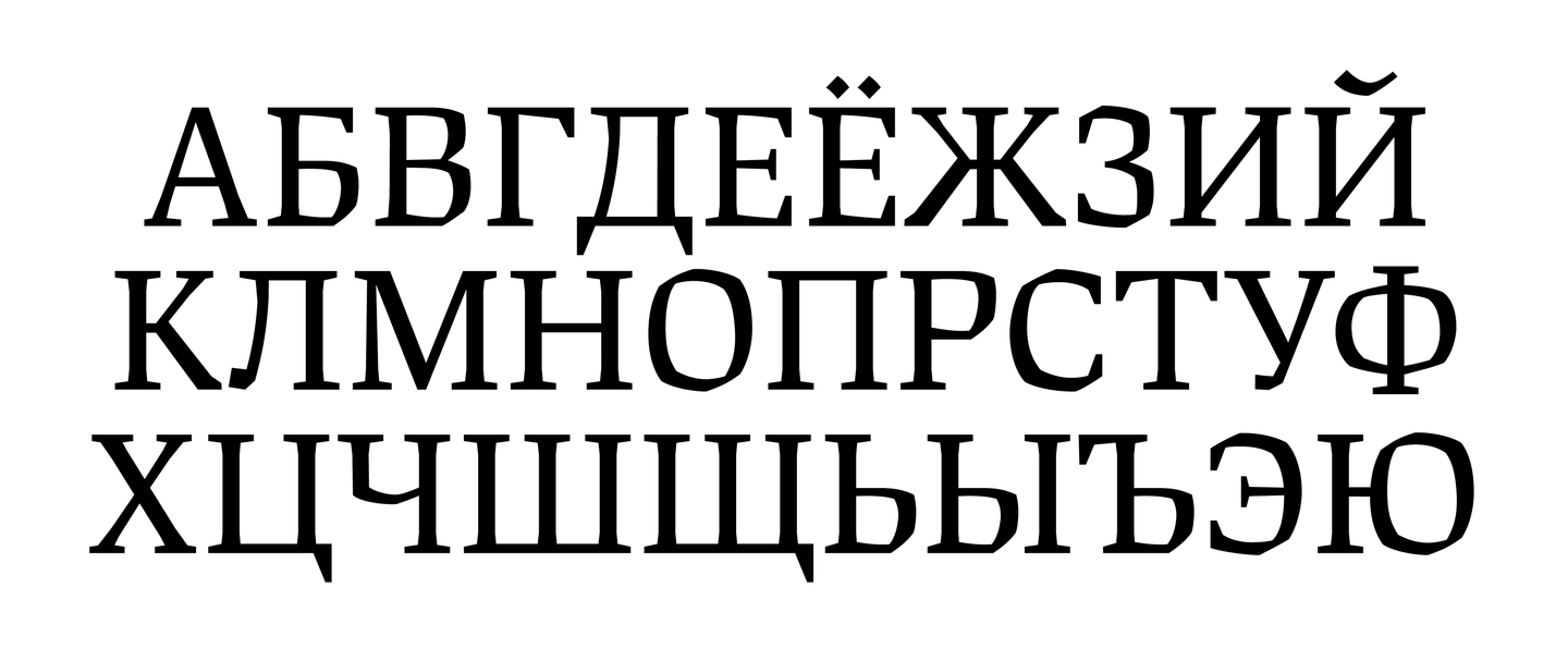
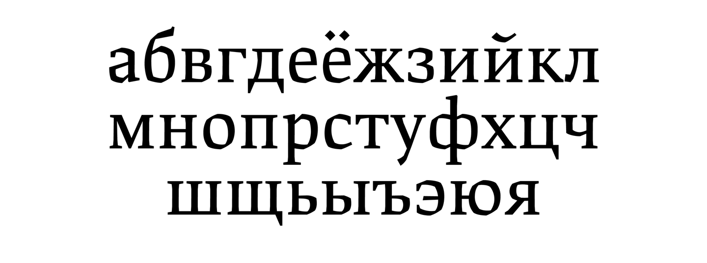
Eisner — is a modern text typeface based on the principles of letter in a wide end pen. Because of the history of the cyril, we don’t have a wide range of text-based garrisons on the kyril, although in the 'nbsp; the latinum of the logic of the wide end pen is shaped with the 'nbsp; the first centuries C.E. It lies at the heart of the European Gothic letter and the Hnbsp; the recruitment of Renaissance Antiques, developed in the Russian handwriting culture for centuries, and appeared in the many unique book handwritings. In scrift Eisner used to be a modern reader, forms are designed as if they were built by a medieval master using digital tools.

Search
When writing with a broad pen, the maximum thickness is in the sections corresponding to approximately 13 and 19 hours due to the tilting of the pen and direction of the hand. This is important when designing fonts on the basics of the wide end feather, because it allows you to reproduce the characteristic features of the strokes and they the contrusus.
Search for counter-form of letter o
The breakage of forms and the determination of lines is related to Eisner with Czech and German expressionism.
apesyman
In the framework of a diploma project on the creation of a modern kirillic text book, based on the principles of the wide end pen, has produced a booklet showing the work of the font in the set. In the quality of the curly material is selected by Gerrit Nordzey’s essay, first published in his LetterLetter (release 7 for 1988 year), which he wrote from the paper for the annual ATYPI conference. Gerrit Nordzei (1931–2022) — an outstanding Dutch printer, calligrapher and pedagogue. From from 1960 to in 1990, he led a department of font design in the Royal Academy of Arts in The Hague. In his work, he developed a theoretical model linking motion, direction, and angle of instrument with letter form. This model became the basis of his approach to analysis of the letter and typography and significant influence on development of modern font design.