
Concept
This project focuses on analyzing global gender inequality using official international statistical data. The study examines the dynamics and differences in women’s status across various countries over more than six decades, from 1960 to 2024.
Gender equality is now viewed not only as a matter of social justice but also as a key indicator of sustainable economic and social development. The level of women’s participation in the economy, access to education, rights, and political representation is directly linked to a country’s well-being, the quality of its institutions, and the opportunities available to future generations.
Data Selection and Source
For the analysis, we used the dataset, «Global Gender Equality Indicators, ” downloaded from the Kaggle platform and based on World Bank data. The dataset covers over 200 countries and the period from 1960 to 2024.
The key fields utilized in this study include: country name, year, indicator, and its numerical value. The selection of this data was motivated by its global scope and extensive time depth, allowing us to analyze long-term changes in gender inequality and compare dynamics across nations.
Initially, the dataset includes aggregated regional indicators and groupings of countries based on income levels. For accurate analysis, these aggregates were removed, and the final visualization uses only data from individual countries.
Selected visualization types and their rationale

Line Graph — To analyze temporal trends, indicators of male and female labor force participation were selected. By grouping data by year and averaging the values, the global average participation rate for men and women was calculated. Each line reflects the change in the indicator over time for the respective gender.
Scatter Plot — A scatter plot was used to investigate the relationship between women’s education level and their labor force participation. Each point on the graph represents an individual year, and the coordinates of the points correspond to the values of the selected indicators.
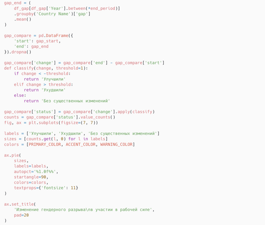
Pie Chart — To assess whether the situation regarding gender equality has improved, the gender gap was calculated as the difference between male and female labor force participation. The data was aggregated across two time periods (initial and final); subsequently, the difference between the average gap values was calculated for each country. Based on the direction of change, countries were classified into three groups.
Bar Charts — To provide a more detailed comparison of countries, a normalized gender equality index was created, based on the absolute magnitude of the gender gap. The index values were time-averaged for each country. Based on this index, the ten countries with the highest and the ten countries with the lowest levels of gender equality were identified.
Correlation Heatmap — A correlation heatmap was constructed to analyze the relationships between numerical variables. First, the numerical columns corresponding to the indicator values by year were selected from the dataset, and then the correlation matrix was calculated using Pearson’s coefficient.
Visual Design
Leonardo AI Prompt: «Abstract modern cover illustration for a presentation. Create a composition of 3 geometric squares in a line in red, blue, and yellow. Clean, minimalistic, professional design wi»
The project’s visual identity is built around the concept of analytical neutrality and research objectivity. Because the topic of gender equality involves socially sensitive and politically significant issues, the design intentionally avoids emotionally charged visual techniques and stereotypical color associations. The primary goal of the project’s visual language is not to interpret the data for the viewer, but rather to create a clear and calm environment for its thoughtful analysis.
The project’s color palette is based on bright yet restrained base colors. A deep blue tone is used as the primary color, associated with the reliability and objectivity of data. This color is applied to key graphic elements: time-series lines, main bars, and markers. The accent color is a saturated red, used sparingly to highlight important indicators, key countries, or significant years. A bright yellow is used as a supplementary color accent to underscore specific analytical conclusions or notable details. A light neutral tone has been chosen as the background color, which reduces visual strain and makes the charts comfortable for extended viewing, while a dark graphite color is used for the text, axes, and supporting elements to ensure high contrast and good readability.
Loading data
For this work, I imported the following libraries: pandas for tabular data processing, numpy for numerical computation, and matplotlib.pyplot and seaborn for plotting. I also utilized matplotlib.cm for color maps, rcParams and font_manager to configure plot styles, and os for file and directory operations.
LOADING LIBRARIES AND DATA
import os import pandas as pd import matplotlib.pyplot as plt from matplotlib import rcParams from matplotlib import font_manager as fm import matplotlib.cm as cm import numpy as np import seaborn as sns
Line Graph
In the first stage of the analysis, the gap between women and men in labor force participation is examined. To achieve this, linear charts are used to display average global values for the indicator by year. This format allows for a clear visualization of the dynamics of the gender gap over time, enabling an assessment of whether the difference between women and men is narrowing globally, as well as identifying periods of accelerated or slowed progress.
The code isolates labor force participation data for women and men from the master dataframe, df_long. Subsequently, the average value is calculated for each gender across the years. Based on this data, a line graph is constructed with years on the X-axis and labor force participation percentage on the Y-axis. The curves for women and men are colored according to predefined palettes, and labels and a legend are added.
Scatter plot
The scatter plot shows a positive correlation between the proportion of women with a secondary education and their labor force participation: in countries with higher levels of female education, their workforce activity is generally higher. There is, however, noticeable variance across countries where high education levels are not always accompanied by high employment, suggesting the influence of additional factors such as cultural norms, employment policy, or job availability. The year labels allow us to observe the dynamics: in most countries, both metrics are gradually increasing, reflecting progress in gender equality.
Because we cannot directly measure «equality»: we examine the difference between men and women and observe whether the gap has narrowed over time.
In most countries, the gender gap in labor force participation has decreased; however, in a significant portion of countries, the changes remain negligible.
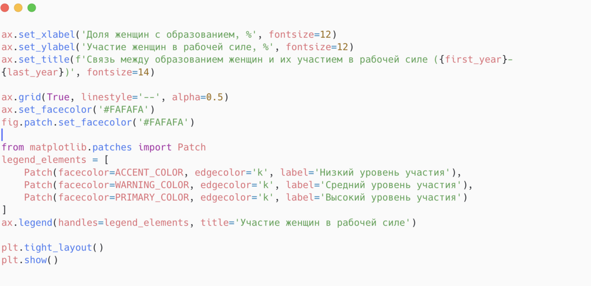
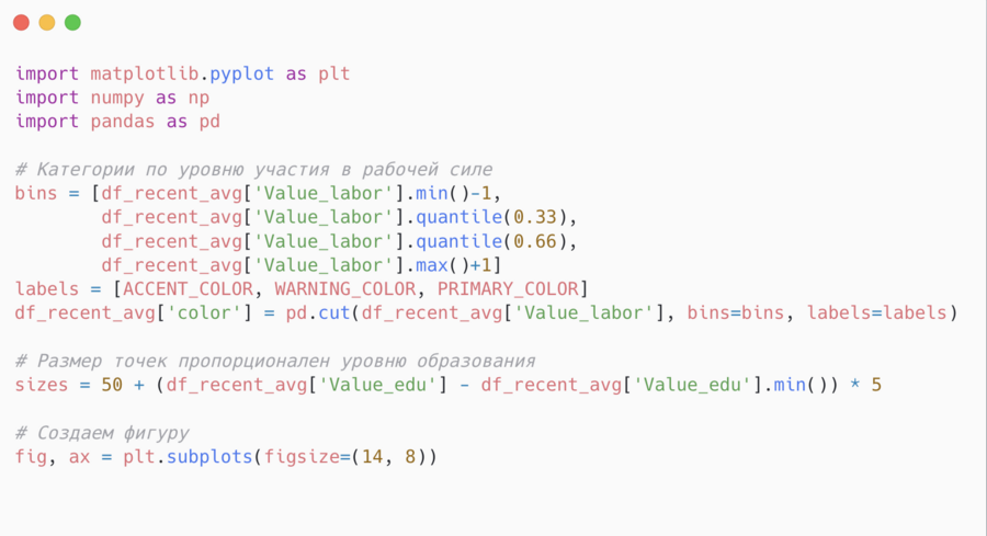
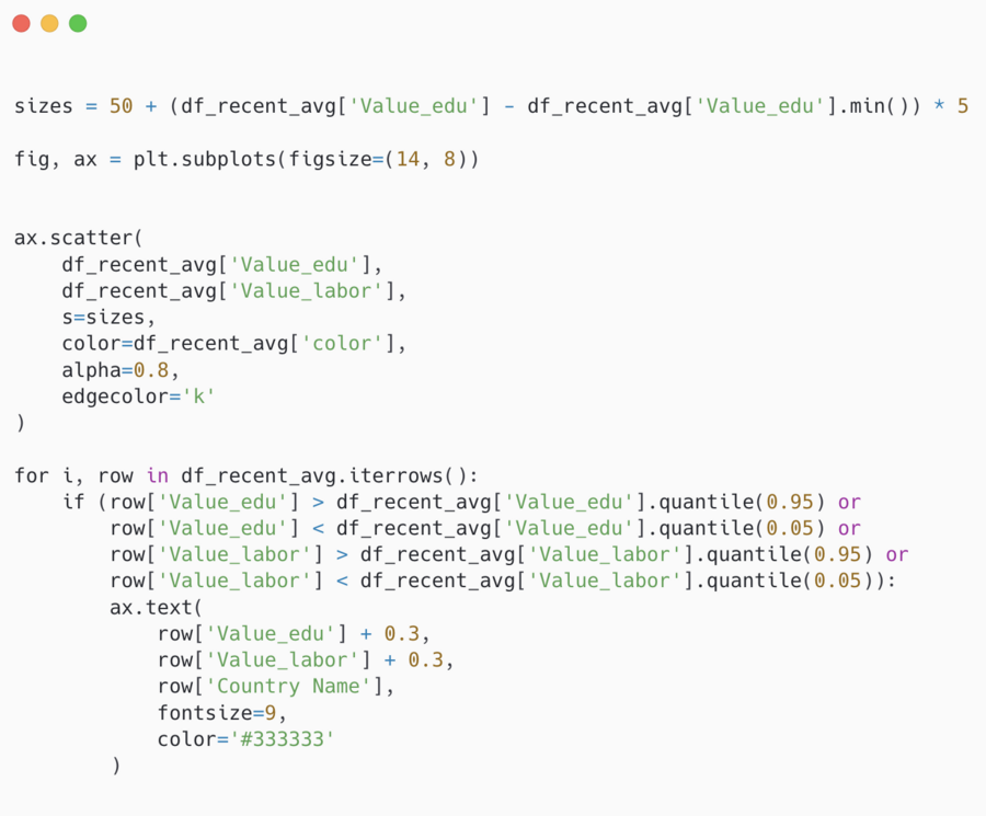
The code generates a scatter plot illustrating the relationship between women’s education level (Value_edu) and their labor force participation (Value_labor). The values for Value_labor are divided into three ranges and colored using different hues (ACCENT_COLOR, WARNING_COLOR, PRIMARY_COLOR). The size of the points corresponds to the education level. Labels indicating the country names are added for extreme values (outliers). Axes, a title, a grid, and a legend explaining the color scale have also been included.
Pie Chart
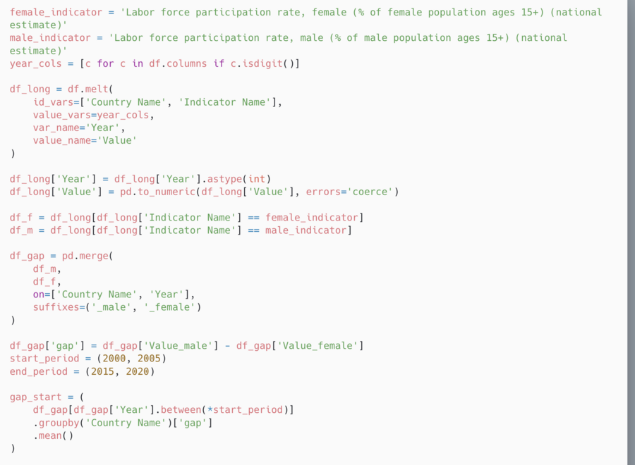
Here, we calculate the gender gap in labor force participation by country, comparing men and women. It uses the average gap values for the initial (2000–2005) and final (2015–2020) periods, calculates the change, and classifies countries into three groups: «Improved,» «Worsened,» and «No significant change.» The result is visualized as a pie chart, where colors denote the three change categories.

Bar chart
Here, a horizontal bar chart is constructed to visualize the top 10 countries by gender equality in workforce participation. The data is sorted by the normalized equality index, and the countries are arranged in ascending order for easy reading. Labels with precise values, a grid, and neat chart styling have been added. The chart allows for a quick overview of the leaders in workforce equality.