Idea
Citic is Citydrive that has moved beyond its boundaries. The letter «K» is at the heart of the project: it completes the name «Citic» and simultaneously becomes a new spark. The parent brand lives within the square icon. Citic breaks this frame: the letter «K» literally steps outside the edge, and its rays detach to form a standalone graphic symbol.
Logo
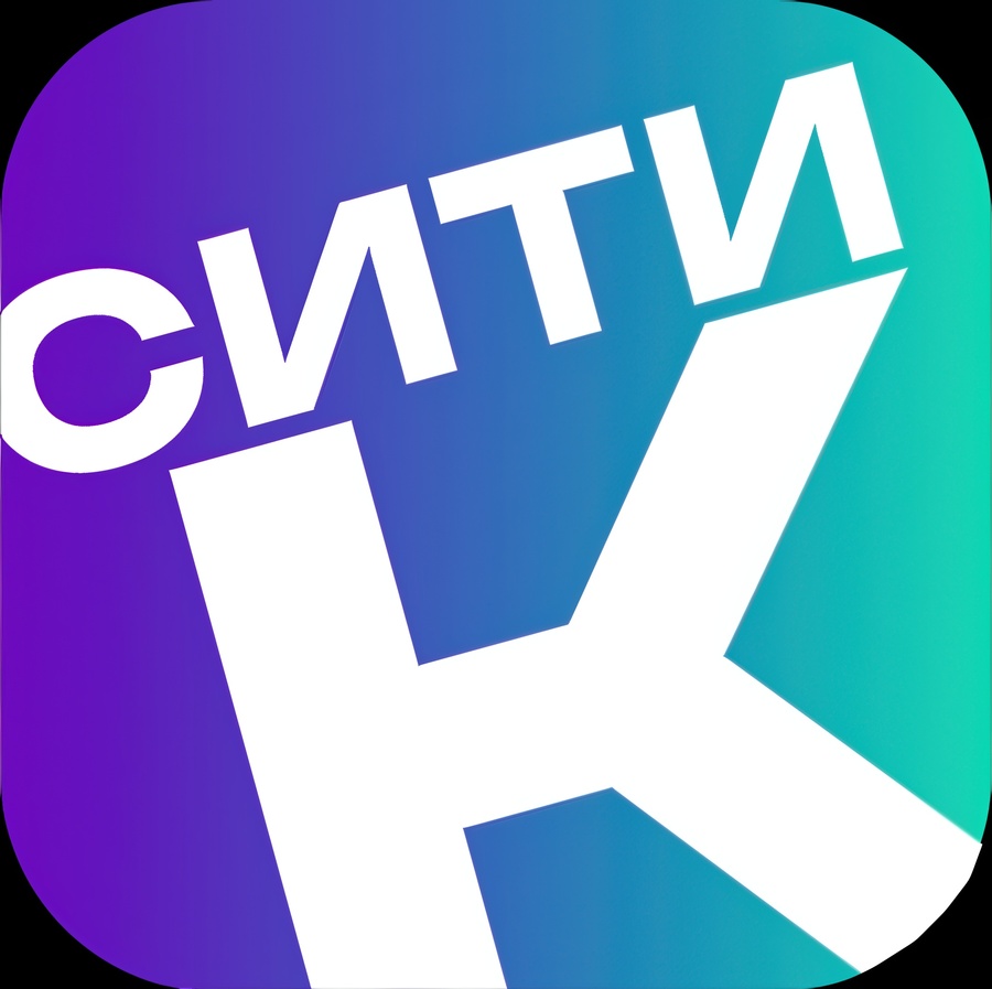
The logo retains the main recognizable element of CityDrive—a square icon with a signature gradient. This ensures that CityTic is immediately perceived as part of the family. Inside, instead of the two-line text «CITY / DRIVE, ” there is the short word „CITY“ and a massive „C.“ The letter does not fit within the square and extends beyond its boundaries—this is the project’s key gesture.
Graphic element
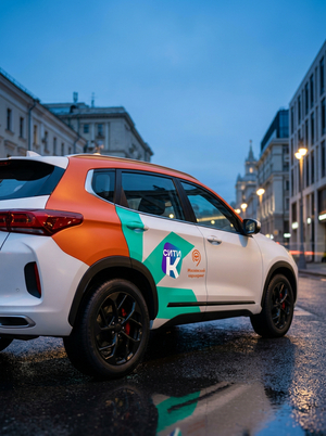
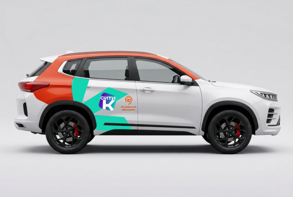
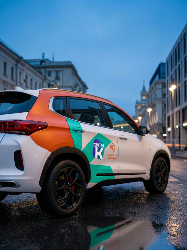
The Spark City icon is born from a single letter: the rays of the letter «K» are separated from its base and assembled into a new figure. On the icon, it reads as a letter; on the vehicle body, it reads as a spark above the wheel. The element retains the logic of the original CityDrive spark: the rays diverge from a single center, maintaining the rhythm of the gaps. However, it is sharper, more dynamic, and more asymmetrical.
Color Palette
The color palette is built upon two hues. Purple is a direct inheritance from the CityDrive icon, establishing a link to the parent brand. Turquoise is drawn from the CityDrive brand book’s supplementary palette. I did not introduce a foreign color; rather, I brought to the forefront a color that was already within the system but remained relegated to the background. In my view, that is the logic of Citytika.
#00D7B4

#6E00BE

Brand typeface
The signature typeface for Citic is Bounded Bold. It is a wide geometric grotesque with a dense, confident silhouette. It is highly legible from a distance, while moving in a vehicle, and even in small sizes within an interface.
Car Wrap