Editorial design · Typography · Visual identity
01. About
Design begins with content.
I am a graphic designer interested in editorial design, typography and visual storytelling. I turn ideas and complex content into visual solutions for publications and cultural projects.
03. Selected work
Three projects. One approach.
From an independent magazine to a book and a printmaking community, each project begins with an idea and finds its own visual language.01 — ZONE 0
02 — 4×4
03 — PECHATNYE DELA
01 — ZONE 0
ZONE 0
An editorial project about liminality, memory and identity
Team project
Created from scratch in a team of three. My primary focus was typography.
The challenge
How can a magazine give structure to an abstract subject — the in-between state between «not yet» and «already» — while allowing readers to approach it from different perspectives?
My contribution
I focused on the magazine’s typography, developing the typographic language that supports its editorial structure and helps guide the reader through the content.
Original size 2304x1334
The concept
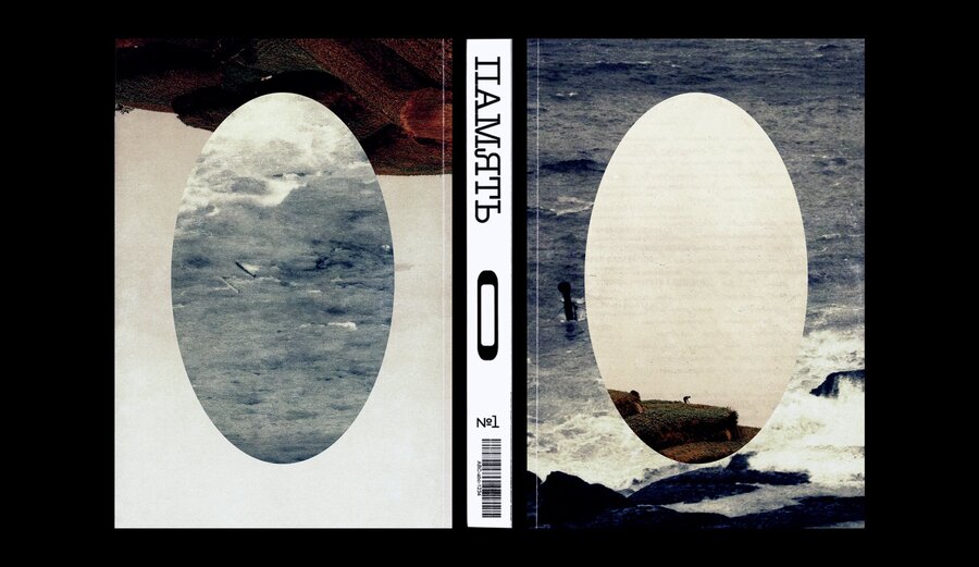
ZONE 0 explores existential crossroads and the conflicting meanings that can coexist within a single idea. Its themes converge towards zero: a point associated with nothingness, nirvana and the absence of change.The structure
The magazine is divided into two mirrored parts: Not Yet and Already. Each contains three sections — Knowledge, Culture and Identity. At the centre, where the two parts meet, is ZONE 0. The mirrored structure allows readers to begin from either perspective.Original size 1920x1360
The sections
The magazine is divided into two parts: «Not Yet» and «Already.» Their contents mirror each other, with each part comprising three sections: Knowledge, Culture, and Identity.At the centre, where the two parts meet, lies «0.» The mirrored layout allows the reader to begin from either perspective — «Not Yet» or «Already.»Original size 2058x1326
Grounding
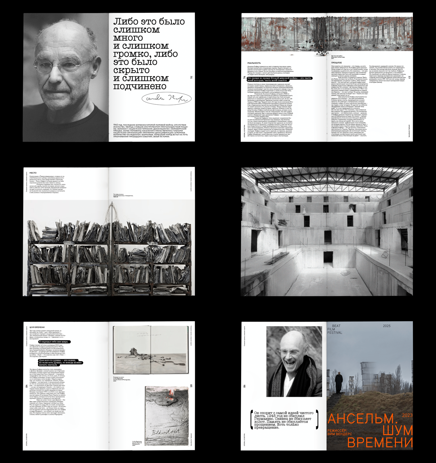
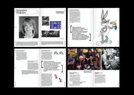
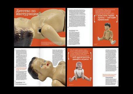
How does memory shape the foundations of identity? From childhood bike rides to meeting a partner, personal moments give us a sense of stability. Photographs, stories and family archives make memories tangible, helping us preserve our identity in a changing world.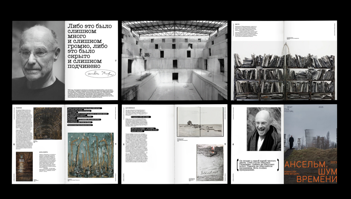
1/2
Distortion
Memory is not a reliable archive. It is selective and unpredictable: it erases some things while holding on to others, guided by emotion and chance associations. This section explores how memory shapes everyday life — from forgotten names to intrusive recollections.Original size 1920x1360
Original size 2304x1633
ZONE 0
A space for readers and editors to reflect on the issue’s theme.
The design approachThe mirrored editorial structure turns the magazine’s central idea into a reading experience. Readers can enter from either side and move towards the shared zero point. The three recurring sections provide a consistent framework for exploring different aspects of the theme.
Original size 2096x1024
Original size 2094x1088
Outcome
An editorial concept and magazine structure that translate the abstract idea of liminality into a navigable publication.Original size 2096x1094
4×4
A book about existential themes and the arts
An independent project
The challenge
How can four fundamental conditions of human existence be explored across different art forms without reducing them to simple answers?
The concept
I brought together Irvin D. Yalom’s four «ultimate concerns» — death, freedom, isolation, and meaninglessness — with four art forms: painting, photography, cinema, and literature.
Original size 1600x1134
Original size 1600x1134
The structure
These two groups form a 4×4 matrix. Each existential concern intersects with each art form, creating sixteen points of encounter — from Böcklin’s Isle of the Dead to Lynch’s Lost Highway, from Tolstoy to Kharms.
The idea behind the book
The book does not offer definitive answers or resolve existential conflicts. Instead, it creates space to stay with difficult questions and shows how art can help us live with them.