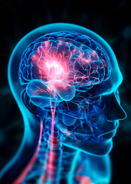
Description

According to the World Health Organization (WHO), stroke ranks as the second leading cause of death worldwide. This topic interests me not only from a scientific perspective but also holds deep personal significance. My family has also dealt with this condition; my grandmother suffered a stroke in her left cerebral hemisphere. Stroke is a severe pathology that can lead to devastating consequences for the body, potentially resulting in complete loss of capacity. It is crucial to diagnose stroke in a timely manner because early diagnosis and risk factor analysis can help prevent a stroke or minimize its impact. Perhaps the results of such an analysis will be useful to others, helping them identify threats and protect their loved ones in time.
For this analysis, I selected the Stroke Prediction Dataset hosted on the Kaggle platform. This dataset provides information on various factors that influence the probability of stroke and is perfectly suited for a prediction task.
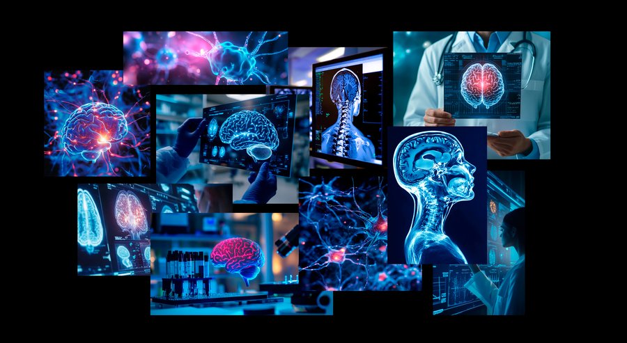
Generated Images in Midjourney1

Color Palette
I drew inspiration from MRI scan imagery, executed in a blue-cyan palette with pink accents highlighting focal areas. To develop the conceptual style guide, I referenced images generated using Midjourney, which helped set the project’s tone and define the color scheme.
My aim was to convey the sensation of a clinical environment while hinting at technological sophistication. The project’s color palette incorporates shades #C63D73, #FED2EA, #00B1F1, #0053B9, and #003680, which were utilized for graphics and presentation design.
1 prompts:
— a detailed MRI scan of a human brain, viewed as medical imaging. The color palette includes shades of blue and pink, maintaining realistic medical details. The brain structure is clear and intricate — illustration of the human brain, showing intricate neural connections and glowing cells. The background is a dark blue with subtle red lights representing some parts in focus — close-up of doctors examining an MRI scan showing the brain in a medical setting, with a blue color palette, high-resolution photography — blue and red glowing neurons in the brain, macro photography, hyper-realistic
During the data analysis, I selected specific types of charts because they seem the most suitable and informative for visualization, namely:
— Pie charts — Donut charts — Line graph — Correlation matrix — Scatter plot — Bar chart
Data Processing
I imported the necessary libraries: numpy, matplotlib, pandas, matplotlib.colors, and seaborn, and then loaded the data from the CSV file «HT_DS.csv» into the df variable for easy table manipulation.
After uploading the data, I began preparing information for the pie charts. I created subsets to analyze the distribution by gender, hypertension, cardiovascular diseases, marital status, and type of residence, saving the results into variables GD, HT, HD, EM, and RT.
Next, I processed the data for two donut charts. The distribution by smoking status is stored in the Smoke variable, and the distribution by work type is in the WT variable.
To build a line graph and ensure all values have been correctly converted to a numeric format, I applied the pd.to_numeric function with the errors='coerce' parameter, which automatically replaces invalid data with null values. I then calculated the count of unique matches using value_counts () and sorted the data by index using sort_index (). I saved the result in the Ages variable.
For the heat map, I filtered the data for people who had suffered a stroke and saved it to the variable MK. Then, I filtered the data for people with a stroke, keeping only the significant features, and saved that to the variable MK1. After that, I calculated the correlation matrix using the .corr () method and saved the result in the matrix variable.
When creating the bar chart, I processed data on age and body mass index (BMI) for male and female stroke survivors. For each group, I calculated the average BMI by age, grouping the data using .groupby ('age') and the .agg ({'bmi': 'mean'}) method. After filtering, I applied the reset_index () method to make the resulting data easier to work with. The final results were saved into the variables MData (for males) and FMData (for females).
To construct the scatter plot, two variables were formed. x_AG contains the ages of patients with stroke, and y_AG contains the average blood glucose levels in their blood.
Data Visualization
— Schedule No. 1
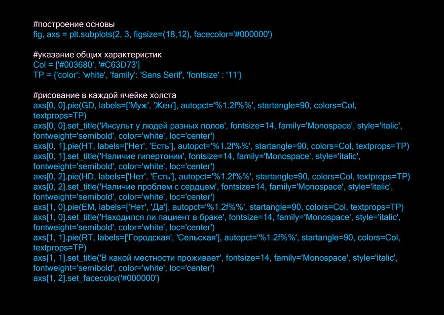
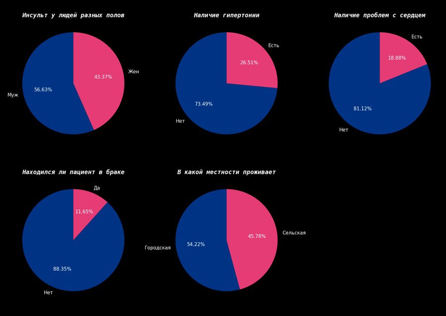
Pie charts. Distribution of stroke patients by sex, presence of hypertension, heart disease, marital status, and type of residential area.
Based on the pie charts provided, several interesting conclusions can be drawn:
Men were more susceptible to stroke (56.63%) compared to women (43.37%), which may be linked to differences in lifestyle and risk factors between the two genders.
A large majority of stroke patients (73.49%) did not have hypertension; however, it was present in 26,51%, confirming hypertension as one risk factor, but far from the only one.
Heart problems were identified in only 18,88% of patients, whereas the vast majority (81.12%) did not have cardiovascular diseases, suggesting they are less prevalent among individuals who have suffered a stroke.
Interestingly, only 11,65% of patients were married, while 88,35% were unmarried, which theoretically could suggest the influence of social and psycho-emotional factors on health.
It is also worth noting that the incidence rates of stroke among those living in urban areas (54.22%) and rural areas (45.78%) suggest a minor influence of geographic location on the likelihood of having a stroke.
— Schedule No. 2