Introduction
Since I am currently studying «Branding in the Fashion Industry, ” and fashion, as is known, constitutes a massive segment of global business, I became interested in observing the growth dynamics of brands, their positioning in popularity rankings, and the specific segment from which the brands for the sample were selected. For all these points, I chose to display the information using various data visualizations.
For the analysis, I selected a dataset containing growth characteristics of various brands. The data was sourced from the Kaggle website.
Types of Diagrams
For the analysis, I selected the following chart types:
— Bar chart — to display the percentage of times a specific brand ranked highest in the rating — Pie chart — to show which brand segments are most numerous — Histogram — to display the growth of each brand from 2001 to 2021 — Line chart — to illustrate the growth of the Louis Vuitton brand
Stages of Work
Initially, I exported the file in XLSX format. Afterward, I wrote code in the command line interface to get a preliminary overview of the data.

Chart 1: Which brands ranked highest
The bar chart was the first to appear, illustrating which brands ranked highest on the list.
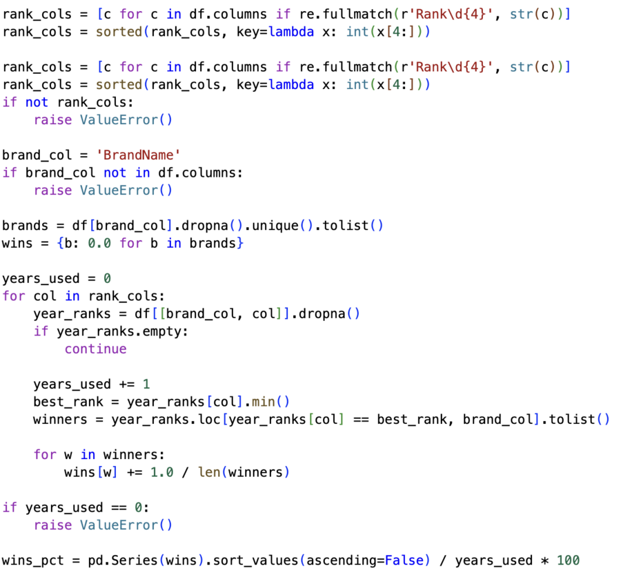
The chart shows that only three brands from the sample were recognized as the best over 20 years.
Schedule 2: Brand Distribution by Sector
Next, we have a pie chart that displays the percentage of brands falling into various segments.
The diagram shows that the sampled brands were primarily from the Luxury segment.
Chart 3: Brand Growth Over the Last 20 Years
The following chart is a histogram that illustrates the growth observed in brands over the past 20 years.
The graph shows that four brands experienced negative growth.
Schedule 4: Louis Vuitton Brand Positioning Dynamics
This scatter plot displays the positions that the Louis Vuitton brand held over the 20 years studied.
The chart shows that in 2005, the brand rose significantly in the rankings and has maintained its position ever since, only growing.