Navigator
Research Concept
European Modernism and Its Transition into American Visual Culture 2.1 Art Deco, Avant-Garde, and the New Graphic Form 2.2 Bauhaus, Constructivism, and Functional Typography 2.3 MoMA as a Conduit for Modernist Language in the U.S.
The American Magazine as a Space for Experimentation 3.1 Fortune: Industry, Machine Aesthetics, and the Image of Modern America 3.2 Vanity Fair: Photography, Rhythm, and the New Spread Composition 3.3 Harper’s Bazaar: Alexey Brodovitch, Negative Space, and Montage 3.4 Vogue and Seventeen: Cipe Pineles and the Expansion of Magazine Modernism
Comparative Visual Analysis 4.1 Geometry, Asymmetry, and the Diagonal 4.2 Photography, Photomontage, and Movement 4.3 Negative Space, Typography, and Page Rhythm
Conclusions
Bibliography of Textual Sources
Image Source List
Concept
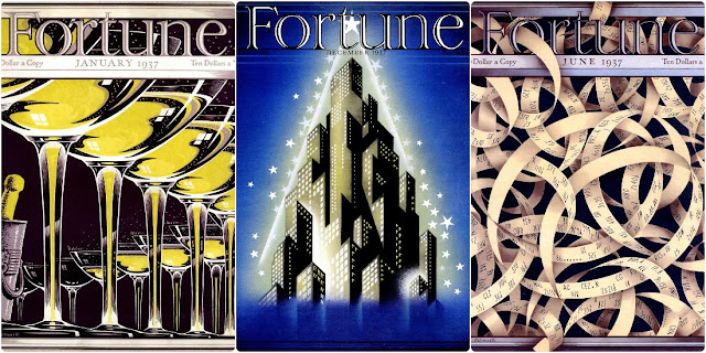
Fortune Magazine Covers from the 1930s
This visual study is dedicated to American magazine design from the 1920s–1940s, treating the magazine not merely as a printed publication but as a unique laboratory where the ideas of European modernism were translated into the language of mass culture. The focus of this research centers on Fortune, Vanity Fair, and Harper’s Bazaar, because it is in these publications that the transition from decorative magazine graphics to a new visual thinking—based on photography, asymmetry, negative space, montage, geometry, and the active role of the spread—is most clearly manifested.
The core idea of this research is that a 1930s American magazine becomes a space where avant-garde moves beyond being the language of a narrow artistic circle and begins functioning as a tool for modern communication.
European art movements proposed new ways of organizing form, but it was the magazine medium that allowed these approaches to become part of daily visual experience. The cover, advertisement strip, table of contents, photo essay, and fashion spread all become sites of experimentation. The page is no longer perceived as a passive surface for text; it begins to function as a stage where image, typeface, negative space, rhythm, and scale engage in complex relationships with one another.
The context of American modernization in the 1930s holds particular significance for this concept. This was a period marked by growing interest in industry, technology, speed, architecture, mass production, and the new urban lifestyle. The «Machine Art» exhibition at MoMA in 1934 presented utilitarian mechanical objects as subjects for aesthetic perception, emphasizing the beauty of industrial forms, materials, and precise constructions. This perspective is crucial for analyzing Fortune, where industry and economics are represented not just as publication themes, but as a visual code—skyscrapers, factories, machinery, advertisement strips, and Margaret Bourke-White’s photography shape the image of America as a machine age country.
Another important layer of the study concerns the institutionalization of Modernism in the United States. MoMA consistently presented key trends in European art and design to American audiences—the exhibition Cubism and Abstract Art in 1936 was conceived as a historical overview of modern art and its development, and the Bauhaus exhibition, spanning 1919–1928 but opened in 1938, showcased nearly seven hundred objects from the school, including works in metal, glass, textiles, wood, paper, and other materials.
Journal design is part of a broader process through which America embraced modernism via museums, exhibitions, designer emigration, and commercial printing.
The visual exploration will center on the question of how magazines translated complex artistic ideas into an accessible and appealing mass format. Fortune will allow us to unpack the theme of mechanical aesthetics and the industrial image of modernity. Vanity Fair will enable us to examine Mehemed Fehmy Agha’s work involving spreads, photography, and composition. Harper’s Bazaar will serve as a key example of how Alexey Brodovitch transformed the fashion magazine into a space of visual dynamism, where negative space functions not as an absence, but as an active expressive medium. Special attention will be paid to Cipe Pineles, whose work illustrates that American magazine graphics were shaped not only by the presence of male art directors but also through the contributions of female designers working with fashion, youth culture, and the evolving reader.
The concept of the VI is to investigate the magazine as a medium that made modernism visible, accessible, and commercially potent. The American magazine of the 1930s is not merely a secondary carrier of artistic ideas, but an independent platform for their reprocessing. It connects European avant-garde, museum context, advertising, photography, fashion, and mass readership.
The journal can be called a laboratory of modernism—it tested new compositional techniques, redefined the role of the image, dismantled the traditional page grid, and helped forge a visual language that significantly shaped the future of graphic design.
European Modernism and Its Transition into American Visual Culture
Art Deco, Avant-Garde, and the New Graphic Form
The 1925 Paris World’s Fair
The formation of American magazine modernism begins with a broader shift in early 20th-century visual culture. Art and design increasingly turned to the imagery of modern life—the city, speed, transportation, advertising, technological progress, and the mass audience. Design gradually stopped being merely decoration and became a language that quickly communicated the ideas, moods, and rhythms of the era.
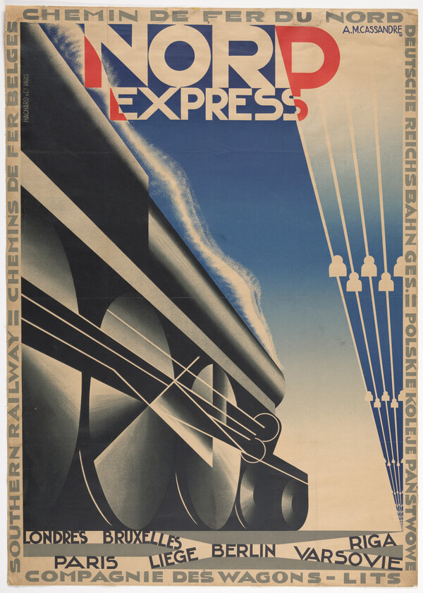
Art Deco became one of the first visual languages in which modernity took on an appealing commercial form. The 1925 Paris Exposition cemented the interest in decorative geometry, quality of execution, luxury, and renewed craftsmanship. This was significant for magazine culture because Art Deco easily translated to covers, posters, advertisements, and spreads. In this presentation, this context is established through the 1925 World’s Fair, as well as through examples by Edward McNait Kauffer and A. M. Cassandra, whose graphics illustrate the transition from the avant-garde to commercial design.
A. M. Cassandre, Nord Express, 1927
Edward McKnight Kauffer, Winter Sale at Derry & Toms, 1919
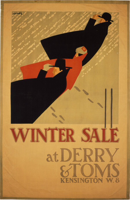
Avant-garde movements fundamentally changed the principle of representation. Cubism dismantled the singular viewpoint, proposing that form be conceived as an amalgamation of fragments, planes, and geometric relationships, while Futurism infused this with the sensation of speed, energy, and the movement of the modern world. The poster became a crucial mediator between the avant-garde and mass culture. In the works of Kauffer and Cassandra, complex artistic techniques became clear, expressive, and commercially effective.
The poster artist is an operator; he doesn’t issue a message, he merely transmits it.
Bauhaus, Constructivism, and Functional Typography
The Bauhaus and Constructivism imbued new graphic design with strict logic. Design came to be understood not as mere decoration, but as a means to clearly organize information. From this, the key techniques of magazine modernism emerged: functional typography, asymmetry, geometric structure, photo montage, and expressive negative space.
Constructivism rejected ornamentation in favor of action. The poster, book, magazine, and advertisement became perceived as visual constructs, where every element worked toward a specific meaning—guiding the eye, setting a rhythm, and amplifying the message. Diagonal lines, large typefaces, photography, and contrasts in scale transformed the page from a flat text surface into a dynamic space.
Herbert Bayer. Bauhaus, Zeitschrift für Bau und Gestaltung. Cover, 1928
Bauhaus transformed the modernist idea into a system where art, architecture, design, and typography worked together. Clarity became paramount: the typeface should not embellish, but accurately convey the message. László Moholy-Nagy’s thought expresses this logic: «Typography is a tool of communication. It must be communication in its most intense form.»
The cover of Herbert Bayer’s Bauhaus Magazine from 1928 demonstrates this principle through the integration of typography, geometry, volume, and negative space into a single composition.
MoMA as a Conduit for Modernist Language in the United States
In the 1930s, the modernist language spread in the United States not only through magazines and designers but also through museum institutions. MoMA played a particularly significant role, presenting modernism as a new way of seeing the world—a place where art, architecture, photography, typography, product design, and industrial form become parts of a singular visual culture.
The exhibition Machine Art, opened at MoMA in 1934, became an important example of this approach. Mechanical and everyday objects were displayed as aesthetically significant forms, almost like sculpture. Because of this, the industrial object began to be perceived not just as a utilitarian item, but as an image of modern beauty.
Installation view of the exhibition Machine Art, MoMA, 1934
Another significant event was the 1936 exhibition, Cubism and Abstract Art, organized by Alfred Barr. It featured nearly 400 works, encompassing painting, graphic arts, sculpture, architecture, furniture, theatrical design, and typography. This exhibition presented modernism not as a collection of disparate movements, but as a historically interconnected system of forms. Barr’s famous diagrammatic approach was particularly significant, charting the different trends of contemporary art as a network of influences. For graphic design, this logic resonated strongly because it translated art history into a visual schema—almost into infographics. Here, modernism became not just the subject of the exhibition, but also a method of knowledge organization.
Cubism and Abstract Art, MoMA, 1936
In 1938, MoMA hosted the exhibition Bauhaus: 1919–1928, which presented Bauhaus as a model of contemporary design thinking, where form, material, function, and communication are interconnected. For American audiences, it became a universal method for working with architecture, design, typography, and visual environments.
MoMA played a role in creating a cultural backdrop where modernist form gained authority and became accessible to the general public. Abstraction, geometry, the industrial object, and experimental composition ceased to be purely radical endeavors.
Bauhaus Magazine Cover, 1928
The American Journal as a Space for Experimentation