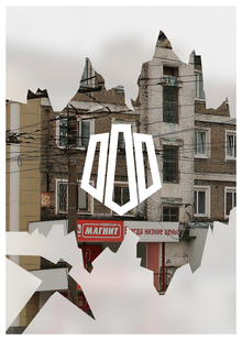
Developing the visual identity for the «Vdokhnovenie» cultural center to serve as the foundation for territorial branding in the Yasenevo district.
The Assignment To develop a cohesive visual identity for the cultural center that connects it to the Yasenevo district and serves as the starting point for the entire territory’s branding. The goal was to overcome the fragmentation of the center’s existing communications, create a recognizable graphic system, solve navigation and event information challenges, and establish a local identity for the district—making residents want to stay and encouraging newcomers to visit.
Target Audience
Primary: Residents of Yasenevo of various ages—families with children, young people, adults, and the elderly; visitors and staff of the cultural center. Secondary: Residents of neighboring districts and Moscow visitors, local creators, event organizers, and center partners; individuals who interact with the district through the urban environment, navigation, transportation, and digital communications.
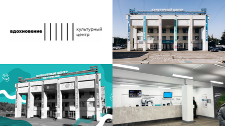
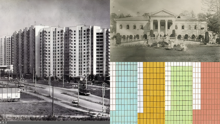
The project is built upon contextual environmental branding. At its core is an investigation into the historical and architectural context of Yasenev: its first mention in 1331, the estate buildings, the panel housing, and the unique modification of the I-700A series, the complex relief, the status as the highest point in Moscow, as well as the color coding of the area’s sections developed by architect Yakov Belopolsky. The starting point chosen is the location of the cultural center—the former «Hanoi» cinema, which historically served as the cultural life center of the district.
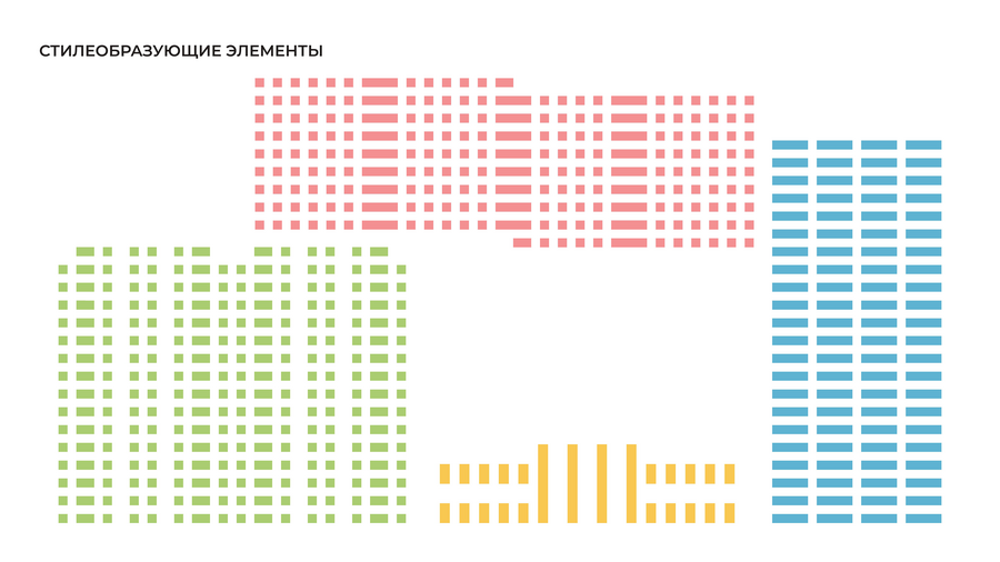
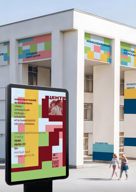
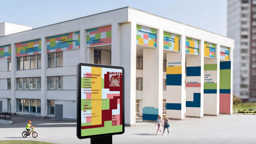
Three visual motifs were selected: the cultural juxtaposition of different architectural layers, the effect of height variation, and the color coding of the district. Based on these, a modular graphic system was created, featuring overlapping elements offset by half-grids, an adaptive «I» mark, and a unified grid for all carriers.

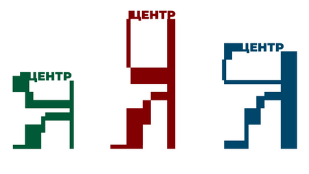
Title «I Center»The word «I» simultaneously alludes to Yasenov and the pronoun «I, ” symbolizing the center as a place for personal development. The variability of the sign represents the multitude of residents within the overall structure of the district, while the unified modular grid ensures cohesion. Blue, burgundy, and green colors help instantly categorize the event type: master classes, lectures and quizzes, screenings, and the summer program.
The layers of the buildings, the change in elevation, and the color coding reflect the uniqueness of Yasenev and allow for an escape from the monotony of the residential area while maintaining the legibility of the urban environment.
Extending the system into the physical environment. Navigation, stops, parks, transit, packaging, merchandise, and digital media bring the brand into everyday life. Unique patterns for stops and navigation solve the problem of orientation within a monotonous environment and enhance the district’s identity.
Halftone overlay transmits the heterogeneity and cultural layers of the neighborhood while maintaining the legibility of the urban graphics.




The website and social media platforms are unified by consistent graphic principles, ensuring brand integrity and providing a venue for local creators.
An identity system was developed, encompassing: an adaptive «Ya» symbol, modular graphics, three poster types, facade and media screen design, wayfinding, elements for public stops, a summer program, and park signage, along with vehicle wrapping, packaging, apparel, souvenirs, and the «Ya Center» website and social media. The system unifies the cultural center and the district under a singular visual code, establishing the foundation for the future territorial branding of Yasenevo.
Polina Filippova
Curator: Ilya Alekseevich Orlov
2026
Stroganov State Academy of Arts