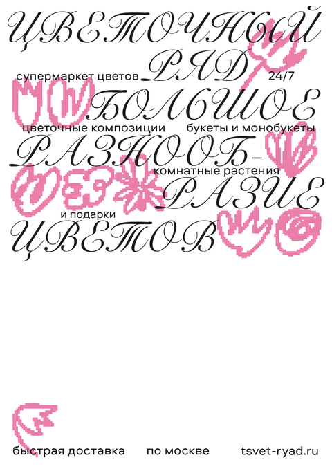
The essence of the brand: The language of flowers — flowers instead of words. It speaks directly to feelings and carries a deep meaning, conveying your attitude to a person, helping you to say even things that you do not dare to say. And all you need are a few colors…
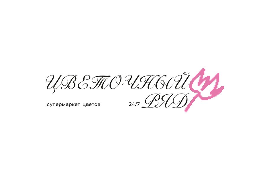
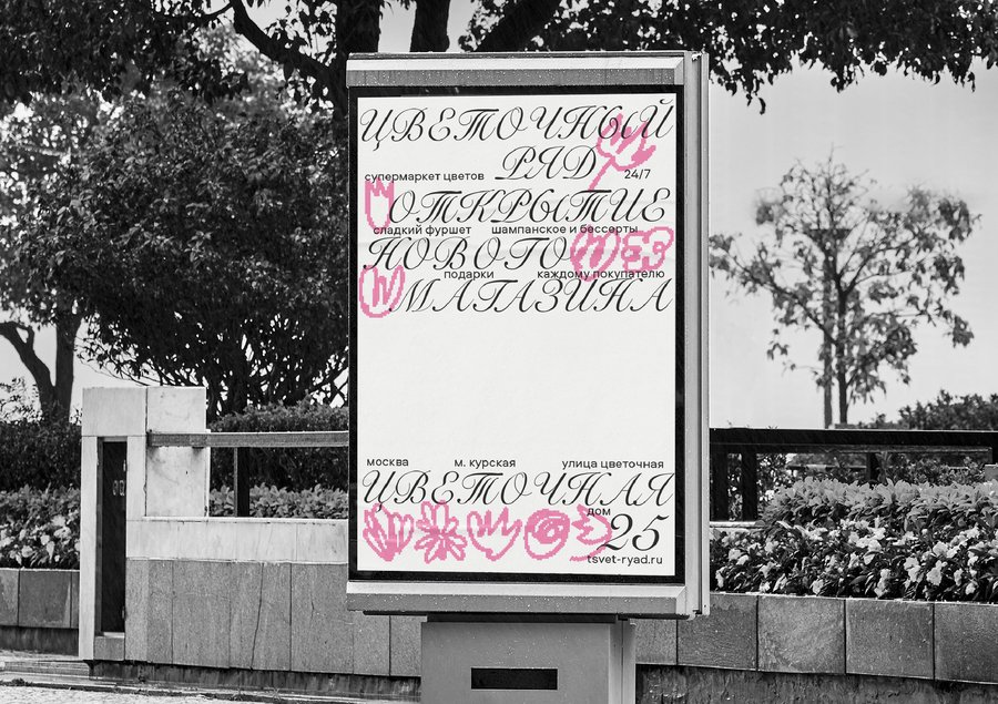
Graphic language: Elegance and tenderness in a font that resembles flower petals + modernity, boldness, and grunge of pixel colors.
Original size 2480x1750
Original size 2480x1750
Original size 2480x1750
Original size 2480x1750
Original size 2480x1750
Original size 2480x1750
Original size 2480x1750
Original size 2480x1750
Original size 2480x1750
Original size 2480x1750
Original size 2480x1750