Flexible, adaptive, universal
design system for the series publication of
museum catalogs
This project involves structuring exhibits
from museums around the world into collections
Each book is a catalog of a single collection
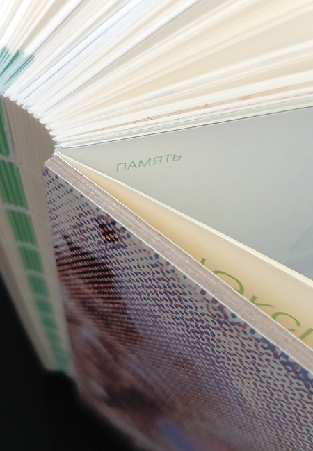
Open spine with color-coded historical periods
70×90/16 Format
Pragmatica Line
272 lines / 17 notebooks
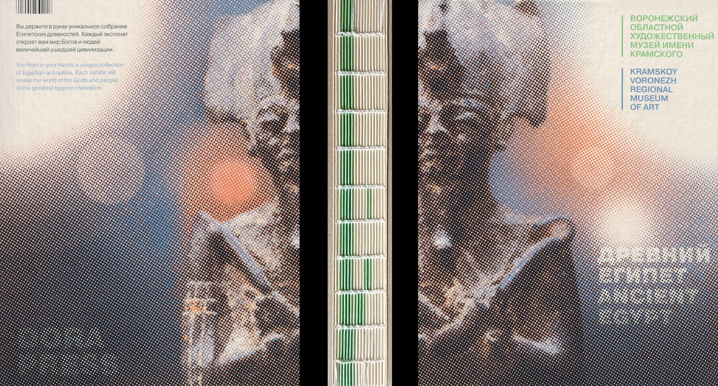
Additional information is provided on the back cover, the front cover, and the title spread.
Publications are not limited to Ancient Egypt. Catalogs can also be organized by collections from Ancient China, Antiquity, the Renaissance, Tsarist Russia, and other collections.
A unified design style will help visitors navigate the publication easily, deeply immerse themselves in the theme, and explore the museum’s exhibits that interest them—while also viewing collections from other countries without crossing borders. Thus, the art and culture of other nations can be closer than you might think.
The design system is based on three core principles.
/1/STRUCTURE
3 основных раздела
АРХЕОЛОГИ / МУЗЕЙ / ЭКСПОЗИЦИЯ
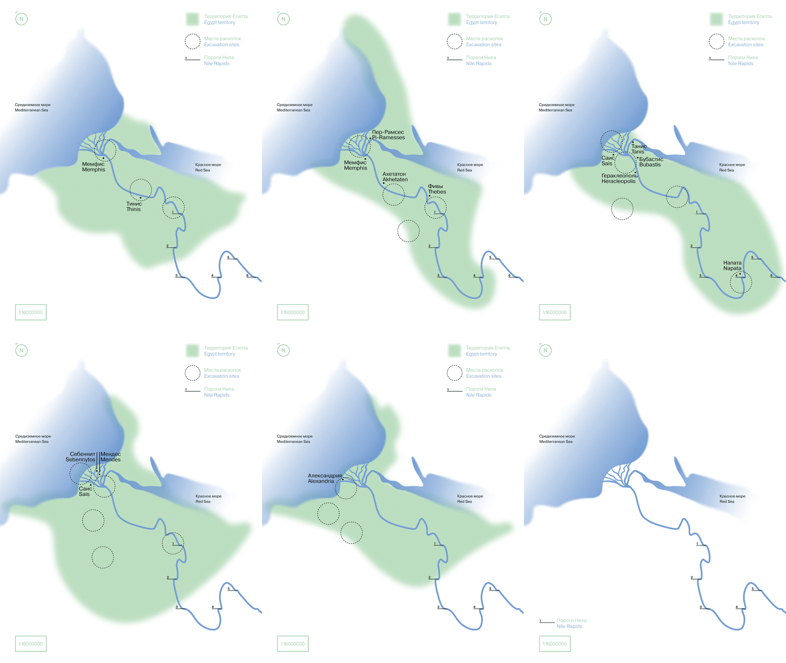
The exhibition section is not separated by a title block, but features color coding on the spine and internal divisions
by historical period.It is accompanied by a map of the region
showing excavation sites and the major capitals of the period.Through this dynamic layout, the reader can trace the changes in the country’s territory, the shifting locations of the most significant archaeological sites, and the succession of capitals and influential cities.
Technical Sections
/2/COLOR THEORY
4 краски Pantone встраиваются в схему
Цвета подбираются к каждой теме каталога
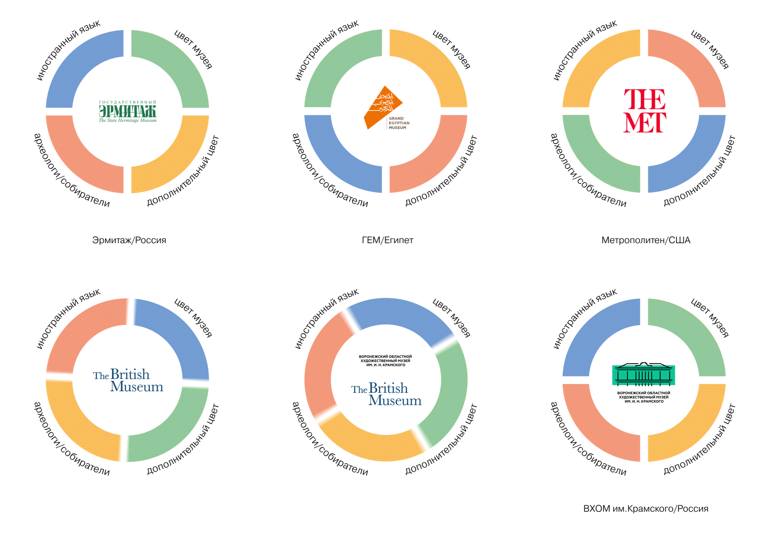
The starting point in the diagram is the museum’s signature color.
A color closely related to it in the diagram will indicate the Museum section and be used to format and lay out the information provided by the museum.
The color opposite to it is the section color for archaeologists/collectors.
From that color, proceeding clockwise, the color for the foreign language is determined.
The remaining color serves as an accent for full-color image seals.
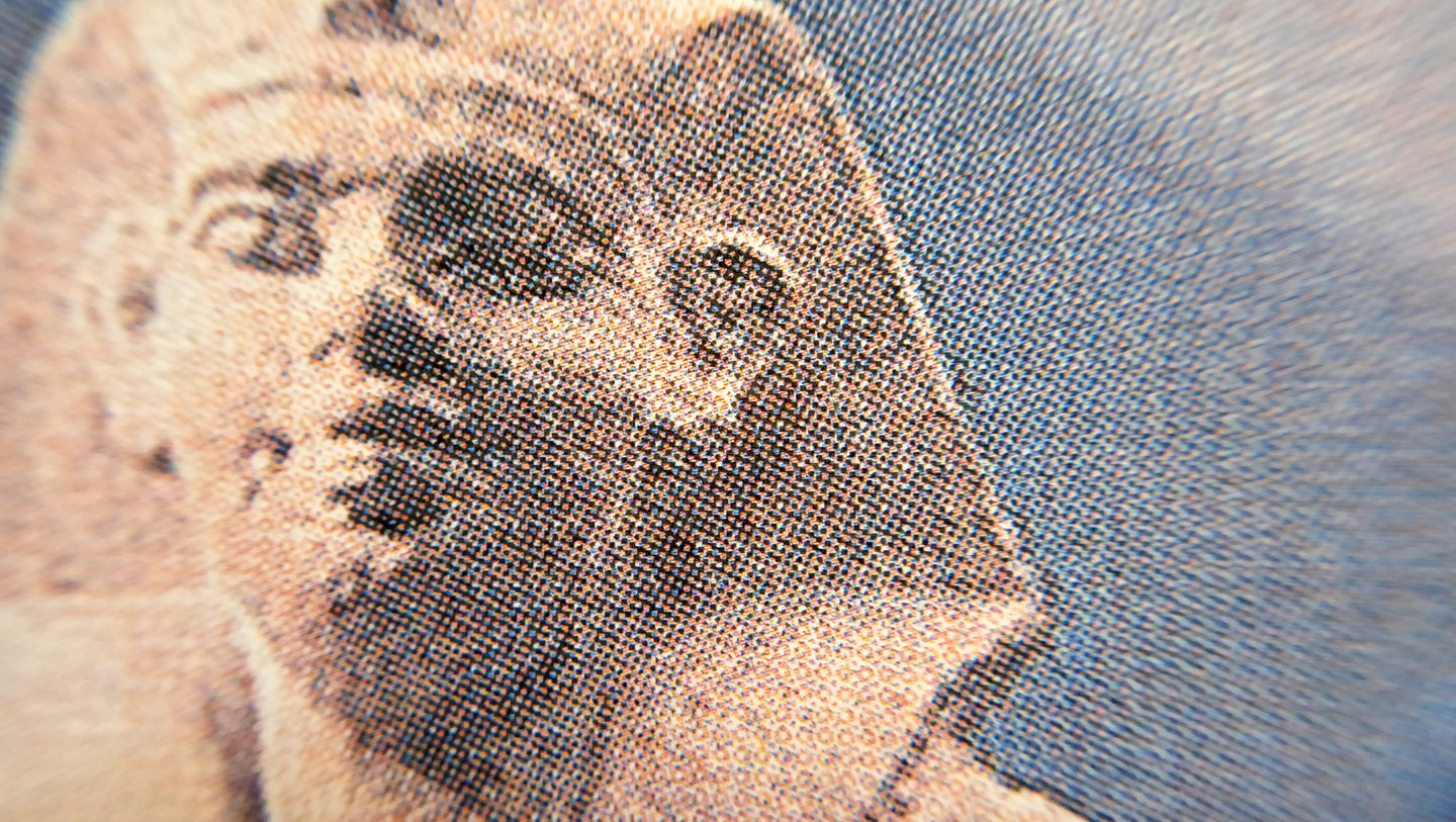
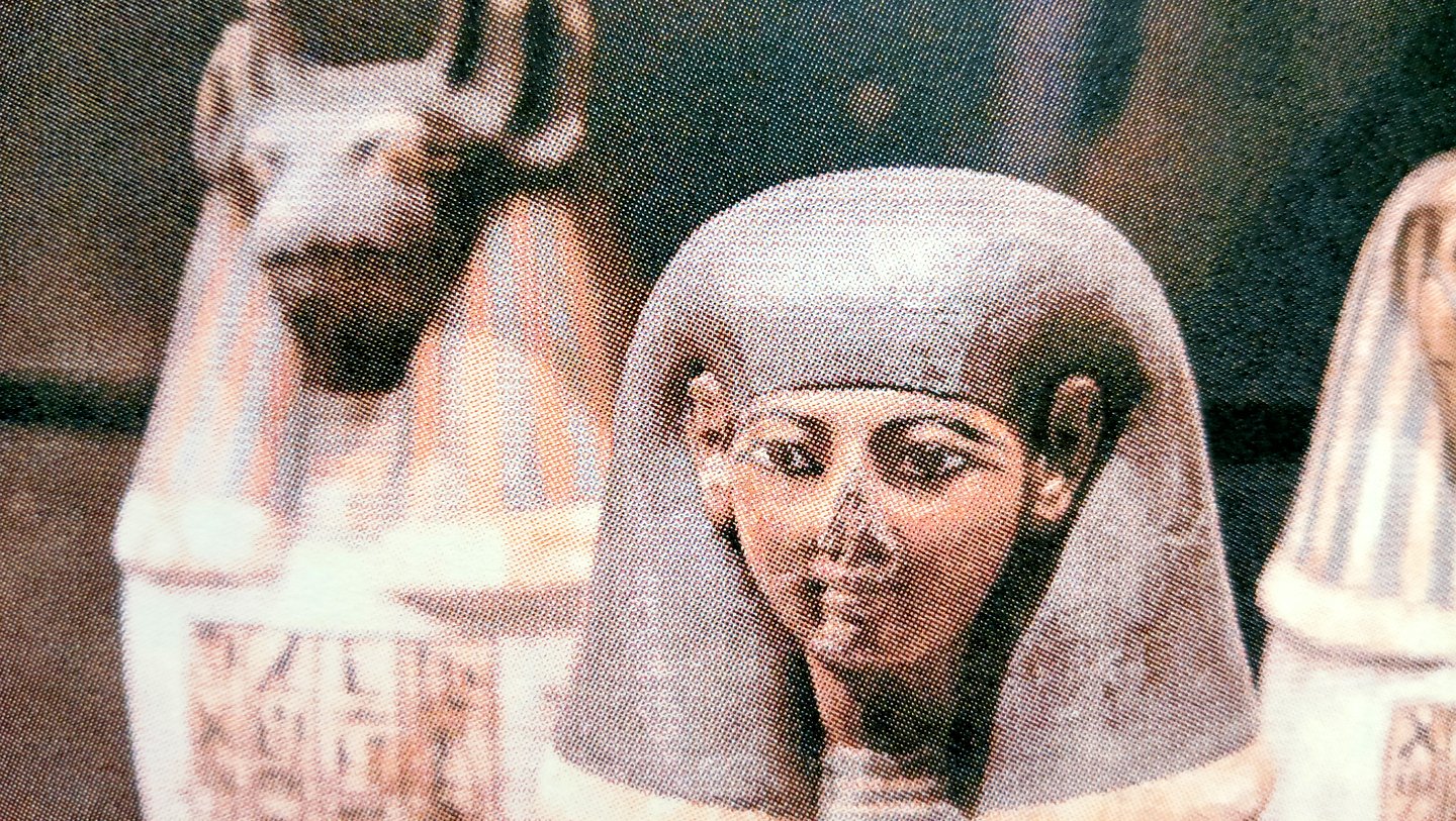
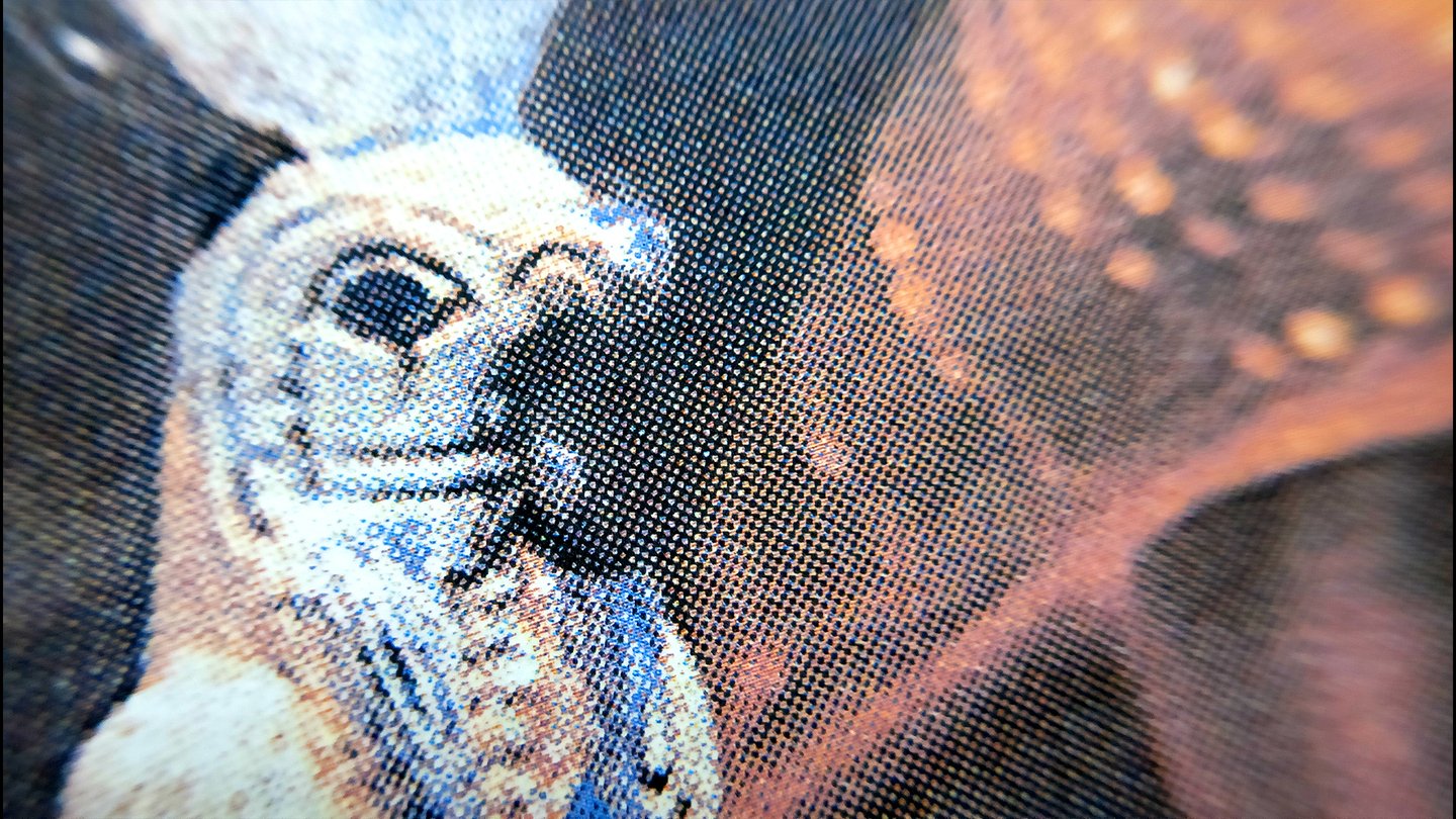
The loose structure allows to emphasize the immutability of history and the fragility of the exhibits.
/3/LAYOUT
Модуль 10×10 мм
Смещение по модулям
Частичная видимость сетки
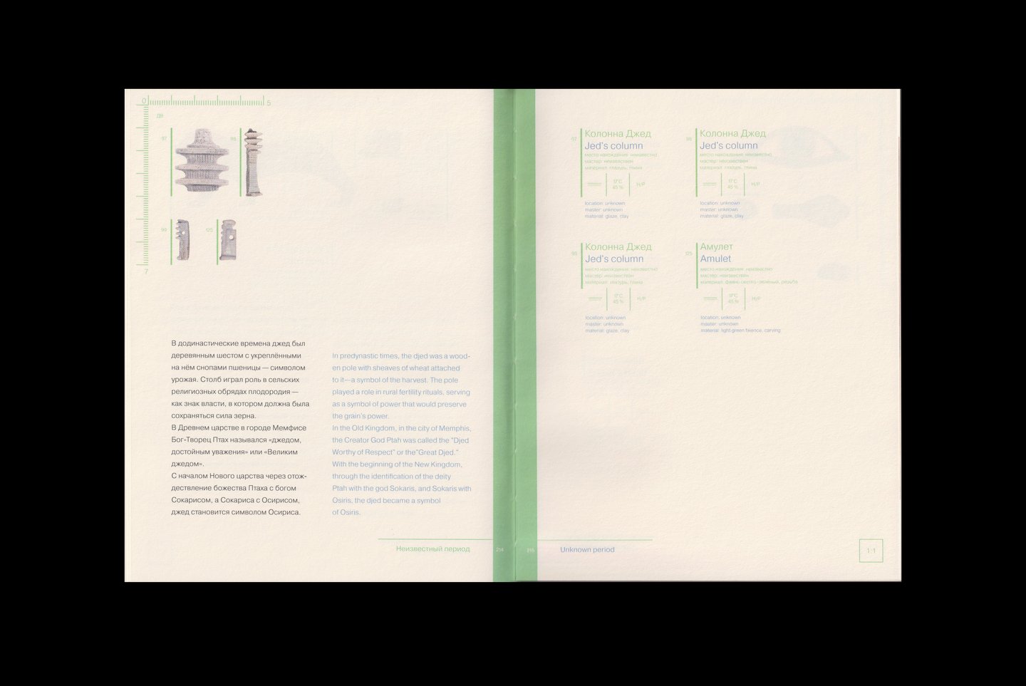
Билингвальная вёрстка
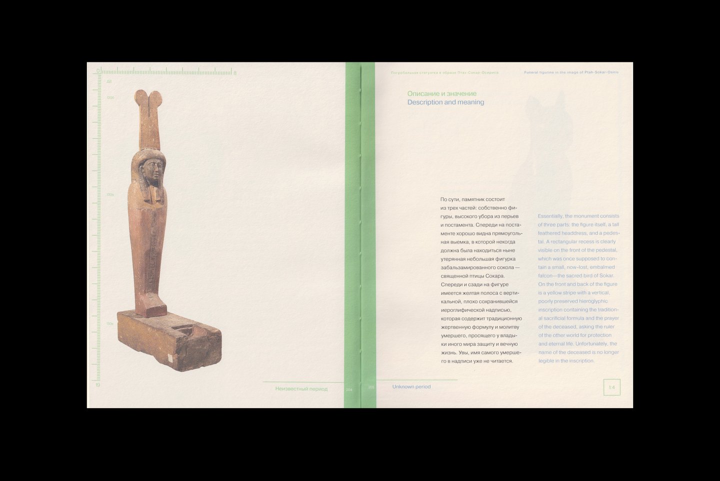
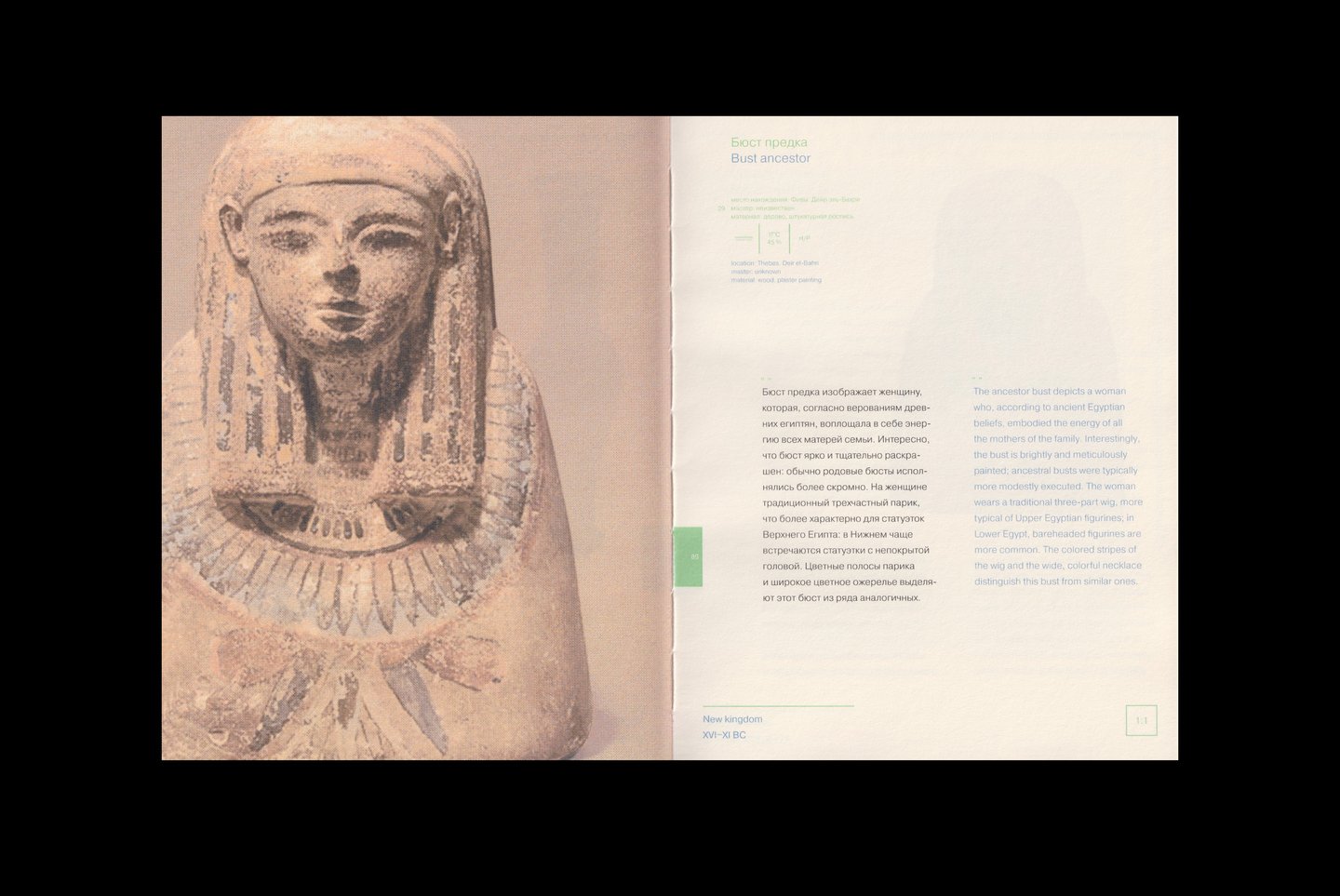
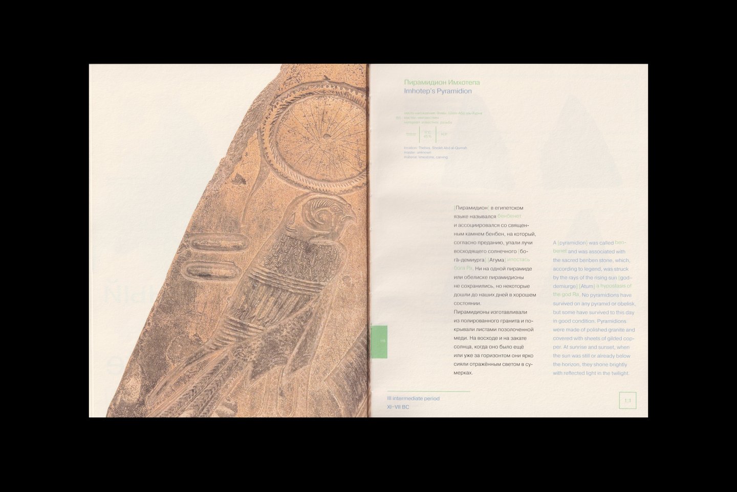
The illustrations in the text serve not only as visual aids but also to compensate for discrepancies between different linguistic systems. If there are no discrepancies but an illustration is required—for example, if it is an essential element of the article—it is placed on the next logical spread.
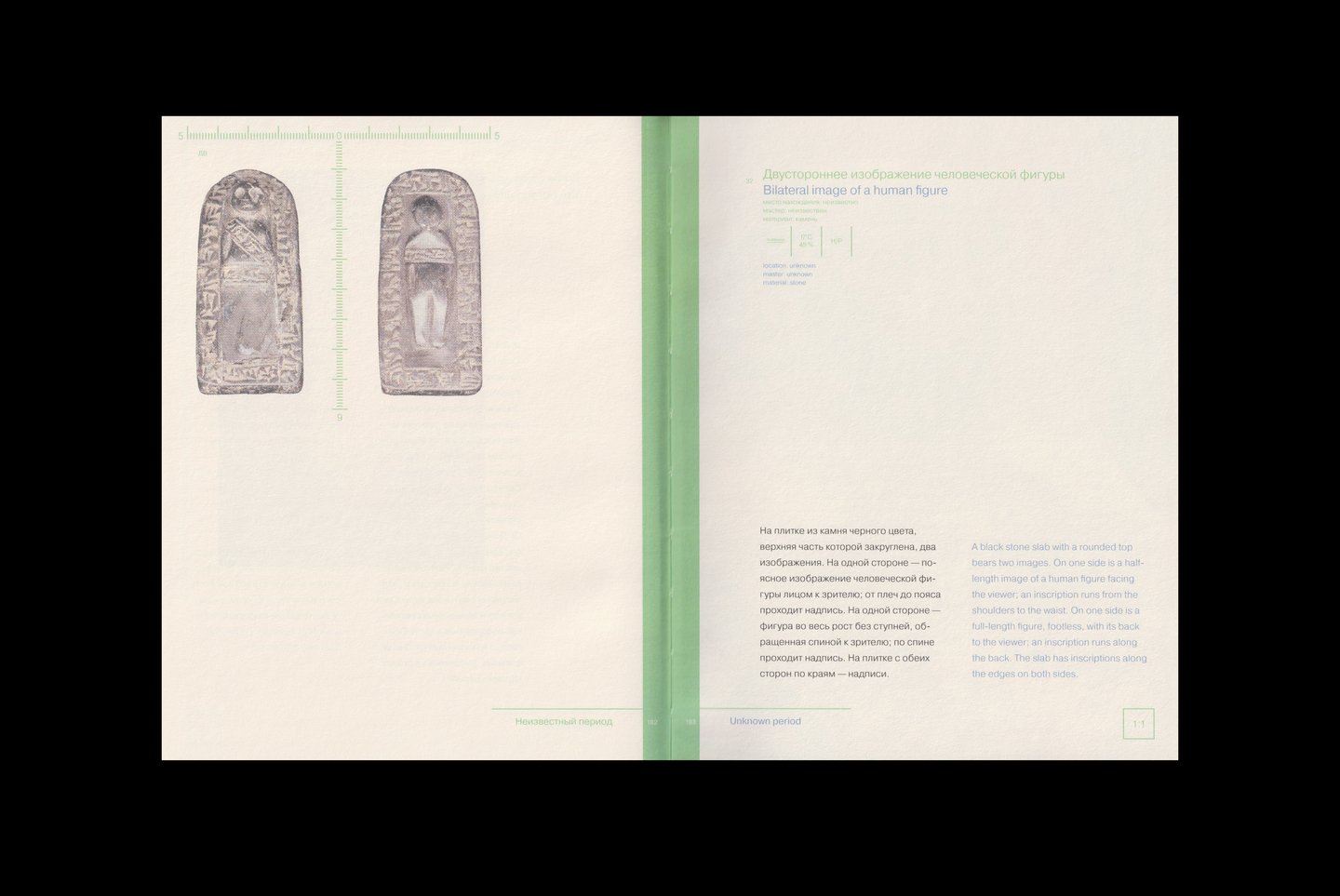
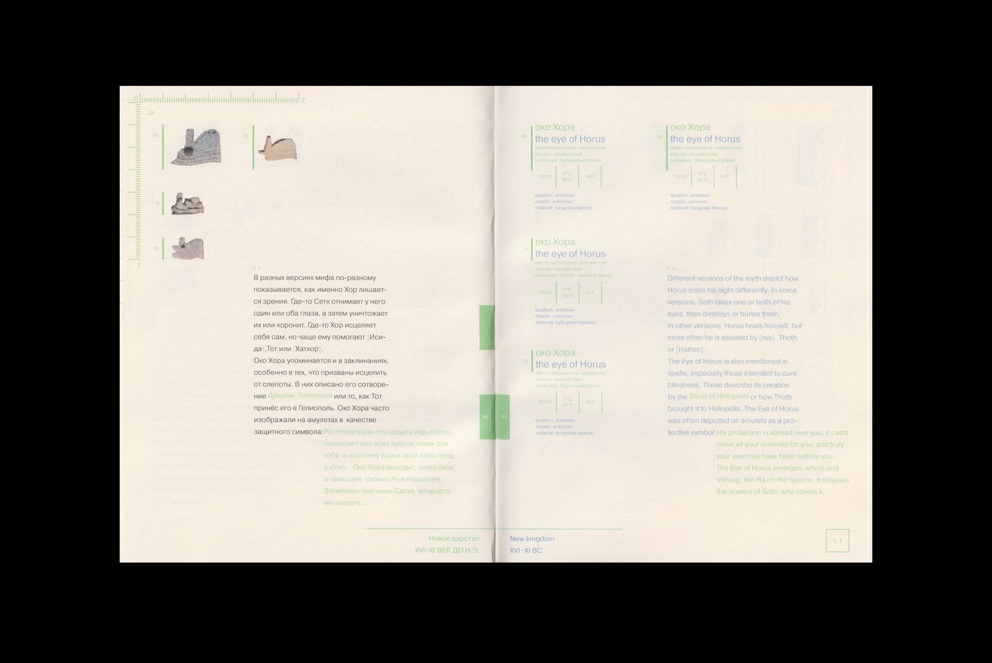
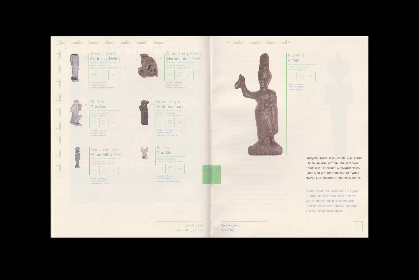
1:1 Scale Exhibits
Видимая сетка и линейка
позволяют ориентироваться
в размерах экспонатов
Chapters featuring different types of exhibits are separated by smutzititles
Exhibit description blocks can either be embedded within the spread composition or repeat the exhibit layout.