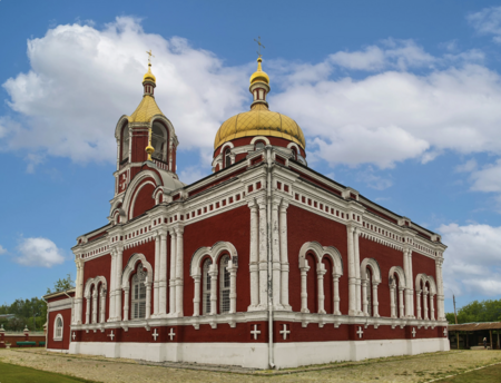
The city is located in the south of the Moscow region, approximately a two-hour drive from Moscow. It takes its name from the older village of Voskresenskoye, which was named after the Church of the Resurrection of Christ. The church is still in operation today.
This is a personal project. I proposed a visual identity concept for the city where I spent the first sixteen years of my life.
In 1938, the settlement was granted town status. From 1931 onwards, it grew up around a chemical plant producing mineral fertilisers. In 2019, all the settlements in the district were merged into the Voskresensk Urban District, and a new coat of arms was approved: a purple field, a golden round shield (a targe), the face of Christ the Saviour, and the emblems of Prince Dmitry Pozharsky — because in the 16th century, these lands belonged to the Pozharsky family.
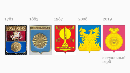
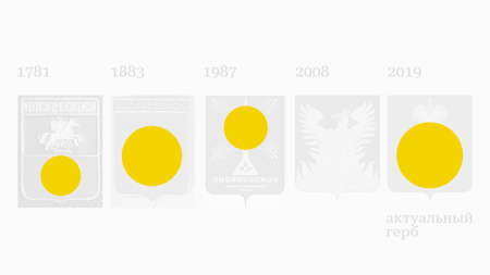

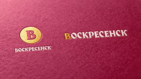
Looking at the old coats of arms of the city and the district, several key elements for the visual identity stand out: the colour red, a reference to the church; yellow, representing the sun and fire (the sun appears in almost all the coats of arms); and the circle, which symbolises both the shield and a halo, alluding to the theme of resurrection. The logo is assembled from these elements.
The horizontal version includes an initial letter, a style widely used in church (liturgical) books for many centuries, particularly in the manuscript tradition.

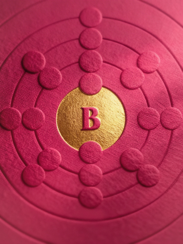
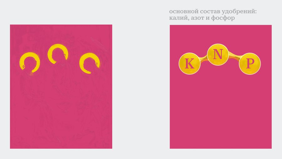
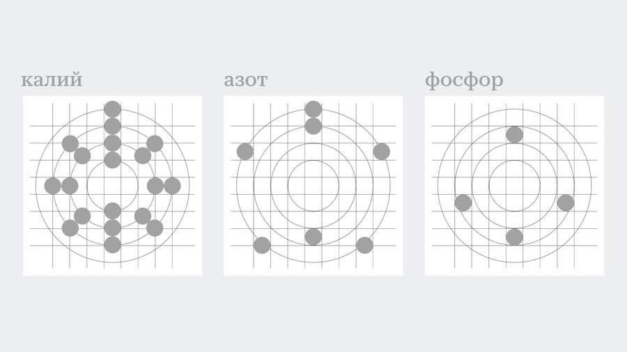
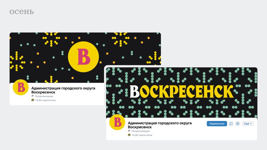
The patterns are based on the graphic formulas of the three main fertiliser components: potassium, phosphorite, and nitrogen. These formed the basis for patterns applied across various media, which are also divided by season (In Russia, there are four of them: winter, spring, summer and autumn).
The project is primarily designed for the digital environment, as social networks are the fastest way for the local administration to communicate with residents.
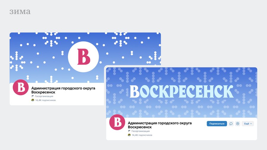
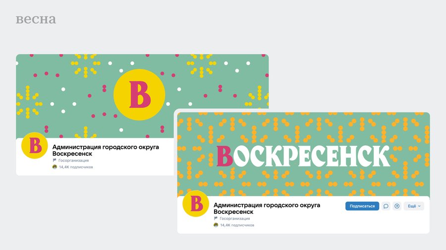
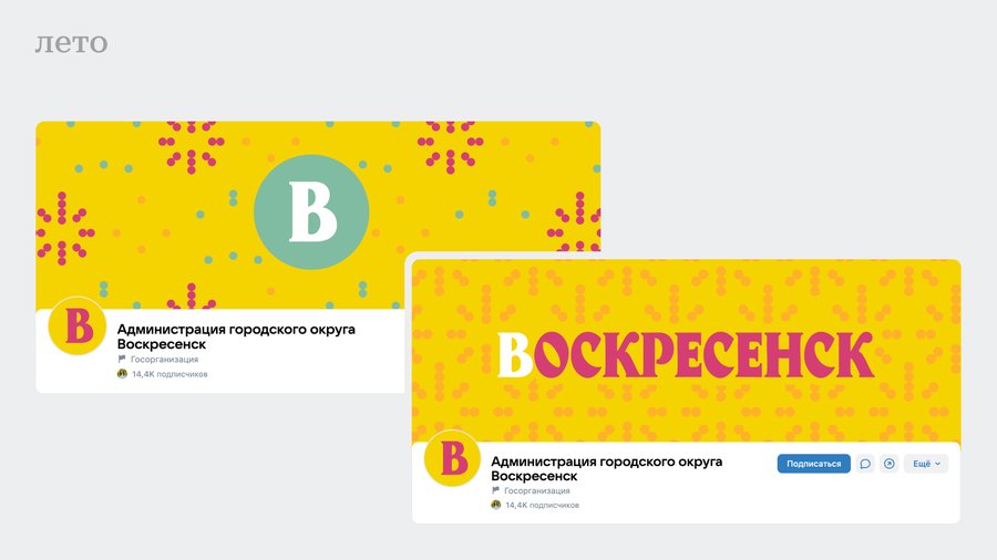
The materials feature gold and concrete: gold evokes the domes of churches, while concrete references the factories and industrial past. The city has a religious name, yet it went through a Soviet, secular period and remains an industrial centre for the chemical industry to this day.

Thank you for reading. I invite you to my Telegram channel, «One Quote»: about communication design, trends and case studies.