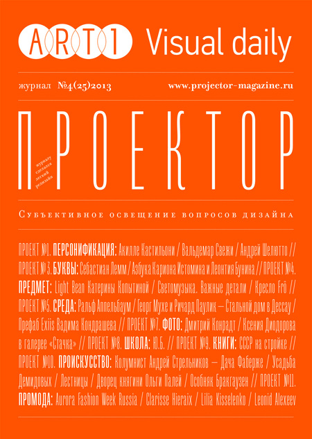
The main change Projector has recently undergone is the new typography. I acquired Mr. Palker and Palkerson typeface families from Yury Gordon. Mr. Palkerson was intended for the headings, and I looked forward to trying it out at large and small sizes and reversed lettering. This is why the issue has a type cover — I love it how the type behaves in this composition. Аs for the orange, this is a good remedy for the winter deprivation of vitamins: I want a bright splash amidst the autumn-winter gloom of St.Petersburg.
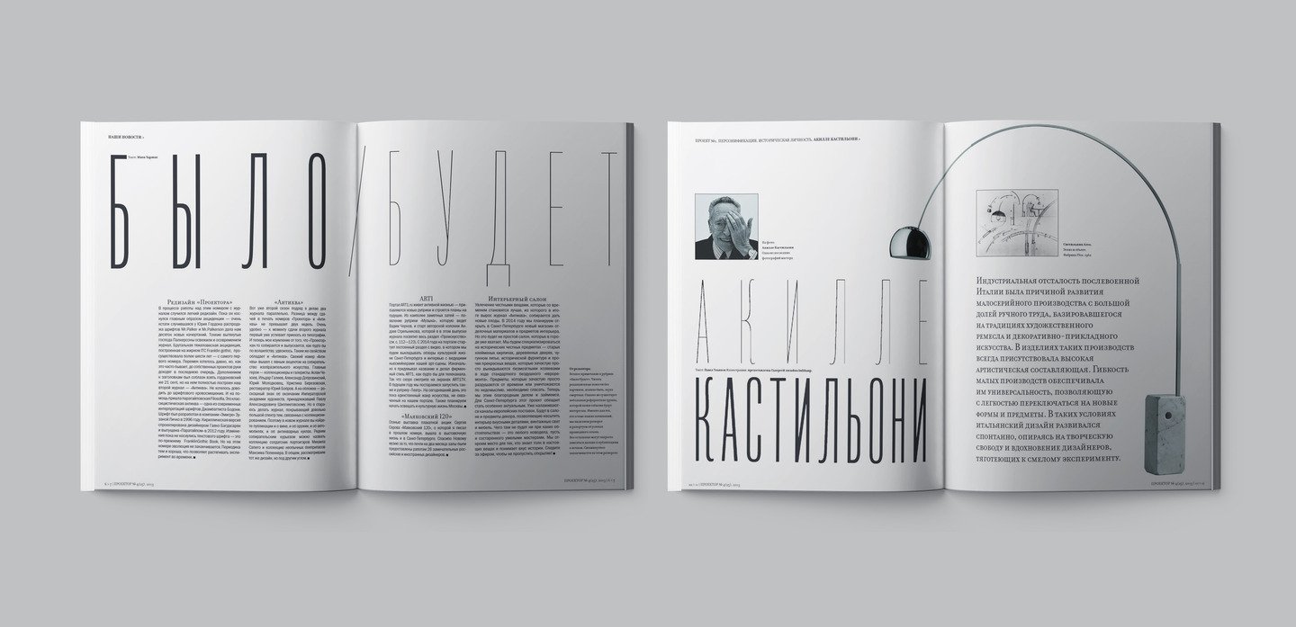
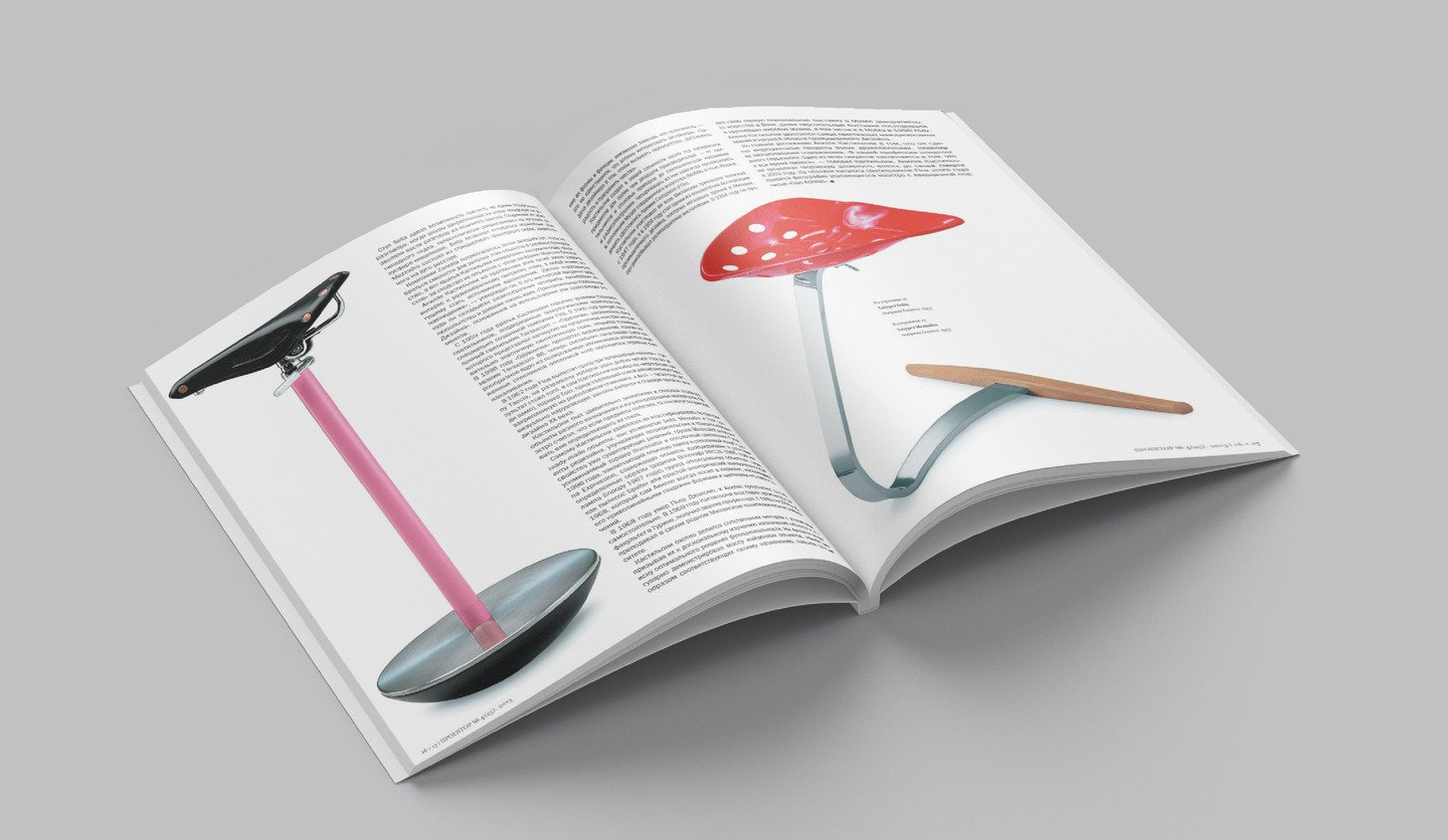
Akilli Castilone is the main historical figure in this issue. He participated in every triennale in Milan since 1947, and in 1956 he became the co-founder of the Association of Industrial Design, created several buildings in Milan and organized a number of installations. In 1984 he had his first personal exhibition in the Museum of Applied Arts in Vienna, which was followed by personal exhibitions in the biggest museums in the world, four instance, MOMA in 1998. Castilone acquired the most prestigious international awards and titles in industrial design. His main achievement is though making industrial products more human-friendly by endowing them with emotional content. «Our job is too serious. One of my secrets is that I keep laughing», — said Castilone.
Long ago I had an idea of a publication about Andrey Shelyutto, and we have finally managed to meet at the studio for a good and honest interview. Andrey Shelutto says: «The country neither has identification nor design. Of course I would really like it to look smarter, have better-designed banknotes, I am scared of „quality-made“ newspapers and TV-shows. In fact, these make me puzzled: how come people can find them any useful at all? Or has everyone’s consciousness changed this much? I’m not sure. I still believe in people».
«Lettering» section starts with t.s.e., a large project of Sebastian Lamb, inspired by the poetry of Thomas Elliott (hence its name). Here’s what the author says: «This work unites typography, photography and art installations. This is the manifesto where I reconsider my personal art values. I am interested in how readable the type is in space, and the way it changes between the second, third, and fourth dimensions».
Something else on lettering: Andrey Kharshak scrutinises one of the most famous literary landmarks of Russian literature and graphic of the XVII century — the abecedarium by Karion Istomin and Leontiy Bunin.
This month’s «Object» section is dedicated to an item by Katerina Kopytina, a young Russian designer, which has recently been brought into mass production. Creating an interesting and emotional object of a simple structure in order to bring it into circulation was quite a challenge. Despite that, Katerina has successfully overcome the stage of design and the manufacturing challenges, when she had to consider if the item was OK for circulation, and not to make it too costly in the end. Russian industrial design seems to have a new name!
Projector has been very lucky. Ralph Appelbaum, the world-leading designer of museum space, has visited St.Petersburg within the preparation for the First Biennale of Museum Design. His studio has implemented over 550 museum projects all over the world, and contributed to construction of another 250 objects. I met Ralph, and we did a big interview on museum design.
«Environment» section shares historical materials on the Steel House by Richard Paulick and Georg Muche in Dessau. The opportunities to implement the latest social architectural and construction ideas encouraged two authors, Georg Muche and Richard Paulick, to start working on their own prefab. Unfortunately, they both were probably taking the new material too seriously to think about its characteristics, or maybe Paulick was too bad at material engineering at university… The house, entirely assembled of steel panels, turned out to be freezing in winter and boiling hot summer.
There should be a camera in your hand, and no prejudice or conceptions letting into your open-mindedness in your head. In this case, Dmitry Konradt is the real adherent of Cartier-Bresson, who he loved so much. Cartier-Bresson would say: «Don’t think, don’t read, open up!» In fact, a photographer is the one who’s trying to be lucky: they wander around the streets, look at the lights, people, colors, and hope they will get it all together right now. «I only record the vibrance», explains Dmitry. «I walk down the street in a certain mood, listen to particular music, and then suddenly something catches my eye. I shoot, and if my picture resonates with someone, my mood becomes a trigger, so I see my work hasn’t been done in vain».
After a little break Sergey Helmyanov, our permanent contributor, is back. He continues the series of publications on the outstanding designers who started the school of Soviet and later Russian design. In this issue: «Y.B.», the founder of the All-Union Scientific Research Institute of Industrial Design, legendary Yury Borisovich Solovyov: «Design is a humanitarian field. Whatever a designer does, it’s done for people». Yury Solovyov started the Institute by his talent and personal charisma. In his book, he called it «the institute of hope», the hope that design would make our culture and country more humanistic and kind. However, the institute was closed on 14 June 2013. Yury passed away on 6 October 2013.
Mikhail Karasik, keeps exploring the history of book design in the USSR in the 1920-30s. In this issue, we’re sharing the story of the magazine «USSR in Construction». Apart from cinematographs and exhibitions, aiming for the mass audience, magazines would personally turn to anyone holding it in their hands — from people in culture and politics to financiers and entrepreneurs — contemporary and future economic partners of the USSR. Its large format, mezzotint, conducting the picture quality and facture most accurately, complex construction of the gathering with a lot all inclusions (leporellos, booklets, maps, tippings)— all of these artistic artifacts were quite appealing and encouraged the reader to believe what was written in the magazine.
The project AboutArt, which I have been doing in partnership with ART1. Visual daily, is entirely dedicated to the abandoned and secret corners of St.Petersburg. Andrey Strelnikov, the new columnist, has recently started a new serious of publications on that. With a camera in his hand, he gets into abandoned and hard-to-get-to locations of our city in order to record the vanishing scenery of local palaces, courtyards and staircases. Getting to know this case better, one can get overwhelmed by the huge number of untended, demolished, abandoned historical buildings in St.Petersburg.
After a little break, Projector again has the column on fashion, run in cooperation with Aurora Fashion Week. Projector has checked up on the last week’s shows in the way an amateur would do: we considered what was most beautiful. To our mind, these are the top three of AFWR SS 2014: Clarisse Hieraix, Lilia Kisselenko, Leonid Alexeev. They all have demonstrated very skillful work with the silhouette — the clothes are graphic and sophisticated. However, the opinion of Projector is quite arbitrary, and, as you can notice by the collections we loved, we would prefer the solutions in sober colors to saturation.