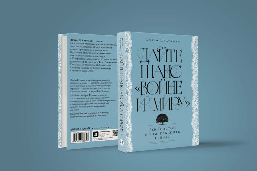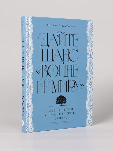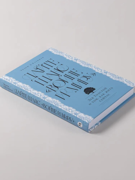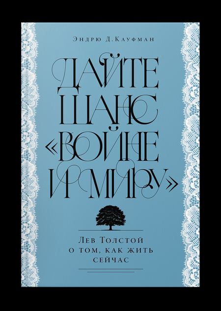
The cover composition is built upon a dialogue between psychological analysis and classic style: the title serves as the central element, set in a contrasting font featuring fine strokes and prominent serifs. The fluidity of the letterforms is emphasized by elegant swashes and flourishes; the typography is perceived as a «dance» reflecting internal movement. The edges are framed with delicate ornamental patterns, referencing 19th-century aesthetics and resonating with the refined drawing of the typeface—the ornament and the letters form a unified visual system. A cool, muted blue background establishes a calm, analytical tone, while the black text provides a striking contrast. The silhouette of the tree at the bottom is an iconic image from the novel and a visual anchor that connects the interpretation to the original source. The hierarchy of elements is structured through variations in point size, leading and lines, transforming the composition into a kind of inquiry.