
Upgrade — an English school designed to help you gain fluency and feel comfortable speaking English. It utilizes an anti-academic approach that focuses on the individual and the learning experience.
Logo
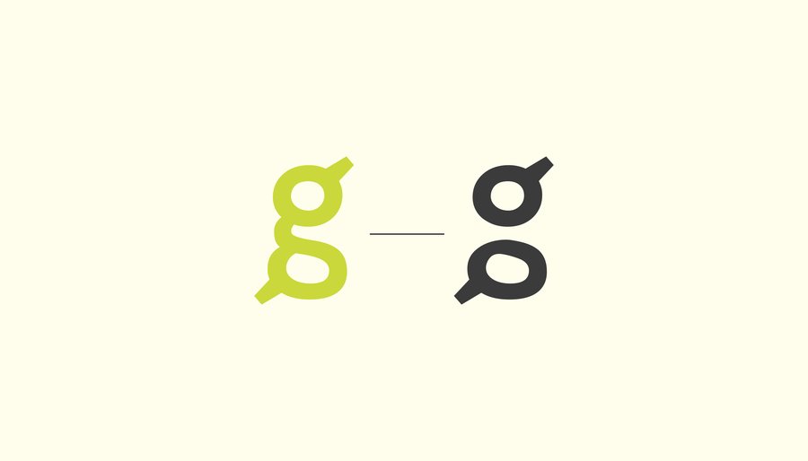
Metaphor in the logo symbol
In the letter 'g' is hidden a metaphor for communication—two bubbles of messages symbolizing dialogue.
The brand’s visual identity reflects the idea that English is not a dull collection of words and rules, but a vibrant and engaging tool. Behind ordinary-seeming sentences lie personal thoughts, emotions, and secondary meanings. One can dive very deeply into the English language and discover much new. For this reason, the concept was named the «second floor"—a layer that is so fascinating to explore while learning the language.
Graphically, this concept works by dividing the space into two halves. The upper section is occupied by the copywriting—phrases that appear simple at first glance. The lower section (the second floor), however, reveals this phrase in greater depth by supporting it with a tangible context—a photograph, fabric texture, water, or other materials and substances. This creates a kind of interplay—the interaction between the upper and lower parts of the space. Meaning is born from their combination.
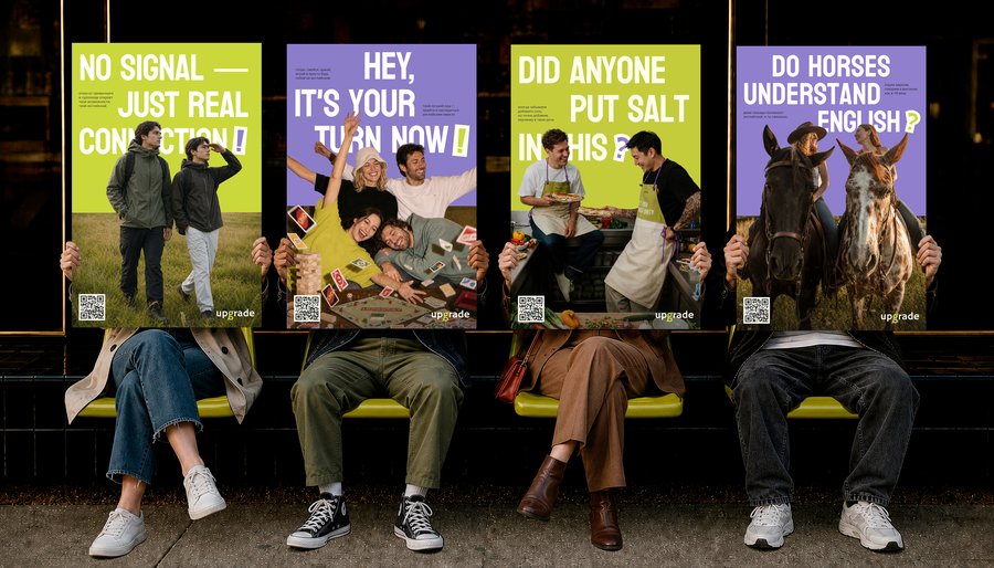
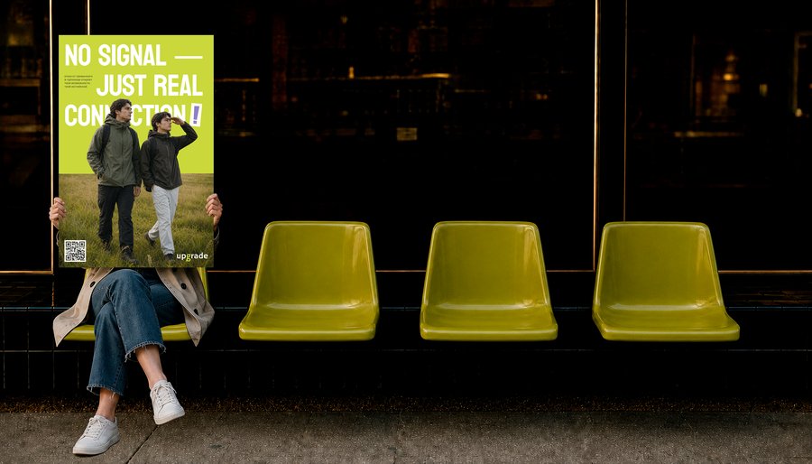
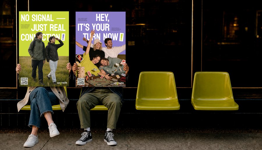
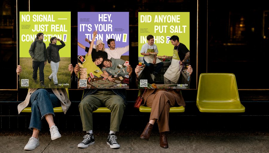
Poster Series
For copywriting, phrases and expressions in English are chosen that have a secondary meaning—these are also called idioms. Texts also incorporate slang, puns, and words with intentional errors, which alters the meaning of the entire phrase.
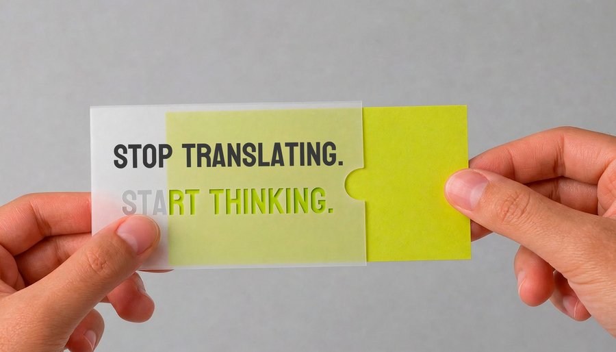
The concept of a double bottom is conveyed not just through dividing the layout in half. It also works with material layering. For example, the school’s business card is housed inside a plastic case with cut-out letters. The full phrase can only be read if you place a «second bottom» underneath—in this case, the colored paper of the business card.
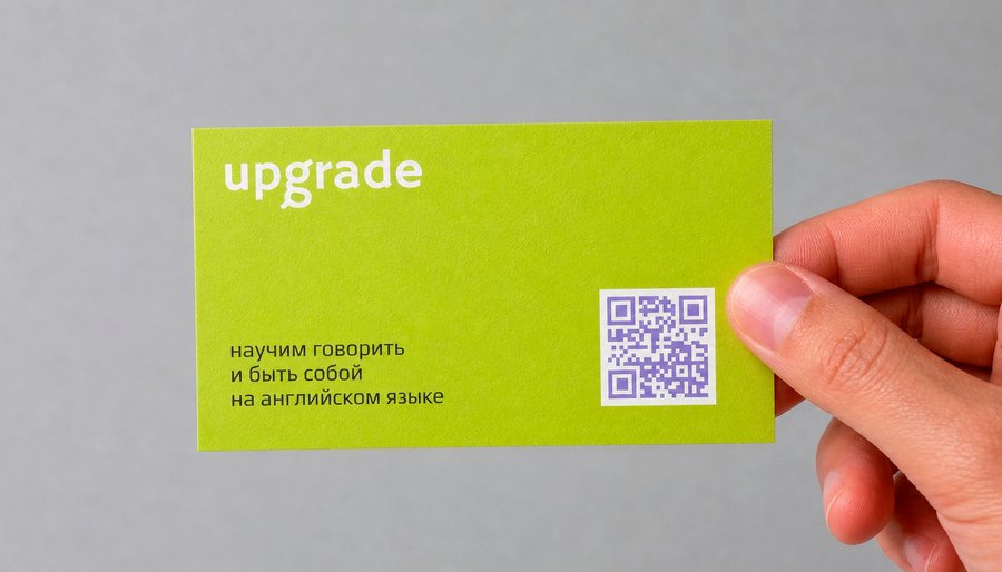
Company Profile
Using semi-transparent materials in branding development helped reveal the concept. This was particularly evident on water vessels, such as bottles and cups. The visibility of the water level through the plastic added context to the copywriting.
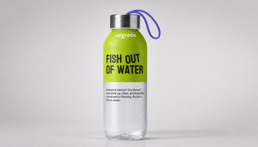
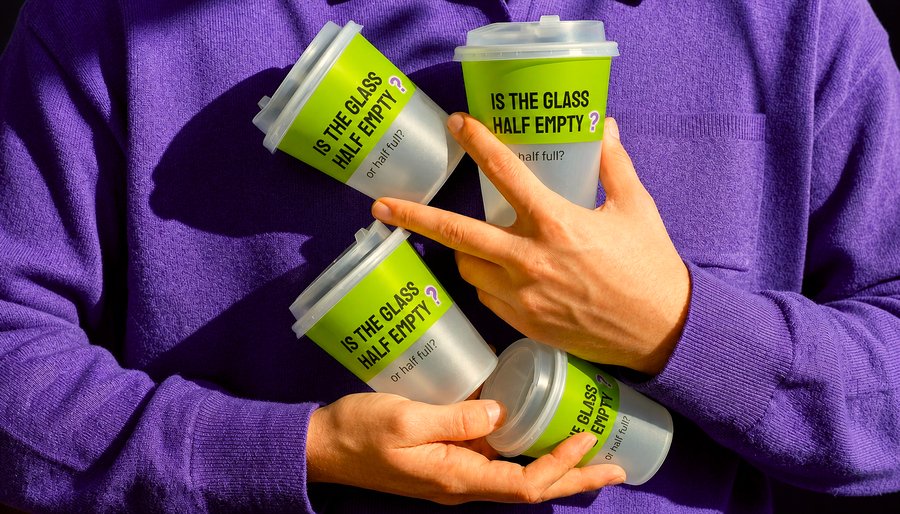
Cups and water bottles
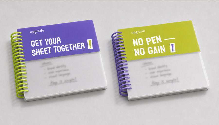
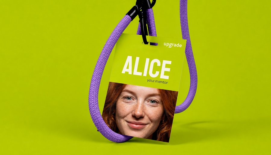
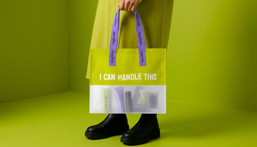
Mentor badge for the school, shopper tote, and notebook set
Some individuals inherently possess a certain depth or an undercurrent that allows branding concepts to function through simple subversion. This was evident with the vests and bracelets.
Vests
Reversible bracelets feature two contrasting sides and act as mood indicators. By flipping the bracelet, a person conveys their state of mind and linguistic preferences to others without saying a word.
light chat — deep conversation I want to go for a walk — I want to talk I speak slowly — I speak quickly
Flip-Flop Silicone Bracelets
The School’s class formats are characterized by high immersion and active engagement. The School offers opportunities to converse in English while preparing British dishes and painting on canvas. Therefore, textile aprons were developed. The upper section of the apron features a motivating idiom, while the lower part is left blank. However, there is a purpose in this design—during creative events, the apron will become stained and will retain all the marks and impressions.
Apron
For the concept of a «double-sided» approach to the school, we developed a card game. It aids in learning and familiarizing oneself with English idioms, while also promoting conversation and fun downtime with companions. The idioms are listed on one side of the card, and the reverse side provides two meanings for the phrase—the literal translation and the true meaning.
Card Game
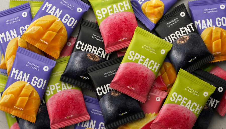
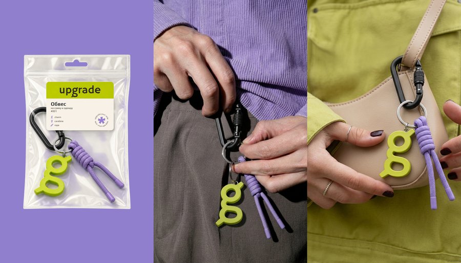
Outer wrap–charm and assortment of chewing gum
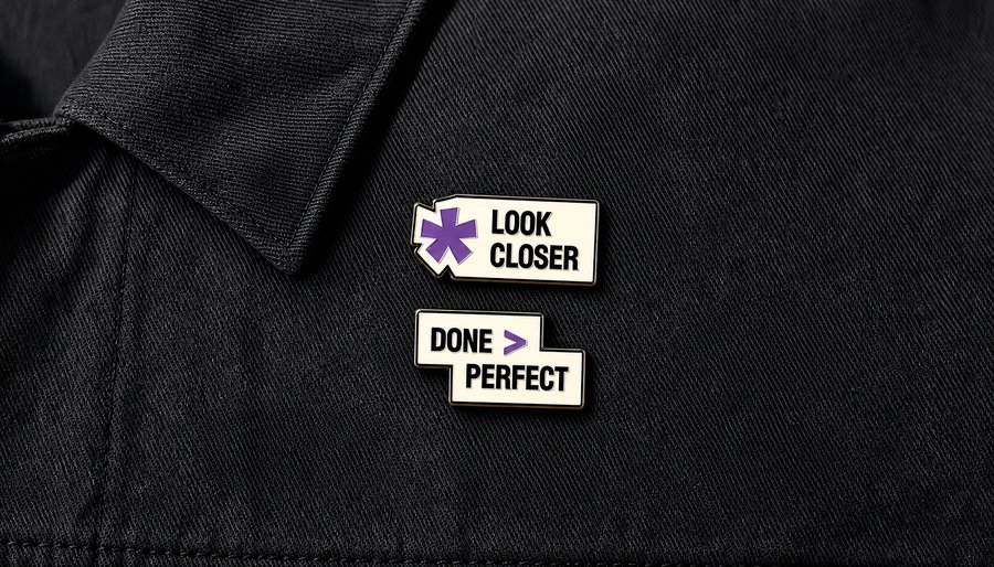
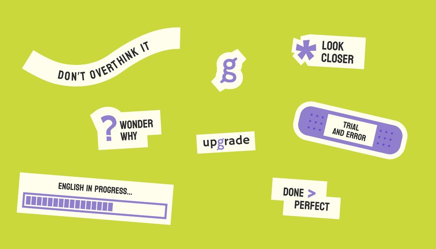
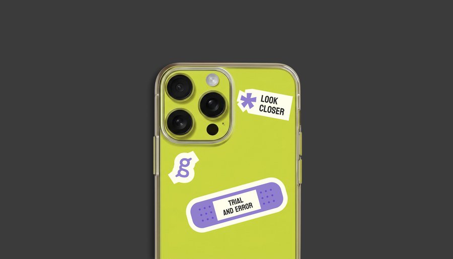
Stickers and Metal Badges
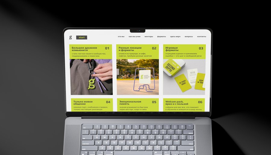
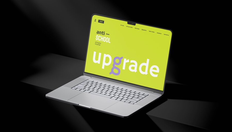
School website