
Description
For a long time, I dreamed of professional headphones but struggled to choose a model and commit to the purchase. At one point, I realized I couldn’t postpone this dream any longer, even though I didn’t have the funds right now to pay for it outright. So, for the first time in my life, I signed up for an installment plan, which proved to be a very interesting experience. My relatives and friends often share stories of their purchases, or instances where they had to take out a loan or use an installment plan. This made me think about how often people in Russia take out loans and who specifically takes them. Do age, education, gender, or any other factors influence this statistic? I will gather this data from an open source and create an analysis using diagrams.
I chose the following types of charts because I find them the most comfortable to view: line chart, graph, bar chart, and pie chart. For the visualization, I am selecting simple fonts and pleasant, pastel colors.
Data Analysis
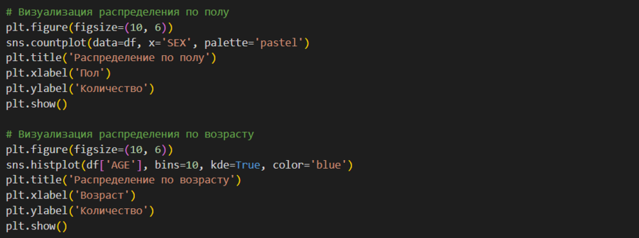
First, I imported the necessary libraries: numpy, matplotlib.pyplot, pandas, and seaborn. After that, I loaded the downloaded sav-file dataset. Next, I began writing the code.
Conclusion
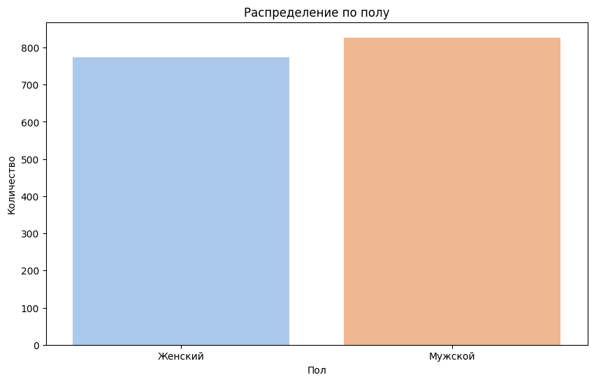
Visualization helps us convey the data we are interested in in a simpler and more concise way. For example, we can visually see that gender does not significantly affect whether or not a person has a credit. Alternatively, using visual components, we can study questions such as whether the amount of time spent watching television influences the presence or quantity of loans.
Description of Generative Model Application
The project cover was created using the neural network https://leonardo.ai/ with the prompt «make an image of credit cards in pastel colors».