As part of the «Infographics and Visualization of Data», I have decided to analyse the state of the forests in Russia and to look into the issue of their disappearance. The creation was based on publicly available data from the Federal Forestry Agency and EMISS.
Issues
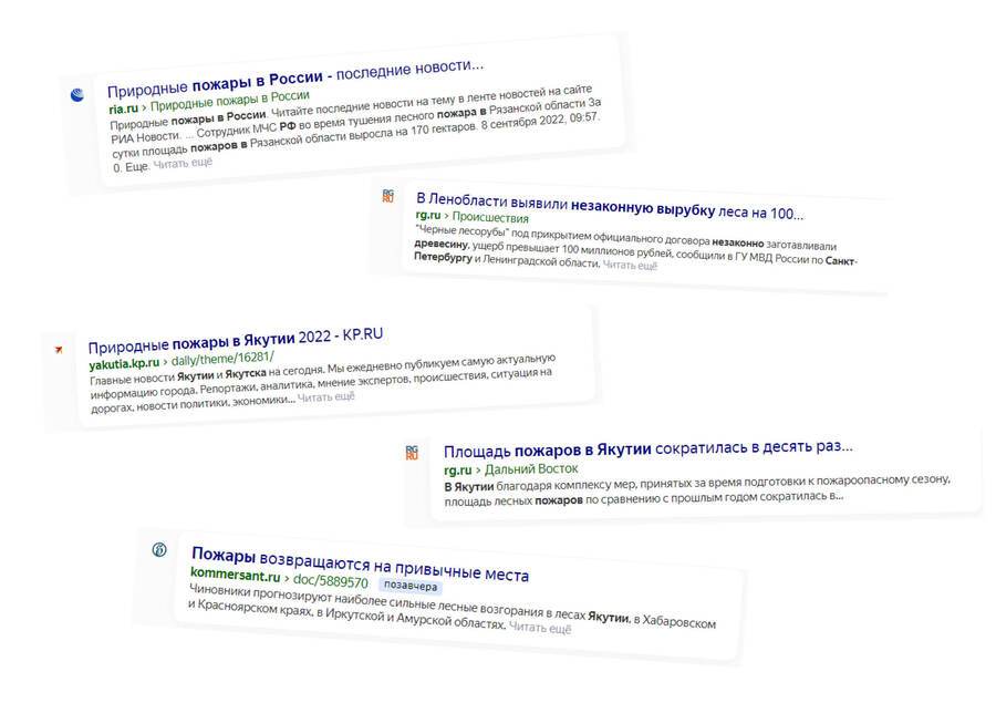
Every year we hear news of massive forest fires, illegal logging and the sale of timber abroad. I’ve decided to check how important the problems are and how they really are.
Deforestation
Before I started working on the data, I decided to see what deforestation from the satellite looked like:
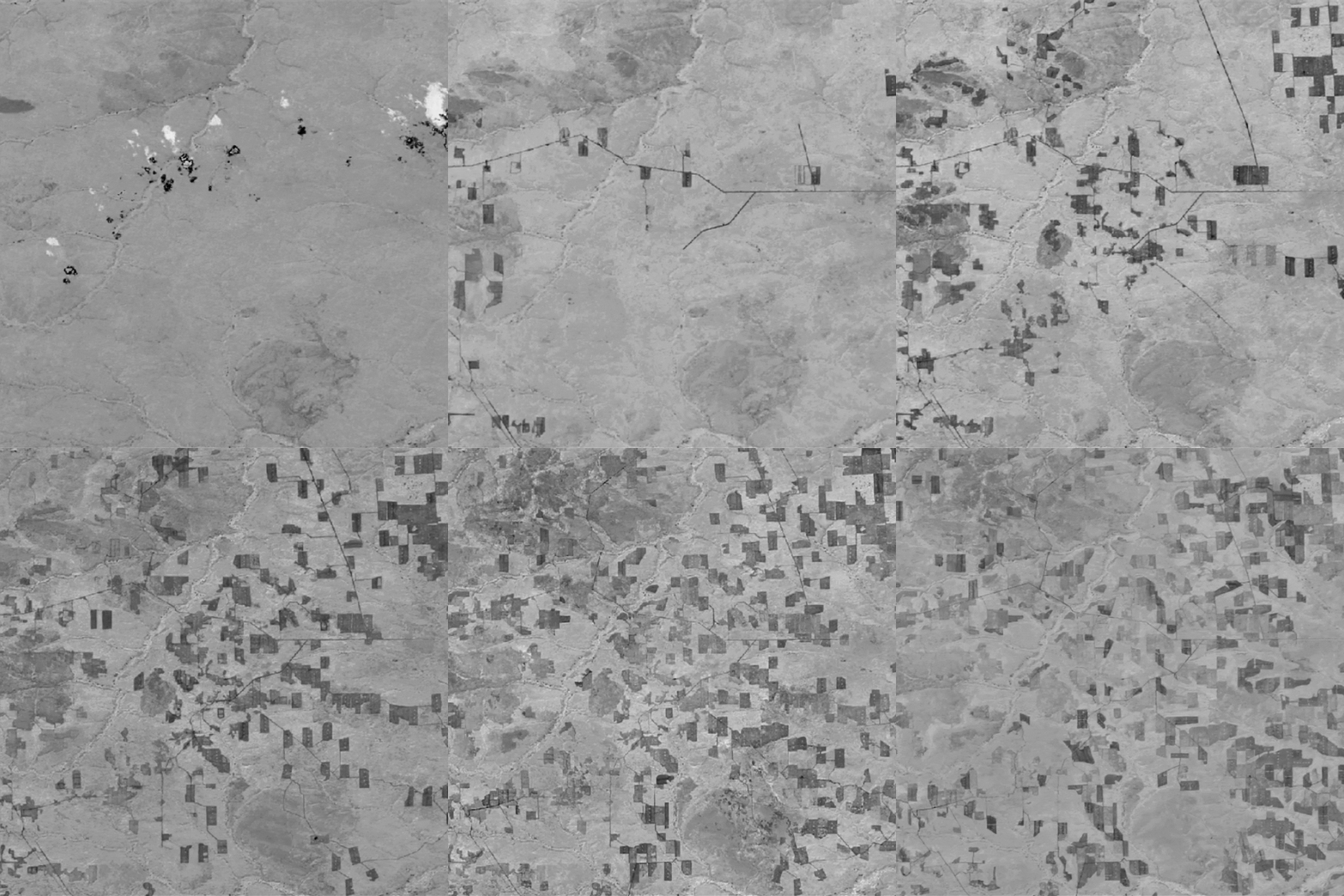
To be honest, I was struck by the appearance. It seemed interesting to me that, in time, the forests were still growing, thus creating a game of transparency. I also thought it was important to explore the topography area, which is doing an accurate representation of the elements of the area. It turns out that the forest is marked by regular leashing circles, which I will decide to use in my posters in the future.
By connecting these two visual metaphors, this is the kind of animation:
Other causes of forest loss
After gathering information about the logging, I also found other causes of forest loss. Forest fires were found to be the main cause of forest loss, and pests, which also significantly affected the state of the forest in Russia, were placed in second place. So I decided to collect these causes over time to track their dynamics.
Forest fires
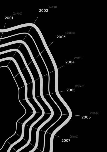
Since fires are the most important cause of forest loss, I have decided to understand the frequency of this phenomenon. One day I had the idea that a tree kept its own life history, which I really wanted to interpret infographics. I found information on the number of forest fires over the years on the EMISS website, and I interpreted it into a database, and I got this kind of nice and very natural visualization. It is important to note that the circle diagram does not close because it is a certain time interval, but not a cycle.
Final appearance
As a result of the work in this module, I was able to become fully familiar with the process of developing infographics, from finding the topic and the necessary data, to visualization and final printing. The final result made me very happy! Thank you for being with me and reading it to the end. Until further meetings)