Island of Nature in the Heart of the Megacity
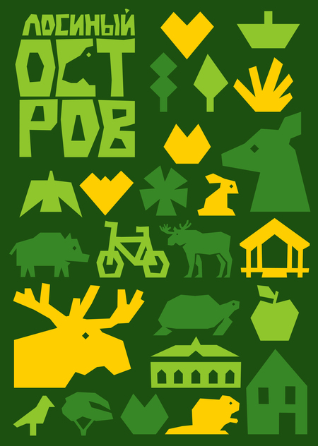
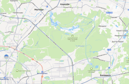
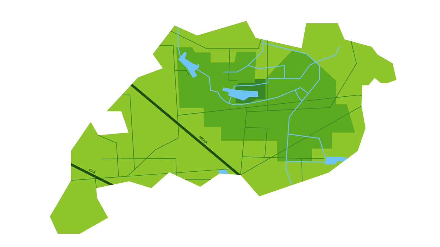
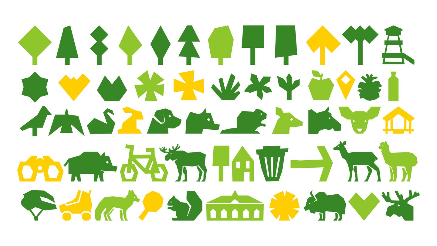
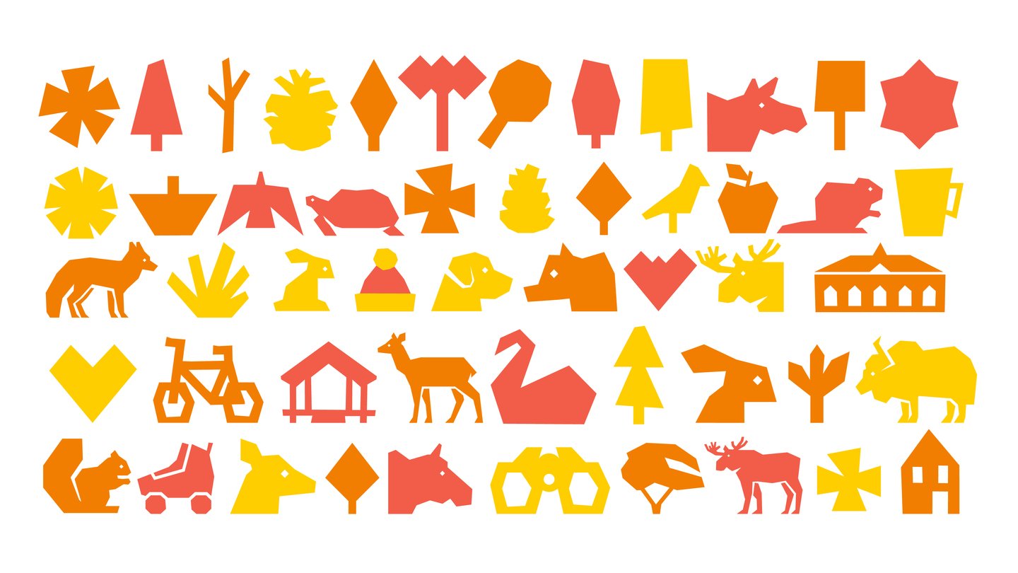
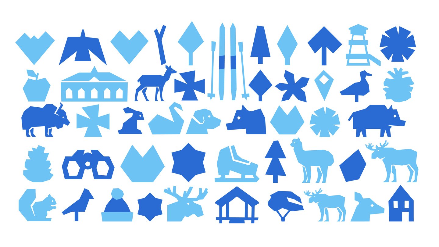
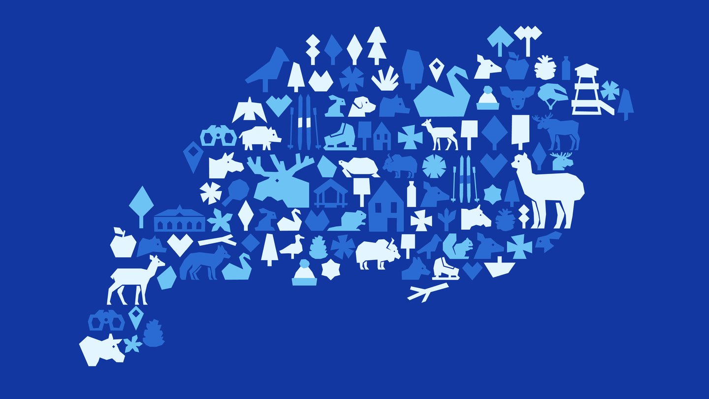
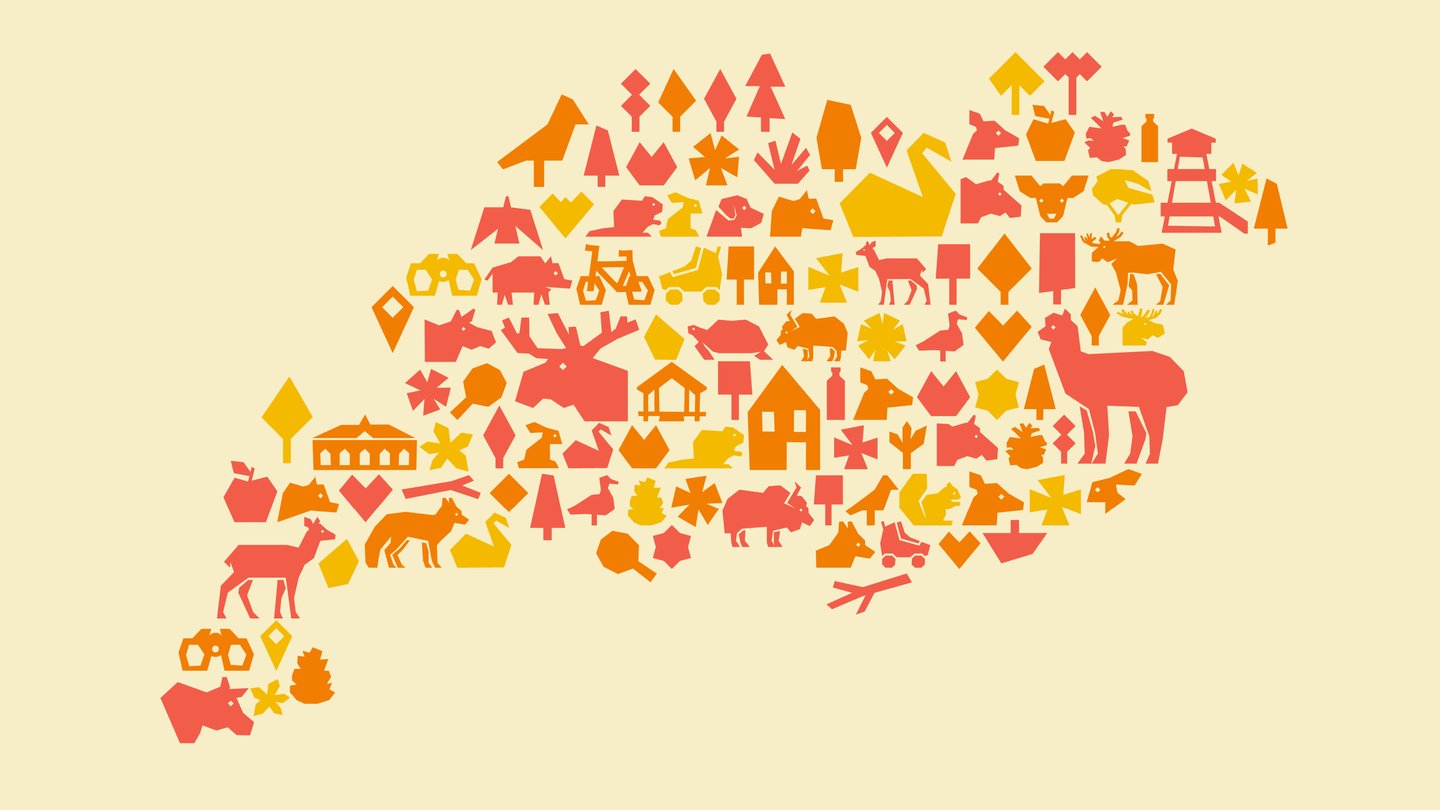
The visual style is based on the shape of Losiny Island map, which resembles a moose’s head in its outline. This similarity—and the contrast between the patch of green against the urban backdrop—became central to the identity. From the simplified map silhouette emerged the logo and pictograms—all deliberately rough, textured, and imperfect, mirroring nature itself.
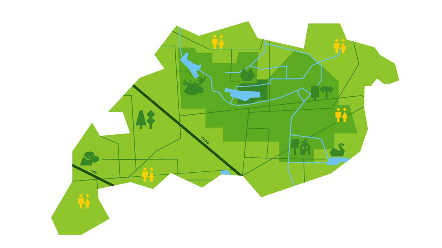
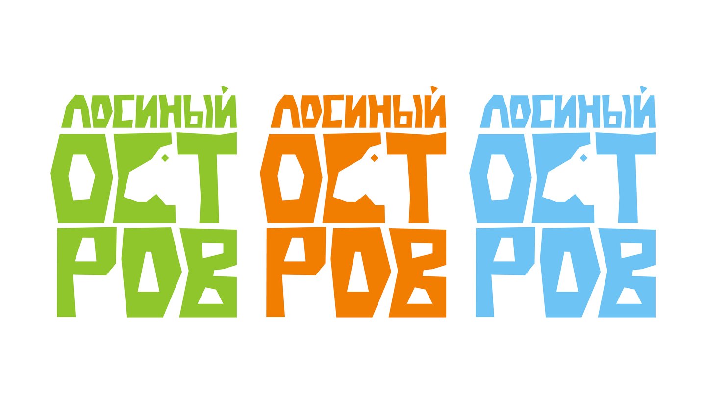
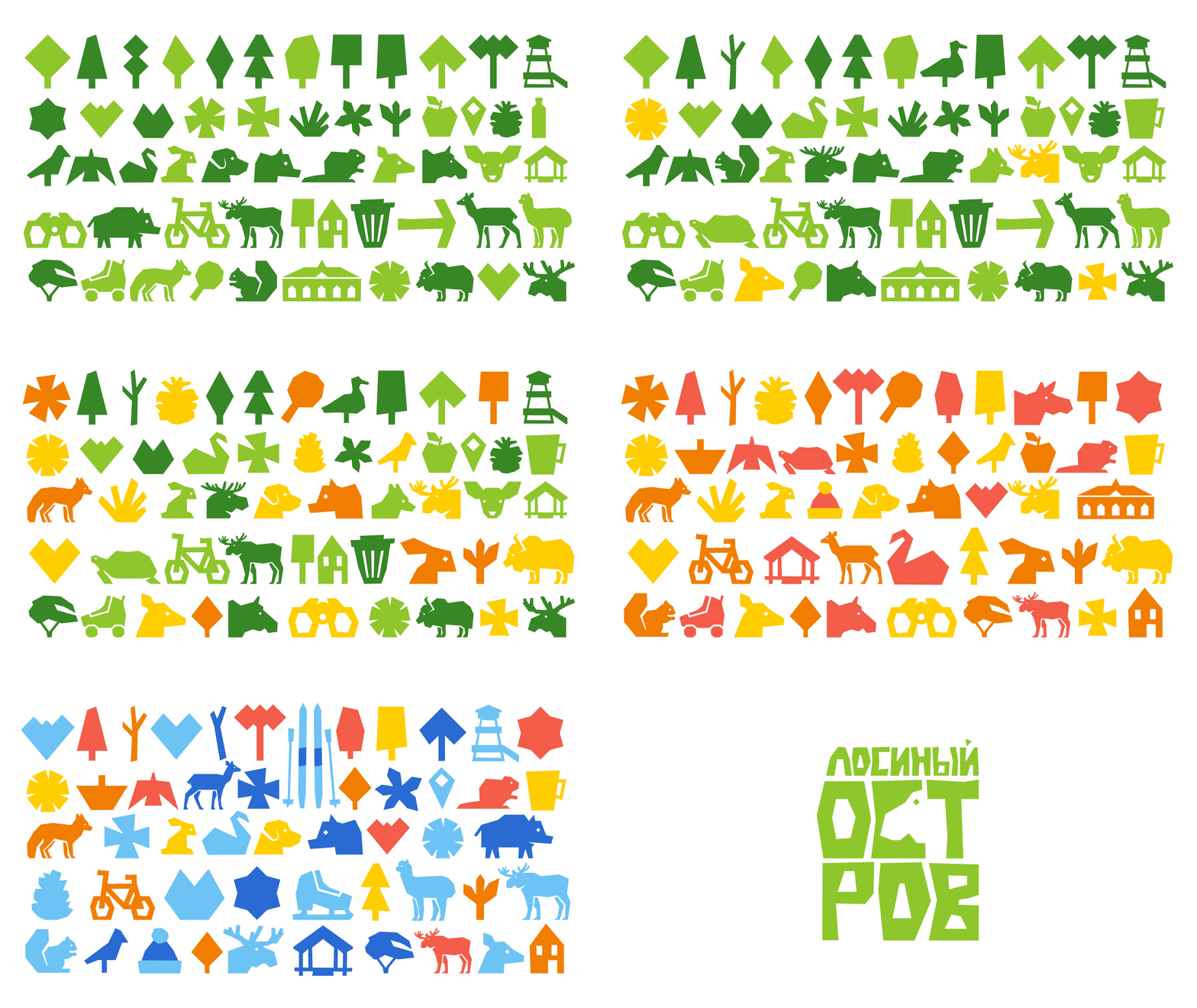
The brand identity for «Losiny Islands» is built on the principle of climatic adaptation; therefore, the logo exists in three color variations, each referencing a specific state of nature. The color of the pictograms also changes along with the logo, maintaining a unified graphic style while adjusting it to the seasonal context.


Original size 4000x2250
Original size 4000x2250
Original size 4000x2250
Original size 4000x2250
Original size 4000x2250
Original size 4000x2250
Original size 4000x2250
Original size 4000x2250
Original size 4000x2250
Original size 4000x2250
Original size 4000x2250
Original size 4000x2250
Original size 4000x2250
Original size 4000x2250
Original size 4000x2250
Original size 4000x2250
Original size 4000x2250
Original size 4000x2250