Original size 3500x2000
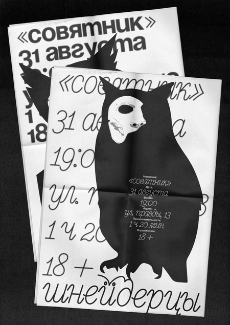
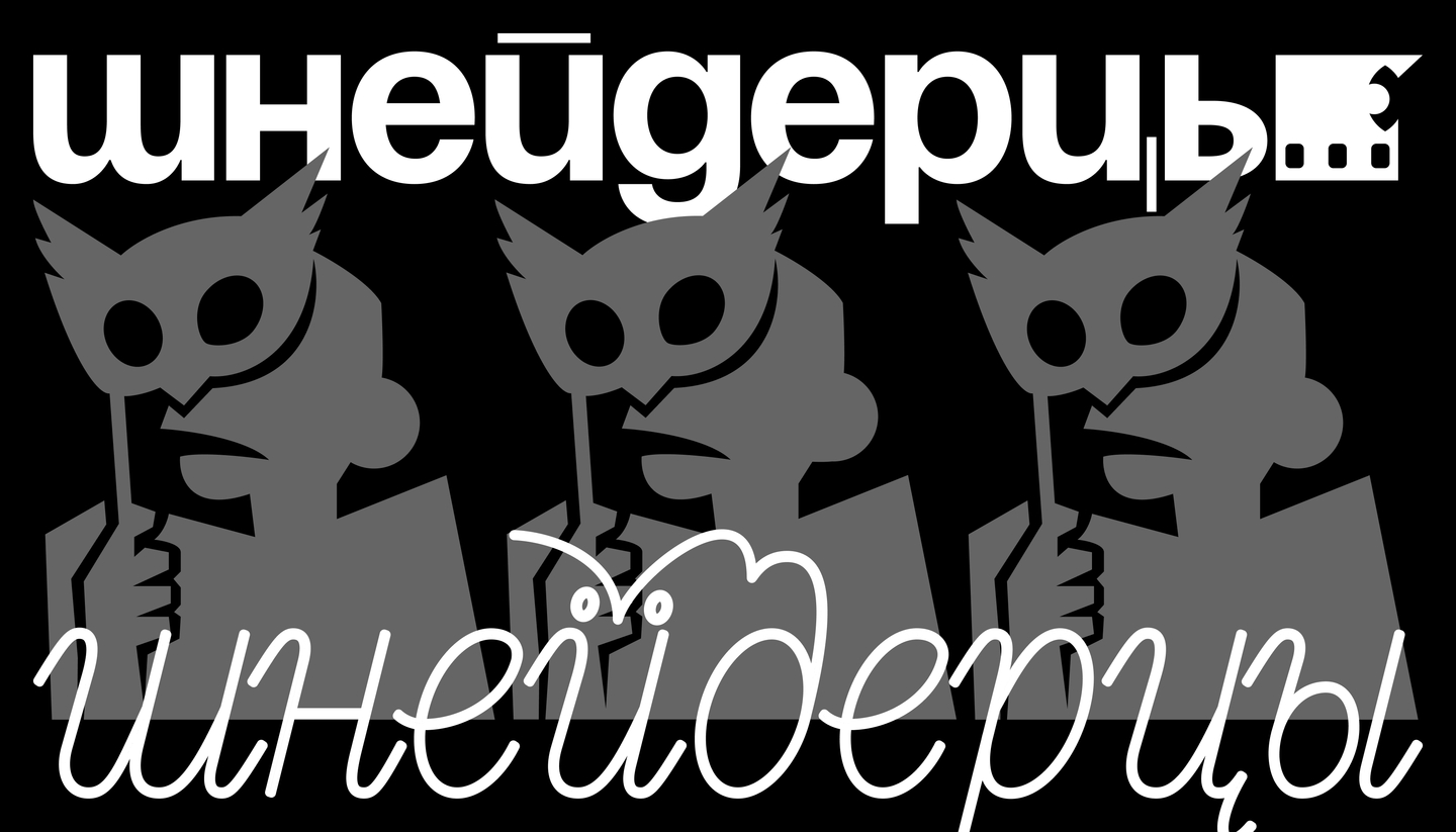
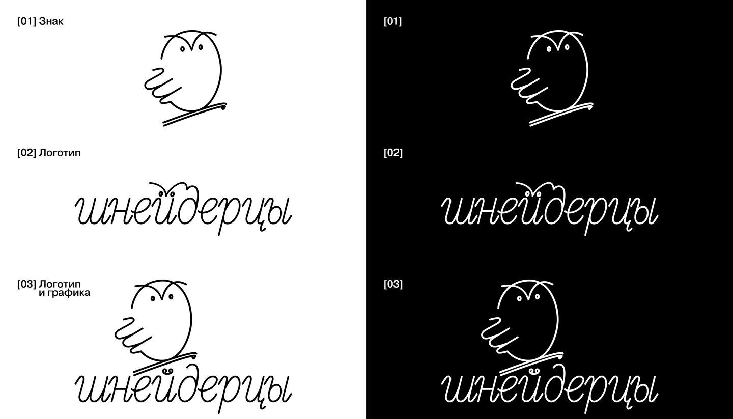
At the core of the design lies the metaphor of astute observation and theatrical illusion: the first version of the logo is a graphic silhouette of an owl, where the wing echoes the shape of the letter «sh». The textual version is a minimalist reference to an owl’s head within the diacritics of the letter «y».
Original size 3500x2000
Original size 3500x2000
Original size 3500x2000
Original size 3500x2000
Original size 3500x2000
Original size 3500x2000
The second version goes further by synthesizing the image of an owl with film strip: the bird’s head is formed from perforations in the film, creating a dynamic pattern of motion that emphasizes the cinematographic nature of the scenic method. There are three perforations in the film, which creates the dynamic hatching of the letter «sh.»
Original size 3500x2000
Original size 3500x2000
Original size 3500x2000
Original size 3500x2000
Original size 3500x2000
Original size 3500x2000
Original size 3500x2000