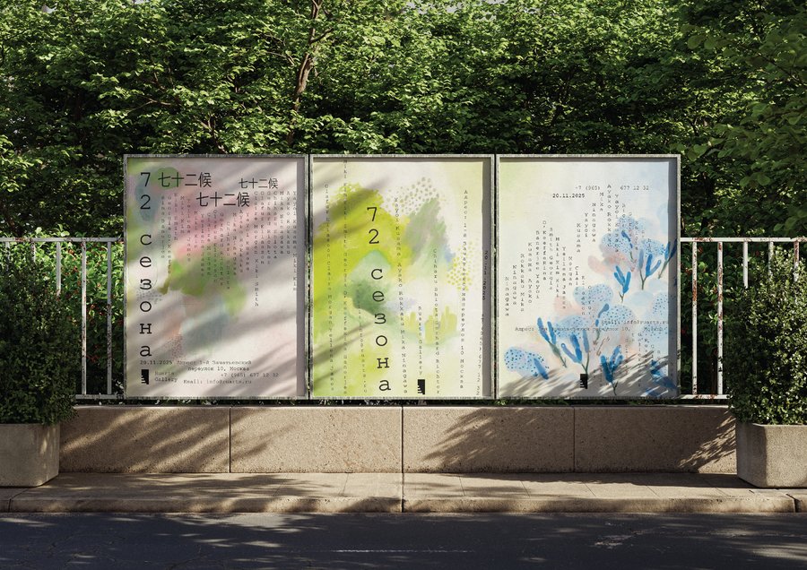
описание проекта
«72 сезона» — бренд японского чая, в основе которого лежит философия гармонии человека с природой, осознанного потребления и внимания к самым незаметным изменениям окружающего мира.
Название бренда отсылает к традиционному японскому календарю, согласно которому год делится не на привычные четыре сезона, а на 72 коротких периода продолжительностью около пяти дней. Каждый из них отражает определённое природное явление: пробуждение насекомых после зимы, появление первых цветов, созревание плодов, изменение направления ветра, выпадение утренней росы или начало осеннего листопада.
В основе этой системы лежит особое восприятие времени. Природа не меняется внезапно: каждое её состояние постепенно перетекает в следующее, а красота заключается не только в масштабных событиях, но и в деталях, которые человек зачастую не замечает. Бренд «72 сезона» предлагает перенести эту философию в повседневную жизнь через простой и знакомый каждому ритуал — чаепитие.
Разделение на 72 сезона позволяет сформировать большую коллекционную линейку, в которой каждый продукт является частью единой истории. Покупатель может выбирать чай не только по вкусовым предпочтениям, но и по настроению, времени года или желаемому состоянию.
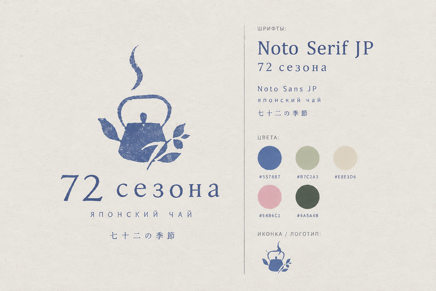
промт: Create a minimalist brand identity presentation for a Japanese-inspired tea brand called «72 сезона» (72 Seasons), based on the traditional Japanese calendar, which divides the year into 72 micro-seasons.Design a simple, elegant and recognizable logo that combines the silhouette of a traditional Japanese teapot with delicate botanical elements, such as tea leaves or small branches. The logo should look like a real brand symbol, not just a decorative illustration.Use a calm Japanese aesthetic, inspired by traditional tea culture, nature, changing seasons and vintage Japanese printmaking. The visual style should resemble a subtle linocut or screen-printed illustration with slightly grainy, textured edges.
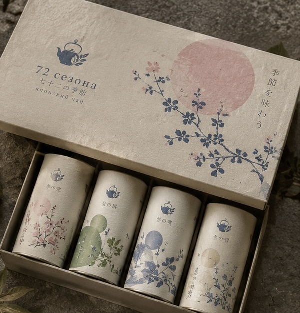
промт: Create a high-quality photorealistic product presentation for my Japanese tea brand «72 сезона» (72 Seasons), inspired by Japan’s 72 microseasons. Showcase the main product line: a collection of beautifully designed tea packages featuring different seasonal flavors. Each variety should have its own subtle color palette, botanical illustrations, name and mood, while maintaining one cohesive and recognizable brand identity.Use my original teapot logo, elegant typography, textured paper packaging and signature colors: muted indigo, sage green, warm ivory, dusty pink and deep forest green. Arrange several cylindrical tea containers and matching boxes in a minimalist composition with soft natural lighting. Keep the focus entirely on the products, with minimal background decoration. All packaging, logos and Russian text should be clearly visible, realistic and aesthetically refined.
Create a high-quality photorealistic collection of eight miniature tea cards for my Japanese tea brand «72 сезона» (72 Seasons), inspired by the attached reference. Each card should represent a different seasonal tea blend, featuring a teapot-shaped cutout filled with realistic tea leaves, herbs, flowers or dried fruits. Include elegant Russian names, short flavor descriptions, ingredients and brewing instructions.Adapt the design to my original brand identity, using the signature teapot logo, Noto Serif JP and Noto Sans JP typography, delicate botanical illustrations, textured ivory paper and muted indigo, sage green and dusty pink accents. Arrange the cards beautifully on a rustic wooden surface with soft natural lighting. Maintain a cohesive, minimalist Japanese aesthetic with clearly readable text and unique compositions for each tea variety.
промт: Create a beautiful, cohesive product mockup presentation for a Japanese-inspired tea brand called «72 сезона» (72 Seasons). Show three branded products together in one composition: elegant tea packaging boxes with botanical illustrations, a small desk calendar inspired by the 72 Japanese micro-seasons, and ceramic tea storage jars decorated with delicate seasonal patterns.Use the brand’s established visual identity, including its minimalist logo, elegant typography, botanical illustrations, muted indigo blue, sage green, warm ivory, dusty pink and natural earthy tones. The products should look realistic, refined and commercially appealing, with a consistent Japanese aesthetic. Clean composition, soft lighting, no additional objects or unrelated elements.
кейвизы
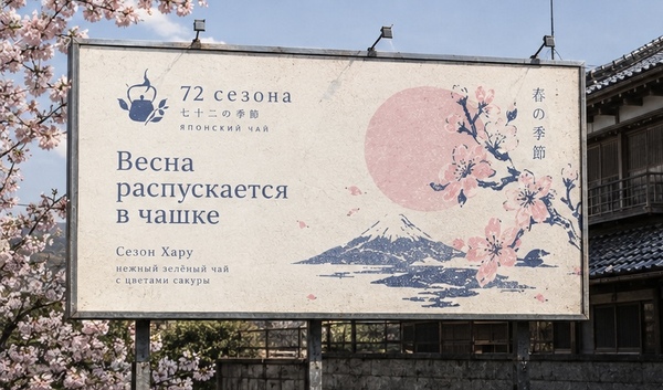
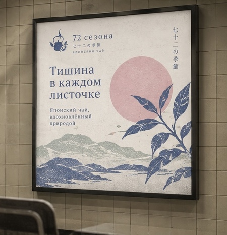
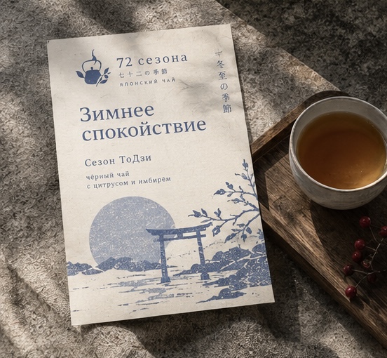
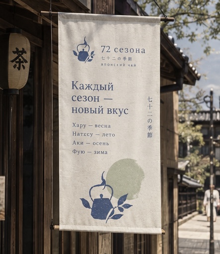
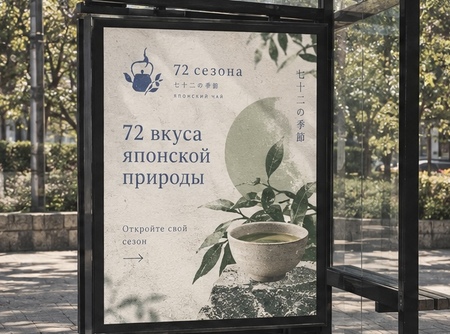
промт: Create a high-quality collage of 5 cohesive key visuals for «72 сезона», a Japanese tea brand inspired by Japan’s 72 microseasons, where every subtle change in nature represents a unique tea flavor. Use the attached brand identity as the main reference, preserving its original teapot logo, typography (Noto Serif JP and Noto Sans JP), textured paper aesthetic and color palette: muted indigo, sage green, warm ivory, dusty pink and deep forest green.Show five different advertising applications: a large outdoor billboard, a Japanese-style fabric banner, a minimalist sidewalk A-board, a bus stop advertisement and an illuminated storefront sign. Each composition should be unique but share one recognizable visual language: Japanese woodblock-inspired botanical illustrations, seasonal nature motifs, organic shapes and poetic Russian headlines. Keep the atmosphere calm, authentic, sophisticated and slightly nostalgic. All five mockups must look photorealistic, aesthetically unified and professionally designed, with clearly readable, correctly spelled Russian text.
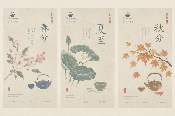
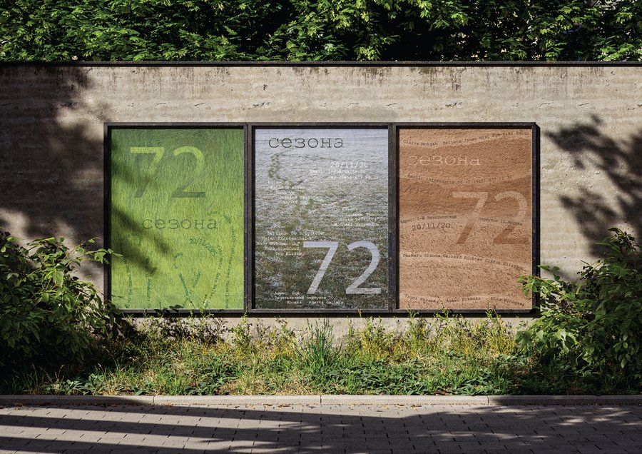
промт: Create three different minimalist Japanese-inspired promotional posters for the tea brand «72 сезона» (72 Seasons), arranged side by side in one horizontal composition. Each poster should represent a different season through delicate botanical illustrations, traditional tea utensils, expressive Japanese typography and subtle calligraphic details.Use textured rice paper backgrounds, muted natural colors, indigo blue, sage green, warm beige and dusty pink. Incorporate the brand logo, name and small Japanese-inspired inscriptions. The design should resemble traditional Japanese tea posters with a modern artistic touch, elegant typography, minimal compositions and subtle vintage print textures. All three posters should look visually connected as one brand collection.
пространство
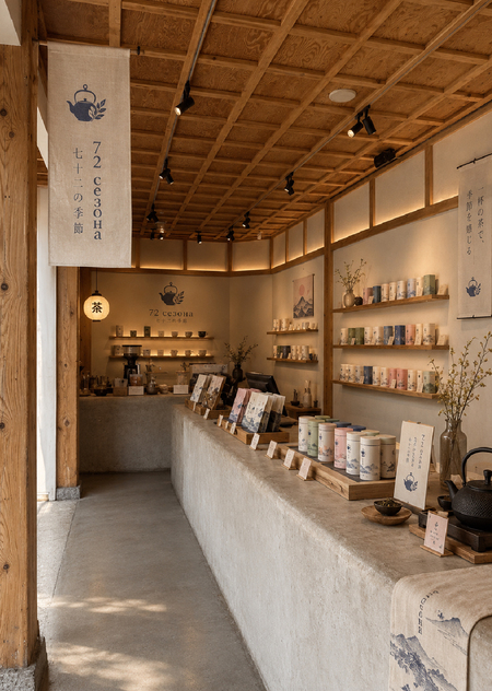
Create a horizontal, photorealistic visualization of a small Japanese-inspired tea shop for a brand called «72 сезона» (72 Seasons), inspired by the traditional Japanese calendar of 72 micro-seasons. The architecture should combine minimalist Japanese aesthetics, natural wood, warm beige plaster, stone and soft natural lighting, creating a calm and уютный atmosphere.Place a large rectangular sign above the entrance featuring the brand’s minimalist logo and the name «72 сезона». Incorporate the brand identity into the storefront and interior through delicate botanical patterns, seasonal illustrations and branded tea packaging displayed on wooden shelves. Use muted indigo blue, sage green, warm ivory, dusty pink and natural earthy tones. The shop should look authentic, elegant and commercially appealing, like a real Japanese boutique tea house. Wide landscape composition, realistic architectural photography, no people or unrelated signage.
Using the attached interior photograph as a reference, create a photorealistic visualization of a Japanese tea boutique for my brand «72 сезона» (72 Seasons). Preserve the original architecture, composition, warm wooden textures, soft lighting and calm, minimalist Japanese atmosphere. Integrate my brand identity naturally into the existing space, using the attached logo, typography and signature color palette: muted indigo, sage green, warm ivory, dusty pink and deep forest green.Add branded tea packaging representing different Japanese microseasons, neatly arranged on wooden shelves and the counter. Include subtle details such as the signature teapot logo, Japanese-inspired fabric banners, botanical illustrations, ceramic tea accessories and elegant signage with the brand name. The interior should feel authentic, harmonious and aesthetically refined, clearly recognizable as a physical store belonging to my tea brand. Avoid excessive decoration and maintain a natural, high-quality architectural photography style.
Используемые инструменты и описание процессов производства изображений
ChatGPT (OpenAI) — Разработка концепций изображений
Генерация изображений в ChatGPT (OpenAI) — Создание фотореалистичных визуализаций на основе текстовых запросов и загруженных референсов
Референсы — Определение композиции, стилистики, атмосферы и вариантов размещения фирменной графики.
Последовательность работыЭтап 1. Подготовка визуальной основы.
В качестве исходных материалов использовалась разработанная айдентика бренда: логотип в виде чайника, фирменная цветовая палитра, шрифты Noto Serif JP и Noto Sans JP, а также изображения-референсы японской архитектуры, упаковки и рекламных носителей.Этап 2. Разработка промптов.
С помощью ChatGPT были составлены запросы для каждой категории изображений. В них указывались композиция, материалы, освещение, цветовая гамма, фирменные элементы и необходимые объекты.Этап 3. Генерация визуальных материалов.
Изображения создавались последовательно, с сохранением общей стилистики бренда:
Кей-визуалы — создание пяти рекламных макетов с единой визуальной системой на разных носителях.
Интерьер магазина — адаптация фотографии японского минималистичного помещения под фирменный магазин «72 сезона».
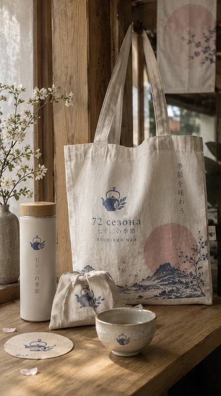
Мерч — Визуализация трёх композиций с фирменными аксессуарами: сумками, посудой, текстилем и подарочными наборами.