About the Project
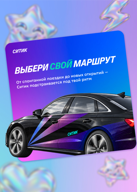
A concept identity design project for the youth branch «CityDrive"—"Sitika.»The project must maintain a connection to «CityDrive» while making the brand appealing to a young audience aged 18 to 30.
Contents
- Research
- Identity Design
- Automotive Branding
- Advertising Campaign
Research
Before beginning the identity design process, it is necessary to analyze what the target audience values and what attracts them to different brands. To understand the needs and values of young people, statistics were reviewed, research was conducted, and information on automotive styling trends was gathered. In future work, these studies will help create an identity that is appealing specifically to the target audience.
What Young Audiences Value in Cars
According to VCIOM research [1], the most important criteria when choosing a car for the 18–24 and 25–34 age groups are price and the car’s specifications. The external appearance of the car plays a more significant role for those in the 18–24 age group, gradually decreasing thereafter (to 8% for those over 60).
Aquarelle Research x LikePR research [2] shows that Gen Z is much more oriented toward design and technology than other generations. For them, novelty and visual style are important.
Thus, for young audiences, the exterior appearance of a car plays a more significant role than it does for representatives of other generations. However, this is not the main criterion—the vehicle’s functionality and specifications are more important.
Car Styling Trends
Chameleon Auto Studio discusses trends in automotive styling, as noted in [3]:
«Automotive styling at the end of 2025 has noticeably ‘matured.’ What is moving to the forefront is not so much loud body kits and extreme colors, but a deliberate appearance that looks more premium than stock while remaining practical.»
People are moving away from flashy shades and complete vehicle wraps toward more neutral colors and emphasizing details.
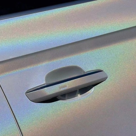
One of the major trends for 2026 is the multi-color iridescent effect. The neutral film shifts into various colors under specific light.This effect allows designers to avoid excessive brightness and garishness while still conveying individuality and modernity.
Brand character and tone of voice
According to a study by «Anketolog» [4], Zoomers perceive the ideal brand as reliable, stylish, creative, and authentic. Three-quarters of respondents prefer a respectful and trustworthy tone of voice.
Research by St. Petersburg State University [5] showed that most young audiences view the artificial use of youth slang by brands negatively. Humor and slang are appropriate in moderation, but they must naturally align with the character’s persona. Therefore, the problem is not the slang or the humor itself, but the brand’s clumsy attempt to impersonate its audience.
Conclusion
Based on our research, we can conclude that, contrary to common stereotypes about youth, not all young people prefer overt flashiness, excessive ornamentation, or a superficial display of «youthfulness.» Gen Z is drawn to a brand’s reliability and creativity, while when it comes to cars, they favor functionality and an individualized yet understated design.
Identity
Logo
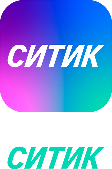
The logo was designed to be simple and minimalist, emphasizing the brand’s modernity and functionality.The brand font, Citydrive Citymobil Sans Narrow, is used in italics. The slanted typeface was chosen to convey a sense of speed.The logo is placed on a color gradient; when used without a background, it is rendered in turquoise.
Color Palette
The color palette is rich, emphasizing individuality and modernity while referencing a holographic sheen effect.
Primary colors: purple for the background, turquoise as an accent, and white.
Additional colors used for the gradient are blue and pink.
Purple, as the main color, is derived from CityDrive, maintaining a connection to the core brand. The gradient is constructed according to the same principles used throughout the entire ecosystem.
Typography
Fonts are also inherited: Citymobil Sans for headings and SB Sans Text for subheadings and body text.The Italic typeface, just like in the logo, reflects speed and ambition.
Graphic Elements