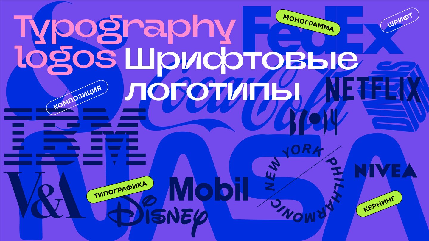
Font logo
The font logo is a logo that consists exclusively of a text element that is made up of a particular font or a specially designed printer. This logo focuses on the name of the brand, written in a unique, stylish and memorized way.
Music
Usually the letters in the text stand evenly behind each other. But everything in the logo could be anything. There are no rules here. Letters can jump, turn over, change places. All it takes to create the necessary effect. Keep an eye on the balance between decorativeity and functionality: the logo should be unique but read.
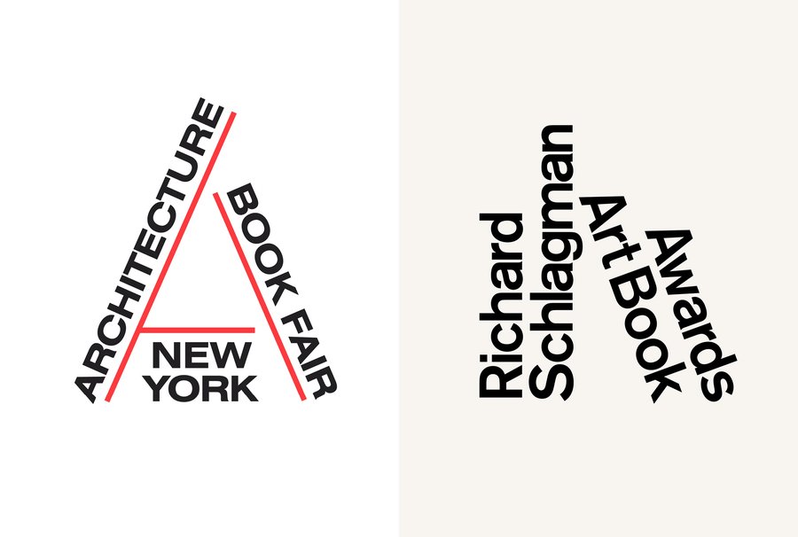
The logo’s composition illustrates the subject of the event
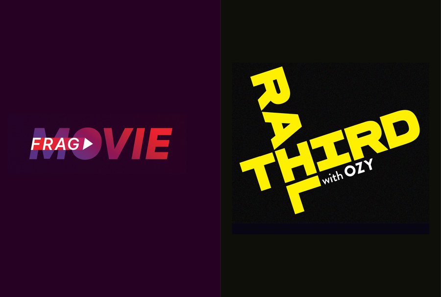
Words can rotate or overlap
Vertical reflection of words
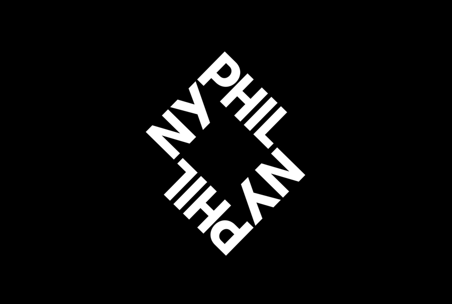
New York Philharmonic logo

Posting of inscriptions
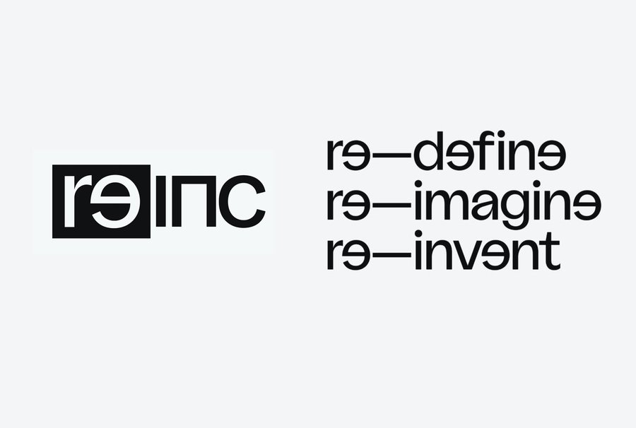
The letters inside the logo can behave differently, too.
Graphic rhyme
In the typeface, the letters are required to be next to all the other alphabet characters. That’s why it’s pretty universal. The logo is a unique combination of letters, so it is always possible to enhance the interaction of letters within this composition, to find and strengthen graphic rhymes.
Diagonal strokes of letters rhyme among themselves
The difference between the Niway logo and the Futura typeface
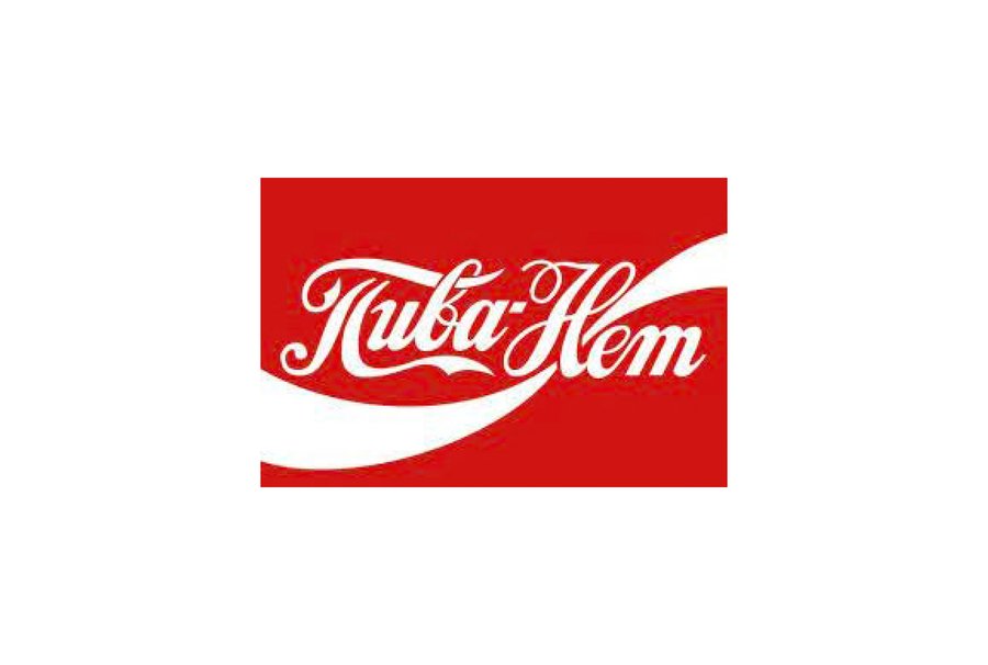
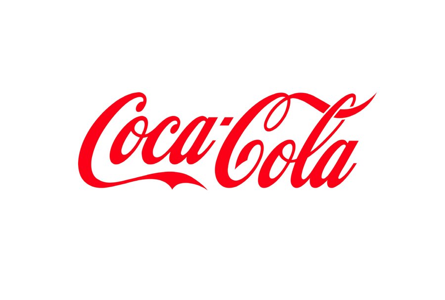
Coch Cole’s logo and Vladimir Chaiki’s «No Beer» joke.
Ecco logo. All letters rhyme with the shape of the circle
Corners and arcs
Cuts, sharp angles
Part of the elements missing
Move
Inner-letter light
Paint traps
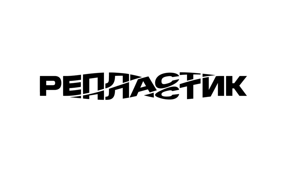
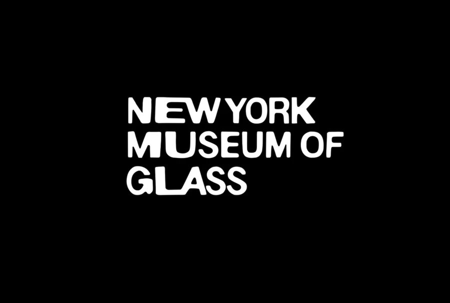
Distortion of the shape of letters
And there’s a lot of good and different fonts.
Symbols
The pattern of letters often resembles some visual symbols, sometimes such symbols can be found in counterface fonts. This allows the logo to be given additional interest, as well as a more accurate presentation of the brand, an illustration of the company ' s scope of activity or certain features.
A classic example is the shooter in the FedEx logo.