
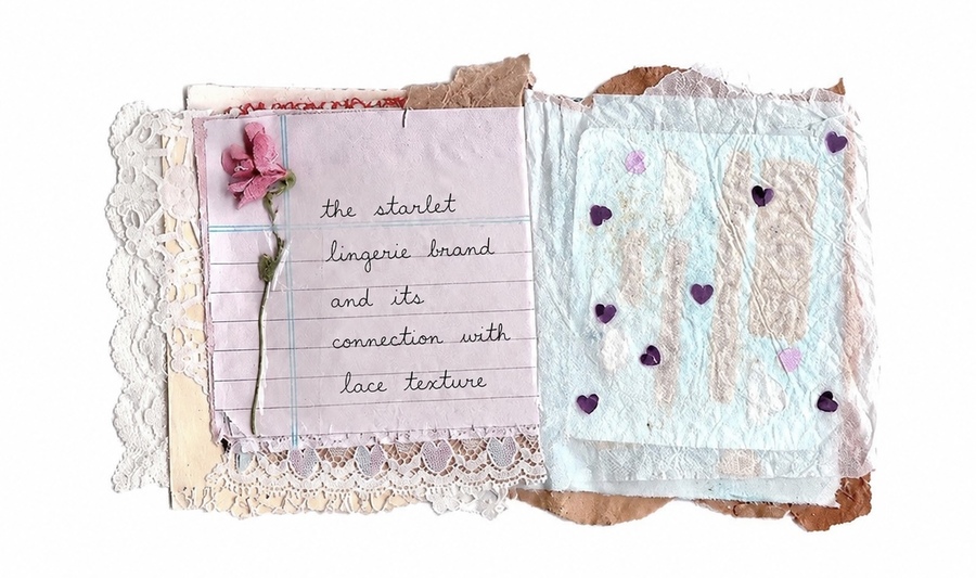
The visual research focused on studying lace as a key symbol of femininity, as well as analyzing how the perception of femininity and its visual codes changed across various historical eras. This study allowed us to trace the evolution of lace’s meaning in fashion—from a marker of luxury and status to a tool for self-expression and individuality.
The results obtained formed an essential foundation for developing the brand platform for the lingerie brand The Starlet. The research helped establish a clearer understanding of how lace can be utilized in the brand’s visual identity, what associations it evokes in the consumer, and what emotional responses it should generate. This enabled us to define the brand’s core values and construct its visual language.
concept
The theme of this final qualification work is the development of a women’s lingerie brand with a Y2K aesthetic for the Russian market.
The relevance of this project is driven by the transformation of the fashion industry in the Russian Federation: following the departure of several international brands, the market for women’s lingerie has significantly contracted in the mid-to-mid-premium positioning segment. While marketplaces have partially filled the vacated niche, their offerings are predominantly focused on low prices, which directly impacts the quality of materials, fit, and visual identity.
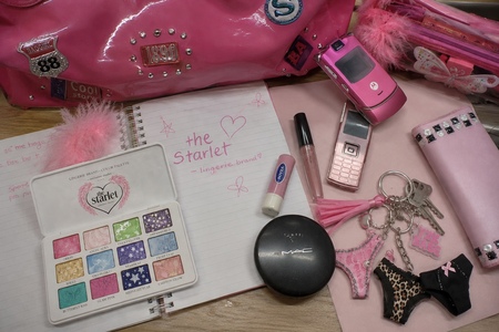
The current assortment of lingerie in Russia is largely represented by either «established» brands with a conservative aesthetic or basic everyday models lacking expressive power or emotional resonance. Meanwhile, Generation Z and young Millennials demonstrate a consistent interest in the aesthetics of the 2000–2010s—bright colors, glossy textures, naive sensuality, pop icon culture, and visual nostalgia.
The brand under development is positioned as a response to the scarcity of emotional and visual diversity in this category. Its concept is built upon combining the Y2K trend with high-quality materials and thoughtful branding. The brand offers not merely a product, but a means of self-expression—lingerie as an element of mood, play, and confidence.
Thus, this project aims to create a relevant and competitive brand capable of occupying the vacant niche and establishing a strong communication channel with a young audience.
brand goal
The Starlet brand aims to create a contemporary Russian lingerie brand that merges Y2K aesthetics, high-quality craftsmanship, and emotional product value. The brand seeks to fill a current gap in the market for expressive and visually appealing lingerie solutions, offering its young audience not just a functional wardrobe staple, but a tool for self-expression.
Identity
Blackletter / Gothic serif
Character: dramatic, vintage, with a Y2K and couture aesthetic
The brand name The Starlet was chosen to reflect its core idea and visual concept. Translated from English, the word «starlet» means «young star» or «rising celebrity.»
For the The Starlet brand, this name symbolizes the modern woman who is the protagonist of her own story. She is confident, fashion-aware, unafraid to draw attention, and views clothing and lingerie as a form of self-expression. The brand concept is founded on the idea that every woman can feel like a star, regardless of her circumstances.
Associations: glamour, provocation, «star energy»
Usage: logo, large headlines, campaigns
The Starlet Lingerie Primary Color Palette
Trends
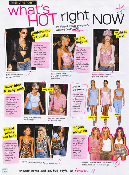
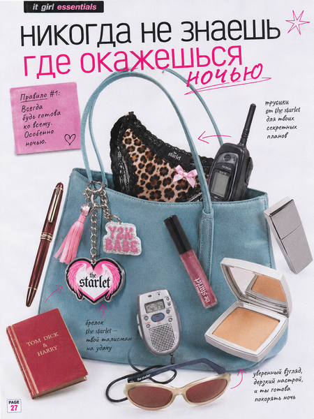
The brand foundation of The Starlet is built upon reinterpreting the aesthetic of the 2000s and early 2010s through contemporary fashion trends. The collection incorporates relevant trends such as lingerie as outerwear, vibrant colored underwear, pastel shades of baby pink and baby blue, animalistic prints, and Y2K nostalgia. These trends are not only highly sought after in the modern fashion industry but also underscore the brand’s concept—one rooted in a fusion of glamour, daring, and early 21st-century pop culture aesthetics.
brand aesthetics
Selection
bubblegum matching sets
animal instinct matching sets
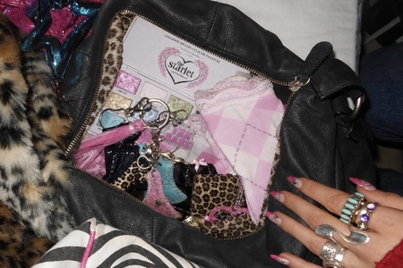
accessories
Packaging
advancement