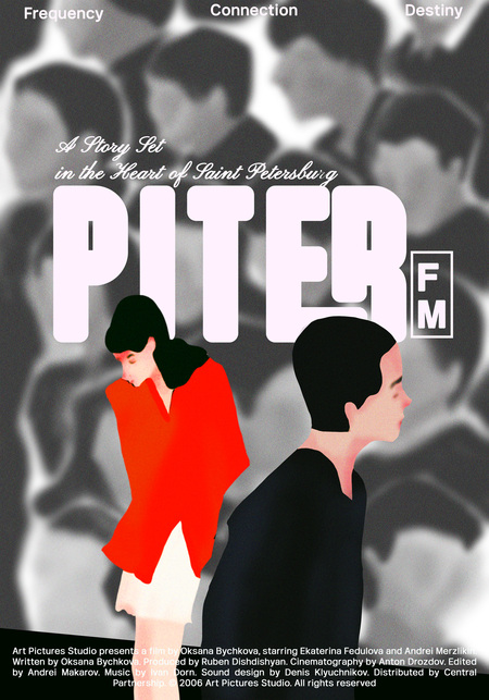
The Alternative Cinema Poster Competition: PITER FM (2006 BY Oksana Bychkova)
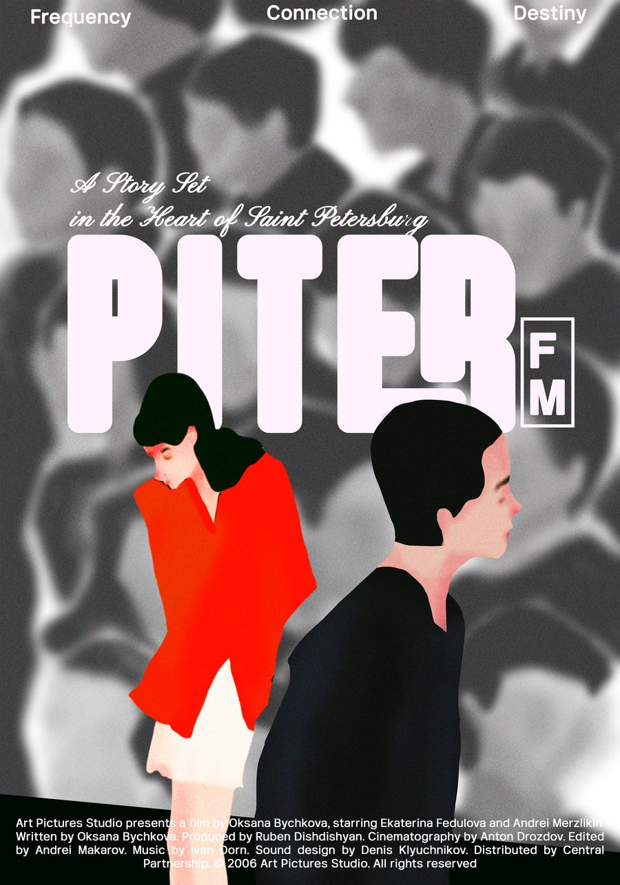
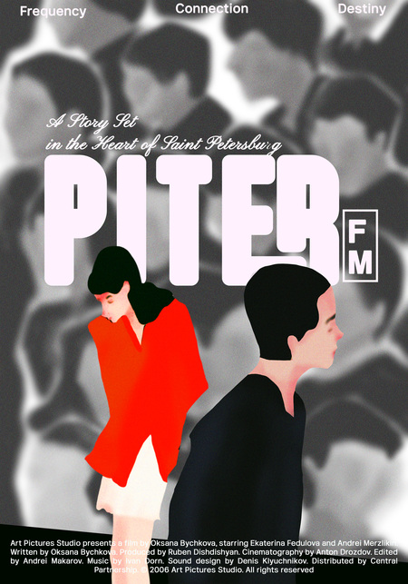
FIRST ALTERNATIVE The poster for Piter FM visually captures the essence of an urban love story set in Saint Petersburg. The design blends stylized illustrations with a blurred photographic background, symbolizing fleeting connections in a bustling city. Two protagonists stand apart, facing opposite directions, emphasizing their missed encounters and the serendipitous nature of their relationship. The typography is bold yet soft, reflecting the film’s romantic yet melancholic atmosphere. The tagline «Frequency, Connection, Destiny» hints at the themes of fate and communication, central to the narrative
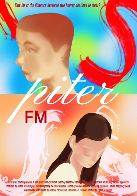
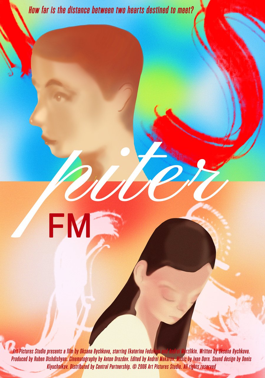
SECOND ALTERNATIVE This Piter FM poster embraces a dreamlike aesthetic, emphasizing the themes of distance and destiny. The composition is divided into two color spectrums cool blue and green hues for the male character, evoking detachment and introspection, while warm orange and red tones surround the female character, symbolizing passion and emotional depth. The abstract brushstrokes in red create a sense of movement, hinting at the characters' intertwined fates despite their physical separation. The tagline, «How far is the distance between two hearts destined to meet?» reinforces the film’s central theme: a love story shaped by coincidence and missed opportunities. The elegant typography, particularly the flowing script of «piter, ” adds a poetic touch, reflecting the film’s sentimental yet modern tone.
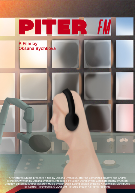
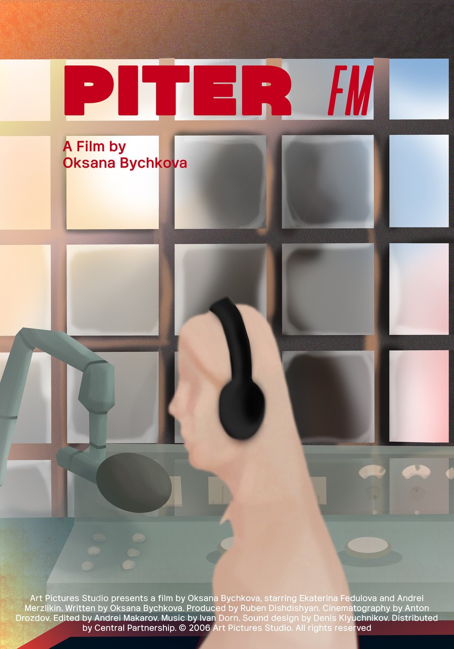
THIRD ALTERNATIVE This Piter FM poster highlights the film’s radio-centric narrative with a composition set in a broadcast studio. In the foreground, a blurred figure wearing headphones symbolizes the protagonist’s deep connection to the world through sound, reinforcing themes of fate and missed connections. The grid like windows in the background serve as a subtle yet significant element among the reflections, a faint silhouette of a man appears, hinting at an unseen presence or a destined encounter. This detail emphasizes the film’s romantic theme, where two souls are unknowingly drawn to each other. The warm to cool gradient reflects the emotional shifts in the story, while the bold red typography of PITER FM captures the energy of radio broadcasting, contrasting with the soft, introspective atmosphere of the composition
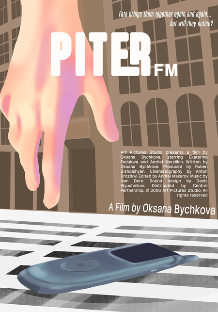
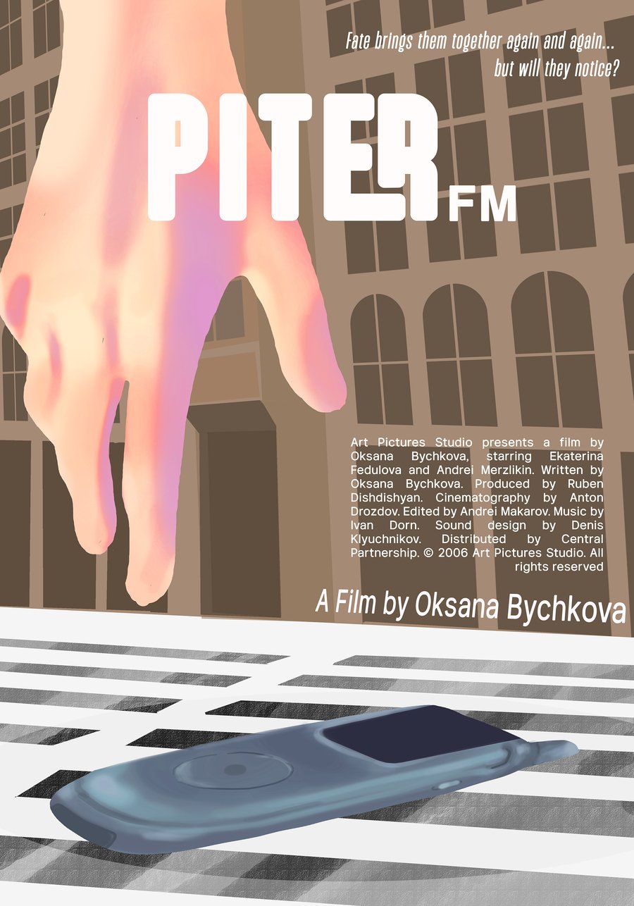
FOURTH ALTERNATIVE This Piter FM poster encapsulates the film’s themes of fate and serendipity through a striking visual metaphor. The dominant image of an outstretched hand, suspended above a fallen MP3 player, symbolizes a moment of chance will the owner notice, or will this opportunity slip away? The setting, an urban landscape with classic European-style architecture, grounds the scene in St. Petersburg’s charming atmosphere. The tagline, «Fate brings them together again and again… but will they notice?», reinforces the central theme of near-missed connections. The warm pinkish glow on the hand contrasts with the muted tones of the background, emphasizing human emotion amidst the structured cityscape. Meanwhile, the bold, modern typography of PITER FM maintains the contemporary feel of the film, while the slanted placement adds a sense of motion and unpredictability.
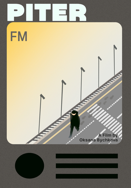
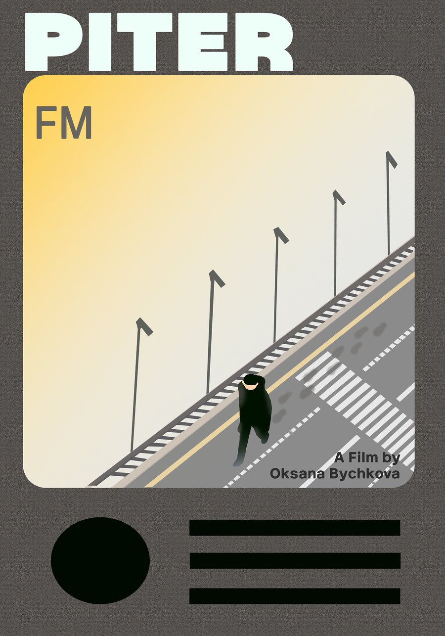
FIFTH ALTERNATIVE This alternative poster for Piter FM depicts a lone man walking on a city sidewalk, leaving footprints on the zebra crossing. The isometric perspective and minimalist composition create a melancholic and reflective atmosphere, aligning with the film’s theme of missed yet fated encounters.
The soft yellow gradient background suggests either dawn or dusk, enhancing the nostalgic and solitary mood. The design elements at the bottom resemble a vintage radio or music player interface, subtly hinting at disrupted communication or the film’s connection to radio broadcasting.
With its simple yet evocative visual style, this poster captures the essence of Piter FM: two people constantly brought together by fate but always on the verge of truly meeting.
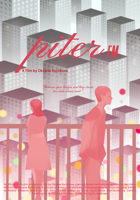
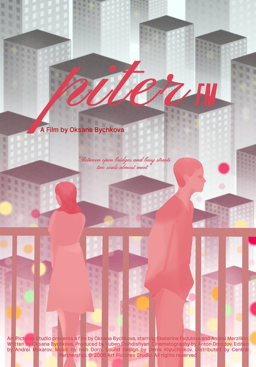
SIXTH ALTERNATIVE This alternative poster for Piter FM captures the essence of fleeting connections in a bustling city. Two silhouetted figures stand on a bridge, facing opposite directions, unaware of each other’s presence. The dreamy pink and red hues create a sense of warmth and possibility, while the towering buildings in the background emphasize the vastness of the city that keeps them apart.
The blurred city lights symbolize the randomness of urban encounters people cross paths every day, yet many never meet. The handwritten-style title and tagline add a personal touch, reinforcing the idea that fate constantly brings people close, but not always together.
With its delicate composition and nostalgic aesthetic, this poster visually represents Piter FM’s central theme: two strangers unknowingly orbiting each other’s lives, just one step away from meeting.
POSTER FILE https://its.id/m/MoviePosterViolaAgnesya