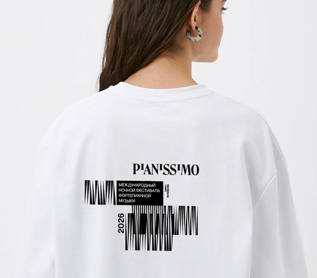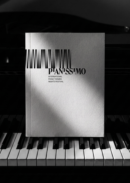
As part of the generative graphics course, a brand identity concept was developed for the international Pianissimo Piano Music Festival. The festival’s characteristic graphics and identity were generated based on piano melodies. This design serves as an extension of the black-and-white key motif established in the logo previously created by Olga Sil and Kirill Martyanov.

The core of the visual identity is based on observing the expressive rhythm of the shadows created when piano keys are pressed. The piano melody itself directs the play of these shadows within the developed graphics.
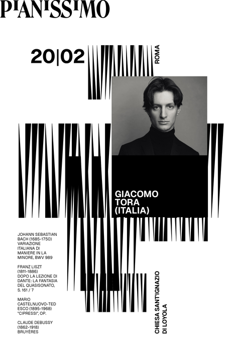
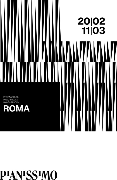
The main graphic constants of the style are the generative pattern, the typography, and the black-and-white color code.
Posters are assembled on a unified grid in TouchDesigner, with the capability for random placement of pattern blocks, performer photographs, and text. Animated versions of the posters have been created for social media and online press.
A distinctive feature of the festival is the selection of concert venues. Each time, the locations are unconventional—ranging from art museums to abandoned factories or contemporary art spaces. Therefore, it was crucial to create an identity that could seamlessly integrate into any stylistic environment.