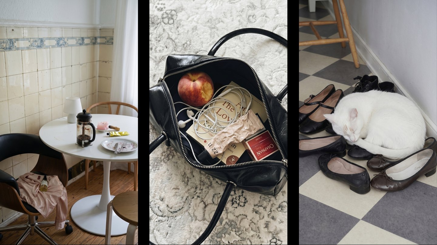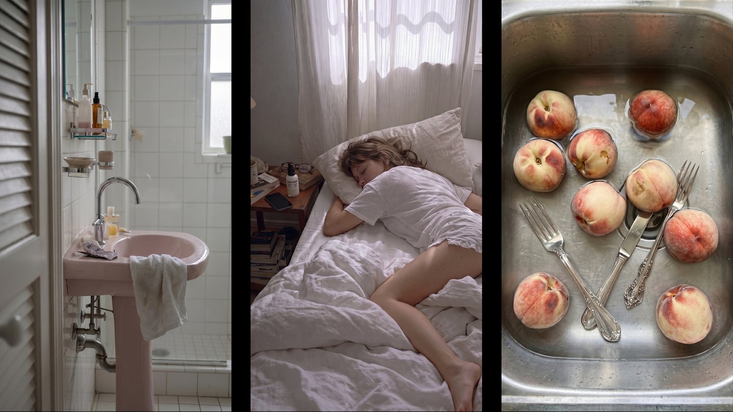

22|11 — a Russian skincare brand founded in Armenia by biochemist Tigran Geolyetsyan.
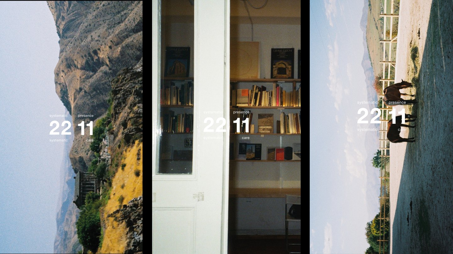
Stills from the opening sequence. The logo line becomes variable within the context of the space.
The goal of the rebranding was to establish a coherent system for both the brand identity and its presence in people’s daily lives.
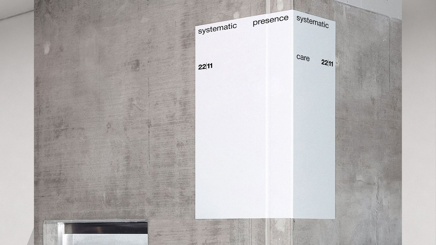
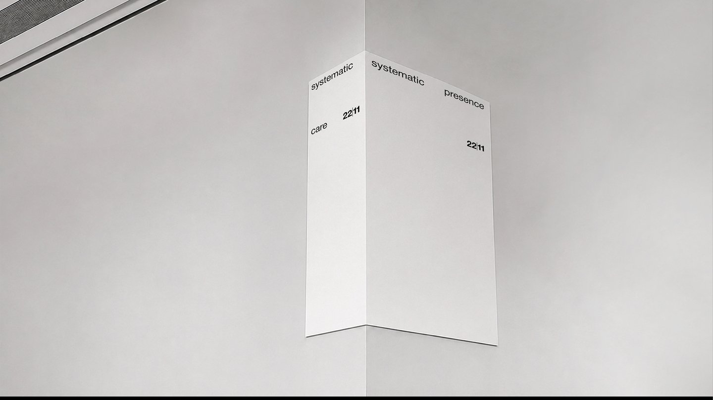
posters. The 22/11 system does not attempt to impose itself onto the natural system; instead, it integrates harmoniously within it.
It was important to integrate the brand’s visual identity and cultural values of Armenia, along with a narrative structure for the brand’s products, unifying all elements through interaction logic.
product usage instruction cards/description of application sequence
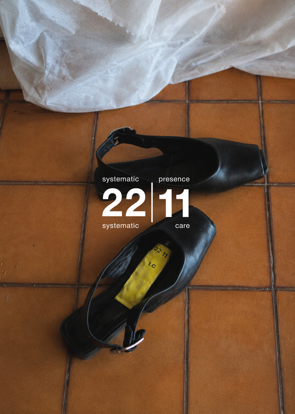
The new concept is that 22|11 does not announce itself, but rather conveys its a priori presence in a person’s life.
Stories for 11/22
The complete list of products is posted on the sheet in a 2k1 proportion.
The brand shuns the idealized image, making randomness and imperfection constants of its visual identity alongside a clearly structured layout system.
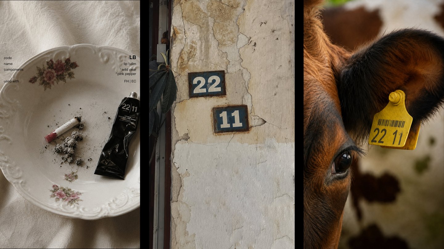
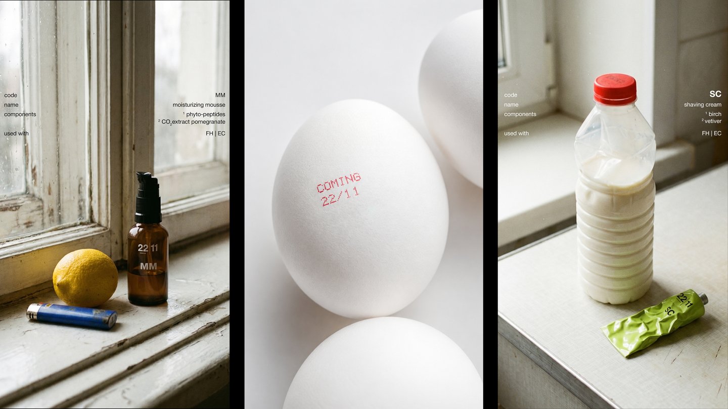
stories for 11/22
posters serve both a decorative and an informational function
Posters serve both a decorative and an informational function.
Money Pouch 22|11
The line in the logo is the central brand sign and can mimic its environment, thereby uniting the brand system with the real-life system.
22|11 integrates into the real space through the mimicry of the logo line. The absence of superfluous detail emphasizes only the fact of its presence.