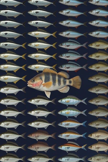
Description
I chose to analyze fish because I believe the underwater world is incredibly interesting, diverse, and multifaceted. However, common, riverine fish should not be overlooked either. They are simple, yet still interesting to analyze. The sheer variety of species attracted my attention to this topic.
For the project, a dataset was selected containing the following data:
- Fish Name — fish name
- Family — family
- Origin — region of origin
- Environment — habitat
- Feeding — dietary information
- Life Span — lifespan
- Temperament — temperament
Based on this data, I constructed a bar chart, a pie chart, and a heat map.
The dataset was sourced from the Kaggle.com.
Stages of Work
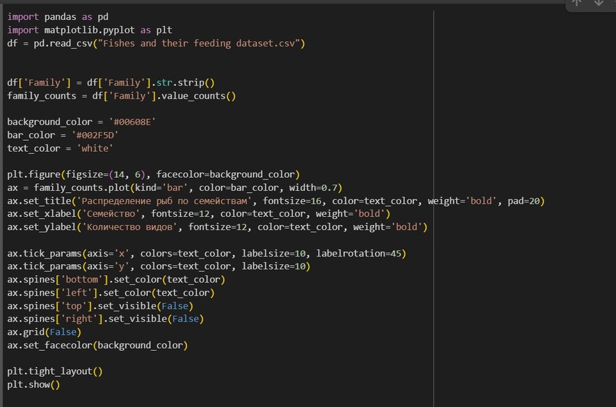
First, the necessary libraries were imported:
- pandas — for loading and preprocessing the CSV file
- matplotlib and seaborn — for creating charts and styling visualizations
- numpy — for processing numerical values, specifically life expectancy
The dark blue color was chosen for all charts:
Background color — #00608E Color of bars and main accents — #002F5D Text color — white or dark blue This color palette directly evokes an association with the underwater world.
Stylistic elements were also utilized: — Unnecessary borders were removed (ax.spines['top'].set_visible (False)) — The grid was disabled (ax.grid (False)) — Bold fonts were used for titles and labels (weight='bold').
Data Visualization in Charts
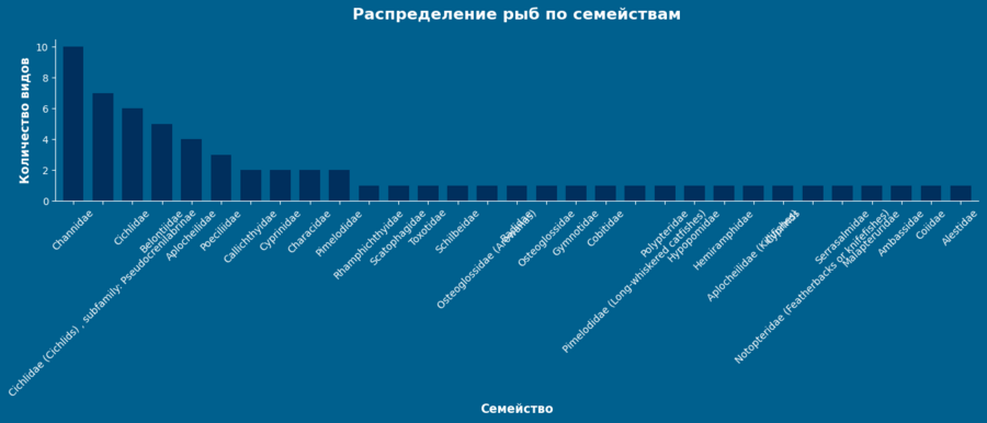
Bar chart showing the distribution of fish species by family
This chart demonstrates the abundance of fish and families within the dataset. Accordingly, the Channidae family (snakeheads) is the most prevalent.
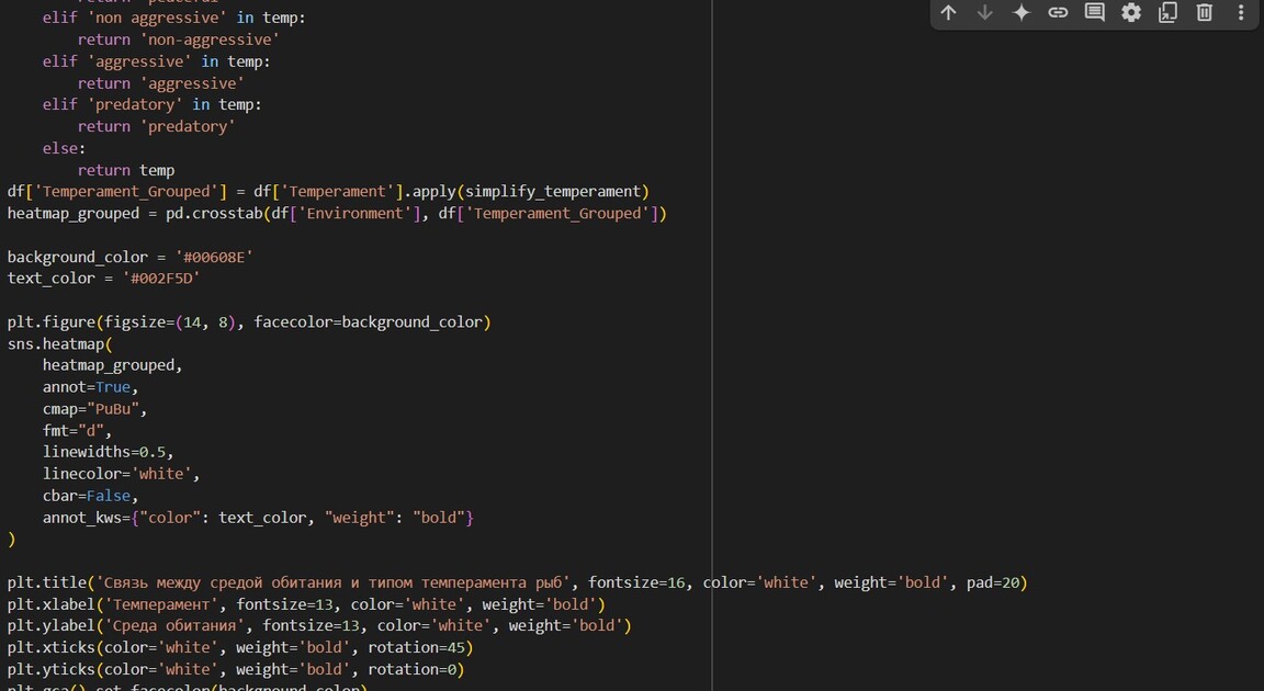
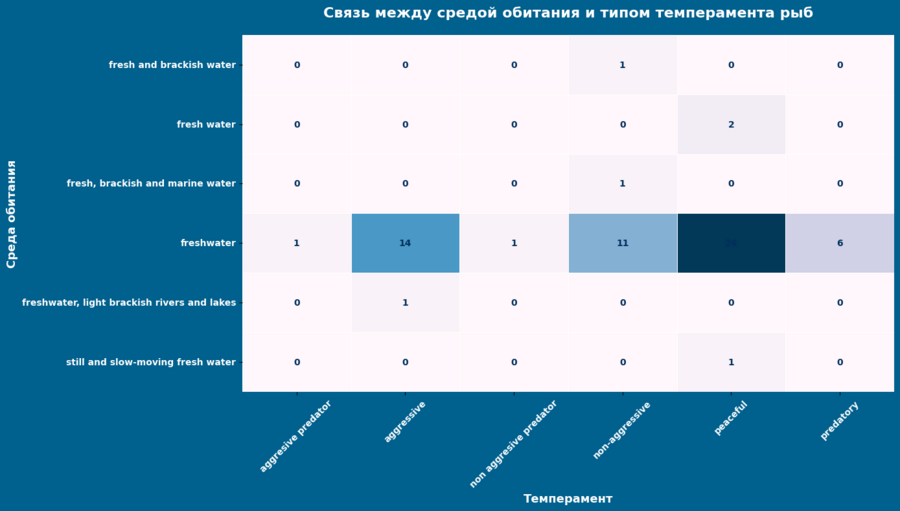
Heatmap of Habitat Dependency and Temperament.
The thermal map reflects the dependency of temperament on the habitat. Naturally, the dataset consists almost entirely of freshwater species, as this is the most diverse habitat type, housing fish of all temperaments—from peaceful to aggressive.
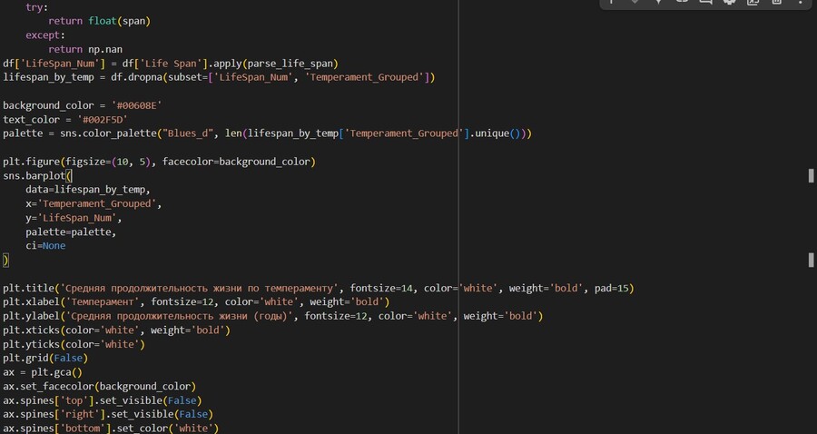
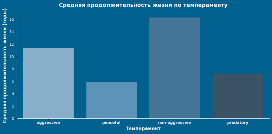
Bar chart illustrating the relationship between life expectancy and temperament.
This histogram illustrates the relationship between lifespan and temperament. Predators have the longest lifespans because they are larger. Aggressive species have the shortest lifespans because they are constantly under high stress, face a greater risk of injury, and are prone to rapid environmental changes.

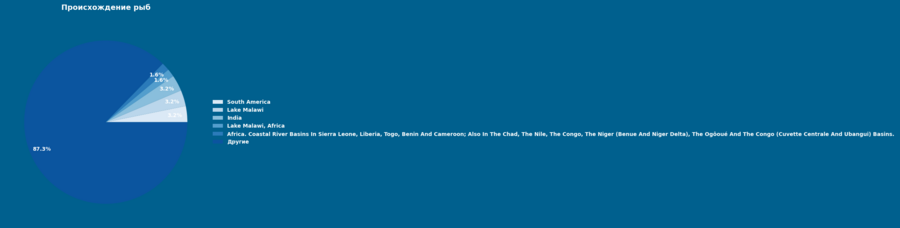
pie chart. fish origin by region.
The diagram illustrates which regions are richer in fish diversity using a clear pie chart example.
List of AI Networks Used
The cover image was generated using Ideogram. Generation prompt:
It looks like a catalog of realistic fish, arranged exactly in rows and columns. The fish look like real, realistic ones. Dark blue background.
The neural network ChatGPT was used to correct errors and clarify ambiguous points in the code. Prompts: «How to add a legend to a chart, but without a border—just with color indicators?», «How to change the colors of the chart and the font?», «How to remove text overlay?», «How to build a heat map?»