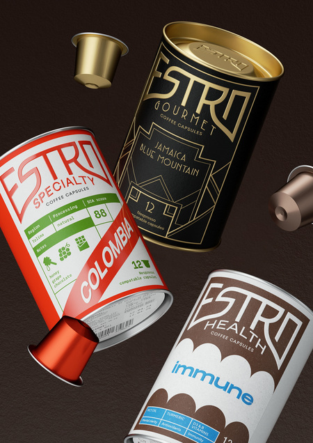
ESTRO — a new brand of coffee capsules whose main advantage lies in new technologies that allow for better preservation of coffee properties.
The core solution chosen was the idea of using different graphics—stylistically and conceptually aligned with the target audience of each of the three diverse product lines.
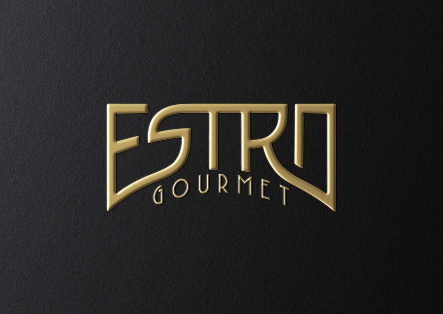
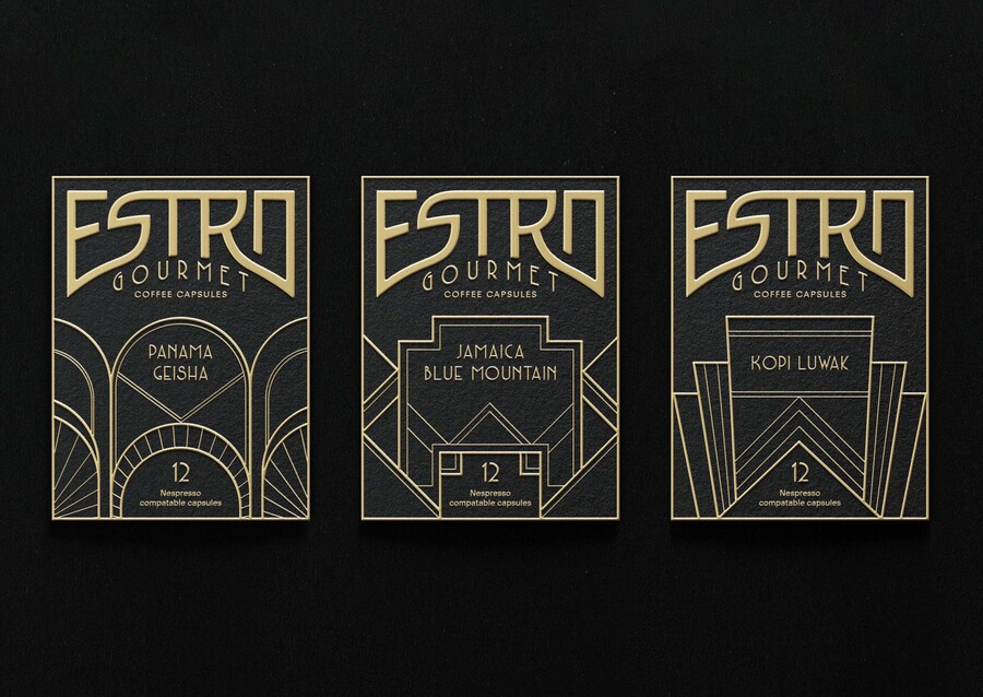
ESTRO Gourmet — a premium line featuring the most expensive coffee varieties. It is designed for high-income individuals who value status, both in life and when selecting coffee capsules. The visual identity for this line is Art Deco style, which embodies luxury.
(No text provided for translation.)
The second line, ESTRO Specialty, is aimed at individuals who understand every nuance of the beverage. They are coffee specialists for whom the origin—where and how the coffee was grown—and its specific characteristics are important. Reflecting its target audience, the packaging provides detailed information on the properties of this coffee varietal, and the country of origin serves as the primary differentiating element among the packages within the line.
Please provide the Russian text you would like me to translate.
The third line, ESTRO Health, consists of coffee infused with health-benefiting properties. This line includes compounds that are beneficial to the body.
The packaging graphics visually suggest the properties of specific capsule types. Furthermore, the sticker «dissolves» into the tube packaging, mirroring how the beneficial ingredients enter the body.
Please provide the Russian text you would like me to translate.