
20 точек на карте истории визуального языка
Или почему мир выглядит так, как выглядит
Why does the world look like it looks? How did we come together at the point at which we are now, and how was the visual language developed and adopted? It seems to be a question of taste, fashion, or technology: today one is popular, tomorrow another. But every event has its own story. Visual language has evolved for thousands of years. Every historical layer of it continues to affect our perception. We’re not just looking at images, we’re reading them, we’re analysing the values, and we’re generally taking a form that’s not obvious. For example, the alphabet has become such a logical part of our existence that we rarely remember (and we do not know at all) how the system of graphical sound symbols emerged. From an intuitive (and situational) phenomenon, visual language has evolved into a system of thinking, ranging from the first images as survival tools to a modern meta-language involving algorithms, interfaces and artificial intelligence. I have highlighted 20 curious facts that have influenced the way in which we shape our current picture of the world. Of course, there was a great crowd of them, and each little detail affects the image of our time. But that will be enough to get to the first stage of studying a phenomenon as big and exciting as visual.
01. Lasco Cave


Lasco Cave (Grotte de Lascaux) 15 — 18 thousand years ago
The first images were created 40–50,000 years ago, in the form of lines, dots, handprints, and we find evidence of early painting almost all over the earth. These pictures weren’t art in the usual sense. But it was an already established visual communication. Some of the most popular rock paintings, created 15 to 18 thousand years ago, are in the Lasco Cave in Southwest France. They operated as a magic ritual, a hunter’s training manual, and an aesthetic act at the same time. Each drawing performed a practical and symbolic function, helping to predict or encourage successful hunting, capture knowledge of animals, and transmit experience to the next generation. The picture wasn’t just evidence of existence. That’s how they put together the first conscious visual messages. It is believed that many of the paintings are located at the points of a cave with special acoustics — the sound of blows of hooves has increased the magical effect. The drawing itself was, of course, imperfect, but remained an important part of the history of the visual language, which began the complex communication system we now possess.
02. Pictograms
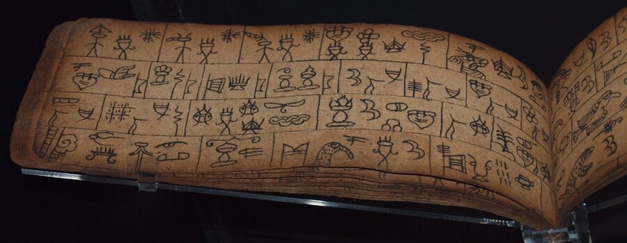
Tibet’s pictorgaphics are written. Fragments of the text recorded by the Dunba (pictogram letter from approximately VIIv. (Signed) B.C.E.
There’s a lot of meanings in one image we’ll see later, in a pictographic letter. Pictograms allow the transmission of information without words, based on a recognized and most characteristic image. Egyptian hieroglyphs, Mesopotamian clinking, and Tibetan pictographic writing are examples of how an image becomes a sign that can transmit both direct meaning and metaphorical, representative. For example, Egypt’s hieroglyphs include about 700 characters. The mountain hieroglyph could mean both the mountain and the alien, distant lands that were beyond the mountains. With the development of the social society and the increasing complexity of communication between people and nations, the speed of communication has grown many times, and this required a completely different symbolic system. The hieroglyphs and icons lost visual resemblance to the original object, turning into abstract badges. But that’s the next story.
Egyptian hieroglyphs
03. Writtenness and speed
A fragment of papyrus Priss, Fiva contains copies of the ieratic letter «Kagemni’s Guidelines» and «Maxim (Teachies) of Birdhotep»
The development of communication has brought new forms of significance. The reason is simple: you have to write fast and massively, keep basic understanding. In addition, shipping is developing, not only are there connections between individual communities of the same people, but also with neighbouring States, which produce unknown concepts that may not be available in the local language. The complexity of communication brings new needs. So the visual language takes a step from the image to the abstract designation of the sound and the idea. There is an alphabetical letter in which the sound is shown in a single symbol, allowing for the writing of all words already. Of course, religious writing, sacrilege signs, temple hieroglyphs are also preserved. The creation of simple and cheap carrier materials has also made it easier to view the silhouette letter. The visual language is divided into a fantastic and sacrial language, but it is beginning to be an abstraction. In time, several types of writing will collapse to form Latins and Cyrillics that we know, which will also change, because writing, like language, is a living and evolving structure. We don’t remember why the letters look like they look, but there’s a simple picture of a pictogram in their dream.
Phoenician alphabet
04. Egypt and the composition
Fresco fragment from the Tomb of Nebamon, 18th Dynasty.
In ancient Egypt, the composition directly reflects the social hierarchy, and by the size of the figure, we can determine the status of the character represented on the fresco. Let’s say that Pharaoh was always a bigger man than his subordinates, even if he was on the same stage. This pattern guided perceptions and singled out the authorities. We still use this technique in interfaces, posters, printing and other visual media, where there is hierarchy.
The image of Roman Emperor Trayan (98–117 N.E.) offering to the Egyptian gods, but we’ll talk about this guy.
The strict rules of the canon also applied to the Egyptian image of man. To capture the body in its most recognizable form, Egyptians combined different perspectives in the same figure. This made it possible to avoid errors and double interpretations in sacred letters and sacrilege images. For example, the head and feet were represented in a profile, while the shoulders were represented in anthas because that was the position where they were most recognized.
Ancient Egyptian Toutmos III potatoes
His canon was, of course, also for the text. The Egyptians called hieroglyphs «Meda Necher» (God’s Word), and their application was considered a sacred act, a magical life — giving image. The text was free of drawings, and the direction of reading was not regulated, meaning that the writing could be read in any direction. However, there was also a need for a composition and a system. For example, in order to calculate the exact size and location of the hieroglyphs, the net inside which was already in writing was first marked. The direction of reading was also understandable because the picture of each hierolgif «looked» at the beginning of the line. If the hieroglyph was depicting something dangerous (e.g. a scorpion or a snake), it was sometimes painted in peaceable texts in half or without a tail so that the magical creature could not harm the deceased. There were also various external signs to mark particular inscriptions: Pharaoh’s name cards, or a line from the story (sometimes it’s very similar to a comic book and matches).
05. Greek canon and proportion
It’s from Argos Doryfort. 450-440 B.C.
Coming up to what’s understandable and famous from the school bench. Unlike the Egyptian, cosmo/theocentric civilization of ancient Egypt, Anti-Greater is more anthropocentric. Man is the measure of all things! By focusing not on eternity, but on humanity, antiquities build a human-based system of proportions and optical adjustments based on human physiology. Antiquity formulates for us a canon of proportions of the human body, architecture, and images through mathematical relationships. This means that the system is becoming more understandable and calculated. Beauty is now harmonious, understandable and subordinate to laws and proportions. For example, a polyclet in Canon described ideal proportions where the human body is eight heads high. For those who have been through art school, these are familiar proportions that have been in existence for a couple thousand years.
Parthenon, Athens, 447 — 438 B.C.E.
But the beauty of ancient harmony is not just in mathematics. Parthenon’s perfection is achieved through curatorship — deliberate distortions that correct optical illusions of the eye. So that the building doesn’t seem to be moving, the floor is convexed, and the columns are enthasis (enthasis) and tilted inside for sustainability. The coal columns are deliberately thickened so they don’t look thin against the background of the sky. The whole structure is based on the balance and principles of the gold section, which creates a benchmark balance between stone power and visual ease. Now we use these techniques for design, and we call it optical compensation.
06. Capitalis Monumentalis


Trajan Colon, 113, Apollodor Architect
It will be difficult to overstate the influence of this little inscription on the column of Trajan, which was created after one of the Romans' victory over their neighbors. We’re used to seeing only the inscription, but it’s a pretty massive structure that’s covered in a barelef spiral. It has over 2,500 figures describing the plot of a military campaign. The virtual performance of printing was exemplary for that time (and became exemplary and later), thanks to the contrasts of vertical and horizontal strokes, and the depth of the lettering makes the game a shadow of volume and interest. In addition, the monument avoided being used as a building material in later times (Rome forums often dealt with parts and served as a material for the construction of more prosaic structures). In the 16th century, the statue of St. Peter was even added to the column, thus protecting it from looting and destruction. At the time of the rebirth, the Trajan column was remembered again, and the font healed its life by becoming a model of Roman capital packages.
07. Gothic Drama
Bible (1407, England)